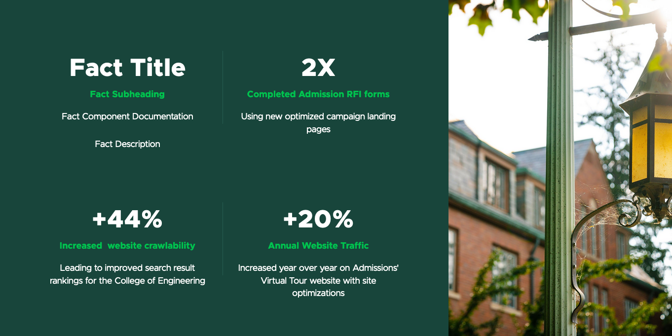
A Text Fact Grid is a container for Fact components, displayed in table fashion with no borders or spacing between cells.

Component Information
Benefits
- This component is used to display facts to help tell a story.
- Facts can be used to help support brand and unit communications goals.
Example Use Cases
- Call out numbers related to a story
- Highlight data points alongside a related image or graphic
Live Example
- Demo: Grid Components
Instructions for Use
In Page Builder:
- Select the page in the Content Tree.
- Click the “+” button in any Placeholder box below the Breadcrumb links.
- Select Text Fact Grid component from list.
Alternate method:
- Click the Components tab at top of Content Tree.
- Locate Text Fact Grid component.
- Drag the Text Fact Grid component to any empty placeholder area of the page below the Breadcrumb links.
Assign content:
- In the Assign content item window, choose the component data to use:
- For existing components, select them from the page’s Data folder or from the appropriate shared folder.
- For new components, select “+”, type in the component title and hit Enter.
- Once the component data is selected, click on the Assign button in the lower right corner.
- In the right pane, expand Advanced styling and choose the desired layout variant from the droplist. The layout on the page will update.
- Click on the “+” symbol inside the appropriate grid container.
- Click on the Fact component in the menu.
- Select the fact to be added to the grid. Click the “+” to create a new Fact.
- Click on the placeholder image in the grid to select it.
- In the right pane, click on the Add button and use the menu to choose an image. Click Add Selected.
Variant Examples


Image Specifications
Sketch Link: Text Fact Grid
Facts Overlay Image
- Desktop – Width: 100% | Height: 622px
- Mobile – Width: 100% | Height: 916px
- Recommended size – Width: 2000px | Height: 1000px
Text Fact with Image - Large
- Desktop – Width: 960px | Height: 737px
- Mobile – Width: 100% | Height: 230px
- Recommended size – Width: 1000px | Height: 800px
Text Fact with Image - Small
- Desktop – Width: 478px | Height: 610px
- Mobile – Width: 100% | Height: 220px
- Recommended size – Width: 500px | Height: 600px
Tool Use Guide
| Page Builder | Explorer | Content Editor | |
| Add component | Optimal | - | - |
| Select variant | Optimal | - | - |
| Flip layout (change side of image display) | Optimal | - | - |
| Select background color | Optimal | - | - |
| Add header and/or description | Optimal | Possible | Possible |
| Add header underline | Optimal | - | - |
| Add image in grid | Optimal | Possible | Possible |
| Add Fact to component | Optimal | - | - |
| Edit Fact* | Optimal | - | Possible |
| Add/change image in Fact* | Optimal | - | Possible |
*Note: Any changes to a Fact apply globally across the website to any instance where that Fact is used.
Documentation updated: July 25, 2025
Is there an issue with this documentation? Report it here.