Display multiple images in a carousel format. The images do not automatically change; the visitor uses arrows or pagination links to change images manually.
Component Information
Benefits
- Carousels are commonly used as a photo gallery.
- Carousels can be used on standard pages or story pages.
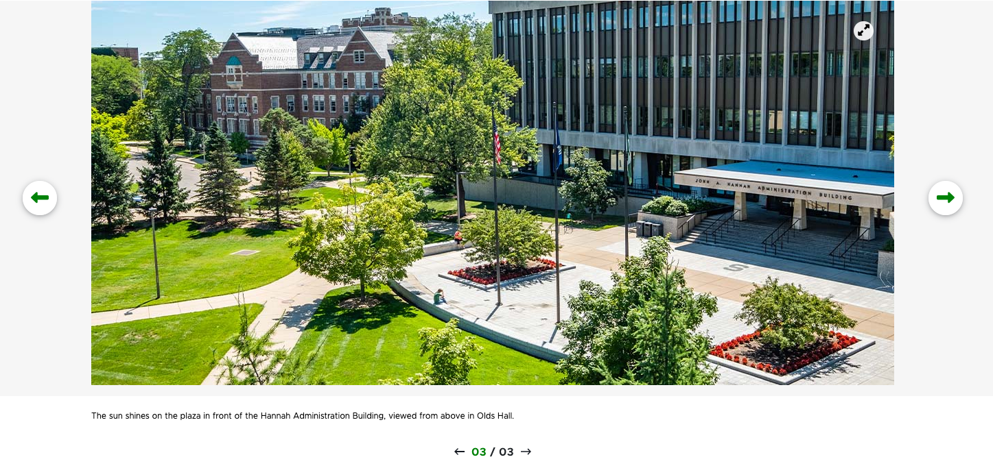
Live Examples
Frequently Asked Questions
No, only manual image advancing is available.
Instructions for Use
In Page Builder:
- Select the page in the content tree.
- Click “+” button in any Placeholder box below the Breadcrumb links.
- Select Carousel component from list.
Alternate method:
- Click Components tab at top of the content tree.
- Locate Carousel component.
- Drag the Carousel component to any empty placeholder area of the page below the Breadcrumb links.
If this is new Carousel content:
- Click “+” next to Data
- Select Carousel with Slide
- Enter a unique name for the data
- Click Assign
If using existing Carousel Data (content):
- Select the data item from the tree
- Click Assign
Note: To add a title or description for the overall carousel, enter them by selecting the component in Content Editor or by filling in the specific fields in the Content Tab of the component options panel in Page Builder.
In Page Builder:
- Click the Carousel component to display the toolbar.
- In “Carousel” right panel menu, click the Design tab.
- Click to expand Manage items.
- Rename Slide 1, which is automatically created, as needed: Click “…” to right of Item, click Rename and give it a new name.
- To add more slides:
- Click “+ Add new” and click Carousel Slide button.
- Give it a unique name.
- To rename a slide: Click “…” to right of the item and give it a new name.
- To delete a slide: Click “…” to the right of the item and delete it.
- To reorder slides: Click “…” and use the up and down arrows to change the tab order.
Note: Initially, a Carousel slide appears without content. The content area contains an image placeholder and slide pagination arrows.
In Page Builder:
Click the pagination arrows to navigate to a slide.

Figure 2: The pagination arrows on a Carousel are used to navigate to images. Click on the Image placeholder icon in the page layout.
Figure 3: The Image placeholder icon in a Carousel slide that does not have an assigned image. - In the right panel, click on the Add button.
- Select an image in the Media Library or upload an image.
- Click Add Selected.
- To add an additional slide, under Manage Items, click on the Add New button.
- Repeat for additional slides.
Note: Image captions must be entered using Content Editor. The display of the image caption is controlled by the variant (e.g., Right Aligned or Center Portrait)
- Click the Carousel to display the toolbar.
- In “Carousel” right panel menu, click the Design tab.
- Click to expand Manage items.
- Click the three dots icon on a slide to open the manage items menu.
- Click Open in Explorer.
- Click the Explorer icon.
- In left pane, locate the Carousel and click to select.
- Edit the Carousel title and description, if desired.
- Locate and click a slide to select it.
- Make changes in the right pane.
- Change orientation.
- Upload or select an image from the Media Library.
- Add alt text.
- Add an image caption.
- To add additional slides:
- Click “+ Create” in the content column.
- Click Carousel Slide.
- Give the content a unique name and click the checkmark icon.
- Add content in the right pane.
- To edit existing Carousel slide:
- Click a Carousel slide item in Carousel panel column.
- Change content in right pane.
- To duplicate a Carousel slide:
- Click a Carousel item in Carousel slide column.
- Click “…” in right pane.
- Click Duplicate.
- To delete a Carousel slide:
- Click a Carousel item in Carousel slide column.
- Click “…” in right pane.
- Click Delete.
- Return to Page Builder by closing the Explorer browser tab.
- Refresh the screen.
- Preview and publish the page.
Locate the Carousel
In Page Builder:
- In Pages, click the dropdown arrow to the right of the Sitecore XM Cloud icon in upper left..
- Select Content Editor. It opens in a new browser tab.
In Content Editor:
- If the Carousel does not appear in the Content Tree, close the page’s Data node and expand it again to refresh the Content Tree.
- In the Content Tree, expand Content > MSU > site name > Home > page name > Data.
- Locate and expand the Carousel component.
Add a Slide
- Right-click the Carousel component.
- Select Insert, then select Carousel Slide.
- Add content in the main pane on the right side.
Note: New slides can also be created by duplicating an existing slide, then changing the name and content.
Edit a Slide
To edit an existing slide:
- Click on the slide in the Content Tree.
- Change as needed in the main content pane on the right side.
- Change orientation.
- Change image.
- Add a caption.
- Change orientation.
Tips for Using Images
- Alt Text can be changed in Explorer or Content Editor.
- An image size can be changed in Content Editor > Image > Properties. HTML uses width and height attributes.
- The image margin (i.e., padding) can be changed in Content Editor > Image > Properties.
Delete a Slide
- Locate and expand the Carousel component.
- In the Content Tree, right-click the slide.
- Click Delete and confirm.
Delete the Carousel
- In the Content Tree, right-click the carousel.
- Click Delete and confirm.
Publish Changes
When done with content authoring activities:
- Return to Page Builder by closing the Explorer browser tab.
- Refresh screen to see changes.
- Preview and publish the page.
Carousel Variants
 Figure 4: The Center Portrait variant of the Carousel component.
 Figure 5: The Center Aligned variant of the Carousel component.
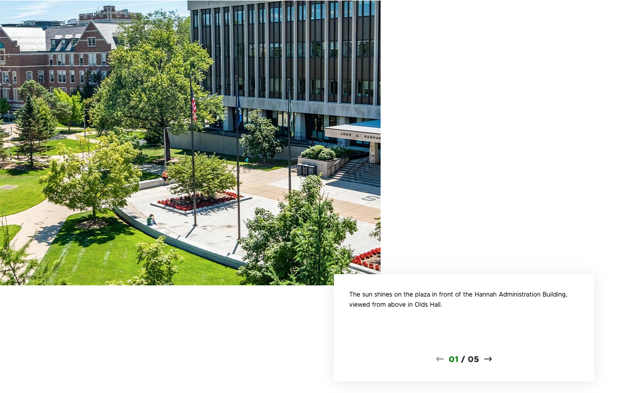 Figure 6: The Left Aligned variant of the Carousel component.
 Figure 7: The Right Aligned variant of the Carousel component.
Image Specifications
Sketch Link: Carousel Component Design
Carousel Images – Landscape
- Desktop – Width: 1170px | Height: 561px
- Tablet – Width: 555px | Height: 312px
- Mobile – Width: 100% | Height: 209px
- Recommended size – Width: 1200px | Height: 600px
Carousel Images – Portrait
- Desktop – Width: 434px | Height: 559px
- Desktop – Width: 434px | Height: 559px
- Mobile – Width: 100% | Height: 398px
- Recommended size – Width: 500px | Height: 600px