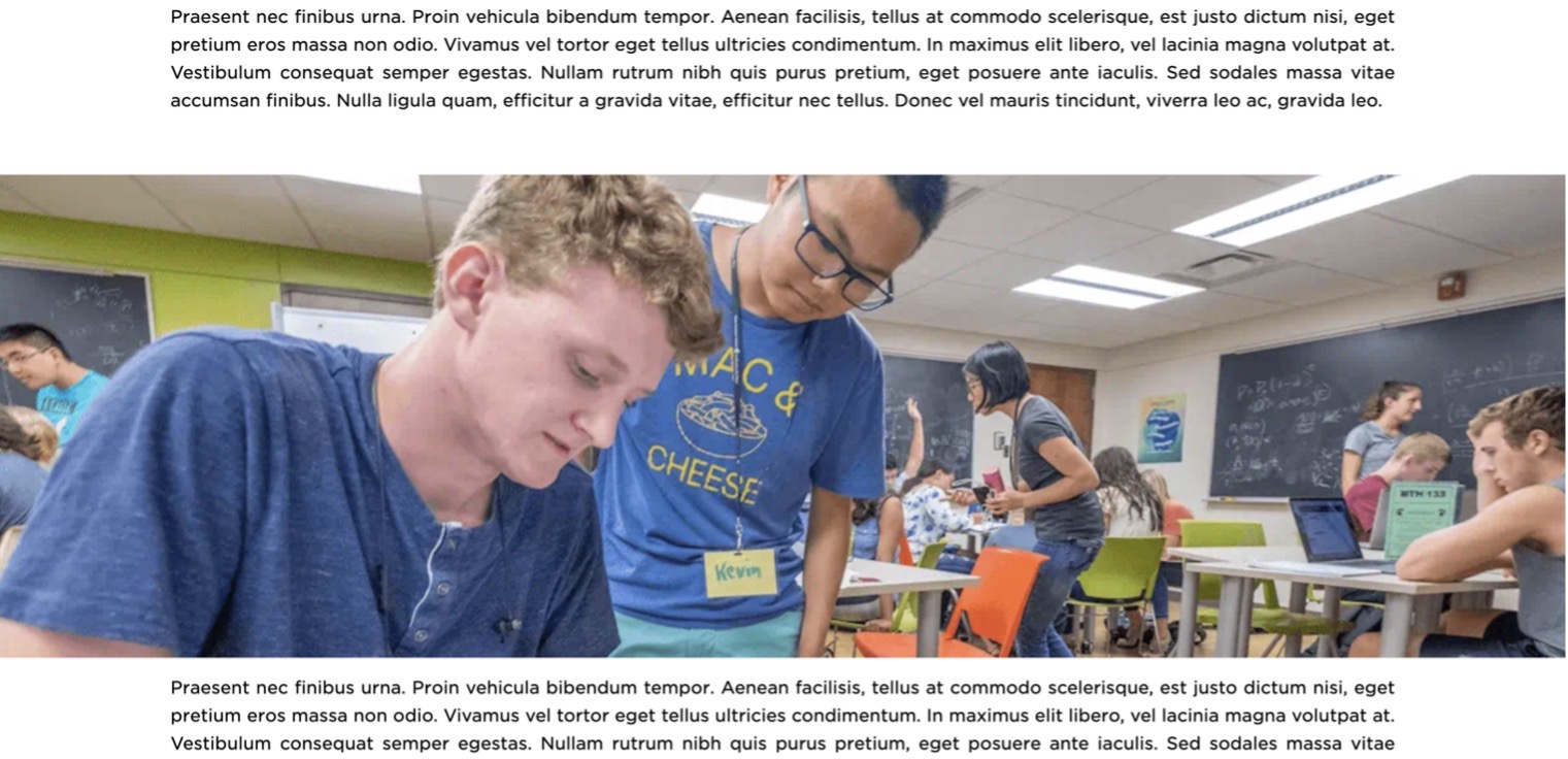
The Wide Flexbox allows a wide image to be displayed outside of the normal margins of the page. The image is treated like the Hero Banner component in that it stretches and adjusts to the page width as a background image.

Component Information
Benefits
- The Wide Flexbox can be used in standard Pages and Story Pages.
- The component is helpful for adding interest to a page, adding flexibility to design.
- The component can be used to break up large amounts of text.
Live Example
Instructions for Use
In Page Builder:
- Select the page in the content tree.
- Click the “+” button in any Placeholder box below the Breadcrumb links.
- Select Wide Flexbox component from list.
Alternate method:
- Click Components tab at top of content tree.
- Locate Wide Flexbox component.
- Drag the Wide Flexbox component to any empty placeholder area of the page below the Breadcrumb links.
- Click the “Add” button.
- Locate the desired image and click it to select.
- Click “Add Selected.”
In Page Builder:
- Click the Wide Flexbox component to select it.
- Click the square with arrow icon to open the component in Explorer.

In Explorer:
- Click Upload to upload an image. Click Browse media library to select an image from the media library.
- Add Alt text, if missing.
- Return to Page Builder.
In Page Builder:
- Refresh the page canvas to view changes.
- Preview the page.
- Publish the page.
In Page Builder:
- Click the dropdown arrow to the right of the Sitecore XM Cloud icon in upper left.
- Select Content Editor. It opens in a new browser tab.
In Content Editor:
- Locate the Wide Flexbox component previously created in the content tree.
- Use the Background Image field to select an image from Media Library or upload a new image.
- Return to Page Builder.
In Page Builder:
- Refresh the page canvas to see changes.
- Preview the page.
- Publish the page.
Tool Use Guide
| Page Builder | Explorer | Content Editor | |
| Add component to page | Optimal | - | - |
| Add/edit image in component | Optimal | Possible | Possible |
| Add alt text to image* | - | Possible | Possible |
*Alt text image should already be added to images in Media Library or Content Hub.
Documentation updated: July 23, 2025
Is there an issue with this documentation? Report it here.