Jump to HeaderJump to Main ContentJump to Footer
Michigan State University
Digital Experience Studio

University Communications and Marketing

Digital Experience Studio

  • Experience Program
    • Website Project Process
    • Working with a Vendor
    • Glossary
    • Taxonomy Data Dictionary
  • |
  • Experience Design
    • Website Strategy
    • Website Structure
    • Information Architecture and Navigation
    • User-Centered Design Conventions
    • Common UX Issues
    • Enterprise Design System
    • Content Planning
    • Creating Accessible Content
    • Taxonomy and Filters
  • |
  • Website Technology
    • Web Standards
    • Search Engine Optimization
    • Cascade CMS
    • Sitecore CMS
    • Content Hub Overview
    • Content Hub DAM
    • Content Hub Operations

    SitecoreAI

    Sitecore user login
  • |
  • Social Media
    • Alt Text Bookmarklet
    • Meta Ad Pixel
    • Social Media and Web Integration
    • Sprinklr

    Sprinklr

    Sprinklr user login
  • |
  • Analytics
    • Google Analytics (GA4)
    • Testing
    • Data Visualization

    Google Analytics

    Google Analytics user login
  • |
  • News and Events
    • News and Updates
    • Events and Trainings
Digital Experience Studio

University Communications and Marketing

  • Experience Program
  • Experience Design
  • Website Technology
  • Social Media
  • Analytics
  • News and Events

< Experience Program

  • Website Project Process
  • Working with a Vendor
  • Glossary
  • Taxonomy Data Dictionary

< Experience Design

  • Website Strategy
  • Website Structure
  • Information Architecture and Navigation
  • User-Centered Design Conventions
  • Common UX Issues
  • Enterprise Design System
  • Content Planning
  • Creating Accessible Content
  • Taxonomy and Filters

< Website Technology

  • Web Standards
  • Search Engine Optimization
  • Cascade CMS
  • Sitecore CMS
  • Content Hub Overview
  • Content Hub DAM
  • Content Hub Operations

SitecoreAI

Sitecore user login

< Social Media

  • Alt Text Bookmarklet
  • Meta Ad Pixel
  • Social Media and Web Integration
  • Sprinklr

Sprinklr

Sprinklr user login

< Analytics

  • Google Analytics (GA4)
  • Testing
  • Data Visualization

Google Analytics

Google Analytics user login

< News and Events

  • News and Updates
  • Events and Trainings
Digital Experience Studio > Website Technology > Sitecore CMS > Sitecore Component Guide >

Grid Container

MSU Tools and Resources

  • A to Z Index
  • Find People
  • Email
  • Tech Support
  • Social Media Directory

Communications Resources

  • University Communications and Marketing
  • University Trademarks and Licensing
  • MSU Brand Studio
  • MSU Editorial Style Guide
  • MSU Photos

Contact us

517-355-7505

Address

Michigan State University 408 West Circle Drive East Lansing, MI 48824

Follow Us

  • Visit our Facebook page
  • Visit our page on X
  • Visit our Instagram page
  • Visit our LinkedIn page
  • Visit our YouTube page
  • Visit our TikTok page

If you're having accessibility issues, please let us know.

Know MoreTransparency Reporting: Budget & Salary/Compensation
  • Contact Information|
  • Site Map|
  • Privacy Statement|
  • Site Accessibility|
  • Call MSU: (517) 355-1855|
  • Visit: msu.edu|
  • Notice of Nondiscrimination|

SPARTANS WILL|© Michigan State University|

Grid Container

The Grid Container is used to arrange specific components in a full-width grid of content with multiple options for the number and size of grid cells to display.

grid-container-example
Fig. 1: Example of a Grid Container from the MSU homepage. This example uses the “1 Tall, 4 Small (2x2)” variant with Image, Story and Fact components.


Component Information

  • Usage
  • Benefits

    • The Grid Container is a container component used to display a full-width grid of content cells in the main body of a page.
    • The individual grid cells are available in different sizes and can contain different types of components, giving a content author flexibility in designing the webpage to accommodate a variety of content. 

    Variants

    • Grid Containers have 12 variants available. Each variant offers a different combination of grid cell numbers and sizes.
    • Cell sizes are:
      • Small
      • Medium
      • Tall
      • Large
      • X-Large
    • The Grid Container can be used to display a select number of components, some of which are only available in certain cell sizes. The components available (with respective cell sizes in parentheses) are:
      • Image (S, M, T, XL)
      • MSU Rich Text (S, M, T, L, XL)
      • Video Player (S, M, T, XL)
      • Box CTA (S)
      • Grid Ad (S, M, T, L, XL)
      • Fact (S)
      • Social Share (S)
  • Best Practices
  • Frequently Asked Questions

    Where is the Grid Container in Content Editor?

    Being a container component, the Grid Container does not appear in a page’s data folder in Content Editor like other components. Make edits to this component in Page Builder.

    I placed a component in a Grid Container cell, but I’m not seeing all the content. What happened?

    Instructions for Use

    Add a Grid Container to a Page

    In Page Builder:

    1. Select the page in the content tree.
    2. Click “+” button in any Placeholder box below the Breadcrumb links.
    3. Select Grid Container component from list. 

    Alternate method:

    1. Click Components tab at top of content tree.
    2. Locate Grid Container component.
    3. Drag the Grid Container component to any empty placeholder area of the page below the Breadcrumb links.
    Setting the Grid Container Variant

    Layout Variants

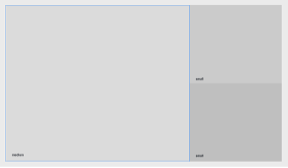
    1 Large, 2 Small
    1-large-2-small-blank
    Fig. 3: Grid Container layout showing the “1 Large, 2 Small” variant.
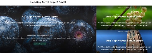
    1-large-2-small-example
    Fig. 4: Grid Container layout showing the “1 Large, 2 Small” variant. Each cell contains a Grid Ad component.

    Image Specifications

    Sketch Link: Grid Container

    Grid XLarge

    • Desktop – Width: 100% | Height: 810px
    • Mobile – Width: 100% | Height: 573px
    • Recommended size – Width: 2000px | Height: 1000px

    Grid Large

    • Desktop – Width: 960px | Height: 810px
    • Mobile – Width: 375px | Height: 536px
    • Recommended size – Width: 1000px | Height: 1000px

    Grid Medium

    • Desktop – Width: 50% / 720px | Height: 810px
    • Mobile – Width: 100% | Height: 300px
    • Recommended size – Width: 800px | Height: 900px

    Grid Small

    • Desktop – Width: 33% / 480px | Height: 405px
    • Mobile – Width: 100% | Height: 300px
    • Recommended size – Width: 500px | Height: 500px

    Grid Tall

    • Desktop – Width: 33% / 480px | Height: 810px
    • Mobile – Width: 100% | Height: 300px
    • Recommended size – Width: 500px | Height: 900px

    Tool Use Guide

    *Add content type and then follow component-specific instructions
     

    Documentation updated: May 29, 2026

    Is there an issue with this documentation? Report it here.

    • Grid Containers are placed and edited in Page Builder.
    • Grid Containers should be used in full-width main content areas of pages.
    • Before placing a Grid Container on a page in Page Builder, have a content plan ready as this will determine what components are needed and what variant to use.
    • While most components can be created while making a Grid Container, it may be easier to create the needed components first.
    • Changing the Grid Container variant will clear components from any cells that are not the same size.
    • Edit cell components following their requirements. Some component data may not display when used in a Grid Container cell.
    • It is not recommended to use the Grid Container at the top of a webpage without a hero banner or other component above the Grid Container. This layout is uncommon in web design and visitors may think the webpage did not load correctly.
  • Expected Behavior
    • The Grid Container will fill the full width of the webpage when viewed on desktop.
    • When viewed on a mobile device, the grid container cells stack vertically, starting with the left/top-left cell first and the right/bottom-right cell being last.
    • Preview the grid at various browser and device sizes to view the stacking order.
  • Template Data
  • Grid Container title (single-line text)

    • This does not display on the webpage.
    • This field is only for system use.

    Grid Container variants

    • Located in Pages under Component Options > Advanced styling > Variant.
    • Variant options are:
      • 1 Large, 2 Small (Stacked)
      • 1 Large, 1 Tall
      • 2 Medium
      • Small 2 and 1 (Newsletter)
      • 2 Small (Stacked), 1 Large
      • 3 Small
      • 4 Small (2x2), 1 Tall
      • 6 Small (3x2)
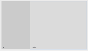
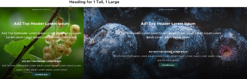
      • 1 Tall, 1 Large
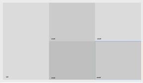
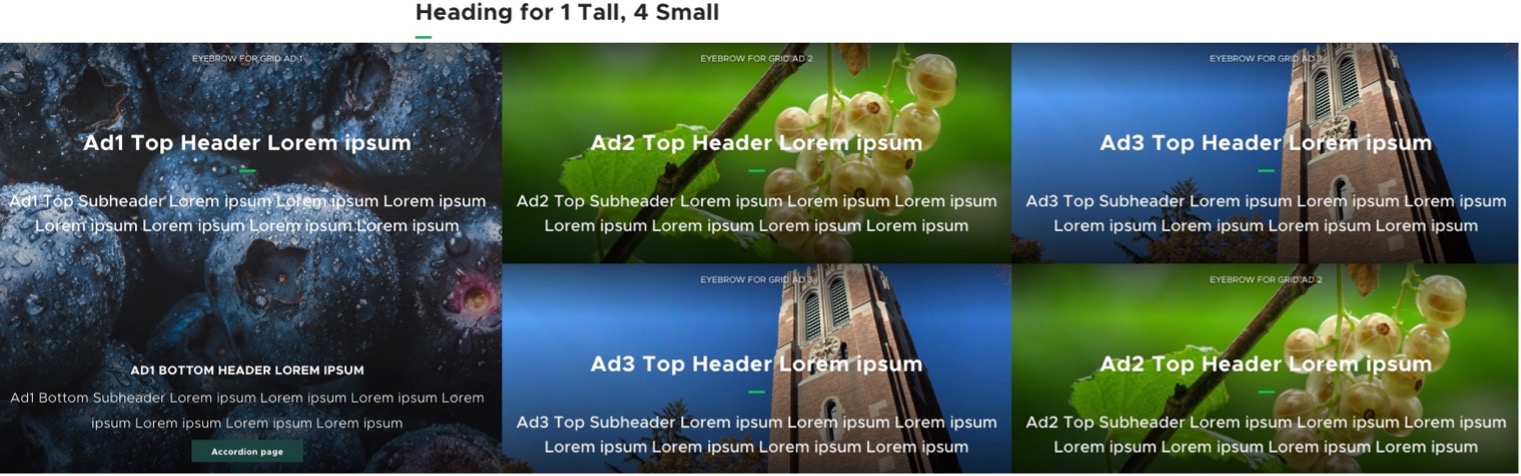
      • 1 Tall, 4 Small (2x2)
      • 3 Tall
      • X-Large
  • Related Information
  • Related Components

    • Image
    • Rich Text
    • Video Player
    • Box CTA
    • Grid Ad
    • Fact
    • Social Share

    Live Examples

    • Demo page: Grid components

    Some component data does not display when used in a Grid Container. Consult that component’s documentation for its usage in a Grid Container.

    1. With the Grid Container selected, locate the right-side Component Options panel.
    2. Click the Design tab.
    3. Choose the desired variant option from the Variant drop-down menu.
    Add Content to a Grid Container
    1. Select a Grid Container cell placeholder.
    2. Choose the desired component from the list of available components.
    3. In the Assign content item window, choose the component data to use: 
      1. For existing components, select from the page’s Data folder or from the appropriate shared folder.
      2. For new components, select Create new, type in the component title and hit enter.
    4. Once the component data is selected, click on the Assign button in the lower right corner.
    5. Add or edit component data, per the component requirements.
    6. Repeat the process until all Grid Container cells are filled.
    Example
    grid-container-admissions-example
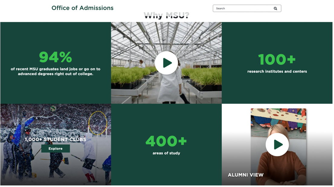
    Fig. 2: Example of a Grid Container from the Office of Admissions. This example uses the “6 Small” variant with Fact, Video and Grid Ad components.
    1 Large, 1 Tall
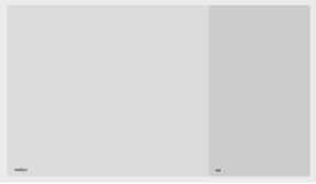
    1-large-1-tall-blank
    Fig. 5: Grid Container layout showing the “1 Large, 1 Tall” variant
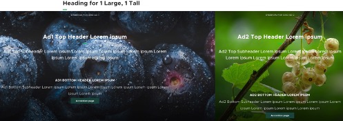
    1-large-1-tall-example
    Fig. 6: Grid Container layout showing the “1 Large, 1 Tall” variant. Each cell contains a Grid Ad component.
    2 Medium
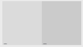
    2-medium-blank
    Fig. 7: Grid Container layout showing the “2 Medium” variant.
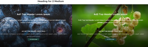
    2-medium-example
    Fig. 8: Grid Container layout showing the “2 Medium” variant. Each cell contains a Grid Ad component.
    Small 2 and 1 (Newsletter)
    Screenshot showing a wide section with a call to action to subscribe to MSUToday and a small grid section with a social media follow call to action.
    Fig. 9: The Small 2 and 1 (Newsletter) variant was designed to showcase a left section that is as wide as two small sections, with another small section on the right. In this example the wide section shows a call-to-action for a newsletter and the right section uses a social share component.
    2 Small, 1 Large
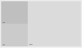
    2-small-1-large-blank
    Fig. 10: Grid Container layout showing the “2 Small, 1 Large” variant.
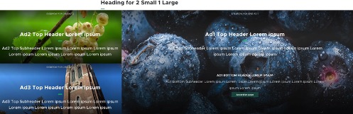
    2-small-1-large-example
    Fig. 11: Grid Container layout showing the “2 Small, 1 Large” variant. Each cell contains a Grid Ad component.
    3 Small
    2-small-1-large-blank
    Fig. 12: Grid Container layout showing the “3 Small” variant.
    2-small-1-large-example
    Fig. 13: Grid Container layout showing the “3 Small” variant. Each cell contains a Grid Ad component.
    4 Small, 1 Tall
    2-small-1-large-blank
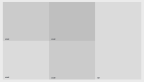
    Fig. 14: Grid Container layout showing the “4 Small, 1 Tall” variant.
    2-small-1-large-example
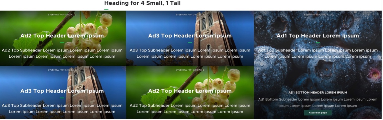
    Fig. 15: Grid Container layout showing the “4 Small, 1 Tall” variant. Each cell contains a Grid Ad component.
    6 Small
    2-small-1-large-blank
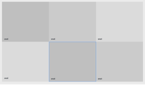
    Fig. 16: Grid Container layout showing the “6 Small” variant.
    2-small-1-large-example
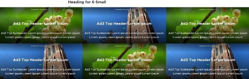
    Fig. 17: Grid Container layout showing the “6 Small” variant. Each cell contains a Grid Ad component.
    1 Tall, 1 Large
    2-small-1-large-blank
    Fig. 18: Grid Container layout showing the “1 Tall, 1 Large” variant.
    2-small-1-large-example
    Fig. 19: Grid Container layout showing the “1 Tall, 1 Large” variant. Each cell contains a Grid Ad component.
    1 Tall, 4 Small
    2-small-1-large-blank
    Fig. 20: Grid Container layout showing the “1 Tall, 4 Small” variant.
    2-small-1-large-example
    Fig. 21: Grid Container layout showing the “1 Tall, 4 Small” variant. Each cell contains a Grid Ad component.
    3 Tall
    2-small-1-large-blank
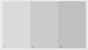
    Fig. 22: Grid Container layout showing the “3 Tall” variant.
    2-small-1-large-example
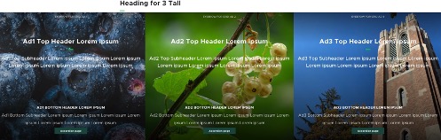
    Fig. 23: Grid Container layout showing the “3 Tall” variant. Each cell contains a Grid Ad component.
    X-Large
    2-small-1-large-blank
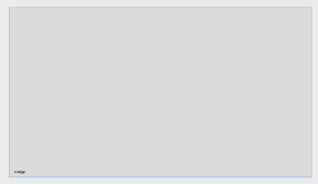
    Fig. 24: Grid Container layout showing the “X-Large” variant.
    2-small-1-large-example
    Fig. 25: Grid Container layout showing the “X-Large” variant. The cell contains one Grid Ad component.