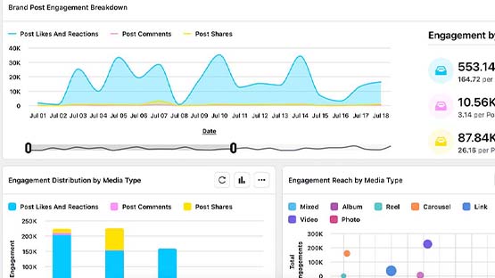
Presenting data to others will generally involve a presentation deck with a summary of key insights, data visualization(s) to display the data, or both. Internal audiences do not have time to comb through the raw data to come to their own conclusions, but they do need to understand the story the data is telling. They need analysis and insights to guide data-based decisions.
What is Data Visualization?
Data visualization is the graphical representation of information and data. By using visual elements like charts, graphs, maps and other visual tools, data visualization provides an accessible way to see and understand trends, outliers, patterns and insights in data.
The primary goal of data visualization is to make complex data more understandable and actionable, allowing users to interpret and analyze data more effectively. It serves as a bridge between raw data and informed decision-making, enhancing comprehension through visual context.
Best Practices
Creating a good data visualization or presentation starts with asking why it is being created.
- What should the audience take away from viewing the visualization or presentation?
- What story should the data tell?
Consider who will be consuming the data visualization or presentation.
- What is their level of expertise?
- What is their level of familiarity with the data?
- What are their needs?
- How will they use the data?
- What should they take away from this report?
- How will this be consumed? Will it be presented and discussed in person or will they be viewing the data on their own?
Select the type of visualization that best represents the data. For example, show trends over time with a line chart. Show comparisons with a bar chart. Use a donut or pie chart to show proportions.
The book “Good Charts: The HBR Guide to Making Smarter, More Persuasive Data Visualizations” by Scott Berinato offers great insights into what type of visualization to choose for specific use cases.
Be honest with the data presentation. Do not manipulate visualization designs to make a certain point. Let the data speak for itself. Do not curate the data to tell a particular story. Scales, proportions and data representations must be accurate and truthful.
For example, do not manipulate the data scales or axes to distort the data. Do not imply data represents something that it does not.
For presentation decks, keep text minimal on each slide so viewers can absorb it during the presentation. If a lot of extra information is needed, include it in handouts or slide notes as a leave behind.
For visualizations, include concise and descriptive titles and labels. It should be clear what a visualization is showing. Label axes and data points where necessary.
Remove anything that does not provide value and is unnecessary to the data story. Avoid clutter. Focus on the most important data points.
Avoid distracting design elements, such as background images and three-dimensional shapes. Use consistent colors, fonts and type sizes throughout the visualization or presentation to avoid confusion.
Use headlines, text, annotations, colors and other visual tools to emphasize the most important data points and trends. Ensure that anyone looking at the data can easily come away with the correct interpretation and key points.
Baselines, benchmarks and trend lines or context can help the audience understand the data within a broader context.
Provide alternative text descriptions for all charts so that users can understand the data without the visual.
Color should be used to enhance understanding without being distracting. It also should not be the sole means of relating data meaning. Combine color with patterns, shapes or labels to ensure individuals without the ability to view different hues are still able to understand the visualization. Be mindful of color contrast and accessibility standards.
Attribute all data sources. Provide relevant notes about the data, particularly about limitations or assumptions.
Include legends, tooltips or explanatory notes to help viewers better understand visualizations. Call out and explain data anomalies.
Get feedback from others to ensure the visualization or presentation is clear, easy to understand and that it correctly communicates the intended message. Adjust as needed.
Tools and Resources
Looker Studio
Looker Studio is a free Google product. Users can connect to a variety of data sources, including GA4 and several social media channels. There are free marketing templates available to help users get started. Access Looker Studio at https://lookerstudio.google.com.
Recommended Reading
The Harvard Business Review book, “Good Charts: The HBR Guide to Making Smarter, More Persuasive Data Visualizations” by Scott Berinato, offers a step-by-step guide to designing quality data visualizations.
Analytics Edge
Analytics Edge connects to GA4 (and many other platforms) and automates the data download and analysis process. There is a yearly cost per computer for the app (Mac M1+ or Windows 10+) or Excel plugin (Windows 10+). There is an additional annual charge per connector.
Sprinklr Tools
Sprinklr users have access to Sprinklr presentations and reporting dashboards. These tools can be used to visualize data from connected social media accounts on supported channels. See the Social Media section of this website for more information.
Documentation updated: June 3, 2024

