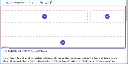
The Two-Thirds Sublayout container adds a two-column layout to a section of a webpage. The left column contains the main content and is two-thirds of the content area width. The right column contains secondary content, such as curated or contextual navigation or an aside, and is one-third of the content area width. Their combined width is equal to a one-column full-width content area.

Component Information
Benefits
- The Two-Thirds Sublayout container allows content authors to provide primary content, secondary content and navigation in a two-column layout, adding layout versatility to the page.
- The Two-Thirds Sublayout container can be placed on a basic page anywhere below the Breadcrumb links. This container cannot be used on other types of pages.
- A page can have both full-width and two-column content. The full-width content can be above and/or below the two-column content area.
- Each column may contain one or multiple components.
- The Two-Thirds Sublayout container extends from one edge of the content area to the other edge. It is not a full-bleed component.
- The Two-Thirds Sublayout container does not extend to the full-page height — the two-column layout only applies to the content placed inside the container.
Example Use Cases
- Provide a secondary navigation area for a group of related pages so that users do not have to open the mega navigation and hunt for other pages on the same topic.
- Provide an image, text and button to the right of the main content that show additional or related information about the main content.
- Highlight a particular page and provide an easy way for visitors to get to it.
Frequently Asked Questions
Click the "+" in a full width area to add a component in that space.
When dragging a component from the Components list, be sure that “mainbody-#” displays before the component is dropped into the page. The number may vary depending on the location on the page.
Instructions for Use
In Page Builder:
- Select the page in the Content Tree.
- Click “+” button in any Placeholder box below the Breadcrumb links.
- Select Two-Thirds Sublayout container from list.
Alternate method:
- Click Components tab at the top of the Content Tree.
- Locate Two-Thirds Sublayout container.
- Drag the Two-Thirds Sublayout container to any empty placeholder area of the page below the Breadcrumb links.

Assign a component:
- Select a Two-Thirds Sublayout container cell placeholder.
- Click “+” in the cell.
- Choose the desired component from the list of available components.
Alternative method:
- Open the Components menu.
- Locate the desired component.
- Click and drag to drop it in the appropriate column.
- To add the component to the left column, drag to the left column and make sure that “twothirdsbody-#” displays before dropping the component. (The number will vary depending on the page.)
- To add the component to the right column, drag to the right column and make sure that “twothirdsnav-#” displays before dropping the component. (The number will vary depending on the page.)
Assign content to the component:
- In the Assign content item window, choose the component data to use:
- For existing components, select them from the page’s Data folder or from the appropriate shared folder.
- For new components, select Create new, type in the component title and hit enter.
- Once the component data is selected, click on the Assign button in the lower right corner.
- Add or edit component data, per the component requirements.
- Repeat the process for other areas in the sublayout container. Multiple components can be added within each container column.
- Preview the page.
- Publish the page.

Tool Use Guide
| Page Builder | Explorer | Content Editor | |
| Add Two-Thirds Sublayout to page | Optimal | - | - |
| Add components to Two-Thirds Sublayout content areas | Optimal | - | - |
| Edit content in components* | Possible | Possible | Possible |
*Follow component-specific instructions.
Documentation updated: Feb. 10, 2025
Is there an issue with this documentation? Report it here.