A combination of text, a background image and a call to action, or CTA, button. Text can appear at the top and bottom of the component. This component can be displayed in a Grid Container component for a tiled layout.
Note: This component was formerly known as “Ad-Coming Soon” in Sitecore XP.

Component Information
Benefits
- The Grid Ad is a versatile component that allows the content author to create a combination of text (including several lines, positions and font sizes), a background image and a call to action, or CTA, button to display in a Grid Container with other made-for-grid components.
- The Grid Ad must be used in a Grid Container or a two-column page layout. It cannot be placed on a page without using one of these components.
- The Grid Container is full page-width. It extends from one edge of the browser window to the other, spanning the width of the site. This expansive view pulls visitor focus to the grid images.
Example Use Cases
- Provide a small snippet of text and keywords with a button link to a story or event page.
- Provide visual imagery to attract visitor attention, text that summarizes detailed content and a button link that directs visitors to a page with more content.
- Highlight a particular page and provide an easy way for visitors to get to it.
Template Data
Image (image)
- Background image for the Grid Ad component. It fills the entire tile.
- Required field.
Eyebrow (single-line text)
- Title that displays at the top of the component.
- The text is automatically converted to uppercase regardless of how text is entered.
Eyebrow Position (droplink)
- The selection determines where the Eyebrow displays in the component.
- Values:
- Up — This is the default. The Eyebrow displays at the top (above any Top Header or Sub-Header).
- Down — The Eyebrow displays at the bottom (above any ottom Header or Sub-Header).
Top Header (single-line text)
- Text that displays in large font at top of component, if present.
- If the Grid Ad component is placed in a Large or Tall grid tile, the Top Header does not display.
- If the Grid Ad component is placed in a Small grid tile and if both Top and Bottom fields are entered, only the Eyebrow and Bottom fields are displayed.
Top Sub-Header (multi-line text)
- Text that displays in a medium-sized font at the top of the component, if present, and below the Top Header, if one is present.
- If the Grid Ad component is placed in a Large or Tall grid tile, the Top Sub-Header text does not display.
Bottom Header (single-line text)
- Text that displays in a medium-sized font at the bottom of the component, if present.
- The text is automatically converted to uppercase regardless of how text is entered.
Bottom Sub-Header (multi-line text)
- Text that displays in a medium-sized font at the top of the component, if present, and below the Bottom Header, if one is present.
CTA (droptree)
- An optional button that displays at the bottom of the component.
- Values:
- None (default)
- Call to Action button
- The button will only display if at least one of the Top or Bottom fields is used.
Frequently Asked Questions
Technically, only the image is required. However, at least one text field should be specified.
Users can use a color contrast analyzing tool to check color contrast. There should be a contrast ratio of at least 4.5:1 for normal text and 3:1 for large text (at least 18 pt.) or bold text.
Read more about color use on the MSU Brand Studio website, under RGB/Hex Accessible Pairings.
Simply adjust the text color, background color or background image to ensure the color contrast is compliant to accessibility standards.
Image Specifications
Grid XLarge
- Desktop – Width: 100% | Height: 810px
- Mobile – Width: 100% | Height: 573px
- Recommended size – Width: 2000px | Height: 1000px
Grid Large
- Desktop – Width: 960px | Height: 810px
- Mobile – Width: 375px | Height: 536px
- Recommended size – Width: 1000px | Height: 1000px
Grid Medium
- Desktop – Width: 50% / 720px | Height: 810px
- Mobile – Width: 100% | Height: 300px
- Recommended size – Width: 800px | Height: 900px
Grid Small
- Desktop – Width: 33% / 480px | Height: 405px
- Mobile – Width: 100% | Height: 300px
- Recommended size – Width: 500px | Height: 500px
Grid Tall
- Desktop – Width: 33% / 480px | Height: 810px
- Mobile – Width: 100% | Height: 300px
- Recommended size – Width: 500px | Height: 900px
Instructions for Use
Add a Grid Container to the page where the Grid Ad component is needed, and select the desired variant.
In Page Builder:
- Click the grid container to display the toolbar.
- Click Click the “+” in a tile and under Components, select Grid Ad.
- Hover over the Data folder in the pop-up window. Click “+” to the right of Data and add a component.
- Click Grid Ad to add the component. Give it a name that is unique within the page.
- To add additional Grid Ad components, click “+” to the right of Data and add another Grid Ad component. Repeat as necessary.
- Click the Grid Ad to be assigned to the grid container cell, and click Assign.
Alternate method:
- Click Components tab at the top of the content tree.
- Locate Grid Components section.
- Drag the Grid Ad to the tile in the Grid Container.
- In the “Assign content item” dialog box, select the appropriate item.
- Click Assign.
In Page Builder, with the Grid Ad selected, expand Advanced Styling and apply settings, as desired:
- ID — not used
- CSS Styles — not used
- Gradient — Shading is applied to the background image for better contrast with text; choose Black (default), Green or White.
- Eyebrow Position — Display Eyebrow position; choose Up (default, above Top text) or Down (above Bottom text)
- Text Alignment — Align all text; choose Center (default) or Left justified
- Green Line — Check to display a decorative green line between the Top Header and Top Subheader.
- If Top text is blank, no green line displays, even if Top Subheader is empty.
- Checking this option has no effect on Bottom text.
- Use Large Bottom Header Text — Check to use large text. This affects the Bottom Header only.
- Use Small Bottom Sub-Header Text — Check to use small text. This affects the Bottom Sub-Header only.
Add Text
- Text fields, including Top Header, Top Sub-Header, Bottom Header and Bottom Sub-Header, can be entered directly in the respective Pages fields.
- There is no specific character limit on text fields. If text is too long, the top and bottom text will either run together or the text is truncated to fit in the component, depending on the field(s). If this happens, text must be shortened. Be sure to preview.
Add Background Image
- Click image in the component.
- In “Image” right column:
- Click Add.
- Select an image from Media Library.
- Click Add selected.
- Use Explorer or Content Editor to add alt text on image — see alternate method for instructions, below. Alt text can also be added to an image when it is uploaded into Media Library or Content Hub.
Add a Call to Action, or CTA, Button
- Click the CTA field in the component.
- In “CTA Button” right column, expand and set options, as needed:
- Link Type — Choose Internal, External or Media destination.
- Link Text — Add the text that will appear on the button.
- URL — This will depend on the type of link
- Expand Optional parameters to set Link title or Open in new window, if needed. Note: It is a best practice to have links open in the same window. If the link will open in a new window this should be made clear to the visitor.
- Click Clear link value to remove the CTA button.
In Page Builder:
- Click the Grid Ad component to display the toolbar.
Click Box with arrow icon to go to Explorer. Explorer will open in a new browser tab.
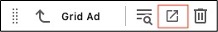
Figure 2: The Grid Ad toolbar. The Explorer icon has been highlighted with a red box.
In Explorer:
- Select the Grid Ad component to add content.
- Select image — Browse Media Library, select an image and click Add image.
- Enter alt text for the image.
- Eyebrow title — Add optional text to display above the Grid Ad.
- Top Header and Top Sub-Header — Add text, if desired.
- Bottom Header and Bottom Sub-Header — Add text, if desired.
- CTA button — Select type, add URL (destination), button text, link title (which serves as the tooltip when a cursor hovers on the link) and set option to open in a new browser tab, if desired.
- Return to Pages.
- Refresh the screen to see changes.
In Page Builder:
- Click the dropdown arrow to the right of the Sitecore XM Cloud icon in upper left.
- Select Content Editor.
In Content Editor:
- Locate the Grid Ad component in the content tree.
- Make necessary changes in each field.
Note: An existing Grid Ad can be duplicated in Content Editor and then changed as needed.
- Return to Page Builder.
- Refresh the canvas to see changes.
- Preview the page.
- Publish the page.


Tool Use Guide
| Page Builder | Explorer | Content Editor | |
| Add to Grid Container | Optimal | - | - |
| Add to side column (two thirds page or sublayout) | Optimal | - | - |
| Add image | Optimal | Possible | Possible |
| Add alt text | - | Optimal | Possible |
| Add/edit text | Optimal | Possible | Possible |