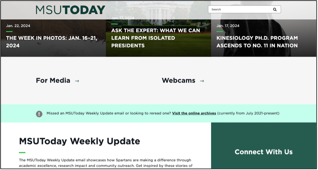
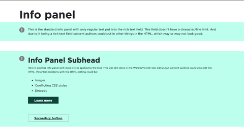
The Info Panel displays a message in a full-width box within a main body content area. The message includes a call to action, or CTA, link to take users to another page.

Component Information
Benefits
- The Info Panel draws attention to a short announcement message in a light green box with an exclamation point icon.
- The Info Panel is a full-width component used in the main content area of a page so it complements the grid design of webpages.
Example Use Cases
- Call attention to upcoming deadlines, such as applications for admission or scholarships.
- Provide notification of nonemergency announcements with a link to a page for more information.
Instructions for Use
In Page Builder:
- Select the page in the content tree.
- Click “+” button in any Placeholder box in the main content area below the Breadcrumb links or the “+” button in the special Info Panel placeholder box above the Breadcrumb.
- Select Info Panel component from list.
Alternate method:
- Click Components tab at top of content tree.
- Locate Info Panel component.
- Drag the Info Panel component to any empty placeholder area of the page in the main content area below the Breadcrumb links or the empty Info Panel placeholder.
If creating a new Info Panel:
- Click on + create new.
- Select Info Panel.
- Type in the component label, hit enter/return, and click Assign.
If selecting an existing Info Panel:
- Locate the appropriate Info Panel in the Page’s Data folder.
- Click the panel to select it.
- Click on Assign.
In Page Builder:
- Select the Info Panel Content field and type in the desired message.
- Use the Content > Element Options pane to adjust text styles and add a link.
In Page Builder:
- Click the Info Panel component to display the toolbar.
- Click Box with arrow icon to go to Explorer. Explorer will open in a new browser tab.
In Explorer:
- Select the Info Panel component to add content.
- Edit content and formatting, as needed.
- Return to Pages.
- Refresh the screen to see changes.
In Page Builder:
- Click the dropdown arrow to the right of the Sitecore XM Cloud icon in upper left.
- Select Content Editor. It opens in a new browser tab.
In Content Editor:
- Locate the Info Panel component in the content tree.
- Make necessary changes in each field.
Note: An existing Info Panel can be duplicated in Content Editor and then changed as needed.
- Return to Page Builder.
- Refresh the screen to see changes.
- Preview the page.
- Publish the page.


Tool Use Guide
| Page Builder | Explorer | Content Editor | |
| Add component | Optimal | - | - |
| Assign data source | Optimal | - | - |
| Edit content | Optimal | Possible | Possible |
Documentation updated: July 23, 2025
Is there an issue with this documentation? Report it here.