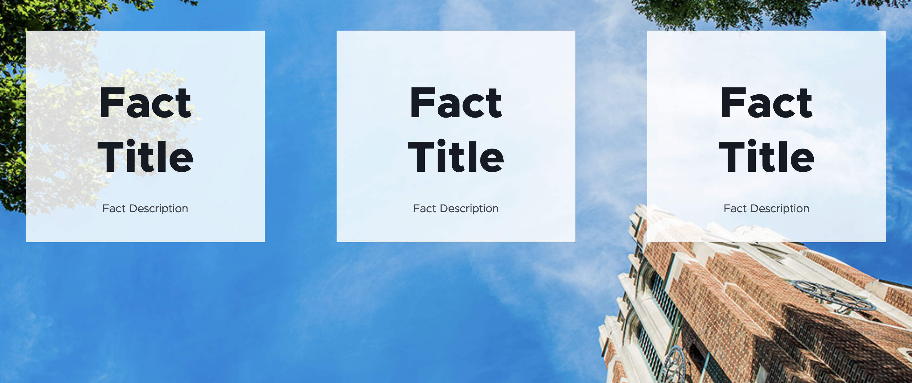
The Image Fact Grid presents one, two or three facts over a full-width background image.

Component Information
Benefits
- An Image Facts Grid is placed on a page to display up to three facts over an image background.
- This provides a more visual option for page design flexibility.
Template Data
Background Image Desktop
- This is a required image field with normal image field options.
- This is used for the desktop image size and for other sizes if other image fields are left blank.
- This field is accessed by clicking on the image icon in the lower right corner of the component.
With Image Fact Grid Component Options > Advanced Styling
- Drop-down menu with three options:
- Translucent Black
- Green
- White
- This changes the color of the Fact background boxes and text.
Three Fact Placeholders
- Assign up to three facts for the placeholders in the Image Fact Grid component.
Frequently Asked Questions
The Image Fact Grid displays up to three facts. It is recommended that you not include Link Description text if adding a link.
A fact is a special component located in the site’s Data > Facts Folder or in the Shared Sites > Global Facts Folder.
See the Fact page for more details.
Users can create a new fact inside of the site’s Data > Facts Folder. Users may also find facts inside the Shared Sites > Global Facts Folder.
See the Fact page for more details.
To work properly, an Image Fact Grid at minimum needs a background image set for desktop view and at least one fact added to the component.
Websites may display one, two or three facts in an Image Fact Grid.
Instructions for Use
- Before adding the Image Fact Grid component, the content author should have the desired facts details ready.
- Existing facts available to use are in the site’s Data > Facts Folder or in the Shared Sites > Global Facts Folder.
- Content authors may create new facts in Content Editor in their site’s Data > Facts Folder.
- Content authors may also create new facts by choosing “Create new” when placing a fact in the Image Facts Grid in Pages. Select the site Facts Folder for the location.
- Data for a fact can be added/edited in the Content Editor, directly in Pages or in Explorer.
Specific notes for facts used in an Image Fact Grid:
- A fact must have the “Title – Text” and “Description” fields completed.
- The “Source URL” and “Description” text are optional.
- The “Subheading” and “Image” fields are not used in the Image Facts Grid. These fields are used in other components that use facts.
In Page Builder:
- Select the page in the Content Tree.
- Click “+” button in any Placeholder box below the Breadcrumb links.
- Select Image Fact Grid component from list.
Alternate method:
- Click Components tab at top of Content Tree.
- Locate Image Fact Grid component.
- Drag the Image Fact Grid component to any empty placeholder area of the page below the Breadcrumb links.
- Add a background image to the Background Image Desktop area by clicking on the background image selector in the bottom right corner.
- In the Background Image Desktop window (to the right), use the image Element Options to add the desired image (or change, if an image had already been selected).
- If different mobile or tablet background images are needed, those can be added in Explorer. See instructions below.
- Select the Image Facts Grid and choose the desired background style under the Advanced Styling in the right-side Component Options panel.
- Add (or create) the desired fact(s), starting with the left-side placeholder.
- To use one fact, leave the middle and right placeholders empty.
- To use two facts, leave the right placeholder empty.
- Add or edit fact data, as needed.
- Note: When using existing facts, take care when editing. Facts could be used in other locations on the site. Any changes made will change the data for the fact anywhere it is used.
- Global Facts are only editable by system administrators.
Mobile and/or tablet background images can be added in Content Editor or Explorer.
In Page Builder:
- Click the dropdown arrow to the right of the Sitecore XM Cloud icon in upper left.
- Select Content editor. It opens in a new browser tab.
In Content Editor:
- If the Image Fact Grid does not appear in the Content Tree, close the page’s Data node and expand it again to refresh the Content Tree.
In the Content Tree, expand Content > MSU > site name > Home > page name > Data or wherever the component was added. - Locate and expand the Image Fact Grid component.
- Use the file location tool to select a background image.
- Click Save.
- Return to Page Builder.
In Page Builder:
- Refresh the canvas to preview the changes.
- Preview and publish.
Style Variants
Tool Use Guide
| Page Builder | Explorer | Content Editor | |
| Add component to page | Optimal | - | - |
| Select variant | Optimal | - | - |
| Add background image | Optimal | Possible | - |
| Add alt text* | - | Optimal | - |
| Add Facts* | Optimal | - | - |
*Alt text should be already be added for images in Content Hub or Media Library.
Documentation updated: July 23, 2025
Is there an issue with this documentation? Report it here.


