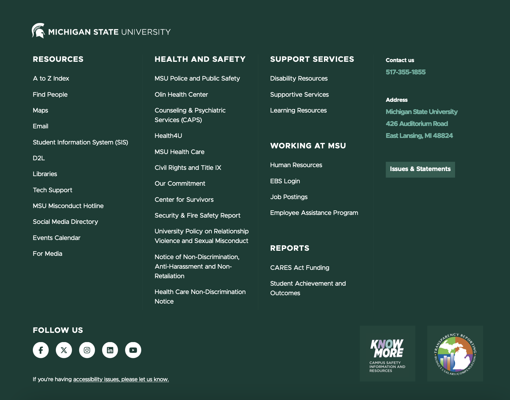
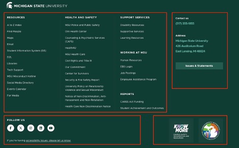
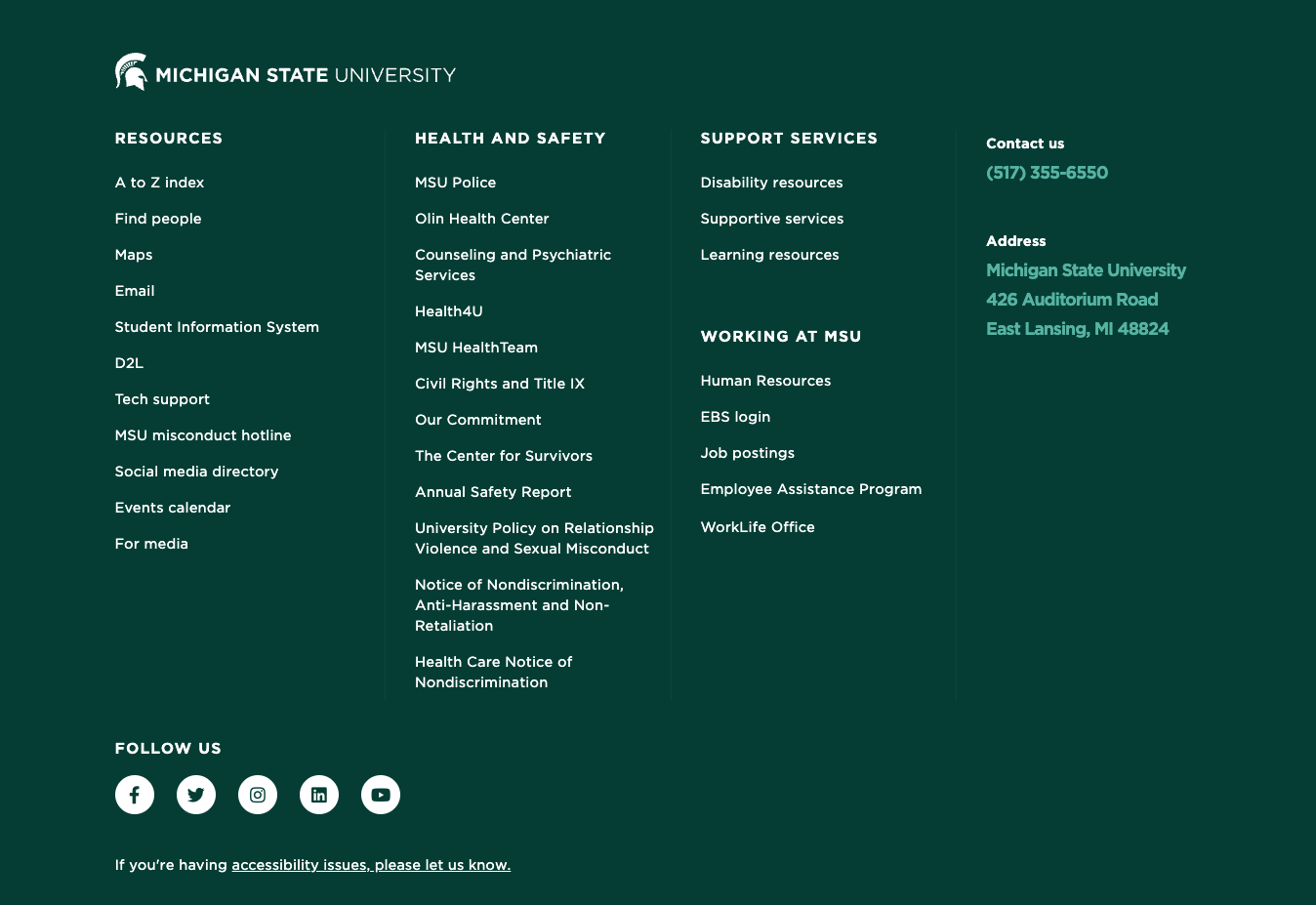
The Footer component collectively refers to a folder containing multiple dependent sections. The Footer contains commonly requested links and general site information that visitors expect to find on any website. The Footer component displays at the bottom of every page (apart from headless pages), above the Legal Footer. The Footer can be modified and customized to some extent.
The Footer is also referred to as the “mega footer.”

Component Information
Benefits
- Display general site-specific and general MSU information on every webpage (with possible exceptions on headless landing pages).
- Provide quick links to enable visitors to find information they may be seeking.
Template Data
Each Contact Us item consists of the fields below. By default, the following subsections are created in new tenant sites: phone, address, issues.
Title (single-line text)
- Displays above the text description in green text
- Required field
Description (multi-line text)
- Short text, may be one line or multiple lines
Link (general link)
- Create a link so that the Title is a clickable destination
- Optional
Display As Button (checkbox)
- Display link as a button instead of a text link
- Optional
Frequently Asked Questions
Footer layout can be modified by changing content or by omitting content in any of the four main sections.
Instructions for Use
In Content Editor:
- Navigate to Content > MSU > site name > Data > Footer.
- Expand Footer folder to see the four main Footer sections.
Important: Do not delete any main Footer section. Deletion of content within a Footer section is permitted.
- Expand Footer Contacts in content tree.
- Add new Contact item:
- Right click Footer Contacts in tree.
- Select Insert > Contact Item.
- Give it a unique name and click OK.
- Name is not displayed anywhere. This is for internal use only.
- In the right pane (main content area), fill in the title and description.
- Title displays as white text.
- Description displays as medium green bolded text.
- Optional: Convert description to a text link by clicking the appropriate option (e.g., Insert Link for internal links or Insert External Link for external links).
- Adding a link turns the description into a clickable/tappable link.
- Phone can be made a link by using this URL format: tel:5179999999
- “Display As Button” (checkbox):
- Check this box to change a text link into a button link.
- The value in the Description field is used as the button label.
- Click Save.
- Change existing Contact item:
- Click the Contact item in content tree.
- Change title — this is a required field.
- Exception: Issues and Statements item has a blank title, where included.
- Change Description
- Can be one line or multiple lines
- Cannot be styled
- Optional
- Change link by clicking a link type. Do not change the link text.
- Insert DAM link — select asset from DAM dialog box.
- Insert link — select internal page from dialog box tree.
- Insert media link — select asset from Media Library tree.
- Insert external link — change description (link text) or fully specified URL, or Target Window.
- Active Browser — open link in same browser tab
- New Browser — open link in new browser tab, usually reserved for PDFs and other static files
- Clear — remove the link; Contact text content remains unchanged
- Check Display as Button to display link as a button instead of a text link.
- Click Save.
- Delete (remove) an existing Contact item:
- Select Contact item in the content tree.
- Right-click the item and select Delete (red X).
- Click Save.
- Note: Deleted items in the Recycle Bin can be restored to the site.
- Save and publish Footer Contacts.
- Expand Footer CTA in content tree.
- To display “Know More” and “MI Transparency” links and images:
- Check Show CTA in Footer?
- To hide “Know More” and “MI Transparency” links and images:
- Uncheck Show CTA in Footer?
- Save and publish Footer CTA.
- Expand Footer Links in content tree.
- Add new column:
- Right click Footer Links in tree.
- Select Insert > Footer Links Column.
- Give it a unique name and click OK.
- If more than three columns are created, only the top three columns in the tree are displayed.
- Add new category:
- Right-click Footer Links Column in tree.
- Select Insert > Footer Links Category.
- Give it a unique name and click OK. Name is not displayed.
- Add new Link:
- Right-click Footer Contacts in tree.
- Select Insert > Footer Link.
- Give it a unique name and click OK. Name is not displayed. It is for internal use only.
- In the right pane (main content area), fill in the title and description.
- Optional: add a link by clicking the appropriate option (e.g., Insert Link for internal links or Insert External Link for external links).
- Adding a link turns the description into a clickable link.
- To have an item display as a button, select the Display As Button checkbox. The value in Description field is used as the button label.
- Change existing column, category or link:
- Locate the item in the tree and select it by clicking on it.
- Make necessary changes. See Add instructions, above, for explanation of fields and options.
- Click Save.
- Delete/remove existing column, category or link:
- Locate the item in the tree and select it by clicking on it.
- Right-click the item and click Delete (red X). The item is moved to Recycle Bin.
- Click Save.
- Note: Deleted items in the Recycle Bin can be restored to the site.
- Save and publish Footer Links.
- Expand Footer Social Media in content tree.
- To change Follow Us text:
- Select Follow Us in tree.
- In the right pane (main content area), change the title to some other text.
- Add new Social Media item:
- Right-click Follow Us in tree.
- Select Insert > Social Media Link.
- Give it a unique name and click OK. Name is not displayed. It is for internal use only.
- Icon: In the right pane (main content area), select an icon from drop-down list.
- Link: Click a link type:
- Insert DAM link — Select asset from DAM dialog box.
- Insert link — Select page from dialog box tree.
- Insert media link — Select asset from Media Library tree.
- Insert external link — Change description (link text), fully specified URL or Target Window.
- Active Browser — Open link in same browser tab.
- New Browser — Open link in new browser tab. This is usually reserved for PDFs and other static files.
- Change existing Social Media item:
- Locate the item in the tree and select it by clicking on it.
- Icon: Change as needed by selecting from the drop-down.
- Change link by clicking a link type. Do not change the link text.
- Insert DAM link — Select asset from DAM dialog box.
- Insert link — Select internal page from dialog box tree.
- Insert media link — Select asset from Media Library tree.
- Insert external link — Change description (link text), fully specified URL or Target Window.
- Active Browser — Open link in same browser tab.
- New Browser — Open link in new browser tab. This is usually reserved for PDFs and other static files.
- Clear — Remove the link. Contact text content remains unchanged.
- Link is required. If cleared, add a new link by selecting a link type.
- Delete to remove an existing Social Media item:
- Locate the item in the tree and select it by clicking on it.
- Right-click the item and click Delete (red X icon). The item is moved to Recycle Bin.
- Note: Deleted items in the Recycle Bin can be restored to the site.
- Click Save.
- Save and publish Footer Social Media


Tool Use Guide
| Page Builder | Explorer | Content Editor | |
| Add/remove columns | - | - | Optimal |
| Add/remove/edit links | - | - | Optimal |
| Add/remove social media | - | - | Optimal |
| Add/remove call to action | - | - | Optimal |