Once the Word document version of the content has been finalized and approved in Content Hub Ops, the next step is to transfer the content into Content Hub’s data fields. This step ensures that the story is structured properly for publication and can be enriched with metadata and media.
Authors should copy and paste the final version of the story from the Word document into the appropriate fields on the left side of the content details page. The available fields vary depending on the content sub-type and content template, but can include single-line text boxes, multi-line rich text editor (RTE) boxes, in-line components (including quote, photo carousel or in-line image), a hero image, thumbnail image and an open graph image.
To view a sample of a fully loaded content item, view the “Loaded Text Example page.”
In-Line Components on MSUToday
Some templates allow for including an in-line component below the first text box rich text editor (RTE) field. An in-line component is a reference to another content item of a specific type, such as Carousel, Quote or In-line Image, that is rendered in MSUToday in a special way.
When loading a story layout, content authors can, where available, load an existing in-line component or create a new in-line component. See “Add an In-Line Component,” below, for more information. Content authors are required to first create and publish their Quotes, Carousels (including the Carousel Cards) and Images before publishing their full story.
Note: When working on a story that includes In-line Components, such as Carousels, Quotes or In-line Images, make sure to always publish the components prior to publishing the whole story to MSUToday. Otherwise, the content author will have to repeat the publishing workflow for the story to include all in-line components within.
Loading the Content
At this stage, all text is copied over from the Word document and all related assets, such as images or media, should be added to the content item. Assets must be loaded into the Content Hub DAM first and then linked to the content item by selecting them through the “Insert Image” action in a rich text editor field.
Follow the instructions below to complete the necessary field(s) for the content item.
For information on using special characters in a text field, see Using Special Characters.
Instructions:
- Click in the Add text box under the Headline field.
- Add text.
Best practices:
- All story content items must have a headline.
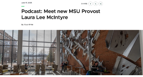
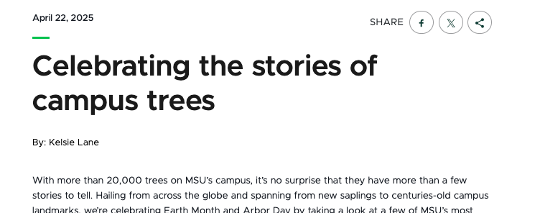
- The headline appears at the top of the content story page on MSUToday, above a hero banner (if present). It also appears below the content thumbnail image on a listing page.
- Headlines should be 60 characters or fewer for search engine optimization and MSUToday design standards.
- Authors may use a longer headline for other platforms, such as Cision.
- If a longer headline is required, utilize the subhead field.
- Use active voice, clarity, avoid jargon, avoid stuffing keywords unnaturally.
- Use sentence case or AP style capitalization and minimal punctuation for clarity.
Instructions:
- Click in the Add text box under the Subhead field.
- Add text.
Best practices:
- Subheads are optional.

Instructions:
- Click in the Add text box under the Headline field.
- Add text.
Note: This is a rich text component, meaning text formatting is available. Click the three vertical dots icon at the right end of the toolbar to open a menu with additional formatting options, including bulleted lists.
Best practices:
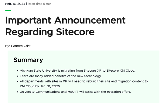
- The summary field is optional. If a summary is included, it will appear at the top of the story, below a hero banner (if present), with a shaded background and a “Summary” header.
- University Communications and Marketing’s user experience research and optimization testing has shown that including a summary on longer stories can improve read rates.
- Avoid use of images in the summary.
- UCAM recommends a summary include 2-5 concise bullet points written in plain language to address story highlights, relevance, impact and key takeaways.
- Use summaries for feature stories, long-form content stories and research stories.
Text boxes are rich text components, meaning formatting is available. These boxes can also include images, videos and podcast embeds (see below for more information).
Some template layouts include one text box, while others include two text boxes with an in-line component placeholder between. The latter layout allows for including an additional content item, such as an in-line image, carousel or quote, between two blocks of text. Only one in-line component can be used within these templates.
Instructions:
- Click in the “Add text” box under the Headline field.
- Add text, formatting and additional content, as desired. See additional tabs below for information on working with media.


Best practices:
- It is up to the content author to ensure that all content meets accessibility standards. Use caution when applying styling, including font and background colors.
- Use formatting classes (paragraph, H2, H3, etc.) to apply section formatting to text, to break up the content and for ease of scanning.
- Use H2 subheadings to break the story into distinct sections.
- Use H3 subheadings within H2 sections to delve into more specific details or subtopics.
- Use subheads every 200-300 words or 2-4 paragraphs to help break up the story.
- Do not apply an H1 class to any text. The headline field includes an H1 tag and adding additional H1 tags will cause accessibility issues.
Instructions:
- In the text box field, place the cursor in the desired image location and click Insert Asset icon on the rich text toolbar.
- Locate the asset required for the story and click Select under the image thumbnail. Assets must have previously been uploaded and approved in the Content Hub DAM prior to including in a story.
- If a public link already exists with the crop dimensions needed:
- The available public link(s) will be displayed in a list.
- Locate the appropriate link (look for the component rendering name in the link label).
- Click the Select button next to the link.
- If no public link exists with the crop dimensions needed:
- Click “+ Public Link.”
- Select WebP from the list of renditions.
- Select Manual crop from the list of crop options.
- Select the desired image dimensions from the available list of preset sizes.
- Add a prefix at the beginning of the URL path to indicate the selected preset, making this link recognizable for later use.
- Optional: Click and drag the lightbox to reposition the cropping.
- Click Save.
- Wait for the system to generate the public link based on the crop.
- Click Select.
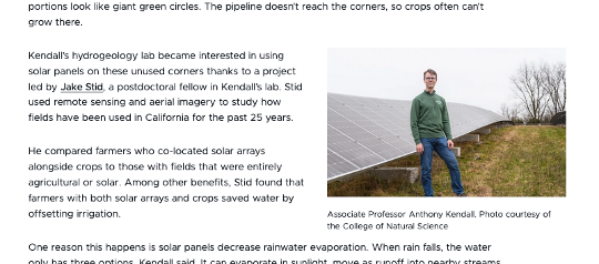
- Optional: Click on the image to open a panel with options to adjust the alignment of the image to be left, center or right aligned. Add a caption in the Media Caption text field.
See "Creating Public Links" for more information, including screenshots, regarding building public image links.
Best practices:
- Double check the image using the preview link during the pre-publishing stage to confirm there are no cropping or pixelation issues.
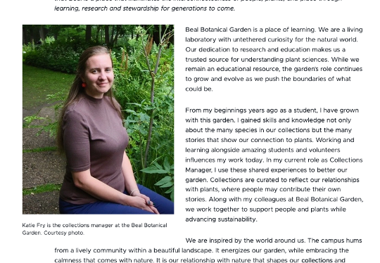
Tip: It can be challenging to work with text and code within the same text box. Create the content that will come before and after the podcast first and embed the podcast code after the text is in place.
Instructions:
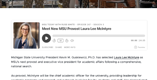
- In another tab or window, locate the podcast episode to be included in the content item. Locate and copy the embed code from the podcast host site.
- Return to the content item details page in Content Hub.
- In the text box field, position the cursor where the podcast should be embedded.
- Click the More options icon on the right side of the rich text formatting menu.
- Click Code.
- Use the keyboard command or right click on the mouse to paste the podcast embed code in the text box where the podcast should appear.
Best practices:
- For accessibility, all podcasts should have episode notes and transcripts available.
- Double check the podcast during preview to confirm there are no display or function issues.
Instructions:
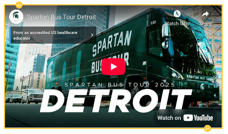
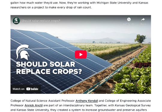
In another tab or window, locate the video to be included in the content item. Copy the video URL.
- Return to the content item details page in Content Hub.
- In the text box field, position the cursor where the video should be embedded.
- Click the Insert media icon on the the rich text formatting menu.
- Paste the URL in the box. Click the checkmark icon to save.
Best practices:
- All videos shared must have captioning available to meet accessibility standards. Captions can either be burned into the video or uploaded to the video hosting platform (e.g., an SRT file).
- All videos should have a proper thumbnail selected in the hosting platform.
- Double check the video during preview to confirm there are no display or function issues.
Tip: To easily add space before or after the video, making it possible to continue adding text, hover over the video image until a blue or yellow arrow appears. Click the arrow to add a blank line above or below the video.
Instructions:
- Click the “+ Add” button in the In-Line Component section.
- To create a new Quote, Carousel or Image component:
- Click “+ Add Content” from the drop-down menu.
- Enter a name for the content item.
- Click the “+” icon to open the selection options for the Content Template.
- Choose a Content Template and click Save.
- Click Save on the Content creation panel.
- The content item will appear in the layout, and the content item will be assigned to the content author. Clicking on the content item will open it in a new tab. Follow the content creation process to draft, review, edit and approve the content outside of Content Hub, and create and publish the component within Content Hub before publishing the story. Expand the tabs below for additional information on creating Quote, Carousel and In-Line Image components.
- To add an existing Quote, Carousel or Image component:
- Click “+ Add existing items” from the drop-down menu.
- Check the box in the corner of the desired content item from the list of available options to add to the selection.
- Click Add button.
- To remove an in-line component from the layout, click the circle with minus sign icon in the corner of the component. Click Remove to confirm.
Instructions:
- Click the "+ Add" button in the In-Line Component section.
- Click “+ Add Content” from the drop-down menu.
- Enter a name for the content item.
- Click the “+” icon to open the selection options for the Content Template.
- Choose the Quote content template and click Save.
- Click Save on the Content creation panel. The component now appears in the story layout, marked as in the “In Progress” state.
- Click on the component to open the component’s content item details page in a new tab.
- Click in the “Add text” section under Quote and enter the quotation.
- Click in the “Add text” section under Author and enter the author’s name.
- Optional: Add an image.
- Click in the “Add text” section under Image to add an image.
- Click the Insert Asset icon on the rich text toolbar.
- Locate the asset required for the story and click Select under the image thumbnail.
- If a public link already exists with the crop dimensions needed:
- The available public link(s) will be displayed in a list.
- Locate the appropriate link (look for the component preset name in the link label).
- Click the Select button next to the link.
- If no public link exists with the crop dimensions needed:
- Click “+ Public Link.”
- Select WebP from the list of renditions.
- Select Manual crop from the list of crop options.
- Select the desired image dimensions from the available list of preset sizes.
- Add a prefix to the URL path to indicate the preset type, making this link recognizable for later use.
- Optional: Click and drag the lightbox to reposition the cropping.
- Click Save.
- Wait for the system to generate the public link based on the crop.
- Click Select.
- Click Save.
- Click Finalize.
Best practices:
- Quotation marks should be “smart quotes.”
- Use good judgement when including lengthy quotes in an in-line quote component.
Tip: Carousels are made up of cards. Building a carousel card nested within a carousel nested within a story layout can get confusing when the user interface is similar for all. Refer to the label at the top of the content item details page to confirm what content item (i.e., card, carousel or story) is being edited and save often.
Instructions:
- Click the "+ Add" button in the In-Line Component section.
- Click “+ Add Content” from the drop-down menu.
- Enter a name for the content item.
- Click the “+” icon to open the selection options for the Content Template.
- Choose the Carousel content template and click Save.
- Click Save on the Content creation panel. The component now appears in the story layout, marked as in the “In Progress” state.
- Click on the component to open the component’s content item details page in a new tab.
Note: The Carousel Headline and Carousel Description fields do not appear in a live story on MSUToday. These fields are optional.
- Add at least one and no more than 20 carousel cards:
- Click “+ Add.”
- Click Content.
- Enter a name for the carousel card.
- Click the “+” icon to open the Content Template selection panel.
- Choose Carousel Card and click Save.
- Click Save.
- Repeat, as needed, for each card.
- Add content to the carousel card(s).
- Click on a Carousel Card item to open it in a new tab.
- Optional: Click in the “Add text” section under Card Headline and enter text to add a caption for the asset.
- Click in the “Add text” section under Card Image to add an image to the card.
- Click the Insert Asset icon on the rich text toolbar.
- Locate the asset required for the story and click Select under the image thumbnail.
- If a public link already exists with the crop dimensions needed:
- The available public link(s) will be displayed in a list.
- Locate the appropriate link (look for the component rendering name in the link label).
- Click the Select button next to the link.
- If no public link exists with the crop dimensions needed:
- Click “+ Public Link.”
- Select WebP from the list of renditions.
- Select Manual crop from the list of crop options.
- Select the desired image dimensions.
- Add a prefix to the URL path to indicate the rendition and crop, making this link recognizable for later use.
- Optional: Click and drag the lightbox to reposition the cropping.
- Click Save.
- Wait for the system to generate the public link based on the crop.
- Click Select.
- Click Save.
- Click Finalize.
- Return to the carousel content item details page.
- Click Save.
- Click Finalize.
- Return to the story page.
Best practices:
- A carousel is typically more than one image. If using only one image, consider an in-line image component instead.
- Double check all the images in the carousel during preview to ensure there are no cropping or pixelation issues.
See "Creating Public Links" for more information, including screenshots, regarding building public image links.
Instructions:
- Click the "+ Add" button in the In-Line Component section
- Click “+ Add Content” from the drop-down menu.
- Enter a name for the content item.
- Click the “+” icon to open the selection options for the Content Template.
- Choose the In-Line Image content template and click Save.
- Click Save on the Content creation panel. The component now appears in the story layout, marked as in the “In Progress” state.
- Click on the component to open the component’s content item details page in a new tab.
- Click in the “Add text” section under In-Line Image to add an image.
- Click the Insert Asset icon on the rich text toolbar.
- Locate the asset required for the story and click Select under the image thumbnail.
- If a public link already exists with the crop dimensions needed:
- The available public link(s) will be displayed in a list.
- Locate the appropriate link (look for the component rendering name in the link label).
- Click the Select button next to the link.
- If no public link exists with the crop dimensions needed:
- Click “+ Public Link.”
- Select WebP from the list of renditions.
- Select Manual crop from the list of crop options.
- Select the desired image dimensions.
- Add a prefix to the URL path to indicate the rendition and crop, making this link recognizable for later use.
- Optional: Click and drag the lightbox to reposition the cropping.
- Click Save.
- Wait for the system to generate the public link based on the crop.
- Click Select.
- Click Save.
- Click Finalize.
Best practices:
- Choose an image with a horizontal orientation for best effect.
- Double check the image during preview to confirm there are no cropping or pixelation issues.
See "Creating Public Links" for more information, including screenshots, regarding building public image links.
Instructions:
- Click in the “Add text” section under Hero Image to add an image.
- Click the Insert Asset icon on the rich text toolbar.
- Locate the asset required for the story and click Select under the image thumbnail.
- If a public link already exists with the crop dimensions needed:
- The available public link(s) will be displayed in a list.
- Locate the appropriate link (look for the component rendering name in the link label).
- Click the Select button next to the link.
- If no public link exists with the crop dimensions needed:
- Click “+ Public Link.”
- Select WebP from the list of renditions.
- Select Manual crop from the list of crop options.
- Select the desired Hero dimensions, MSU Story Hero – Standard Wide (2000 x 800px).
- Add story-hero to the beginning of the URL path to indicate the rendition and crop, making this link recognizable for later use.
- Optional: Click and drag the lightbox to reposition the cropping.
- Click Save.
- Wait for the system to generate the public link based on the crop.
- Click Select.
Best practices:
- Use an appropriately sized image for a hero banner.
- Do not select MSU Homepage - Large Hero Banner, MSU Secondary page - Small Hero Banner, or MSU Secondary page Extra Small Hero Banner.
- When creating new public links, be sure to include story-hero in the link title.
- Do not add a media caption. Hero images do not use captions.
While this field is a rich text component, it should only be used to add an image. Any text added here will not appear on the live MSUToday story. The layout mapping expects only a single image in this field and ignores anything else.
See "Creating Public Links" for more information, including screenshots, regarding building public image links.
Instructions:
- Click in the “Add text” section under Thumbnail Image to add an image.
- Click the Insert Asset icon on the rich text toolbar.
- Locate the asset required for the story and click Select under the image thumbnail.
- If a public link already exists with the crop dimensions needed:
- The available public link(s) will be displayed in a list.
- Locate the appropriate link (look for the component rendering name in the link label).
- Click the Select button next to the link.
- If no public link exists with the crop dimensions needed:
- Click “+ Public Link.”
- Select WebP from the list of renditions.
- Select Manual crop from the list of crop options.
- Select the desired thumbnail dimensions, MSU Story Card – Thumbnail – Desktop (500 x 300px).
- Add story-thumbnail to the beginning of the URL path to indicate the rendition and crop, making this link recognizable for later use.
- Optional: Click and drag the lightbox to reposition the cropping.
- Click Save.
- Wait for the system to generate the public link based on the crop.
- Click Select.
Best practices:
- Use an appropriately sized image for a thumbnail. This image will appear on listing pages.
- When creating new public links, be sure to include thumbnail in the link title.
- Do not add a media caption. Thumbnail images do not use captions.

While this field is a rich text component, it should only be used to add an image. Any text added here will not appear on the live MSUToday story. The layout mapping expects only a single image in this field and ignores anything else.
See "Creating Public Links" for more information, including screenshots, regarding building public image links.
Instructions:
- Click in the “Add text” section under Open Graph Image to add an image.
- Click the Insert Asset icon on the rich text toolbar.
- Locate the asset required for the story and click Select under the image thumbnail.
- If a public link already exists with the crop dimensions needed:
- The available public link(s) will be displayed in a list.
- Locate the appropriate link (look for the component rendering name in the link label).
- Click the Select button next to the link.
- If no public link exists with the crop dimensions needed:
- Click “+ Public Link.”
- Select WebP from the list of renditions.
- Select Manual crop from the list of crop options.
- Select the desired dimensions, MSU Story Card – Open Graph – Desktop (1200 x 630px).
- Add a prefix to the URL path to indicate the rendition and crop, making this link recognizable for later use.
- Optional: Click and drag the lightbox to reposition the cropping.
- Click Save.
- Wait for the system to generate the public link based on the crop.
- Click Select.
Best practices:
- Open graph images are what appear when a web page is shared on social media, via text message or appears in search engine results.
- Users should always upload an open graph image to a story page. If no open graph image is present, the platform where a link is shared may pull in another image from the page, and that image may be an inappropriate match for the content being shared.
- Use an appropriately sized image for an open graph image.
- When creating new public links, be sure to include open graph in the link title.
- Do not add a media caption. Open graph images do not use captions.
While this field is a rich text component, it should only be used to add an image. Any text added here will not appear on the live MSUToday story. The layout mapping expects only a single image in this field and ignores anything else.
See "Creating Public Links" for more information, including screenshots, regarding building public image links.
Prepare for Taxonomy Validation
After all content and media have been entered, the content author is ready to enter the next state: Validate Taxonomy. Click the Confirm Taxonomy button at the top right corner of the content item details page, indicating that the content item layout is final. All that is left is confirming metadata and preparing for publishing.

While loading the story, make sure to click the “Save” button regularly to avoid losing progress. Content changes do not save automatically.