Selecting a Page Layout
When adding a page, users are prompted to select a page layout. This is the starting set of components and structural elements on the webpage. Read below for additional details on the available page layouts.
Use this for a basic content page. The default main content section is full width to the page. Components and containers can be added to add structure and content to the page.
Use this for a two-column layout for the full page. Alternatively, users can add a two thirds component to a webpage to add a two-column layout to a section of the page.
These pages are designed to optimize conversions by reducing potential distractions and encourage the visitor to take a desired course of action. They’re typically used with inbound campaigns, such as social media ads, display advertising or email campaigns. The call to action that drives to the landing page should relate to the content on the page, providing visitors with a quality experience.
Landing Pages with Full Footer
This layout for inbound campaign landing pages includes the Full Footer component.
Landing Page with Legal Footer
This layout for inbound campaign landing pages includes the Legal Footer component but not the Full Footer component.
Each Events item creates an Event Details Page, comprised of components like any other web page in Sitecore XM Cloud. Adding the Events feature to a website creates an Events Listing Page, which automatically displays events in a list view.
Each news item creates a Story Page, comprised of components like other web pages in Sitecore XM Cloud. Adding the News feature to a website creates a News Listing Page, which automatically displays news stories in a list view.
Each People Directory item creates a Person Details Page, comprised of template data common to directory profiles with the ability add additional features, including Job Cards, Education, Awards, Publications and Research Grants. Adding the People Directory feature to a website creates a People Listing Page, which automatically displays People Directory entries in a list view.
Each Program Card item creates a Program Details Page, comprised of template data common to programs. Adding the Program Finder feature to a website creates a Program Listing Page, which automatically displays Program Cards entries in a list view.
A Search page will be provided for users when a new website is created by the MSU IT team if Sitecore Search is enabled for the website.
A Site Map page will be provided for users when a new website is created by the MSU IT team. This site automatically lists all pages within the website. As new pages are added to the site, they will appear on the Site Map page. The Site Map helps visitors find content, and it aides search engine crawlers in identifying what content is available on the website and how it is organized.
Page Structural Elements
In Page Builder, users can add structure to a webpage using Page Structure elements and components.
Row and Column Splitters
Users can add a row splitter or column splitter to a content area. This manually creates grid cells in the content area. Users can then add content components to these cells.
To use: Click the + icon in a content area and select Column Splitter or Row Splitter under the Page Structure menu in the Components panel or drag a splitter from the Component menu in the left pane into an available content area.
Two-Thirds Sublayout
Use this component to add a two-column layout to a section of a webpage.
Grid Container
Use the Grid Container component to add a grid to a webpage. The cells in the grid can contain various content components. There are several grid variants available.
Image Fact Grid
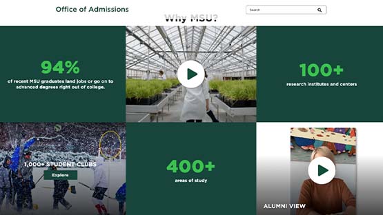
Use an Image Fact Grid component to showcase text and number-based pride points on an image background.
Text Fact Grid
Use a Text Fact Grid to showcase text and number-based pride points in a variety of layouts, with or without an image.
Mixed Content Grid and Mixed Content Full Bleed
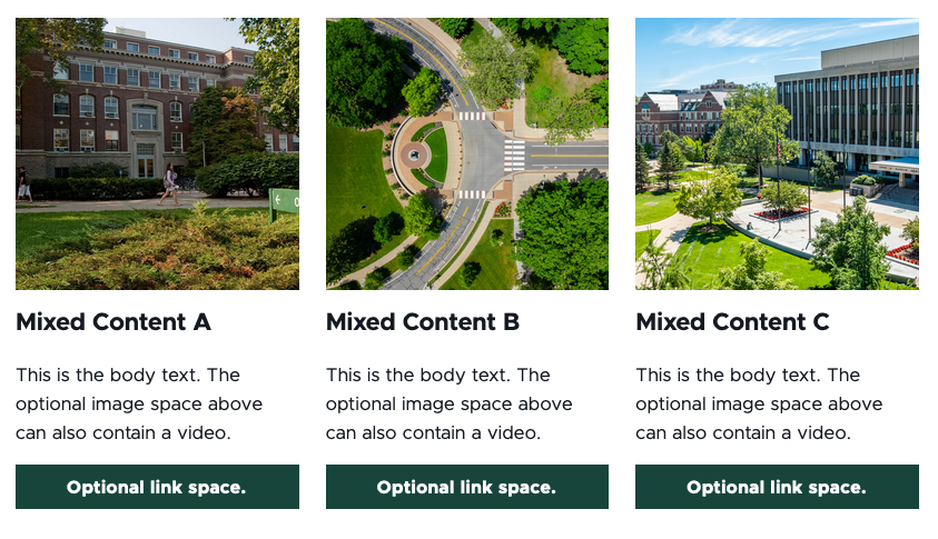
Combine a headline, text, a call to action and an image or video in a component the width of the selected content area (i.e., grid) or the width of the page (i.e., full bleed).
Documentation updated: Oct. 22, 2025
Is there an issue with this documentation? Report it here.

