Logging In
SitecoreAI access is enabled with Okta single sign-on. Users with access* will be able to log in using their MSU Net ID.
Environments
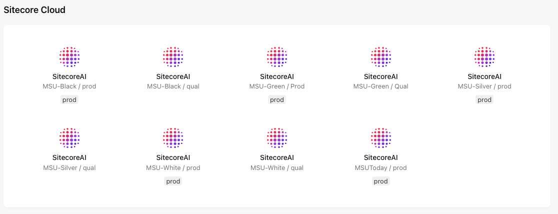
Upon log in, users are presented with the Environments and Apps screen. Available options here will vary depending on access levels. Campus websites are assigned to a color-coded environment (Black, Green, Silver or White).
Available environments:
- SitecoreAI — MSU-Black / prod or MSU-Green / prod or MSU-Silver / prod or MSU-White / prod: These are the production environment. All website development by content authors is done in production.
- SitecoreAI — MSU-Black / qual or MSU-Green / qual or MSU-Silver / qual or MSU-White / qual: This is the testing environment, used by Sitecore developers for quality assurance testing. The majority of users will not use this app.
Navigate between the environments by either clicking on the appropriate environment icon on the landing page or by clicking the launchpad icon (a grid of nine dots in the top left corner) and choosing the appropriate option from the drop-down menu. Be sure to select the correct environment.

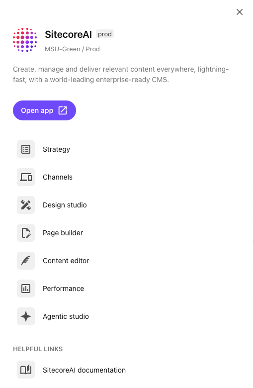
Clicking an environment icon will open the Tools menu. On the Tools menu, click on a tool to go straight to that tool. Choose the website from the website drop-down menu on the Global toolbar in the tool window.
Tools
Each SitecoreAI environment contains a suite of tools used for webpage creation and website management. Access to the tools may vary, depending on a user’s level of system access.
These tools include:
- Design Studio — Design Studio is most commonly used to create Forms for embedding within a webpage. The Forms feature within Design Studio is used to create, edit and manage Forms built within Sitecore. This will not be used for non-Sitecore forms that are embedded into a webpage.
- Page Builder — Page Builder is the tool most commonly used by content authors to create and manage website content. It is a visual editor with drag-and-drop functionality for adding prebuilt components to a page layout. The content in the components can be edited on the page and previewed in real time on various device sizes.
- Content Editor — Content Editor can also be used to create and edit content, outside of the context of how it is presented on a webpage. It works with data fields rather than a visual layout.
- Performance — View basic website and form analytics provided by SitecoreAI and access additional features, such as A/B tests. This is not meant to be a replacement for Google Analytics.
- Agentic Studio — Agentic Studio features have not yet been enabled in the MSU SitecoreAI system. When features are available documentation will be added to this website.
To launch a tool:
- Select the appropriate SitecoreAI MSU / prod option from the environment and apps landing page or the environment menu (open by clicking the nine dot "launchpad" icon).
- Select the tool from the menu.

Learn More
Page Builder
Content authors can use Page Builder to create and edit webpages within a website. Most users will predominantly work with this tool.
Content Editor
Content Editor allows users to work with content independent of how it is presented on a website. Editing is done in fields and is not visual. Use of this tool is generally optional and won’t be necessary for most users.
Field Types
The SitecoreAI documentation throughout this website will reference various fields and field types. Expand the tabs below for an explanation of these field types.
A toggle button. Selecting the checkbox will change a setting for the field.
Users select one or more checkboxes representing the options within the item specified by the Source property of the field.
Manually select or enter a date.
Manually select or enter a date and time. If no time is entered, the field will default to midnight.
Lets users select a single item from the list specified by the Source property of the field using a drop-down list.
Users select a single item from the list specified by the Source property of the field. The name of the selected item is stored in the system.
Lets users select a descendant of the item specified by the Source property of the field.
Select a file from the Media Library. Click Open file to open the Media Browser and select the file.
Lets users link to an item, a URL, an anchor, an email address or a JavaScript function. General link with search allows users to search for and create a link to an item stored anywhere in the Content Tree.
Associates a themed icon with each item.
Select an image from the Media Library and specify image properties. Click Open file to open the Media Browser and select the file.
A single line of numeric text.
Creates a link to a specific item within the Content Tree.
Simple text spanning multiple lines. There is no rich text support for these fields.
User can select zero or more items from the list specified by the Source property of the field. The user can sort the selected items.
A single line of numeric text.
A single line of text.
Text that can span multiple lines and include rich text formatting. Click Show Editor to access the rich text editor. Click Edit html to access the stored HTML.
A single line of text.
Users can select zero or more descendants of the item specified by the Source property of the field. The user can sort the selected items. The TreelistEx version will only display selected items until the user opens the editing menu in a new browser window.
Documentation updated: Jan. 13, 2026
*Okta single sign-on access is limited to the following user groups:
Units with questions regarding access eligibility may contact University Communications and Marketing.