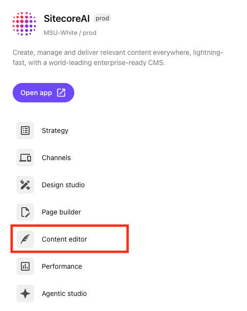
SitecoreAI Content Editor allows users to work with content independent of how it is presented on a website. This can be useful when creating and editing content that appears on several webpages. Content Editor users work with data fields; the tool is not visual.
Content Editor is an optional tool and not generally necessary for building webpages. Users can complete most of their work using Page Builder, though there may be settings that require editing in Content Editor.
Users opting to use Content Editor can:
- Create new content items
- Edit fields and settings for content items
- Add alternate versions of content items
- Manage which versions are available for publishing
- Publish content items
To use Content Editor, select it from the Tools menu.

Content Editor User Interface
Expand the tabs below to review the different areas of Content Editor.
The Ribbon is the main navigation menu, found at the top of the screen. Actions are grouped into categories such as Home, Navigate, Publish, Versions and View. Use the Ribbon to navigate to different functions within Content Editor and to take actions.

The Content Tree is a hierarchical list of the pages and content items within a website. Click on an item to view and edit it in the content area.

The Content Area is located below the Ribbon and to the right of the Content Tree. The Content Area is where a user can view and edit fields to make changes to content.

Page Layouts
View information and use cases for the available page templates and components that can be used to build page layouts.
Component Guide
View documentation, including use cases, best practices, data field explanations and step-by-step instructions for working with components.
Documentation updated: Jan. 13, 2026
Is there an issue with this documentation? Report it here.