Sitecore XM Cloud Explorer is used to edit content independent from how it is presented. This can be useful when creating and editing content that appears on several webpages.
Explorer is an optional tool and not generally necessary for building webpages. Users can complete most of their work using Page Builder, though there may be settings that require editing in Explorer or Content Editor.
Users opting to use Explorer can:
- Create new content items
- Edit fields and settings for content items
- Add alternate versions of content items
- Manage which versions are available for publishing
- Publish content items
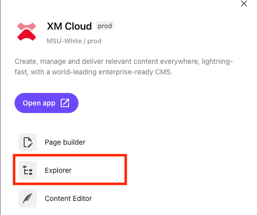
To use Explorer, select it from the Tools menu in the XM Cloud app.

Explorer User Interface
Expand the tabs below to review the different areas of Explorer.
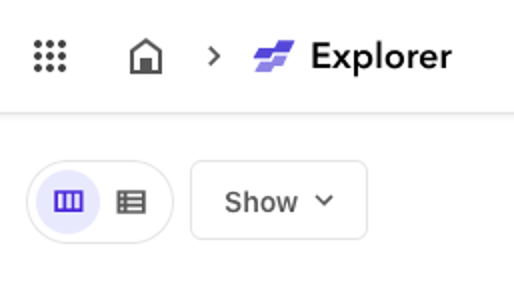
Users can toggle between a cascading tile view (default) and a table view. Toggling to table view adds additional filtering options. The Show drop-down menu can be used to add or remove filters.


When viewing items as cascading tiles, the view divides into two sections. The left pane shows cascading lists of items. Clicking on an item will open a column to the right of the current column and a list of child items under the selected item will appear. The left-most column will be the website(s) a user can access.
Click on the folders to expand the next column until reaching the desired item to work with. A selected item will be highlighted in light purple and editable. Details, Content and Version for the item will appear in the right pane in a tabbed interface. Click the ellipses icon (…) at the top right corner to access Rename, Duplicate and Delete actions.
Up to three columns will be visible within the left pane at any one time, depending on browser size. Scroll side-to-side within the left pane to navigate between levels of this hierarchy.
When viewing items in table view, the view is a traditional content tree. Child items open under a parent item. Users can access Rename, Duplicate and Delete actions by clicking the ellipses icon (…) at the end of the item’s row. Click on an item to access and edit Details, Content and Version in full view.
Page Layouts
View information and use cases for the available page templates and components that can be used to build page layouts.
Component Guide
View documentation, including use cases, best practices, data field explanations and step-by-step instructions for working with components.
Documentation updated: July 1, 2025
Is there an issue with this documentation? Report it here.