Content Editor is used to create pages using predesigned templates. Content is then added into various components by editing data fields in the items. Content is created, modified and deleted independently of page layout and cascading style sheets, or CSS. The data in content fields will be displayed in a specific layout and style, contingent on the component it is associated with. Most content can be edited in Content Editor, but some content elements must be edited in Experience Editor.
To access Content Editor:
- From Launchpad: Click the Launchpad icon (nine-square grid icon at the upper left corner of the page) and select Content Editor on the menu.
- From Media Library: Click Content Editor in the asset tree in the left pane of the page.
Content Editor’s appearance and functionality will vary, depending on:
- Roles assigned to the user
- Local security settings
- Customizations that have been added
Content Editor Features
The main features of the Content Editor are the Navigation Ribbon, the Content Tree, Nodes, the Content Area and the Gutter. Expand the tabs below to learn more about these features and to view examples.
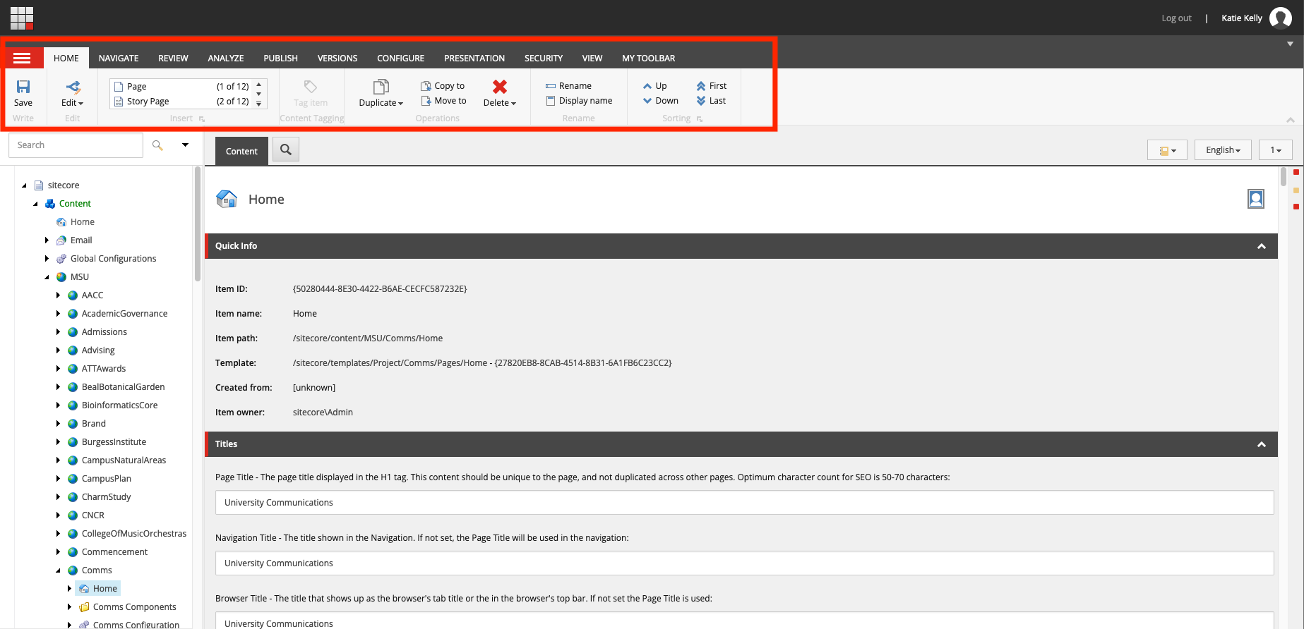
The Navigation Ribbon is a horizontal bar at the top of the page. Groups of functions appear in different tabs on this ribbon. The ribbon and tabs can be customized, and the available tools vary depending on a user’s access rights and security settings.
The Content Tree is a hierarchical list of all items that make up the website. It appears in a pane on the left side of the screen. The tree expands and collapses for easy viewing. Items can include nodes (e.g., folders), pages and page components. Icons designate the type of each item.
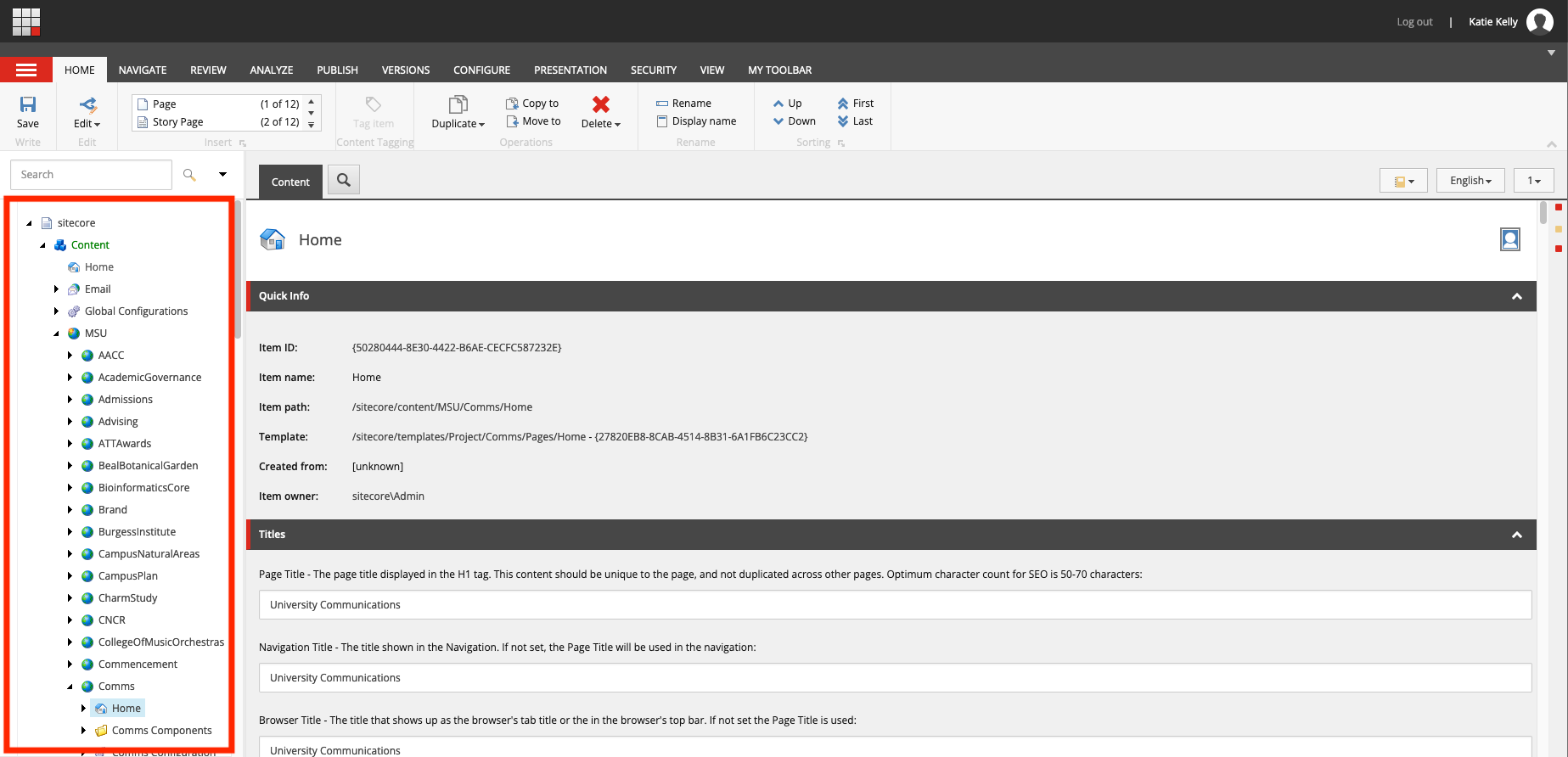
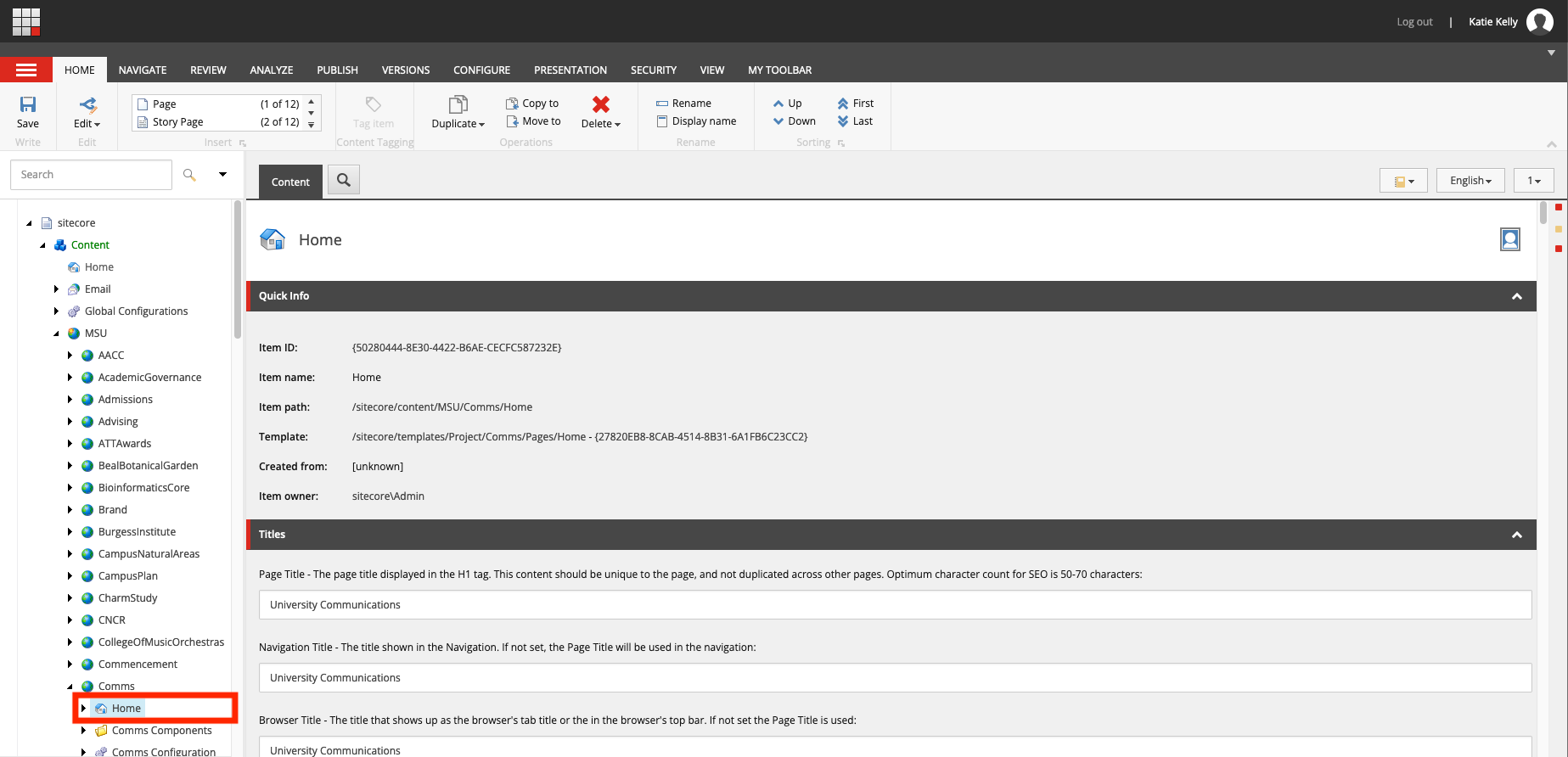
Each website is called a tenant and has a site node (e.g., “MSUToday”) within the Content Tree. Within this node are three nodes (e.g., folders): Home, Sitename Components and Sitename Configurations. The Home node contains the content for the website. When a page is created, a Page Components folder is automatically created as a child item under that page. All page components are created and stored here, while images and static files are stored in the Media Library.
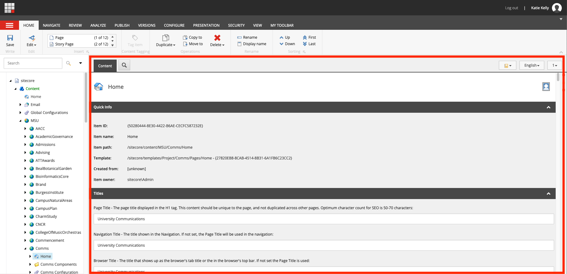
The right pane displays details related to the content item selected in the Content Tree. Use this area for editing selected content.
The Gutter is a thin column to the left of the Content Tree. The Gutter can be configured to display icons related to workflow.
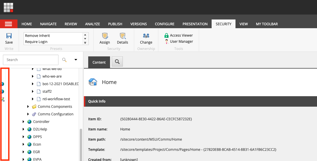
Gutter Recommendations
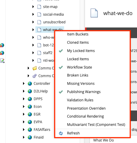
To customize the types of icons displayed in the Gutter, right click anywhere in the Gutter area (to the left of the Content Tree). Check the items to be included in the display. University Communications and Marketing recommends including the following:
- My Locked Items — This shows the items that the user has opened for editing and has not checked back in.
- Locked Items — Items must be unlocked before other users can edit them. Locked items indicate other content that is currently being edited by another user.
- Workflow State — This shows where an item is within the workflow process.
Flexible Workflows
Many of the actions available via the Navigation Ribbon tools can also be completed by right-clicking an item in the Content Tree. Right-clicking on an item will only offer actions appropriate for that item. Users can use whichever method they prefer for their workflow.
Previewing Content
Content Editor shows the data fields associated with items and components. As such, a page cannot be viewed in its entirety while editing a content component here. To view a completed page, a content author can use:
- Preview — See a read-only view of the page that is not a perfect browser-like rendering.
- Experience Editor — Navigate to Experience Editor of page editing and viewing of the page layout, though not a perfect browser-like rendering.
- Publish — View the published page in a browser.
Documentation updated: Nov. 1, 2024