Forms are built and managed using SitecoreAI’s Design Studio. See below for resources regarding Sitecore Forms, as well as step-by-step instructions for creating and editing forms and embedding forms on a web page.
Using SitecoreAI Forms
Using Design Studio
Forms are built in SitecoreAI Design Studio. Learn how to use the Design Studio interface.
Design Studio: Forms
Guidelines for usage, best practices, styling, accessibility and data fields for forms.
Form Field Guide
Learn about the data template and setting options for the various available form fields.
Building Basic Forms
Follow the instructions in the tabs below to generate a form, establish a webhook to capture form data and to embed the form on a web page.
Note: Users must have Advanced User access for a website's environment to work with Forms. Users should email Comms.WebSupport@msu.edu to request Advanced User access if they do not already have it. Include the environment and website that requires the form in the request.
- Log in to SitecoreAI.
- On the launchpad, click to select the appropriate environment where the form will be built. This should be the same environment as the website where the form will be embedded.
- Click Design Studio on the right-side panel. It opens in a new browser tab.
- Click Forms on the left-side toolbar navigation.
- Click Create form button on the top-right corner of the page.
- Enter a name for the form. Include the site and/or unit name in the form name. This helps identify the form and assists users when placing forms on web pages to be sure the correct form is selected.
- Click Save.
Add form items
Forms can be built from scratch using a set layout or can be created based on a saved form template. The instructions below cover building from scratch. See “Build a Form Using a Template” in the Advanced Form Features section, below, for template instructions.
- Choose a starting form layout from the available options.
NOTE: This layout is specific to the form, not to the page it will be placed on. For example, if the Full-width form layout is selected and the resulting form is placed in a two-thirds page layout, the form width will be restricted to the confines of the left column in the layout where it is placed but will take up the full width of that column.
Forms are built similarly to how a page is built in Page builder. Form fields are called “Items” and behave similarly to page components. Click in a placeholder (“+” icon) within the form layout to add an item or drag and drop an item from the Items tab in the left-side panel into the form design on the right.
- Click the Items tab on the left-side panel.
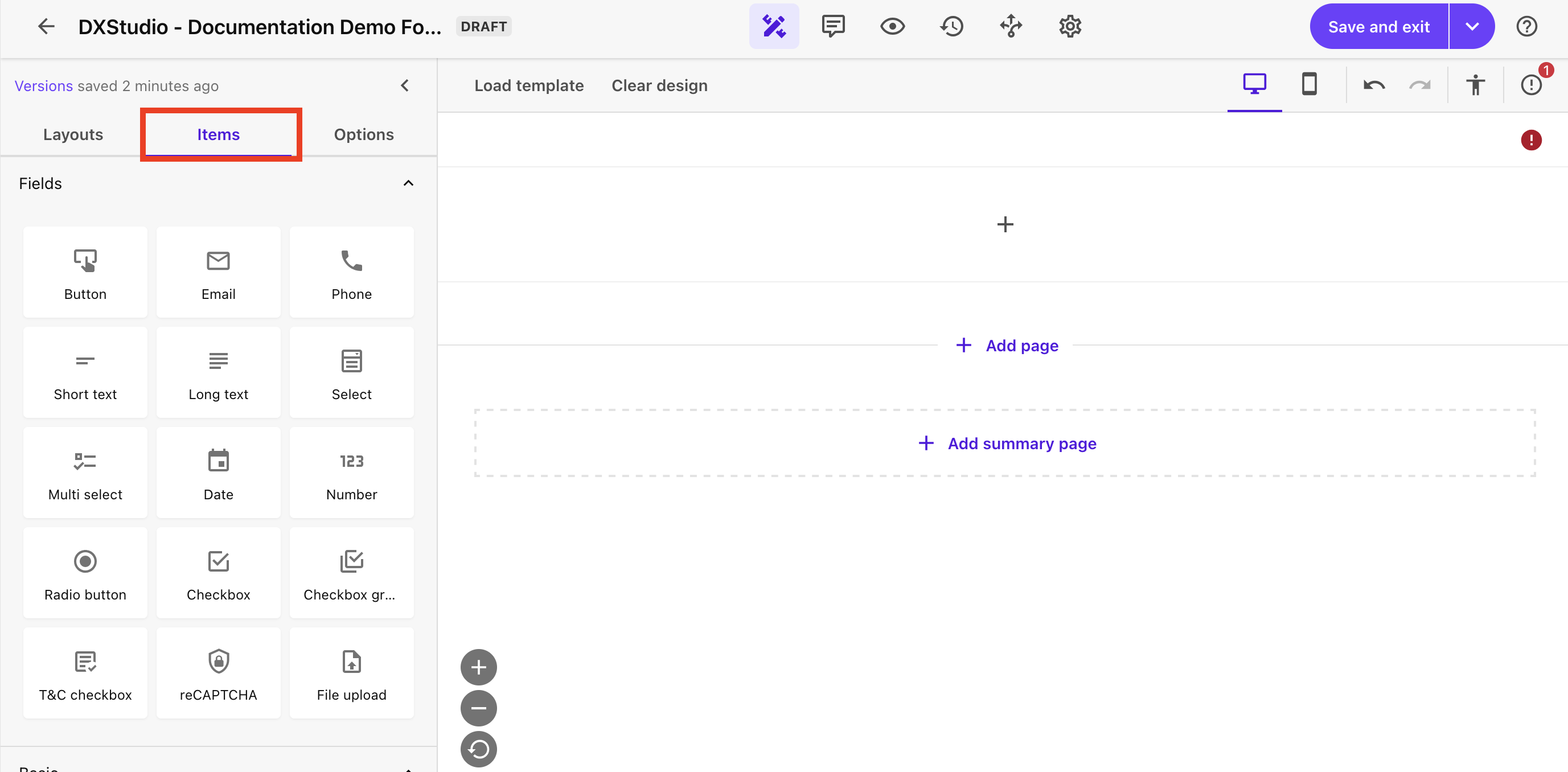
- Click and drag a field onto the form layout and release it in the desired location.
- Click on the form field item to open the field setting panel on the right.
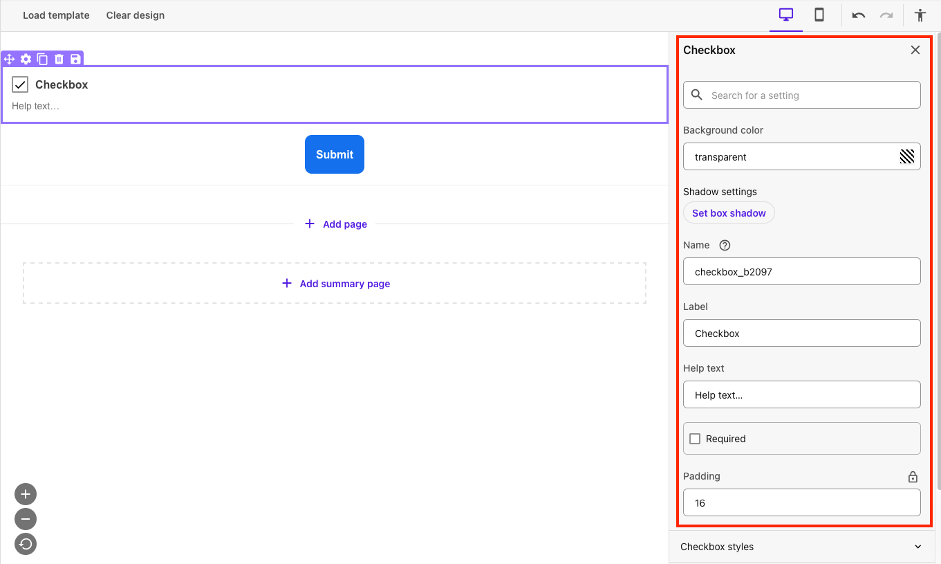
- Adjust any settings, as needed. See the Form Field Guide for more information on available settings for specific items.
Best practice: Include a clear field name in the Name field and Label field. They can be the same. The Label field will be visible to the user filling out the form. The Name field will be associated with the form data that is viewed in the internal email generated by the form submission.
- Click the Options tab on the left-side panel to control form settings for the entire form, such as border and button colors. See the Data tab on the Design Studio: Forms page for more information about the Options tab fields.
Alternative method: Form-level formatting options can also be controlled using style sheets. See “Create a Form Style” in the “Advanced Form Creation Features” section, below, for more information.
Preview form design
Use the Preview feature within SitecoreAI forms to view the form as it would appear on a desktop, tablet or mobile device.
- Click the Preview icon on the toolbar above the form.
- Click the appropriate device icon to preview the form.
(Optional) View form versions
View different versions of the form using the Versions preview.
- Click the Versions icon on the toolbar above the form.
- Click the desired version of the form from the list on the left.
To complete and activate the form, units must request a webhook generated by University Communications and Marketing.
To request a webhook: Send an email to Comms.WebSupport@msu.edu. Be sure to note that a webhook is needed for a new form and include the website(s) the form will be included on and the email address to which the webhook should send the form submission data.
Users will receive a string of characters to be used as the webhook in Step 5. It is recommended that users keep a record of this character string to refer to in case there’s an issue with the form submission emails and the webhook needs to be confirmed to ensure there are no typos, etc.
- Click the Settings icon on the toolbar above the form to open the Settings tab.
- Leave the Form ID field as is. Do not change this.
- Edit the form name, if needed, by clicking the pencil icon to the right of the name. Click Save to save the changes.
- Select Generic Form Webhook from the “Choose webhook” drop-down menu.
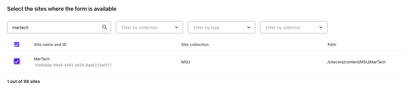
- Restrict access to the form:
- Click Edit under “Forms available on.”
- Check the box to the left of any website for which the form should be available to be placed.
- Click Save.
- Choose a submit action to control the user’s experience after submitting the form and fill in the related fields.
- Success message is the default action — A customizable message indicating the form was successfully submitted will appear.
- Redirect to a URL — The user is taken to a new web page, such as a “Thank you for your submission” page with next steps or additional information to continue the user journey. This can be used with Google Analytics tracking to measure form conversions, if units set up the page as a conversion in their analytics.
- None — Nothing happens for the visitor after they submit the form. This is not recommended. Users need some sort of confirmation to feel assured that their submission was received.
Forms must have a hidden short text field added containing the webhook code for the system to correctly route form data to an email address when a visitor submits the form.
- Confirm there is a mechanism for visitors to submit the form. This is typically a button with a label of “Submit” or something similar.
- Add a Short text item to the form below the submit button item.
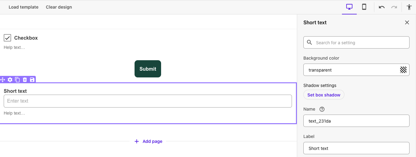
- Click on the Short text item to access the item settings panel on the right.
- Enter the following settings in the settings panel fields:
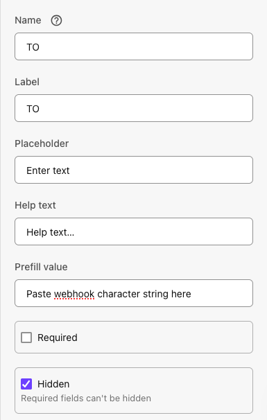
- Name: TO
- Label: TO
- Prefill value: Copy and paste the webhook character string provided by University Communications and Marketing (see Step 3, above) into this field.
- Hidden: Check the box to hide this field.
The form is now ready for use but it must be activated before it can accept data.
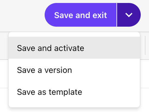
To activate a form from the form edit view:
- Click the drop-down arrow to the right of the Save and exit button.
- Click Save and activate.
- Click Activate.
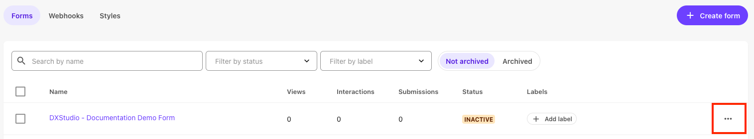
Alternatively, to activate a form from the Forms listing page:
- On the Form table view, locate the row for the form in question.
- Click the three-dots Actions icon at the right end of the form row.
- Click Activate on the pop-up menu.
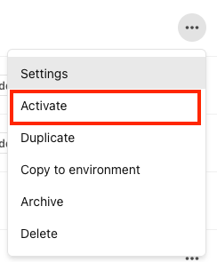
- Click Activate.
- Open Page Builder.
- If in Design Studio: Click Page Builder button in the toolbar at the top of the page.
- If not in Design Studio: Open SitecoreAI, choose the environment for the appropriate website and click Page Builder on the side-panel menu.
- Click the site selector drop-down from the top left corner of the main Page Builder toolbar.
- Select the necessary website where the form will be embedded.
- In the Sitemap panel Content Tree, navigate to the page where the form will be embedded.
- Click the Components tab in the left-side panel to open the page components list.
- Scroll to the Forms section. Click Forms to expand this section, if needed.
- Locate the desired form in the list of available forms. Each form appears as a form component in the Forms section of the Components list.
Note: If a form is not visible in the Components tab, check in Design Studio to confirm that a) the form has been activated and b) the form settings show the form is available to the website in question (visible under form settings). If the website is not listed, edit the form settings for the “Form is visible on” field and check to include the website.
- Click and drag the desired form onto the page. Drop it where the form should be placed.
- Continue to build the page as normal using Page Builder.
After a form has been built, saved, activated and placed on a web page, the web page must be published.
Follow the standard publishing procedures. See “Publishing Content with Workflows” for more information.
Advanced Form Creation Features
Some users may choose to use advanced features when creating forms. Form templates can offer a quick start to a form build based on a previously saved template. Form logic alters item behavior depending on pre-established conditions. Style sheets can be created to apply CSS style set to one or more forms. Follow the instructions below to add form logic or create style sheets.
Users can save a specific form item (i.e., a field and its settings) for reuse. Saved items will appear in the “Saved” section at the bottom of the Items panel.
- Click on the item in the form edit view.
- Confirm settings are configured correctly.
- Click the Save icon on the purple toolbar that appears above the item when it has been selected.
- Add a name for the saved item. Item names should be clear and describe the unit or website and intent of the item.
- Select where to save the item.
- Items saved to the current environment are available to all SitecoreAI users with access to the environment.
- Items saved to the organization are available to all SitecoreAI users at MSU.
- Click Save.
Users can save an existing form layout as a template and can load a saved template to create a new form.
To save a form as a template:
- Build out the form layout with the items and styling desired to be included in a template.
- Click the drop-down arrow to the right of the Save button to expand the Save options menu.
- Click Save as template.
- Name the template. Template names should be clear and include a unit name so other users can tell the intended use of the template.
- Choose an option for where to save the template. Saving the template to the current environment will make the template available for users in the same environment. Saving the template to the organization will make the template for users in any MSU environment.
- Click Save.
To load a template when creating a form:
- Create a blank form (see Step 1 under “Building Basic Forms,” above.)
- Click Load template.
- Search for and locate the desired saved template. The Preview button opens the template in a pop-up window for closer inspection.
- Click Use.
- Click Use Template.
- Make any necessary changes and proceed as normal to build, save and activate the form.
To remove a template and all form content:
- Click Clear design.
- Click Clear.
Sitecore users can create robust forms that utilize logic rules to route site visitors to different questions as they fill out a form. For example, a question could be skipped (i.e., hidden) if a visitor responds to a previous question in a particular manner.
- Click the Logic icon on the toolbar above the form.
- Click the Add logic button at the top right corner.
- Select the condition required for the logic rule to run from the drop-down list of available options. Conditions for a field vary depending on the type of field.
Note: Multiple conditions can be added. Conditions can be grouped. Use the and/or drop-down when multiple conditions are selected to control whether all conditions must be met or if one of the conditions must be met.
- Click Add action to set what happens when the condition(s) are met. Actions can include:
- Hide field
- Show field
- Make a field required
- Make a required field optional
Note: Multiple actions can be added. All associated actions will occur when stated conditions are met.
Form styles are style sheets that apply to one or more forms. This is an efficient way to ensure all forms across a website share the same design properties for a cohesive look. Form styling should align to MSU’s brand standards, color palette and Web Accessibility Standards.
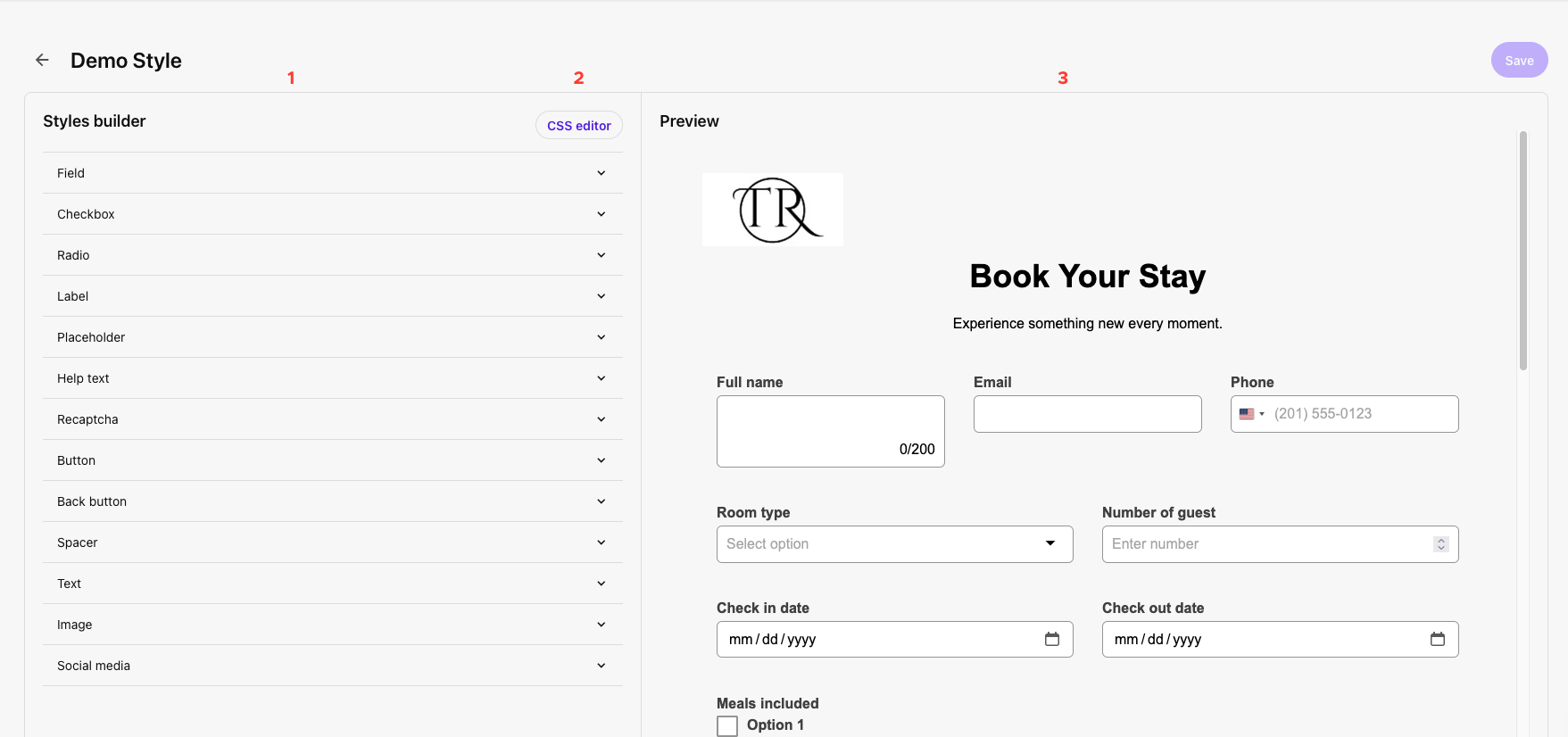
To create a Form style using Styles builder:
- Open Design Studio.
- Click Styles to open the form styles tab.
- Click + Create Style.
- Name the form style. Include a unit name to clarify for users the intended purpose of this style.
- Click Add.
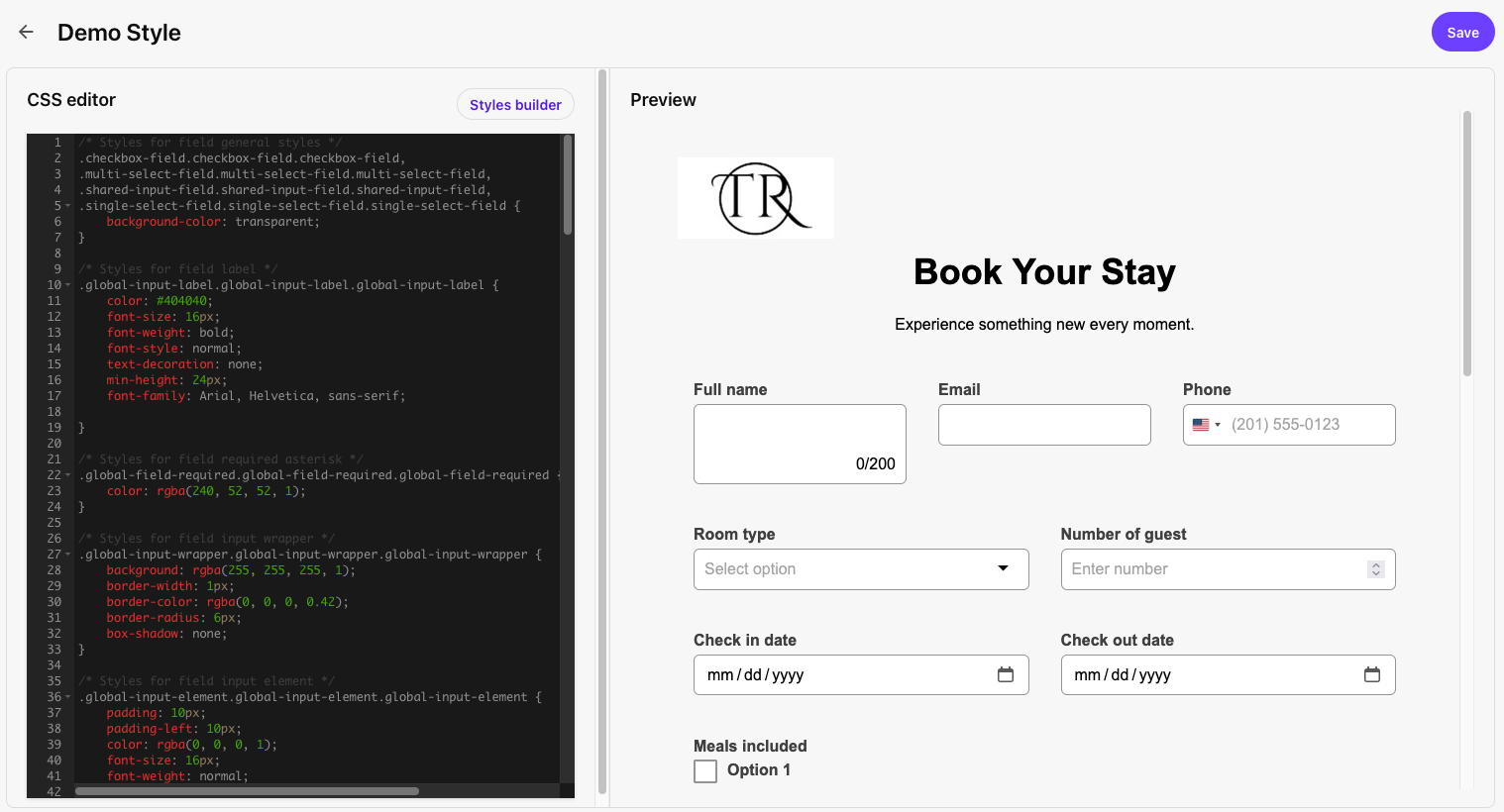
- Use the Styles builder panel on the left to navigate to different elements and add styling. Use the Preview panel on the right to view the impact of style changes made in the Styles builder panel.
- Style settings covered by style sheets include Field, Checkbox, Radio, Label, Placeholder, Help text, ReCAPTCHA, Button, Back button, Spacer, Text, Image and Social media.
- In general, for style settings related to border width, radius, padding or font size, enter a number. For style settings related to color, click the color square to open a color picker and enter a HEX code, RGBA code or select a color with the color picker or palette.
- See the Data tab on the Design Studio: Forms page for more information about the specific options that can be controlled with style sheets.
- When all desired style settings have been established, click Save.
To create a Form style using CSS editor:
- Open Design Studio.
- Click Styles to open the Form styles tab.
- Click + Create Style.
- Name the Form style. Include a unit name to clarify for users the intended purpose of this style.
- Click Add.
- Click the CSS editor button at the top right of the Styles builder panel on the left.
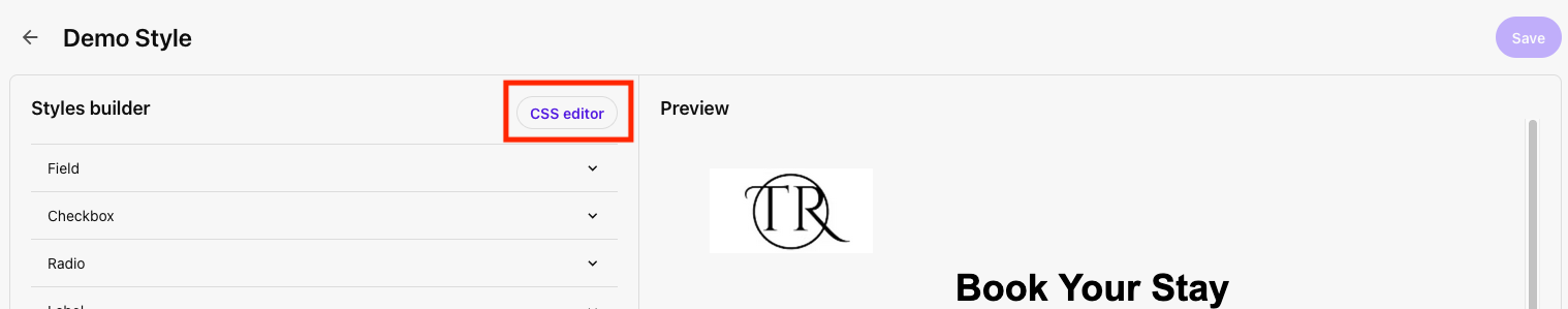
- Click Edit as CSS.
- Edit the CSS code in the CSS editor panel on the left. Use the Preview panel on the right to view the impact of style changes made in the CSS editor panel.
- When all desired style settings have been established, click Save.
Manage or Edit Existing Forms
Follow the instructions in the tabs below to edit an existing form, restrict site(s) a form can be used on, view analytics for a form, copy a form to another environment, archive or delete a form.
- On the Form table view, locate the row for the form in question.
- Click the form name to open the form in edit view.
- Make any changes necessary to the form, following the instructions outlined in “Building Basic Forms,” above.
- Save, as appropriate.
- For active forms embedded on a web page: Open the page in Page Builder, refresh and review the changes, and submit the changes to the publishing workflow.
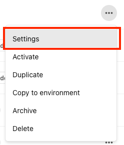
- On the Form table view, locate the row for the form in question.
- Click the three-dots Actions icon at the right end of the form row.
- Click Settings on the pop-up menu.
- Scroll to the bottom and locate the “Form available on” setting. Click Edit.
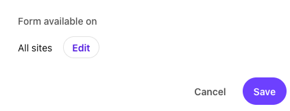
- Check the box next to the website(s) where this form is eligible to appear.
- Click Save.
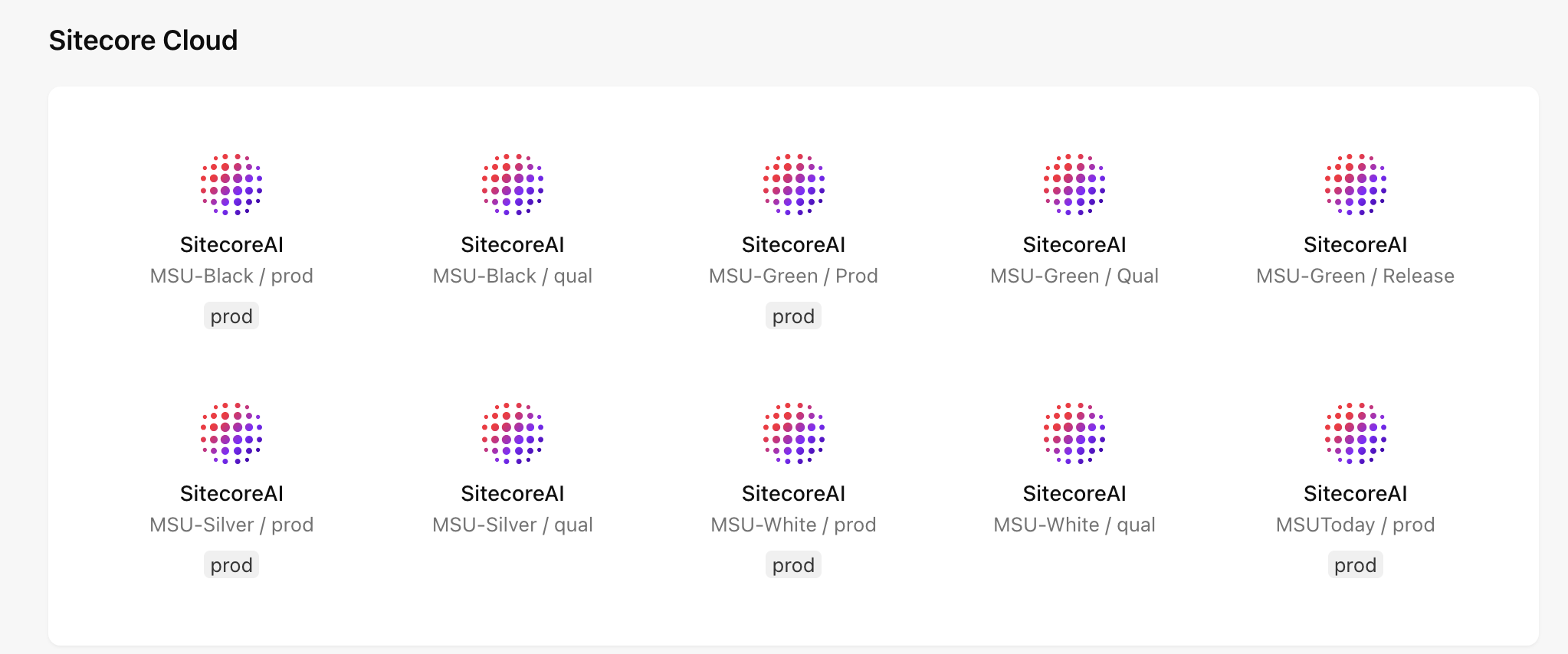
- Log in to SitecoreAI.
- On the launchpad, click to select the appropriate environment where the form is housed. (See Fig. 2)
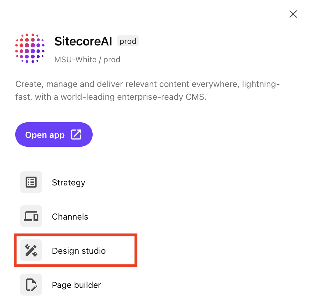
- Click Design Studio on the right-side panel. (See Fig. 3) It opens in a new browser tab.
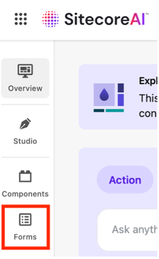
- Click Forms on the left-side toolbar navigation. (See Fig. 4)
- Locate the form in the Forms table. Use Search, Filter by status or Filter by label, if needed.
- The Forms table provides the following form analytics:
- Views — The number of site visitors who have viewed the form.
- Interactions — The number of site visitors who have interacted with the form, such as entering data into a field.
- Submissions — The number of site visitors who have submitted the form.
- Status — An Active tag indicates the form is live. Inactive means the form has not yet been activated and cannot accept submissions.
- Labels — Sitecore users can add tags to forms to facilitate ease of identification.
- Not archived / Archived — Toggle this switch to alternate between views of forms that are not archived or have been archived. “Not archived” does not automatically mean “Live.”
Note: Interactions may be higher than submissions. A large gap may indicate an issue with the user experience of the form: It may be asking too many questions or appear at the wrong stage of the user journey before a visitor is ready to commit to submitting a form.
If there are many interactions but zero submissions, this can indicate an issue with how the webhook was set up for the form. Contact Comms.WebSupport@msu.edu to troubleshoot. Include the form name and details about which website and web page contain the form.
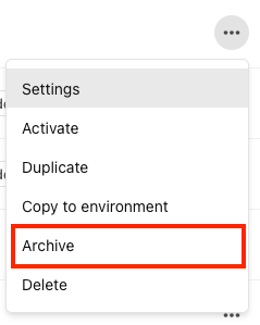
When a form is no longer needed and should not be used, it can be archived. This helps reduce the number of forms visible in the interface.
- On the Form table view, locate the row for the form in question.
- Click the three-dots Actions icon at the right end of the form row.
- Click Archive on the pop-up menu.
Forms are environment-specific but MSU’s Sitecore users may have websites in different environments and wish to use the same form layout. This can be done by building a form in one environment and then copying it to another environment. The user should have access to both environments before attempting this.
- On the Form table view for the first environment, locate the row for the form in question.
- Click the three-dots Actions icon at the right end of the form row.
- Click Copy to environment on the pop-up menu.
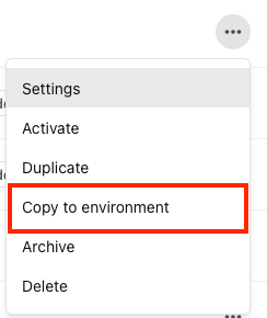
- Select the appropriate environment from the list of available options.
- Click Copy.
When a form is no longer needed and data is no longer needed, it can be deleted. This helps reduce the number of forms visible in the interface.
- On the Form table view, locate the row for the form in question.
- Click the three-dots Actions icon at the right end of the form row.
- Click Delete on the pop-up menu.
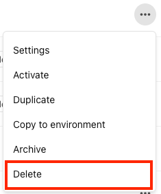
- Click Delete.
Tool Use Guide
Documentation updated: May 29, 2026
Is there an issue with this documentation? Report it here.