Content authors can use Page Builder to create and edit webpages and the content that appears on these webpages. Most users needing to create and edit pages will work exclusively in this tool.
The components and page templates have been developed with a goal of ensuring that most functional needs can be met using Page Builder. It is the most user-friendly tool in the SitecoreAI suite.
Page Builder User Interface
Expand the tabs below to review the different areas of Page Builder.
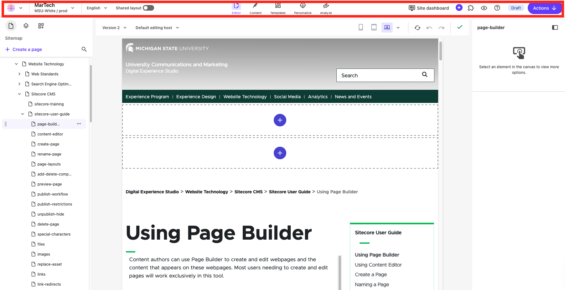
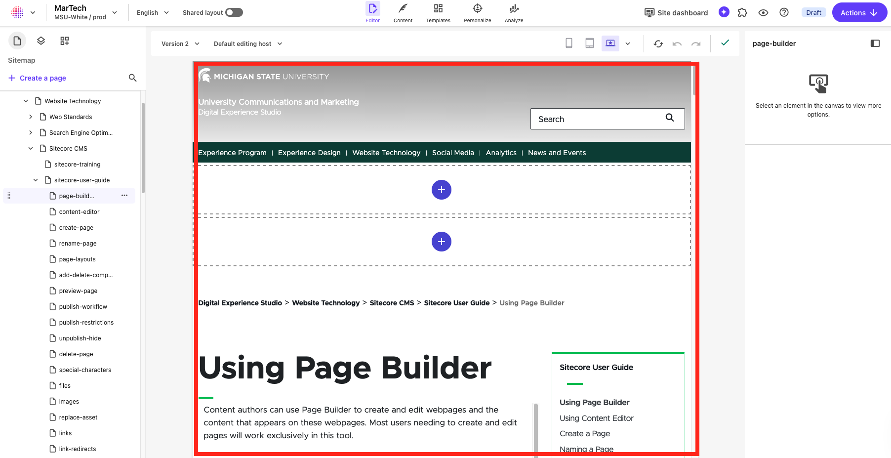
The Global Toolbar appears at the top of the window. Selections on this toolbar will apply to all screens in Page builder. Use this toolbar to:
- Navigate to the SitecoreAI Dashboard by clicking the dotted circle icon on the left
- Open another SitecoreAI tool, such as Content Editor, using the dropdown arrow next to the dotted circle icon
- Navigate to a different website or environment using the dropdown arrow next to the active site name. This opens the Site Name dropdown menu.
- Select a language variant of the website to work on (for multilingual sites) using the language dropdown menu. The default setting is "English."
- Toggle between Editor, Templates, Personalize and Analyze modes by clicking the corresponding icon.
- Preview the page in a browser window.
- Click Site dashboard to open the Sitecore overview analytics in a new window.
- Click the puzzle piece icon to open the Apps menu. As of January 2026, there are no additional applications installed for MSU's Sitecore. Documentation will be added to this website if future apps are enabled.
- Click the question mark icon to open the Sitecore help menu. These reference documents are general to Sitecore and not specific to MSU's environments.
- Publish the page. See "Publish or Unpublish a Page" for additional directions.
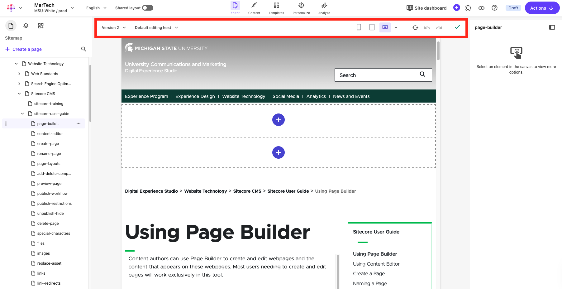
The Local Toolbar appears below the Global Toolbar. Settings here are specific to the selected website. Use this toolbar to:
- Change the version of the page being edited
- Refresh the Canvas (i.e., editing panel)
- Undo the immediate past action
- Redo an action
- Preview the page on different types of devices
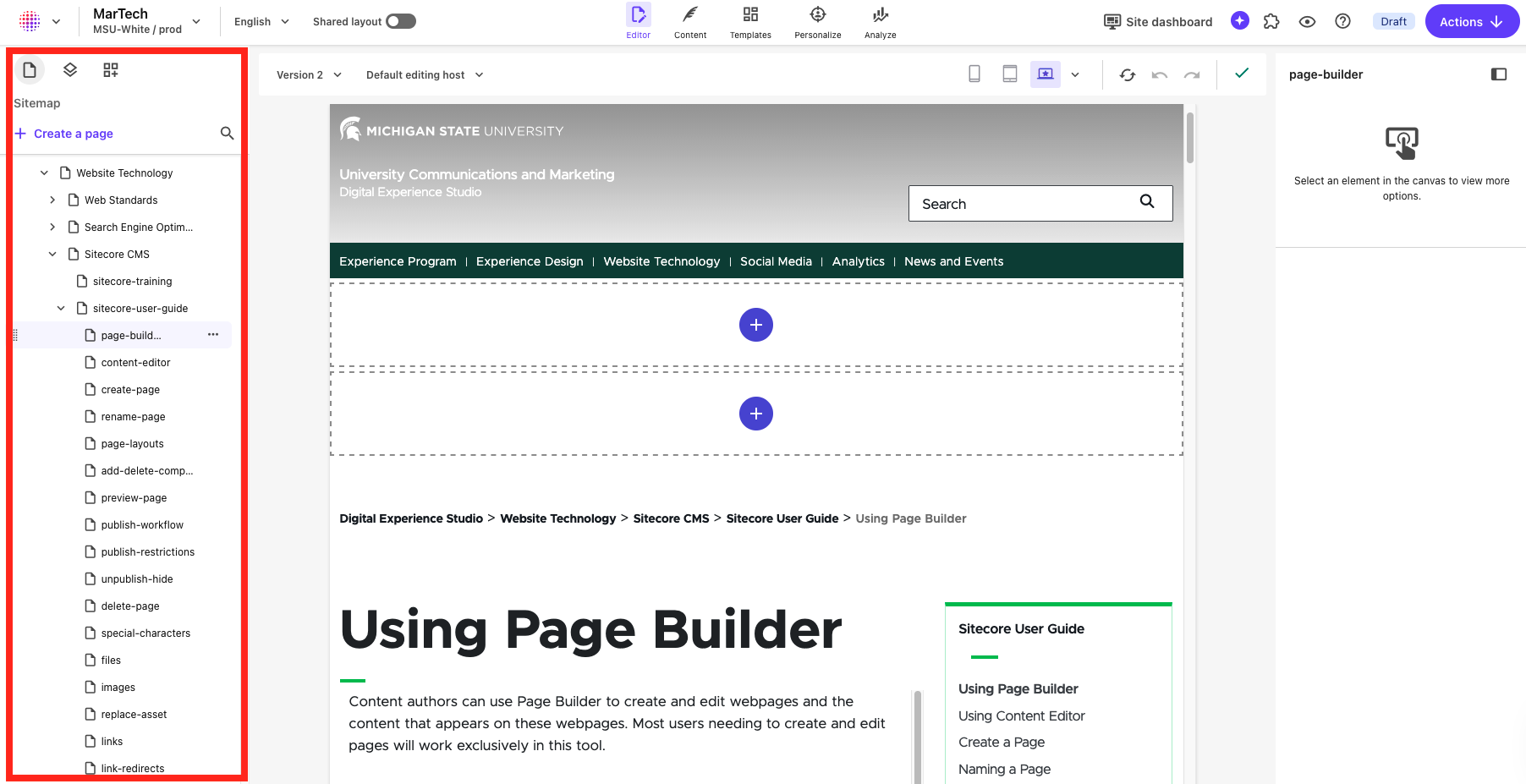
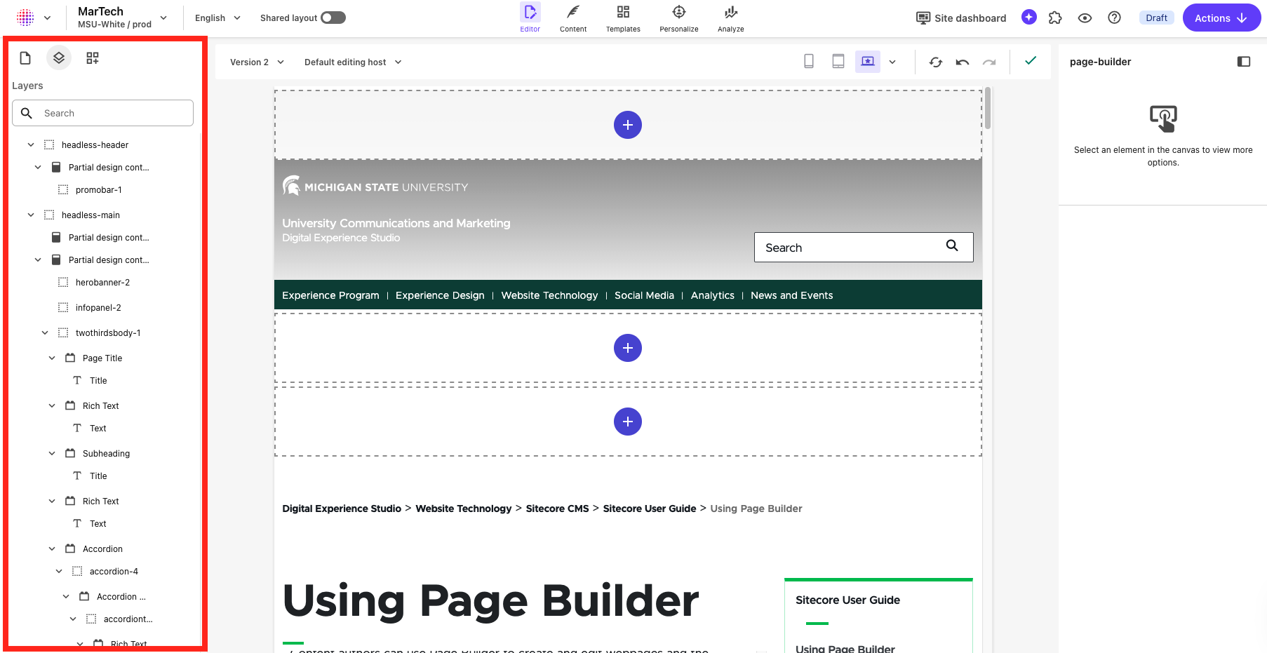
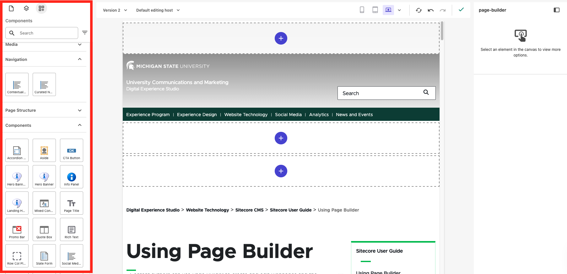
The Left Side Panel appears along the left side of the screen. Here, users can view the site and access editing functionalities. Icons appear at the top of the side panel control the content visible in the side panel (see Fig. 4).
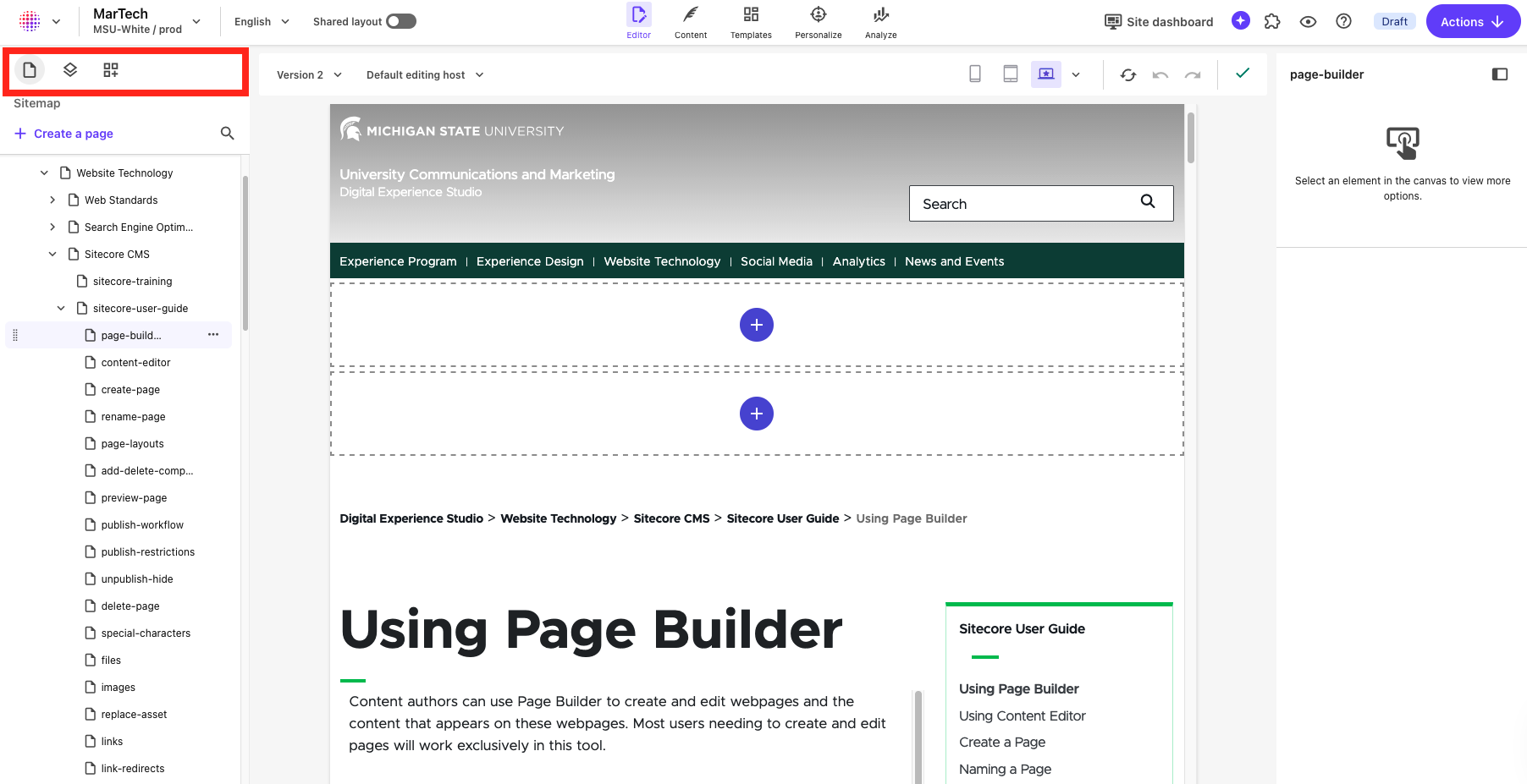
Use this toolbar to:
- Access the sitemap (left icon) to locate and select a page to edit (see Fig. 5)
- Access the layers menu (center icon) to see all components as they appear nested on the page (see Fig. 6)
- Access the component menu (right icon) to place components on the page (see Fig. 7)
- Select an item to view in the canvas (see Fig. 9)
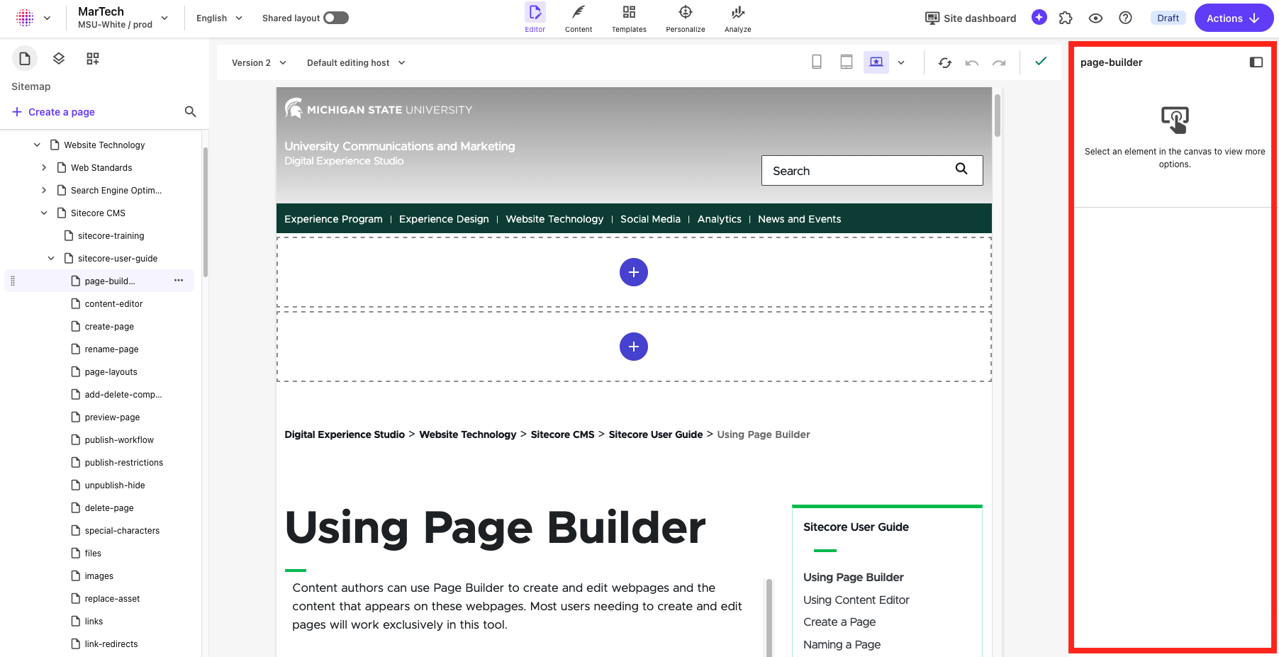
The Right Side Panel appears along the right side of the window. The content here varies depending on what is selected in the main editor view area. The pane provides information and possible actions for the page or selected component, field or placeholder. If the pane is not visible, click the small arrow in a circle icon to expand the pane. Use this pane to:
- Configure components with the Design tab
- Assign content and configure certain content elements to components with the Content tab
When a page or item is selected in the Content Tree, it will appear in Editor View in the canvas in the middle of the screen.
Page Layouts
View information and use cases for the available page templates and components that can be used to build page layouts.
Component Guide
View documentation, including use cases, best practices, data field explanations and step-by-step instructions for working with components.
Documentation updated: June 15, 2026
Is there an issue with this documentation? Report it here.