Sitecore Design Studio is a tool used to create and test components and forms for use within Sitecore.
Accessing Design Studio
- Log in to SitecoreAI.
- Click the appropriate environment from the Sitecore Cloud launchpad (see Fig. 1).
Select Design Studio on the right-side panel menu (see Fig. 2).
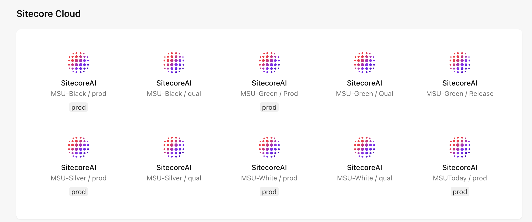
Fig. 1: The available environments will vary depending on user permissions. 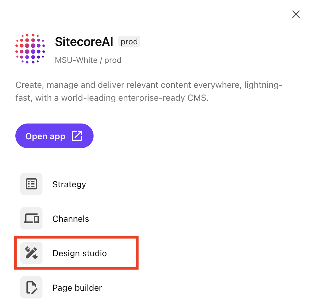
Fig. 2: The Design Studio tab appears on the list of available apps once an environment is selected.
Design Studio Features
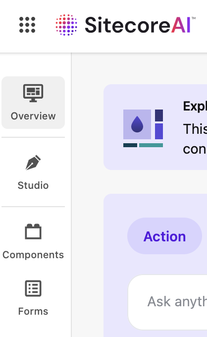
The following features may be accessible from the left sidebar navigation within Design Studio, depending on user permissions (see Fig. 3):
- Overview — The Overview tab serves as the hub for managing various items in progress in Design Studio.
- Studio — The Studio tab is a place for viewing, building and testing component ideas, as well as experimenting with new variants using AI.
Note: While users can design and experiment with creating components in Design Studio, these components cannot be placed in a website. Rather, they may be considered as prototypes. Ultimately, components must be vetted for brand alignment, design system alignment, user experience best practices, system security and stability before they can be considered eligible for inclusion in MSU’s enterprise component library.
- Components — The Components tab is currently not available. MSU’s Sitecore must be upgraded to Content SDK 1.1.0 or later to use this function. An upgrade is in progress.
- Forms — The Forms tab is used to design, build and manage forms used within SitecoreAI websites. This is the tab most Design Studio users will use.
Navigating Design Studio
Forms Feature
Explore the tabs below for an explanation of the Design Studio interface for Forms features.
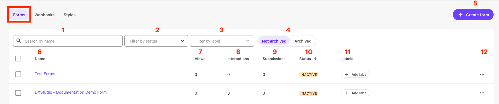
- Search by name: Use this box to search for a form using the form name.
- Filter by status: Use this drop-down to filter the list of forms by draft, active or inactive status.
- Filter by label: Use this drop-down to filter the list of forms by user-generated label.
- Not archived/archived: Use this toggle to change the view of listed forms. By default, “Not archived” forms are shown.
- + Create from: Click this button to create a new form.
- Form name: Click a form name to open that form for editing. Form names should include unit or website name for clarity. Form names help Sitecore users identify the correct form to include on a web page.
- Views: Views displays the count of visitors who have viewed the form on a web page(s).
- Interactions: Interactions displays the count of visitors who have interacted with the form on a web page(s).
- Submissions: Submissions displays the count of visitors who have completed and submitted the form.
- Status: Status denotes whether a form is in draft, inactive or active status.
- Labels: Users can add label tags to help with sorting forms. Labels should be clear and avoid internal unit jargon.
- Actions button: This opens an Actions menu for a specific form.
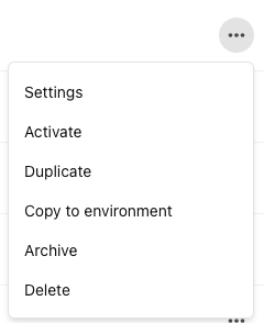
- Settings: This opens form-specific settings, including form name, form ID, Webhook and which site(s) the form is available for use on. These settings are also available via the Settings tab in the Form editing view.
- Refresh: This refreshes an active form.
- Activate: This activates an inactive form.
- Duplicate: This duplicates a form. Duplicating a form can be useful if creating a similar, but slightly different form.
- Copy to environment: This copies the form to another environment, enabling the same form layout and copy to be used on another website in a different environment.
- Archive: This archives a form. Archived forms are not available for use on a website.
- Delete: This deletes a form and any data associated with the form.
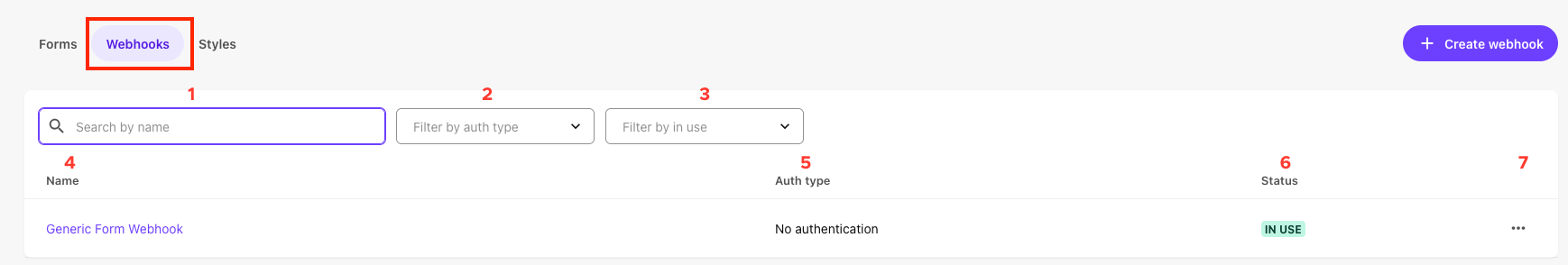
- Search by name: Use this box to search available webhooks by name.
- Filter by auth type: Use this drop-down to filter the list of webhooks by type of authentication (e.g., OAuth 2, Basic, API key, No authentication).
- Filter by in use: Use this drop-down to filter the list of webhooks by whether they are currently in use.
- Name: Click a webhook name to open that webhook for editing.
- Auth type: This notes the type of authentication required for the webhook.
- Status: This notes if a webhook is in use.
- Actions button: This opens an Actions menu for a specific webhook.

- + Create style: Click this button to create a new forms style set.
- Actions button: This opens an Actions menu for a specific forms style set.
- Style set name: Names should be clear to all users and should specify the unit or website they’re designed to be used on. Click on a style set name to open the editing view. Styles are edited using a CSS editor panel with a preview pane.
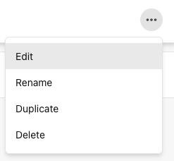
- Edit: Use this option to open the style set editing view.
- Rename: Use this option to change the name of an existing style set. Names should be clear to all users and should specify the unit or website they’re designed to be used on.
- Duplicate: This duplicates a form style set. Duplicating a style set can be useful if creating a similar, but slightly different style.
- Delete: This deletes a form style set.
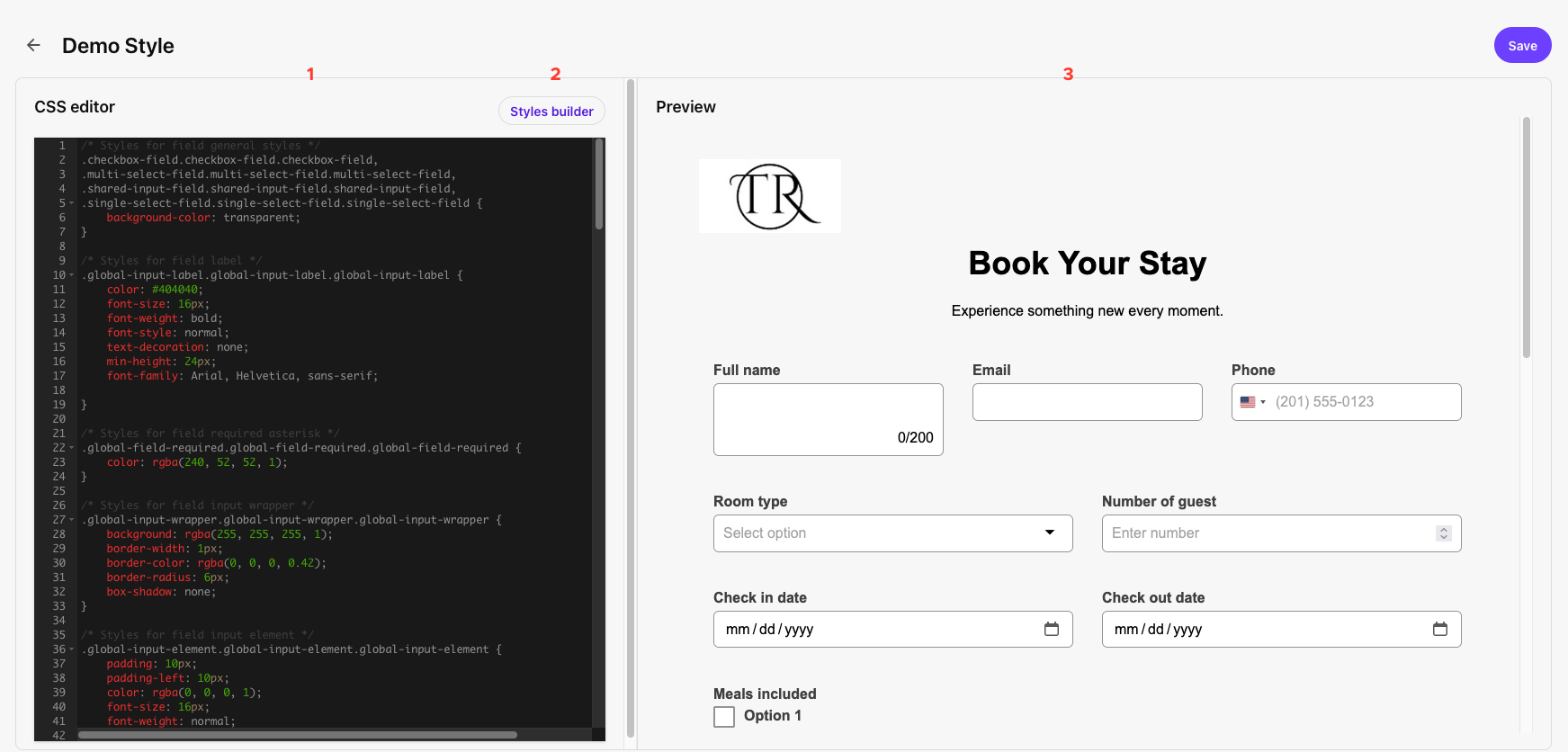
- CSS editor: Form styles are edited using the CSS editor.
- Styles builder: Users can use the Styles builder to create a CSS style sheet.
- Preview: The impact of style changes made in the CSS editor are visible in the Preview panel.
Important: Clicking the Styles builder button on an existing style will erase the style sheet and overwrite the existing CSS. It is best to use the Styles builder when creating a new style sheet.
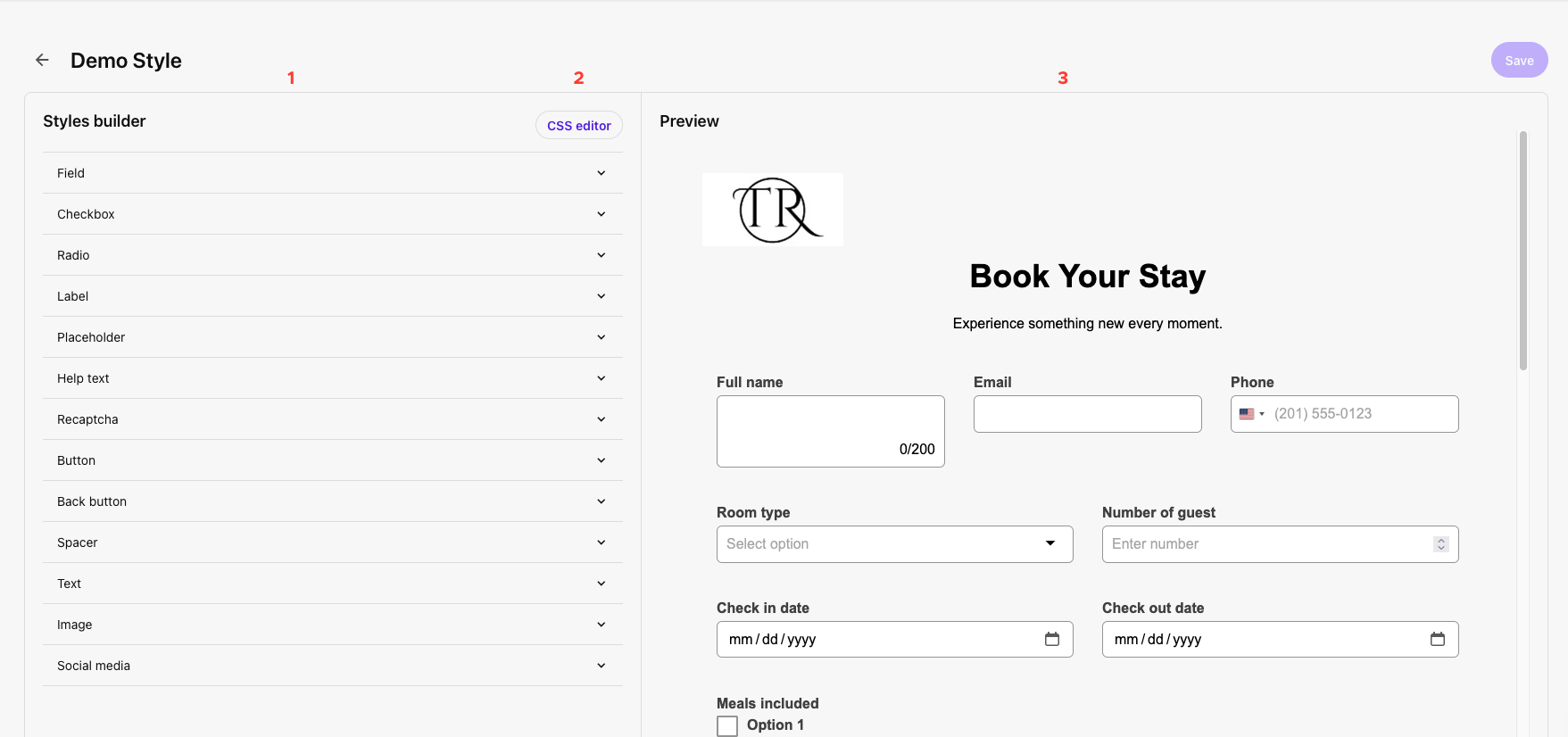
- Style options: Click to expand each form item type and edit style controls for the item.
- CSS editor: Edit form style using a CSS code editor.
- Preview: The results of style changes made in the Styles builder are visible in the Preview panel.
This documentation explores the layout of the Form editing view. For full instructions on building or editing forms, see “Build and Manage Forms.”
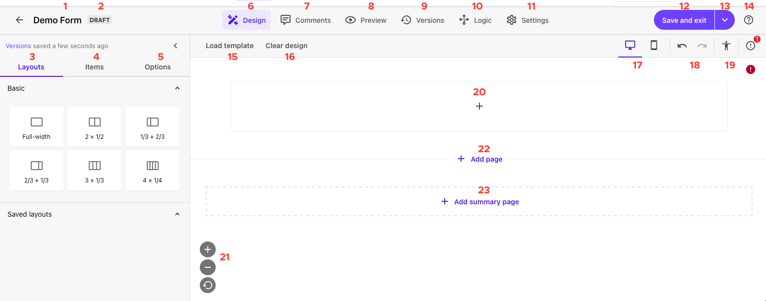
- Form name: The name of the form open for editing is displayed in the upper left corner of the interface.
- Form status: A tag indicates if this form is in draft, inactive or active status.
- Layouts tab: The Layouts tab enables users to select from various pre-saved form layouts. These layouts impact the layout of the form itself, within the container it is placed. For example, a full-width form layout will take up the full width of the left column if placed in a two-thirds page layout or two-thirds sublayout.
- Items tab: The Items tab enables users to add items to the form, including fields and content elements.
- Options tab: The Options tab enables users to customize the styling for the overall form. Options selected here will override any forms styling applied using style sheets. See the Data tab on “Design Studio: Forms” for more information on these settings.
- Design tab: The Design tab enables users to edit the design and layout of the form.
- Comments tab: The Comments tab enables users to add comments visible internally to system users. These can be used to track feedback during the form creation process. Comments can be marked as “Resolved.”
- Preview tab: The Preview tab enables users to simulate the appearance of the form on desktop, tablet or mobile devices.
- Versions tab: The Version tab enables users to view historic versions of the form.
- Logic tab: The Logic tab enables users to control item visibility and behavior based on various conditions.
- Settings tab: The Settings tab enables users to control form-level settings, including form name, style sheet, webhook, which site(s) a form is available to be used on, and what happens when a user submits a form.
- Save and exit: The Save and exit button saves all changes to the form and takes the user back to the Forms landing page.
- Save and Exit drop-down: The drop-down arrow to the right of the Save and Exit button provides additional saving options:
- Save and activate: Saves all changes and activates the form, enabling it to collect data. Forms should be activated before publishing on a web page.
- Save a version: Saves a new version of the form. This can be useful if considering multiple layouts.
- Save as template: Saves the form as a template. Templates can be used to create new forms with the same layout or design as a foundation.
- Help: Access support articles from Sitecore. Note: These resources are generic to Sitecore and may not take into account MSU’s enterprise settings or users’ permissions.
- Load template: Click this button to load a previously saved forms template as the starting point for a form.
- Clear design: Click this button to remove all items added to the form.
- Device modality: Toggle between desktop and mobile views when building a form. Use these options when editing how items appear on mobile compared to desktop (e.g., different item padding). Use the Preview tab to preview what forms look like on different devices.
- Undo / Redo: This allows you to undo the most recent action or redo the most recent undone action.
- Accessibility check: This accessibility check performs a high-level check of the form for alt text, labeling and color contrast.
Note: Users are responsible for ensuring their website content, including forms, meets MSU’s Web Accessibility Standards. This Sitecore Forms accessibility check is helpful but should not be the only tool used for confirming pages with forms are accessible. Units should also use Silktide or other resources. For questions regarding accessibility, please contact the MSU Digital Accessibility team.
- Form building canvas: This section of the forms interface is used to build a form. It behaves similarly to Page Builder. See “Build and Manage Forms” for more information.
- Scale controls: Zoom in, zoom out or reset the zoom using the scale controls.
- + Add page: Click to add a page to the form. Forms are edited in an endless scroll interface with noted page breaks but will appear properly paginated in preview and when live.
- + Add summary page: Click to add a response summary page to the end of the form.
Using SitecoreAI Forms
Design Studio: Forms
Guidelines for usage, best practices, styling, accessibility and data fields for forms.
Build and Manage Forms
Explore how to create, manage, activate and embed forms in a SitecoreAI website.
Form Field Guide
Learn about the data template and setting options for the various available form fields.