Jump to HeaderJump to Main ContentJump to Footer
Michigan State University
Digital Experience Studio

University Communications and Marketing

Digital Experience Studio

  • Experience Program
    • Website Project Process
    • Working with a Vendor
    • Glossary
    • Taxonomy Data Dictionary
  • |
  • Experience Design
    • Website Strategy
    • Website Structure
    • Information Architecture and Navigation
    • User-Centered Design Conventions
    • Common UX Issues
    • Enterprise Design System
    • Content Planning
    • Creating Accessible Content
    • Taxonomy and Filters
  • |
  • Website Technology
    • Web Standards
    • Search Engine Optimization
    • Cascade CMS
    • Sitecore CMS
    • Content Hub Overview
    • Content Hub DAM
    • Content Hub Operations

    SitecoreAI

    Sitecore user login
  • |
  • Social Media
    • Alt Text Bookmarklet
    • Meta Ad Pixel
    • Social Media and Web Integration
    • Sprinklr

    Sprinklr

    Sprinklr user login
  • |
  • Analytics
    • Google Analytics (GA4)
    • Testing
    • Data Visualization

    Google Analytics

    Google Analytics user login
  • |
  • News and Events
    • News and Updates
    • Events and Trainings
Digital Experience Studio

University Communications and Marketing

  • Experience Program
  • Experience Design
  • Website Technology
  • Social Media
  • Analytics
  • News and Events

< Experience Program

  • Website Project Process
  • Working with a Vendor
  • Glossary
  • Taxonomy Data Dictionary

< Experience Design

  • Website Strategy
  • Website Structure
  • Information Architecture and Navigation
  • User-Centered Design Conventions
  • Common UX Issues
  • Enterprise Design System
  • Content Planning
  • Creating Accessible Content
  • Taxonomy and Filters

< Website Technology

  • Web Standards
  • Search Engine Optimization
  • Cascade CMS
  • Sitecore CMS
  • Content Hub Overview
  • Content Hub DAM
  • Content Hub Operations

SitecoreAI

Sitecore user login

< Social Media

  • Alt Text Bookmarklet
  • Meta Ad Pixel
  • Social Media and Web Integration
  • Sprinklr

Sprinklr

Sprinklr user login

< Analytics

  • Google Analytics (GA4)
  • Testing
  • Data Visualization

Google Analytics

Google Analytics user login

< News and Events

  • News and Updates
  • Events and Trainings
Digital Experience Studio > Website Technology > Sitecore CMS > Sitecore User Guide >

Design Studio: Forms

MSU Tools and Resources

  • A to Z Index
  • Find People
  • Email
  • Tech Support
  • Social Media Directory

Communications Resources

  • University Communications and Marketing
  • University Trademarks and Licensing
  • MSU Brand Studio
  • MSU Editorial Style Guide
  • MSU Photos

Contact us

517-355-7505

Address

Michigan State University 408 West Circle Drive East Lansing, MI 48824

Follow Us

  • Visit our Facebook page
  • Visit our page on X
  • Visit our Instagram page
  • Visit our LinkedIn page
  • Visit our YouTube page
  • Visit our TikTok page

If you're having accessibility issues, please let us know.

Know MoreTransparency Reporting: Budget & Salary/Compensation
  • Contact Information|
  • Site Map|
  • Privacy Statement|
  • Site Accessibility|
  • Call MSU: (517) 355-1855|
  • Visit: msu.edu|
  • Notice of Nondiscrimination|

SPARTANS WILL|© Michigan State University|

Design Studio: Forms

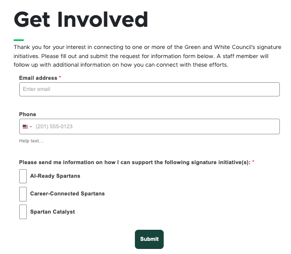
A sample form featuring an email field, checkbox for options and a submit button.
Fig. 1: A form built using SitecoreAI’s Design Studio.
  • Usage
  • SitecoreAI’s Forms function enables users to build forms within the Sitecore Design Studio interface and make those forms available for placement on web pages without coding. Visitors to web pages can then fill in and submit the form, generating an email containing the form’s field responses to a predetermined form-specific email address. Additional means of gathering form field responses may be made available in the future. See below for information related to:

    • Best practices
    • Expected behavior
    • Related information

    Best Practices

    Building the form:

    • Always include the site or unit name in the form name. This label will not be visible on the website. Including a site or unit name in the form name helps distinguish forms and ensure the correct form is used on a web page.
    • Add visibility restrictions for the form so it is only visible to Sitecore users working on a particular website(s). This ensures that a form is not embedded in an incorrect location.
    • Use clear, concise language and include help text in the form where appropriate.
    • Include an email address or other contact information fields to be able to follow up with form submitters.
    • Once a form has been published to a web page, keep changes to a minimum. 
    Note: Users must have Advanced User access for a website's environment to work with Forms. Users should email Comms.WebSupport@msu.edu to request Advanced User access if they do not already have it. Include the environment and website that requires the form in the request.

    Fielding form submissions:

    • Submitted forms generate an email to an internal account containing the form data. Use a shared MSU email address connected to the unit for this setting. This ensures data security and form longevity. If someone responsible for maintaining the account leaves their position, the responses can be handled by another individual managing the email inbox.

    Note: See the Technology at MSU knowledge base article on Shared Mailboxes for information on how to request a shared mailbox account.

    • Have at least two individuals responsible for managing the email inbox associated with the shared email address and designate one individual as the primary account manager. This ensures there is a backup user in place when the primary account manager is out of the office. Designating a primary ensures that someone is actively monitoring the email address and not assuming someone else is taking care of things.

    Tip: Have users add the shared mailbox to their Outlook to make managing the form submission emails more efficient.

    • Provide training to individuals managing the email inbox associated with form submissions. Ensure they know how to process form submissions, who to send information to and how to follow up with form submitters.
    • If a response to the form submission may take some time, send an email to the submitter acknowledging their submission and providing an estimate on when they should receive a response. This provides quality customer service and improves the digital experience. 

    Back to top

  • Style
  • Design Studio enables users to customize the formatting of Forms using the Options tab in the left-side panel of the form editing view (see Fig. 2).

    It is up to the user to ensure that any settings here meet accessibility standards and provide a quality, brand-aligned experience for users. 

    For information about MSU’s brand standards, including the MSU brand color palette, please see the MSU Brand Studio website.

    For information about MSU’s website accessibility standards, please see the Digital Accessibility website.
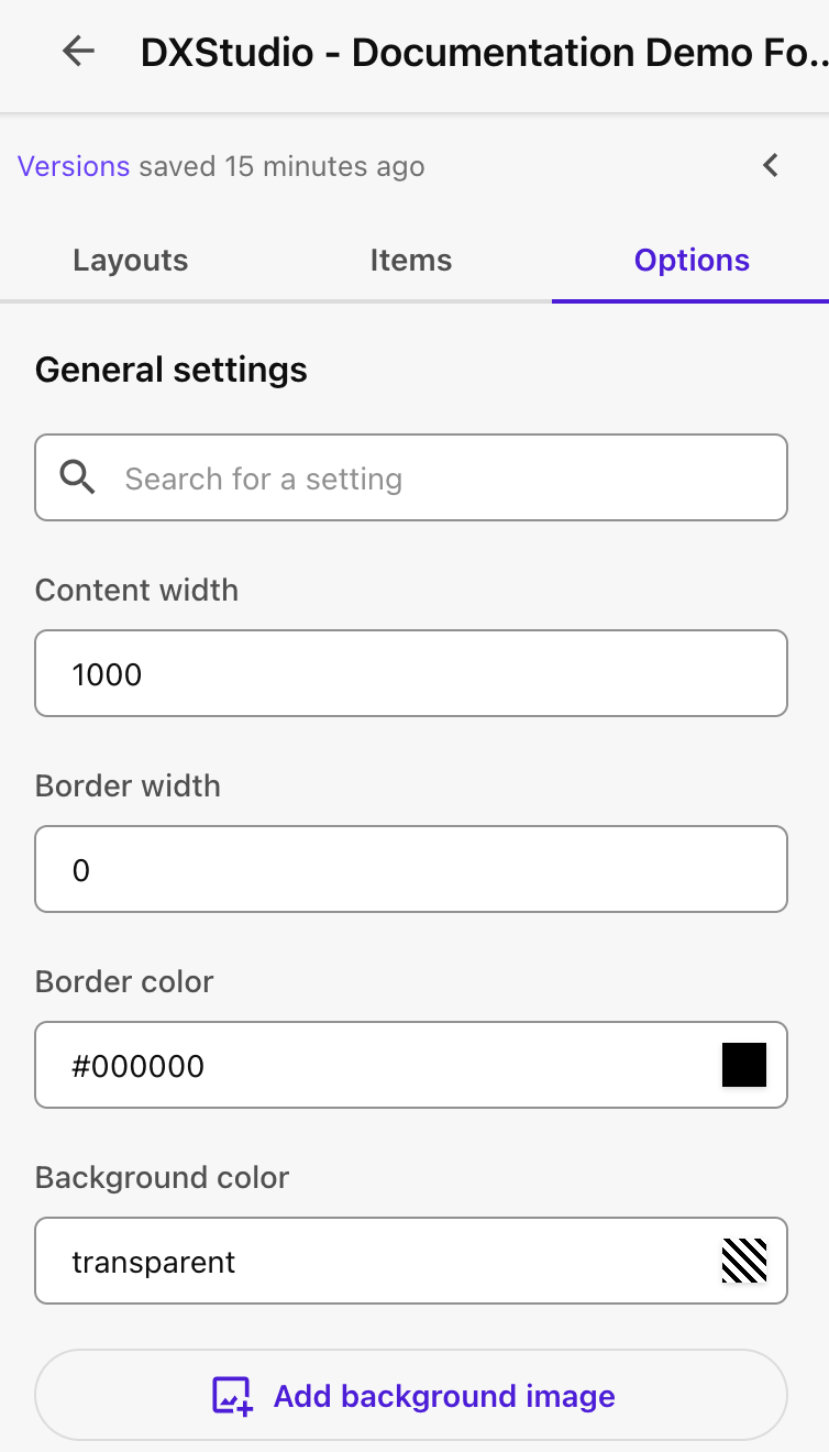
     

    The Forms Options tab includes various fields to edit formatting settings for the form.
    Fig. 2: The Options panel of the Design Studio form builder enables users to customize the styling of forms.
  • Data
  • Forms have robust data templates to power their structure, logic flows and design. See below for information regarding the data fields associated with:

    • General design settings
    • Logic settings
    • Form settings
    • Field-specific settings

    General Design Settings

  • Accessibility
  • The system itself is designed with accessibility in mind, but content and form design play a vital role in ensuring accessibility needs are met. 

    Users building forms should properly fill in all necessary item fields, such as field label and help text, to support compliance with MSU Web Accessibility standards.

    Any custom formatting, such as font and background colors, must adhere to MSU Web Accessibility standards. Font and color choices also should adhere to MSU brand standards.

    Frequently Asked Questions

    Who can create, edit and manage forms and add a form to a website?

    Sitecore users with "Advanced" level access have permissions to create, edit, manage and place forms on websites. To request "Advanced" access, users should email Comms.WebSupport@msu.edu. Be sure to include the website(s) the user works on and which environment(s) are used in the request.

    Using SitecoreAI Forms

    Using Design Studio

    Forms are built in SitecoreAI Design Studio. Learn how to use the Design Studio interface. 

    Get started

    Build and Manage Forms  

    Explore how to create, manage, activate and embed forms in a SitecoreAI website. 

    Build forms

    Form Field Guide 

    Learn about the data template and setting options for the various available form fields. 

    Explore fields

    Documentation updated: June 15, 2026

    Is there an issue with this documentation? Report it here.

    Expected Behavior

    • Fields stack in mobile view.
    • Forms can be embedded in a full-width page layout, the left column of a two-column page template or a two-thirds sublayout component. Forms cannot be embedded in the right column of a two-column page layout or two-thirds sublayout component.
    • Forms are eligible to be embedded in a web page if they’ve been made viewable to users for a website. Forms can be made viewable to users of multiple websites and can be included in multiple websites.
    • Webhooks enable forms to generate one email containing form data that is then sent to one email address. Different forms can use different email addresses, but all submissions from the same form will go to the same address. 

    What is a Webhook?
    A webhook is a way for one system to automatically send information to another system in real time. For example, it allows SitecoreAI to send form submission data to an email service. 

    Additional webhooks to connect SitecoreAI forms to other systems may be created by developers. Users can contact Comms.WebSupport@msu.edu to suggest additional webhooks. Please provide details in the request, including the website(s) requiring the webhook, what the webhook should accomplish and any additional information that may assist the developer team in evaluating the webhook suggestion. 

    Back to top

    Related Information

    Users can utilize other form platforms, such as Microsoft Forms or Qualtrics, on a SitecoreAI website, but these forms cannot be embedded. In these cases, users can link to the form from text, a CTA button or a mixed content component. 

    Support for Google Apps, Microsoft Forms and Qualtrics are provided by MSU IT Services. See the Technology at MSU website for more information.

    Back to top

    Design settings are found by clicking the Design icon on the toolbar at the top of the form editor and then the Options tab in the left-side panel. These options control overall form design.


    General design settings are sorted into categories, with settings for each category displayed in a collapsible panel. See below for information regarding the data fields associated with:

    • Main form settings
    • Link settings
    • Slot settings
    • Text settings
    • Validation message settings
    • Spacer settings
    • Image settings
    • Button settings
    • Social media settings

    Main settings panel

    Search

    • Use this box to search across the Options panel for a specific setting field.

    Content width

    • Sets the width of the form content
    • Default setting: 1000

    Border width

    • Sets the width of the form border
    • Default setting: 0 (no border)

    Border color

    • Sets the color of the form border
    • Default setting: #000000 (black)
    • No border will be visible unless the border width is greater than 0.
    • Selected colors should adhere to MSU brand standards.

    Background color

    • Sets the color of the form background
    • Default setting: transparent
    • Selected colors should adhere to MSU brand standards.
    • Text and background color contrast must adhere to MSU Web Accessibility standards.

    Add background image

    • Sets an image as the form background
    • Default setting: no image
    • Selected images should adhere to MSU brand standards and be licensed or permissioned for the unit’s web use.
    • Text and background color contrast (including colors within images) must adhere to MSU Web Accessibility standards.

    Google Fonts tab

    • Select an available Google web font, if desired.

    Use retina-quality images

    • Checkbox field
    • Default setting: Do not use retina-quality images
    • Using retina-quality images can slow page load times and decrease the quality of a visitor’s experience on the website, particularly at slow internet speeds. Using retina-quality images is not recommended.

    Back to general design settings
    Back to top

    Link settings panel

    Link color

    • Sets a color for form text links
    • Default setting: #337ab7 (blue)
    • Click the color square to apply a new color to the background of the form using the color picker, HEX code, RGBA numbers or select from the palette.
    • Selected colors should adhere to MSU brand standards.
    • Text and background color contrast must adhere to MSU Web Accessibility standards.

    Link font family

    • Controls the font family for form text links
    • Default setting: Arial

    Link font size

    • Controls the font size for form text links
    • Default setting: 16

    Apply to inserted links

    • Check this button to apply the changed settings to previously inserted links.

    Back to general design settings
    Back to top

    Slot settings panel

    The slot refers to the layout slot or placeholder space in a form’s structure that acts as a container to help organize items within the layout of the form.

    Background color

    • Sets the background color for a slot
    • Default setting: transparent
    • Click the color square to apply a new color to the background of the form using the color picker, HEX code, RGBA numbers or select from the palette.
    • Selected colors should adhere to MSU brand standards.
    • Text and background color contrast must adhere to MSU Web Accessibility standards.

    Content background color

    • Sets the background color for a content area within a slot
    • Default setting: transparent
    • Click the color square to apply a new color to the background of the form using the color picker, HEX code, RGBA numbers or select from the palette.
    • Selected colors should adhere to MSU brand standards.
    • Text and background color contrast must adhere to MSU Web Accessibility standards.

    Vertical align

    • Sets the default vertical alignment of content within a slot
    • Options:
      • Top
      • Middle
      • Bottom
    • Default setting: top

    Minimum height

    • Sets a minimum height for a slot
    • Default setting: none

    Padding

    • Controls the area of space around the slot, limiting how close other items can be to the slot
    • Default setting: 0

    Border width

    • Controls the thickness of the outer border of the slot
    • Default setting: 0 (no border)

    Border radius

    • Rounds the corners of the outer border edge on a slot
    • One number controls the radius for all four corners of the border on the element.
    • Default setting: 0

    Border color

    • Sets a border color for slots
    • Default setting: black
    • No border will be visible unless the border width is greater than 0.
    • Click the color square to apply a new color to the background of the form using the color picker, HEX code, RGBA numbers or select from the palette.
    • Selected colors should adhere to MSU brand standards.

    Back to general design settings
    Back to top

    Text settings panel

    Default font color

    • Sets a color for form text items
    • Default setting: black
    • Click the color square to apply a new color to the background of the form using the color picker, HEX code, RGBA numbers or select from the palette.
    • Selected colors should adhere to MSU brand standards.
    • Text and background color contrast must adhere to MSU Web Accessibility standards.

    Default font size

    • Controls the font size for form text items
    • Default setting: 16

    Default line height

    • Controls the default line height for form text items
    • Default setting: 1.3

    Default font family

    • Controls the font family for form text items
    • Default setting: Arial

    Background color

    • Controls the background color for the text item
    • Default setting: transparent
    • Click the color square to apply a new color to the background of the form using the color picker, HEX code, RGBA numbers or select from the palette.
    • Selected colors should adhere to MSU brand standards.
    • Text and background color contrast must adhere to MSU Web Accessibility standards.

    Shadow settings

    • Adds a drop shadow around the text item
    • Click the Set box shadow button to open the box shadow settings interface.
    • Options:
      • Horizontal length
      • Vertical length
      • Blur radius
      • Spread radius
      • Color

    Border width

    • Controls the thickness of the outer border of the text item
    • Default setting: 0 (no border)

    Border color

    • Sets a border color for text items
    • Default setting: black
    • No border will be visible unless the border width is greater than 0.
    • Click the color square to apply a new color to the background of the form using the color picker, HEX code, RGBA numbers or select from the palette.
    • Selected colors should adhere to MSU brand standards.

    Border radius

    • Rounds the corners of the outer border edge
    • One number controls the radius for all four corners of the border on the element.
    • Default setting: 0

    Padding

    • Controls the area of space around the text within a text item, limiting how close text can be to the edge of the item
    • Default setting: 10

    Back to general design settings
    Back to top

    Validation messages settings panel

    Required field

    • Controls the validation message that appears if a required field is not completed
    • Single-line text
    • Default setting: This field is required.

    Email field

    • Controls the validation message that appears if an email field is not completed using an email format
    • Single-line text
    • Default setting: Email address must follow the format user@example.com.

    Phone field

    • Controls the validation message that appears if a phone field is not completed using a phone number format
    • Single-line text
    • Default setting: Phone number must follow the format +(country_code)(phone_number).

    ReCAPTCHA

    • Controls the validation message that appears requiring reCAPTCHA
    • Single-line text
    • Default setting: Validate using the reCAPTCHA.

    Invisible ReCAPTCHA

    • Controls the validation message that appears if reCAPTCHA is incorrectly completed
    • Single-line text
    • Default setting: reCAPTCHA validation failed.

    File type

    • Controls the validation message that appears if an unsupported file type is entered in a file field
    • Single-line text
    • Default setting: File type not supported.

    File size

    • Controls the validation message that appears if an uploaded file exceeds the maximum file size
    • Single-line text
    • Default setting: Max file size exceeded.

    File number

    • Controls the validation message that appears if uploaded files exceed the maximum file count
    • Single-line text
    • Default setting: Max number of files exceeded.

    File error

    • Controls the validation message that appears if a file upload fails for a reason other than file type, file size or file number
    • Single-line text
    • Default setting: File did not upload.

    Back to general design settings
    Back to top

    Spacer settings panel

    Background color

    • Default setting: transparent
    • Click the color square to apply a new color to the background of the form using the color picker, HEX code, RGBA numbers or select from the palette.
    • Selected colors should adhere to MSU brand standards.

    Shadow settings

    • Adds a drop shadow effect to the spacer
    • Click the Set box shadow button to open the box shadow settings interface.
    • Options:
      • Horizontal length
      • Vertical length
      • Blur radius
      • Spread radius
      • Color

    Height

    • Controls the height of the spacer
    • Default setting: 40

    Border width

    • Controls the thickness of the outer border of the spacer
    • Default setting: 0 (no border)

    Border color

    • Sets a border color for form spacers
    • Default setting: black
    • No border will be visible unless the border width is greater than 0.
    • Click the color square to apply a new color to the background of the form using the color picker, HEX code, RGBA numbers or select from the palette.
    • Selected colors should adhere to MSU brand standards.

    Border radius

    • Rounds the corners of the spacer outer border edge
    • One number controls the radius for all four corners of the border on the element.
    • Default setting: 0

    Back to general design settings
    Back to top

    Image settings panel

    Background color

    • Sets a background color for the area behind a button
    • Default setting: transparent
    • Click the color square to apply a new color to the background of the form using the color picker, HEX code, RGBA numbers or select from the palette.
    • Selected colors should adhere to MSU brand standards.

    Shadow settings

    • Adds a drop shadow effect to an image border
    • Click the Set box shadow button to open the box shadow settings interface.
    • Options:
      • Horizontal length
      • Vertical length
      • Blur radius
      • Spread radius
      • Color

    Border width

    • Controls the thickness of the outer border of the button
    • Default setting: 0 (no border)

    Border color

    • Sets a border color for form images
    • Default setting: black
    • No border will be visible unless the border width is greater than 0.
    • Click the color square to apply a new color to the background of the form using the color picker, HEX code, RGBA numbers or select from the palette.
    • Selected colors should adhere to MSU brand standards.

    Alignment

    • Controls how an image is aligned within the form
    • Select an icon for alignment.
    • Options include:
      • Left
      • Center
      • Right
    • Default setting: left

    Padding

    • Controls the area of space around the image, limiting how close other elements can be to the edge of the image
    • Default setting: 0

    Image border radius

    • Rounds the corners of the image’s outer border edge
    • One number controls the radius for all four corners of the border on the element.
    • Default setting: 0

    URL link

    • Sets a URL navigated to when the image is clicked on by a visitor
    • Link field
    • Must include a full URL, including https://
    • Default setting: none

    Alt text

    • Sets an alternative text string to describe images to visually impaired visitors
    • Alt text should be in place for any image used to convey information to users, in accordance with MSU Web Accessibility standards.

    Back to general design settings
    Back to top

    Button settings panel

    Background color

    • Sets a background color for the area behind a button
    • Default: transparent
    • Click the color square to apply a new color to the background of the form using the color picker, HEX code, RGBA numbers or select from the palette.
    • Selected colors should adhere to MSU brand standards.

    Shadow settings

    • Adds a shadow effect to a button
    • Click the Set box shadow button to open the box shadow settings interface.
    • Options:
      • Horizontal length
      • Vertical length
      • Blur radius
      • Spread radius
      • Color

    Button color

    • Sets a color for a button
    • Default setting: blue
    • Click the color square to apply a new color to the button using the color picker, HEX code, RGBA numbers or select from the palette.
    • Selected colors should adhere to MSU brand standards.
    • Text and background color contrast must adhere to MSU Web Accessibility standards.

    Label color

    • Sets a color for the label on a button
    • Default setting: white
    • Click the color square to apply a new color to the background of the form using the color picker, HEX code, RGBA numbers or select from the palette.
    • Selected colors should adhere to MSU brand standards.
    • Text and background color contrast must adhere to MSU Web Accessibility standards.

    Border color

    • Sets a border color for form buttons
    • Default setting: black
    • No border will be visible unless the border width is greater than 0.
    • Click the color square to apply a new color to the background of the form using the color picker, HEX code, RGBA numbers or select from the palette.
    • Selected colors should adhere to MSU brand standards.

    Label

    • Controls the default form button label(s)
    • Default setting: submit

    Font family

    • Controls the font family for form button label(s)
    • Default setting: Arial

    Font size

    • Controls the font size for form button label(s)
    • Default setting: 16

    Alignment

    • Controls how text is aligned within the button
    • Select an icon for alignment.
    • Options include:
      • Left
      • Center
      • Right
    • Default setting: center

    Button width

    • Controls how the button size adjusts based on the text label
    • Options:
      • Fit to text: default setting; the button width expands to accommodate the text label and label padding.
      • Full width: the button width spans the container.
      • Custom: the user dictates the button width and height.

    Label padding

    • Controls the area of space around the text within a button, limiting how close text can be to the edge of the button
    • Default setting: 16

    Margin

    • Controls the area of space around the button, limiting how close other elements can be to the edge of the button
    • Default setting: 16

    Border width

    • Controls the thickness of the outer border of the button
    • Default setting: 0 (no border)

    Border radius

    • Rounds the corners of the outer border edge
    • One number controls the radius for all four corners of the border on the element.
    • Default setting: 10

    Back to general design settings
    Back to top

    Social media settings panel

    Background color

    • Sets a background color for a social media element
    • Default setting: transparent
    • Click the color square to apply a new color to the background of the form using the color picker, HEX code, RGBA numbers or select from the palette.
    • Selected colors should adhere to MSU brand standards.
    • Text and background color contrast must adhere to MSU Web Accessibility standards.

    Shadow settings

    • Adds a drop shadow to social media icons
    • Click the Set box shadow button to open the box shadow settings interface.
    • Options:
      • Horizontal length
      • Vertical length
      • Blur radius
      • Spread radius
      • Color

    Spacing

    • Adds spacing between social media icons
    • Enter pixels for spacing between elements
    • Default setting: 2

    Alignment

    • Controls social media icon alignment
    • Select an icon for alignment
    • Options include:
      • Left
      • Center
      • Right
    • Default setting: center

    Icon style

    • Controls the social media icon style
    • Drop-list selection
    • Controls the style of the social media icons
    • Available options:
      • Default — Round outline style icons in platform colors with a circle border.
      • Blue — Round outline style icons in blue with a circle border.
      • Grey circle — Round outline style icons in light grey with a circle border.
      • Grey round thin — Outline style icons on medium grey circle background. The icon color either appears white or matches the item background color, depending on the icon.
      • Mint round thin — Outline style icons on medium green circle background. The icon color either appears white or matches the item background color, depending on the icon.
      • Peach circle — Round outline style icons in peach with a circle border.
      • White circle — Round outline style icons in white with a circle border.
      • White half circle — Outline style icons appear in white surrounded by a white circle border, shown at half transparency. The color of the icon and circle ultimately depend on the item background color. For example, icon and circle appear light grey when on a black background.
      • White half roundsquare — Platform icons appear cut out of white squares with rounded corners, shown at half transparency. The color of the rounded square ultimately depends on the item background color. For example, the rounded squares appear light grey when on a black background. The color of the icon matches the item background color.
      • White solid — Platform icons display in white.
      • White half solid — Platform icons appear in white, shown at half transparency. The color of the icon ultimately depends on the item background color. For example, the icons appear light grey when on a black background.
      • White roundsquare — Platform icons appear cut out of white squares with rounded corners. The color of the icon matches the item background color.
      • White solid — Platform icons display in white.
      • White square — Outline style icons on a white square. The color of the icon is either black or matches the item background color, depending on the icon.
      • Anthracite square — Outline style icons on a dark grey square. The color of the icon is either white or matches the item background color, depending on the icon.
      • Black half round — Platform icons appear cut out of black circles, shown at half transparency. The color of the icon matches the item background color. The color of the circle ultimately depends on the item background. For example, the circles appear grey when on a white background.
      • Black half roundsquare — Platform icons appear cut out of black squares with rounded corners, shown at half transparency. The color of the icon matches the item background color. The color of the rounded square ultimately depends on the item background. For example, the rounded squares appear grey when on a white background.
      • Black half solid — Platform icons appear in black, shown at half transparency. The color of the icon ultimately depends on the item background color. For example, the icons appear grey when on a white background.
      • Black round — Platform icons appear cut out of black circles. The color of the icon matches the item background color.
      • Black roundsquare — Platform icons appear cut out of black squares with rounded corners. The color of the icon matches the item background color.
      • Black solid — Platform icons display in black.
      • Black square — Outline style icons on a black square. The color of the icon is either white or matches the item background color, depending on the icon.

    Social settings

    • Creates a link for individual social media icons
    • URL fields
    • Click a social icon to activate. Colored icons are activated and include a link field. Grey icons are not activated.
    • Enter the full URL (including https://) for the social media channel.
    • Available channels:
      • Facebook
      • X
      • Instagram
      • Pinterest
      • YouTube
      • LinkedIn
      • Tumblr
      • SoundCloud
      • TikTok
      • Snapchat
      • Website (generic)

    Back to general design settings
    Back to top

    Logic Settings

    Logic Settings are found by clicking the Logic icon on the toolbar at the top of the form editor. These options control form behavior as visitors fill out the form.

    Form field (Conditions)

    • Each field within a form can be used as a condition.
    • The type of field controls the logic condition rules available. For example, a date field could have conditions based on the entered date (e.g., is, is after, is before) while an email field could have conditions based on the entered text (e.g., contains, does not contain, is empty). 

    And/Or (Conditions)

    • When multiple conditions are added, an and/or drop-down appears.
    • Selecting “and” requires all conditions within the condition group be met.
    • Selecting “or” requires that one of the conditions in the condition group be met.

    Actions

    One or more actions can be added to be executed when conditions are met. 

    • Hide field
      • The field will not be displayed if the outlined conditions are met.
      • Example use case: If a user selects email as a preferred contact method, hide the phone number field.
    • Show field
      • The field will be displayed if the outlined conditions are met.
      • Example use case: If a user selects email as a preferred contact method, show an email address field.
    • Make a field required
      • The field will be required if the outlined conditions are met.
      • The form cannot be submitted if the required field is not completed.
      • Example use case: If a user selects email as a preferred contact method, the email address field becomes required.
    • Make a required field optional
      • A field with a default setting of required will not be required if outlined conditions are met.
      • Example use case: By default, a form requires a phone number and an email address. If a user selects email as a preferred contact method, the phone number field becomes optional.

    Back to top

    Form Settings

    Form Settings are found by clicking the Settings icon on the toolbar at the top of the form editor. These options control form behavior.

    Form ID

    • The Form ID is automatically generated by Sitecore.
    • Do not edit the Form ID field.

    Name

    • The Name field is the name of the form.
    • The Name is visible in the system for Sitecore users but is not visible to website visitors.
    • Form names should be clear and connect to the unit or website the form is designed to serve. This helps ensure that users find and select the correct form when placing a form on a website.

    Style

    • Most users will not use this setting.
    • Advanced users may opt to design a specific style set for forms.

    Choose webhook

    • Webhooks are tools that automate the sharing of data from one system to another. In this case, sharing data from a Sitecore form to an email service.
    • Drop-list setting
    • Generic Form Webhook is the option to be used on campus, unless otherwise specified by a developer.

    Form available on

    • By default, forms are available on all sites.
    • Users should change this setting to limit the form to the website(s) it is relevant to. This helps ensure the data collected is accurate and relevant for the intended use case.
    • Click the Edit button to open the site selection panel.

    Choose submit action

    • This setting controls what the site visitor experiences after submitting a form.
    • Drop-list selection
    • Options:
      • Success message — Default. A customizable message indicating the form was successfully submitted will appear.
      • Redirect to a URL — The user is taken to a new web page, such as a “Thank you for your submission” page with next steps or additional information to continue the user journey. This can be used with Google Analytics tracking to measure form conversions, if units set up the page as a conversion in their analytics.
      • None — Nothing happens for the visitor after they submit the form. This is not recommended. Users need some sort of confirmation to feel assured that their submission was received. 

    Success message

    • Rich text editor field
    • Text entered in this field will appear on the page when a form has been successfully submitted, if the “Success message” Submit action is selected.

    Redirect URL

    • Link field
    • Users should include the full URL (starting with https://).
    • Users will be redirected to this page when a form has been successfully submitted if the “Redirect to a URL” Submit action is selected.

    Dynamic URL parameters

    • Multi-select list field
    • Users check the field data that should be included as parameters added to the redirect URL, if the “Redirect to a URL” Submit action is selected.
    • URL parameters can be used within the site’s analytics to measure performance.

    Fail message

    • Rich text editor field
    • Text entered in this field will appear on the page when a form has not been successfully submitted.

    Back to top

    Field-Specific Settings

    Each form field contains its own set of data template settings and options. See the “Form Field Guide” for more information about settings and data template options for form fields.

    Back to top

    Does anything need to be enabled on a website in order to use forms?

    No, form capability is automatically enabled on all websites. Any user with "Advanced" Sitecore access and permission to edit a particular website can create, edit and manage a form and add it to the website.

    Can websites use other form platforms besides Sitecore?

    Yes, but these forms will not be available for embedding in a web page and cannot be managed within the SitecoreAI interface. See “Related Information,” in the Usage tab above, for more details.

    Can a form generate an email to different email addresses, depending on the response to a question?

    Not currently. The current available webhook functionality supports one email from one form to one address. 

    Can a form generate emails to multiple email addresses?

    Not currently. The current available webhook functionality supports one email from one form to one address. 

    Users managing the email address inbox can set up an Outlook rule to automatically forward the email to other email addresses based on the subject line. 

    What is a webhook?

    A webhook is a way for one system to automatically send information to another system in real time. For example, it allows SitecoreAI to send form submission data to an email service. 

    How can users request different webhooks to enable alternative form data processing options?

    Users can contact Comms.WebSupport@msu.edu to suggest additional webhooks. Please provide details in the request, including the website(s) requiring the webhook, what the webhook should accomplish and any additional information that may assist the developer team in evaluating the webhook suggestion. 

    Webhooks require development. Requests will be evaluated and prioritized following the standard process for any system enhancement request requiring development.