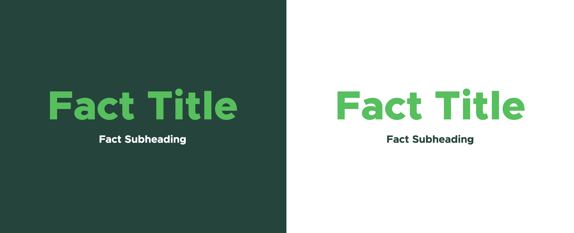
The Fact component is used to highlight an interesting data fact with some supporting text.

Component Information
Benefits
- The Fact component displays a large data fact (a number or short word) with brief supporting text inside of a box.
- A Fact may be set to link to another page. This is optional.
- A Fact is not placed on a page by itself. It is used inside of other components: Grid Container, Image Fact Grid or Text Fact Grid.
- Global Facts are also available for use across sites. Having Facts that serve site-wide or across sites ensures that the same Facts referenced in different locations use the same data, and that updates are made in all locations where a Fact is used.
- The minimalist text on background design helps provide some visual interest on grids when mixed with other types of components.
Example Use Cases
- Display the number of majors in a college and link to a page where prospective students can explore the programs.
- Highlight a program ranking.
- Emphasize a point of pride and link to a story with additional details.
- Create a visually interesting contact information page grid.
Frequently Asked Questions
Facts for a site are in the site’s Facts folder, which is inside of the site’s Data node. Facts also may be available from the Global Facts folder.
See Fact instructions to create site Facts.
Global Facts are created by University Communications and Marketing. Contact Comms.WebSupport@msu.edu to offer a suggestion for consideration.
No. The “Title — Image” field is only for preapproved SVG icons. Icons are sourced from https://fontawesome.com/.
If a new icon is needed, please contact University Communications and Marketing at Comms.WebSupport@msu.edu.
Instructions for Use
- Place an existing Fact in a Grid Component, Image Fact Grid component or Text Fact Grid component, following procedures for those components.
- Existing Facts available to use are in the site’s Data > Facts folder or in the Shared Sites > Global Facts folder.
- Content authors may create new Facts in the Content Editor in their site’s Data > Facts folder.
- Content authors may also create new Facts by choosing “Create new” when placing a Fact in the Image Fact Grid in Pages. Select the site Facts folder for the location.
- Data for a Fact can be added/edited in the Content Editor, directly in Pages or in Explorer.
- When creating a new Fact, be sure to test it in the Grid Container, the Image Fact Grid component and the Text Fact Grid component to ensure it will look good if and when it is reused on other site pages.
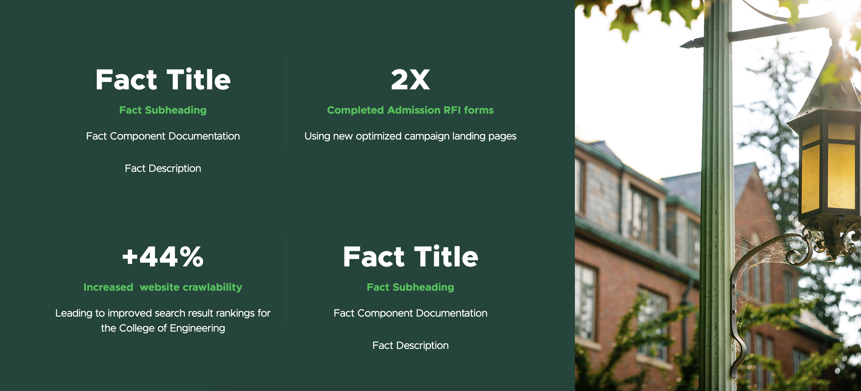
Facts used in an image fact grid on the Brand Studio Brand Strategy page.


Tool Use Guide
| Page Builder | Explorer | Content Editor | |
| Create a Fact | Optimal | - | - |
| Add a Fact to the page | Optimal | - | - |
| Add/edit Fact title | Optimal | Possible | Possible |
| Add/edit Fact subheading | Optimal | Possible | Possible |
| Add/edit Fact link | Optimal | Possible | Possible |
| Add/edit Fact image* | - | Possible | Optimal |
| Add/edit Fact description** | - | Possible | Possible |
* Fact image is only for approved SVG icons and only displays in the Text Fact Grid.
**Fact description only displays in an Image Fact Grid.
Documentation updated: July 23, 2025
Is there an issue with this documentation? Report it here.