What is a Component?
Components are the building blocks for web pages. Components hold content in data fields and then assign predesigned style to the content according to the type of component. Components are most commonly placed and edited in Page Builder. They can also be placed in Page Builder and then edited in Content Editor.
Component Workflow
The general workflow for using components is to:
- Create the page where the component will live.
- Create and place the new component(s) in Page Builder.*
- Add or edit component content in Page Builder.**
*A few components are used as layouts or containers that hold other components created in Page Builder. For example, the Two-Thirds Sublayout and the Grid Container components are meant to hold other components. These layout components are added in Page Builder, and then additional components are added into the layout cells. Layout components will not appear in the site Content Tree.
**Some components require using Content Editor to edit content. For example, Main Navigation content is edited in Content Editor. Links to PDFs are created in Content Editor. See specific component documentation for more information on each component.
Component Toolbar
When a component is selected and active on a page, the component toolbar will appear. The toolbar icons are as follows:
- Grab – Use to reposition the component.
- Select parent element – Use to select the next level component.
- Name – Use to identify the type of component selected.
- Move up and Move down – Use to move the component up or down one position.
- A/B/n Test Component – Use to initiate a version test on the component.
- AI – If available, use AI to generate content for the component.
- Swap – Use to change which data source is mapped to the component.
- Duplicate – Use to copy the component and data source.
Delete – Use to remove the component from the page layout. This does not delete the content item data.
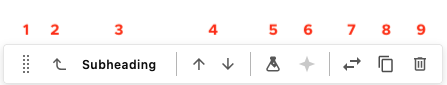
Figure 1: The component toolbar for a selected Subheading component. Numbers have been added to correspond to the icon legend listed above.
Instructions for Using Components
In Page Builder:
- In the site tree, locate the page where a component will be placed. Click the page name to select.
- Click Components on the left panel menu to switch to the Components tab.
- Locate the desired component in the Components menu.
- Click and drag the component tile onto the page and release where the component will be placed.
Quick tip: Dark and light purple lines will indicate where a component can be placed. Red lines and shading will appear if a component cannot be placed at the cursor’s location.
Assign content item:
- To use an existing content item, select it from the list and click Assign.
- To create a new content item:
Hover to the right of the Data table until an icon appears and click to select the “+” icon.
Note: Users may opt to nest the content under another item line, such as within an accordion tab, by instead clicking the “+” next to that line item.
- Click to select the appropriate content item type from the available list.
- Enter a name for the content item. The name must be unique within the page. Click away or hit the enter key to save the name.
- Click Assign.
- Edit content by following the relevant component documentation.
In Page Builder:
When working with an empty page or with components that can contain other components (i.e., Grid Container, Accordion tabs), placeholder cells will appear on the page. These are empty blocks where components can be added and are indicated by a purple “+” icon in a circle.
Note: In some cases, the placeholder cells and “+” icons will not appear until a specific component variant is selected in the Advanced styling panel of the right-side component menu.
- Click on the “+” icon where the component is to be added.
- Click to select the appropriate content item type from the available list.
- To use an existing content item, select it from the list and click Assign.
- To create a new content item:
Hover to the right of the Data table until an icon appears and click to select the “+” icon.
Note: Users may opt to nest the content under another item line, such as within an Accordion tab, by instead clicking the “+” next to that line item.
- Click to select the appropriate content item type from the available list.
- Enter a name for the content item. The name must be unique within the page. Click away or hit the enter key to save the name.
- Click Assign.
- Edit content by following the relevant component documentation.
Components can be moved using drag and drop or arrow icons.
Drag and Drop:
- Click to select the component. The component toolbar will appear.
Click and hold the icon on the left end of the toolbar (two columns of five dots) to grab the component.

Figure 2: The Grab icon on the component toolbar for a selected Subheading component can be used to drag and drop the component to a new location on the page. - Drag the component to a new location and release.
Note: Dark and light purple lines will indicate where a component can be placed. Red lines and shading will appear if a component cannot be placed at the cursor’s location.
Arrow Icons:
- Click to select the component. The component toolbar will appear.
Click the up or down arrow on the component toolbar to move the component above or below the nearest component. Arrows will only appear when there are components above or below the selected component.

Figure 3: The Move Up and Move Down icons on the component toolbar for a selected Subheading component can be used to move the component to a new location on the page. - Repeat as necessary.
- Click on the component in the content canvas to select it.
- On the right-side component menu, click the Design tab and click Styling to expand the panel.
Click the Spacing options to add indented padding around the component, if needed. Each option has an on (gray) or off (white) setting. The amount of padding cannot be adjusted.
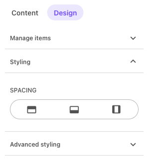
Figure 4: The Spacing panel on the Styling menu for a selected component can be used to add padding around the component. The left icon will add padding above the component. The middle icon will add padding below the component. The right icon will add padding to both sides of the component. These options can be combined, if desired. - Click Advanced styling to expand the panel.
- Adjust variant and component options, as necessary. See specific component documentation for details.
Follow specific component documentation for information on adding content to components placed on a page.
Tips for copying and pasting content into Sitecore:
- Strip formatting when pasting from other applications to avoid errant code, which can cause issues on the web page.
- If copying text from an email, check any hyperlinks to ensure they go directly to the desired page and are not routing through an email server. Email service links can expire and will break.
Remove or Delete Components
To Remove a Component from Displaying on a Page:
In Page Builder:
- Locate the page in the Content Tree (left pane).
- Click the page to select it.
- Locate the component to be removed. Click to select it. The component toolbar will appear.
- Click the Delete icon (i.e., trashcan).
Caution: Be sure the component is selected. The Component Toolbar should be visible. If a WYSIWYG toolbar is visible, the content within the component is selected. Clicking the Delete icon on the WYSIWYG toolbar will delete the content from the data source without removing the component from the page, and the content will be lost.
- Publish the page to push the changes live.
Note: Components removed from the page are still available as content items unless deleted in Content Editor.
To Fully Delete a Content Item:
Content items are the data sources that are assigned to, and displayed by, a component. Deleting a component from a page does not delete the content item data source.
In Content Editor:
- Locate the page in the Content Tree (left pane).
- Locate the content item. It should be located in the place it was assigned during content creation.
- Right click on the item name.
- Click Delete.
- Click OK.
- Click Save.
Note: If a user attempts to delete a content item in Content Editor that is in use in a website, a Breaking Links alert pop-up will appear. Users should stop and remove the content from any web pages before proceeding. Use the link options on the Breaking Links panel to view where existing content links are in place.
Documentation updated: May 29, 2026
Is there an issue with this documentation? Report it here.