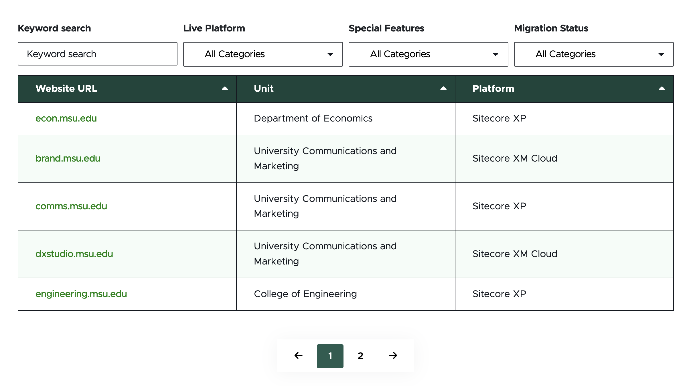
The Table component is an easy way to display tabular content on a page without having to work with HTML or CSS. The Table component can be used for simple, small tables without any additional functionality. It also can be used for larger tables with search, sort and filter options. The Table component is intended to provide text information in a fully responsive table with MSU brand styling.
Component Information
Benefits
- The Table component is used to present information in a table format.
- Tables can contain different amounts of content and have different levels of functionality.
- Table components can be used in the main body area of pages and in the left column of Two-Thirds Sublayout containers.
Template Data
Content options in content tab of right-side menu:
Column # Title: (single-line text)
- Text in this field creates the Column header for the numbered column.
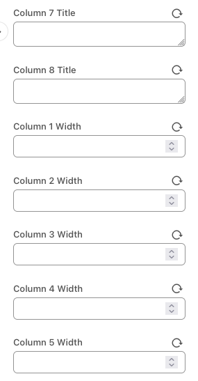
Column # Width (single-line text)
- This field accepts numbers only. The number sets the column’s width, represented as a percentage of the whole.
- The default value is blank.
- When all Column # Width fields are blank, the width of the Table columns will be equally divided. For example, if there are four columns each column will display at 25% of the full table width.
- When numeric values are added to the Column # Width fields, they represent the percentage of the width the column will take. If adding values to the fields, each column in use must have a number, and these numbers must add up to 100. For example: If using four columns, the column widths could be 20, 20, 20 and 40, but could not be 20, 20, 20 and blank.
Manage Items options in design tab of right-side menu:
+ Add new (button)
- Add additional table row(s)
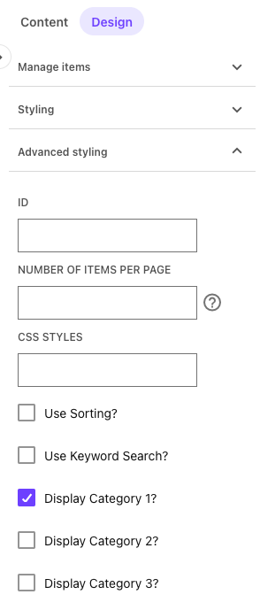
Advanced Styling options in design tab of right-side menu:
Number of Items per Page (single-line text)
- This field accepts numbers only.
- The default value is blank, which means there will be no pagination.
- If a number is entered, it will limit the number of Table rows per page to this number.
Use Sorting? (check box)
- When checked, table columns are sortable.
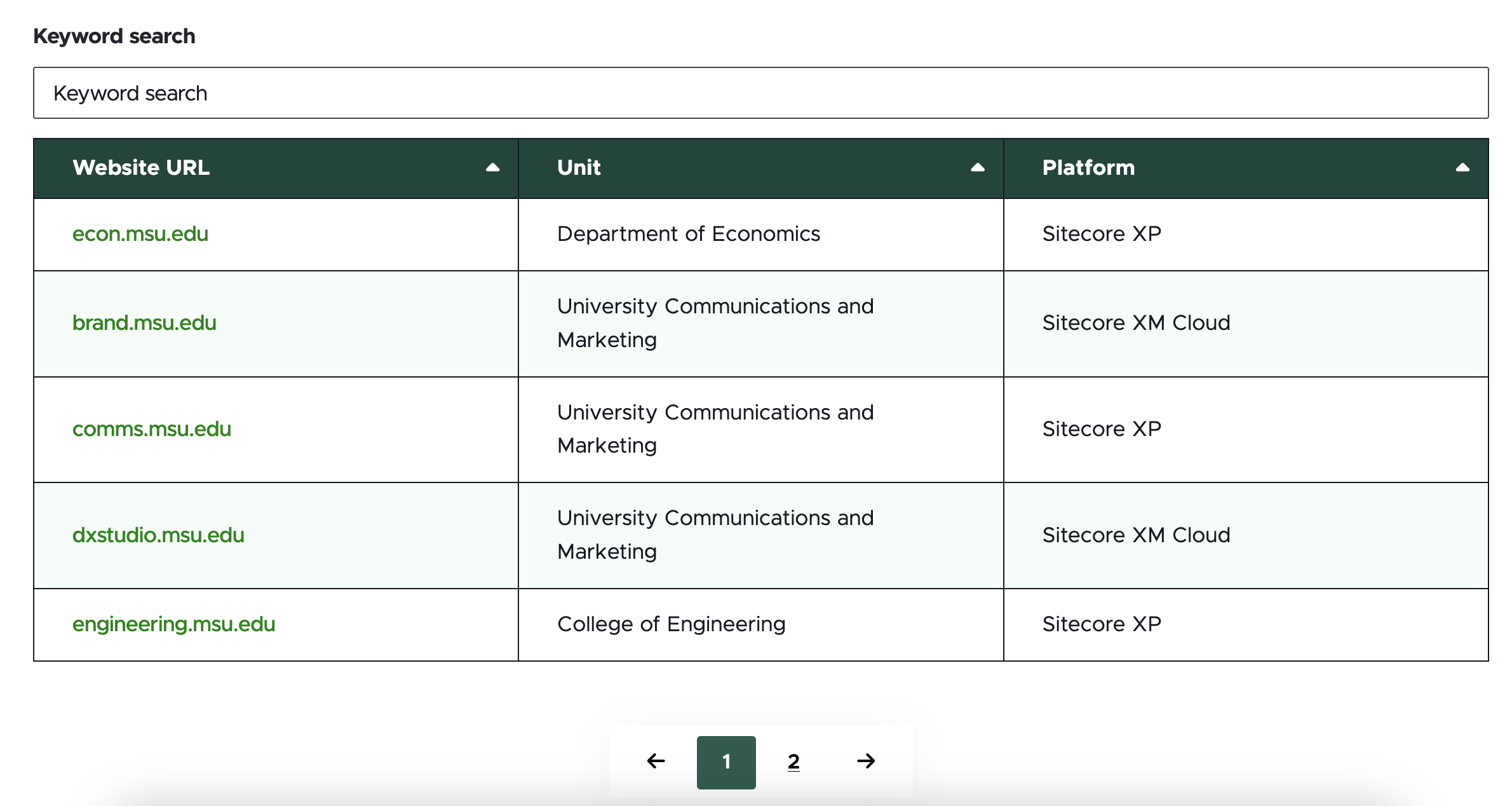
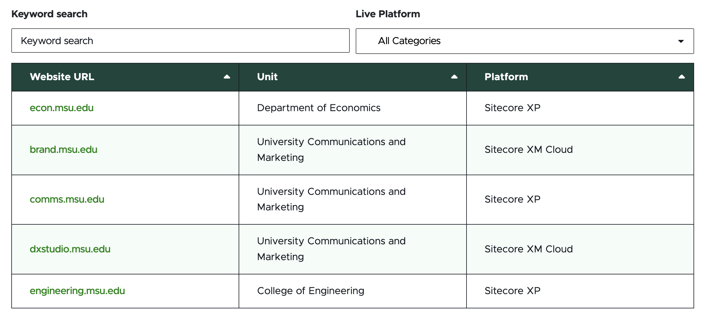
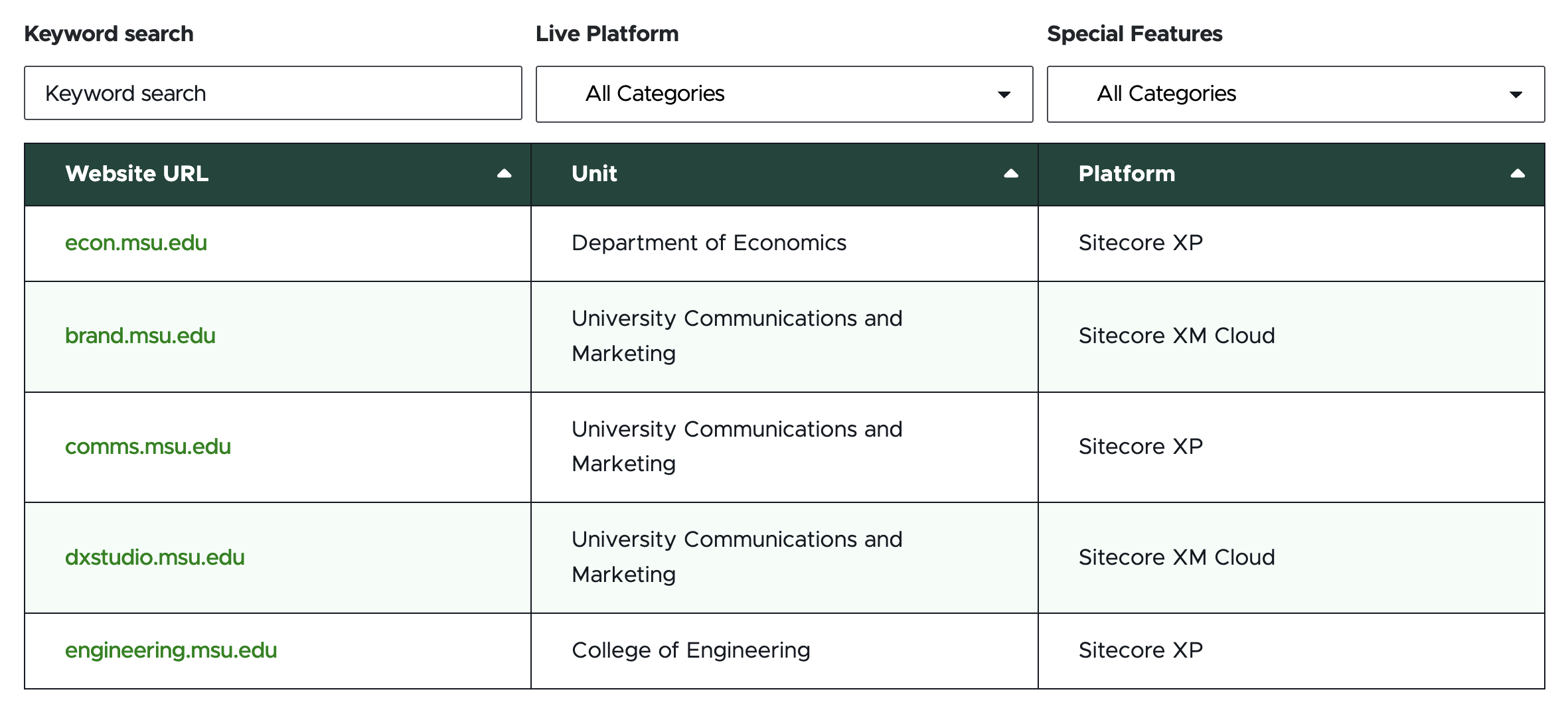
Use Keyword Search? (check box)
- When checked, a text-based Search box is added above the table.
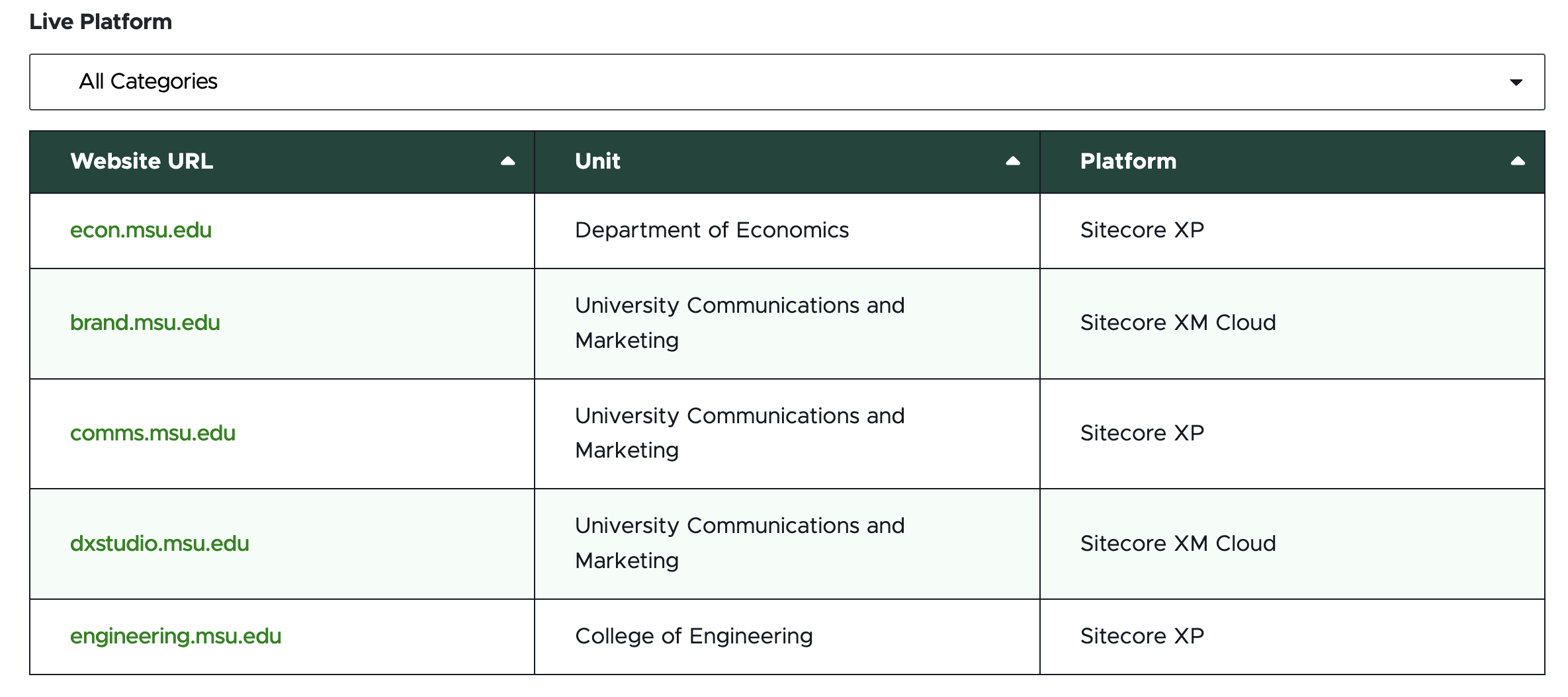
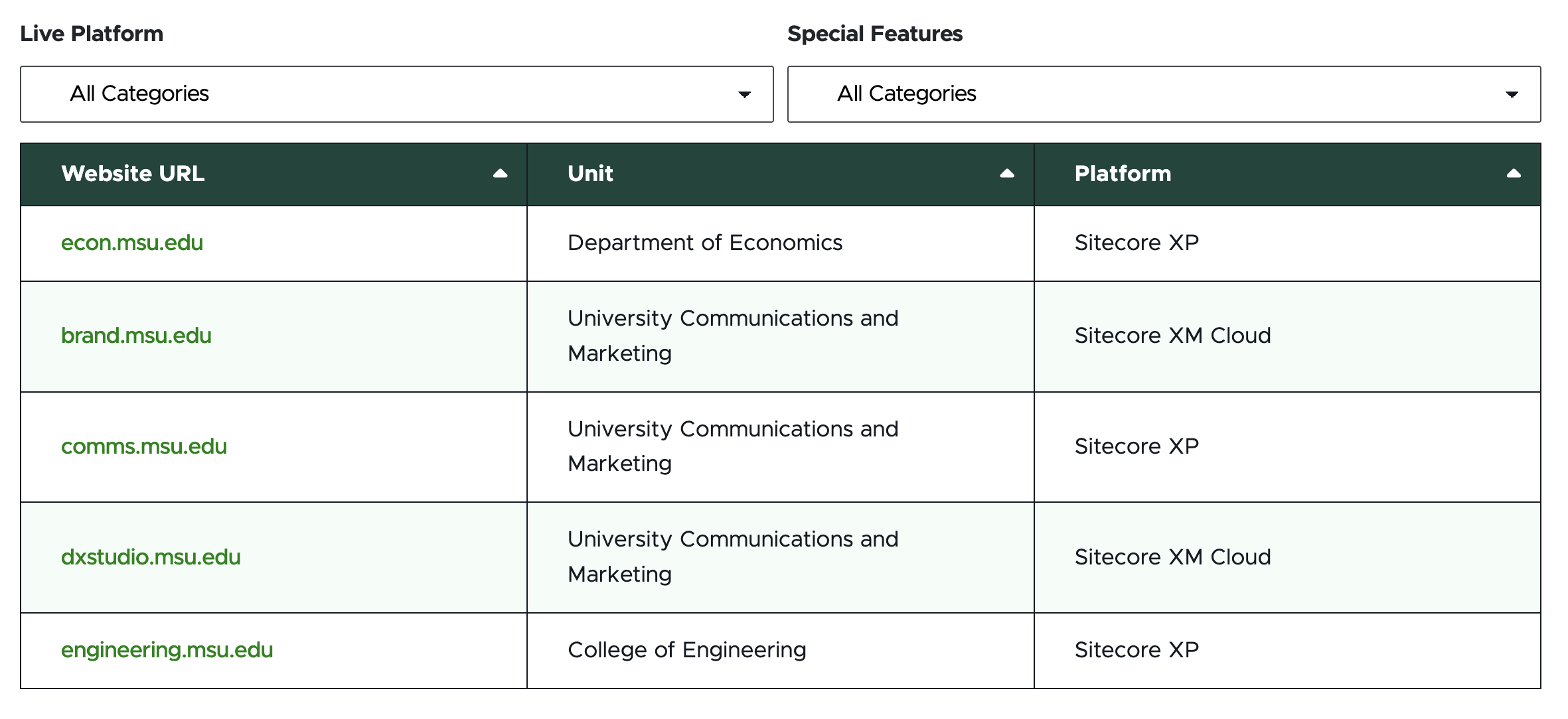
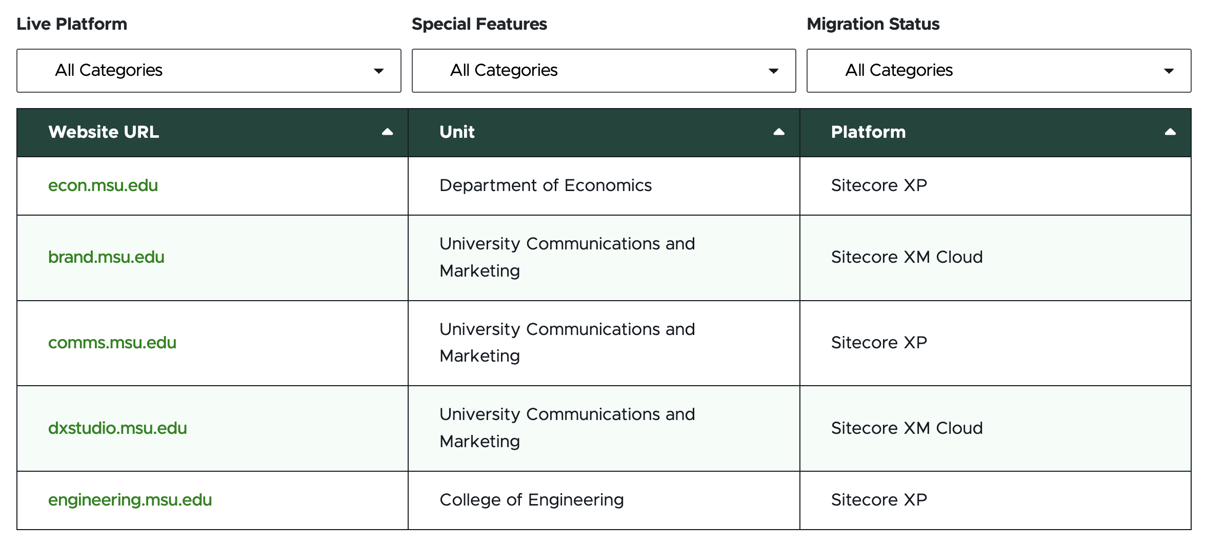
Display Category #?
- When checked, the respective category filter will appear above the table.
Column # Title: (single-line text)
- Text in this field creates the Column header for the numbered column.
- Empty column fields do not display. Fill columns in numeric order, starting with column 1.
Column # Width (single-line text)
- This field accepts numbers only. The number sets the column’s width, represented as a percentage of the whole.
- The default value is blank.
- When all Column # Width fields are blank, the width of the Table columns will be equally divided. For example, if there are four columns each column will display at 25% of the full table width.
- When numeric values are added to the Column # Width fields, they represent the percentage of the width the column will take. If adding values to the fields, each column in use must have a number, and these numbers must add up to 100. For example: If using four columns, the column widths could be 20, 20, 20 and 40, but could not be 20, 20, 20 and blank.
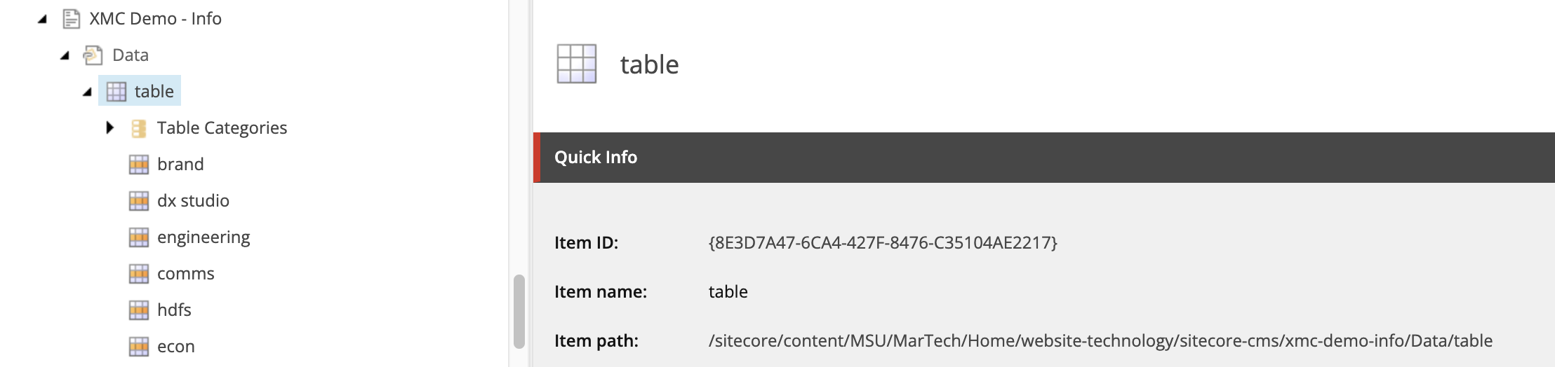
Specific Category items in the Content Tree, under Table Categories:
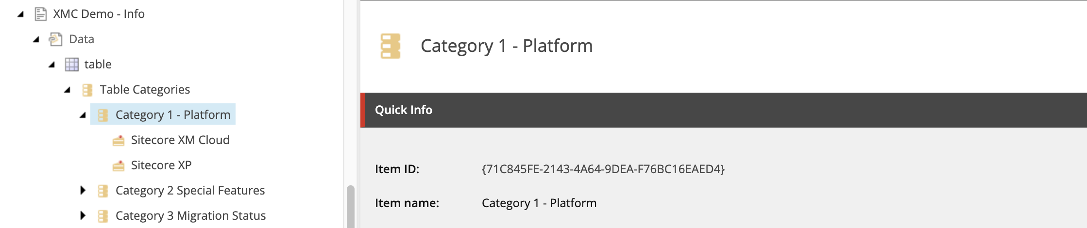
Title (single-line text)
- Category title text that displays above Category filter for the numbered category
Category value item selected in the Content Tree, under a Category:
Value (single-line text)
- Category value label
Table Column # (multi-line text)
- These text fields correspond to the cells in the table for the row. The number corresponds to the table column, reading left to right.
- Data entered here corresponds to the same fields in Page Builder. It is up to the content author which interface they prefer. Page Builder allows for viewing the table in a visual format while entering content.
- These fields allow for some basic HTML formatting tags:
- <b></b> for bold
- <i></i> for italic
- <a href=””></a> for links
Category 1 / 2 / 3 (selection field)
- Assign desired category values to the table row.
- To assign, click the category value in the “All” panel on the left for the appropriate category and click the > icon to move it to the “Selected” panel.
Frequently Asked Questions
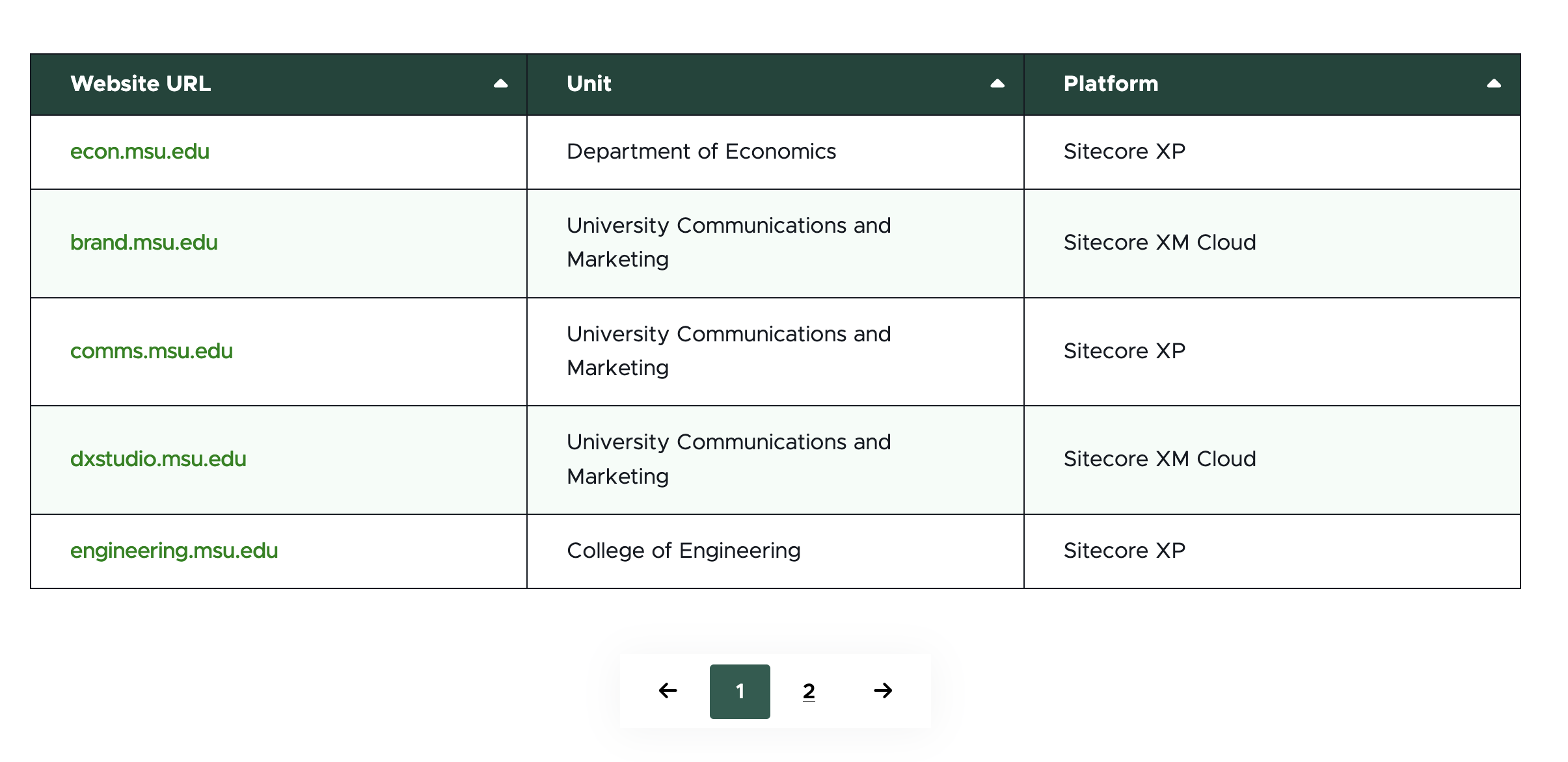
A table can have an unlimited number of rows. If including more than twenty rows, using pagination is recommended so the page is not too long.
A table can have one to eight columns.
Table cells can include text with limited HTML styling (bold, italic and link).
The Table component is added to the page in Page Builder. The majority of the initial setup is done in a combination of Content Editor and Page Builder. Row content can be added in Content Editor.
Instructions for Use
Some table settings must be configured in Page Builder, while others must be configured in Content Editor. Expand the tabs below to learn the appropriate tool and necessary steps for completing various table-related tasks. Publish in the workspace where changes are made. For example, if changes are made in Content Editor, publish them from Content Editor. If changes are made in Content Editor and Page Builder, publish from both spaces.
In Pages builder:
- Select the page in the Content Tree. The page must use a basic Page or Two-Thirds Page layout.
- Click the “+” button in any full-width area Placeholder box below the Breadcrumb links.
- Select Table component from list.
Alternate method:
- Click Components tab at top of the Content Tree.
- Locate Table component.
- Drag the Table component to any empty full-width or left column placeholder area of the page below the Breadcrumb links.
Assign data to the Table component:
- In the Assign content item window, choose the component data to use:
- For existing components, select them from the page’s Data folder or from the appropriate shared folder.
- For new components, select “+”, type in the component title and hit Enter.
- Once the component data is selected, click on the Assign button in the lower right corner.
When added to the page, the Table component has a Categories folder and an initial Table Row with one cell.
In Page Builder:
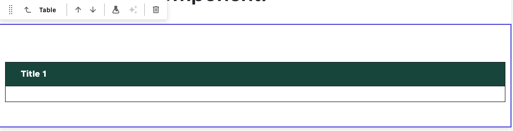
- Click the Table component to select it. The component will be outlined with a purple box, and the component toolbar will appear.
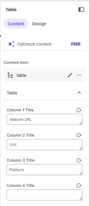
- On the right-side panel, choose the Content tab.
- Enter titles in the Column # Title field(s) for all columns needed in the table. Work in numeric order, starting with Column 1. Tables may have up to eight columns.
- (Optional) Enter a number in the Column # Width field(s) to manually adjust the width of the columns. If numbers are added, a number must be added to represent the percent of total width assigned to each column in use, and the numbers must total 100.
In Page Builder:
- Click the Table component to select it. The component will be outlined with a purple box, and the component toolbar will appear.
- On the right-side panel, choose the Design tab.
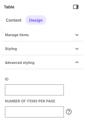
- Expand the Advanced Styling section.
- Add a number in the “Number of Items Per Page” field. This controls the number of table rows that appear on a page of the table. If a table contains more rows than this number, pagination controls will appear below the table.
In Page Builder:
- Click the Table component to select it. The component will be outlined with a purple box, and the component toolbar will appear.
- On the right-side panel, choose the Design tab.
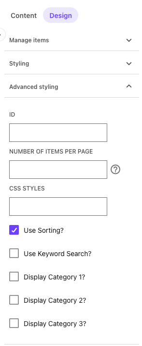
- Expand the Advanced Styling section.
- Check the box next to “Use Sorting?”
In Page Builder:
- Click the Table component to select it. The component will be outlined with a purple box, and the component toolbar will appear.
- On the right-side panel, choose the Design tab.
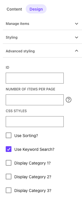
- Expand the Advanced Styling section.
- Check the box next to “Use Keyword Search?”
First, filter categories and values must first be created in either Content Editor or Content mode within Page Builder. Then rows should be tagged with the appropriate category value(s), and finally filters should be activated in Page Builder.
Create categories in Page Builder:
- Navigate to the page in the Sitemap list on the left side panel by expanding Home > page name.
- Click the quill icon on the local toolbar to open Content mode.
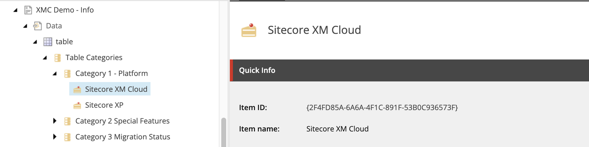
- Navigate to the table component and locate Table Categories.
- Tables can have up to three filter categories. Each filter category can have multiple values. For example, a category of “Platform” can have values of “SitecoreAI,” “Content Hub” and “Sprinklr.” To rename a category from the default "Category #," click the Category item in the Content tree and update the text in the Title field.
- To add value(s) to the category filter:
- Click the “…” icon to the right of the Category in the Content tree.
- Click Create item.
- Click Category and then Select.
- Enter a name for the category value and hit Enter.
- Click on the category value item in the Content tree and enter a value for the category in the Value field and click away from the field to save the entry.
Alternatively, in Content Editor:
- If the Table component does not appear in the Content Tree, close the page’s Data node and expand it again to refresh the Content Tree. Then in the Content Tree, expand Content > MSU > site name > Home > page name > Data or wherever the component was added.
- Locate and expand the Table component in the Content Tree.
- Expand the Table Categories folder.
- Click on the filter to be edited. Tables can have up to three filter categories. Each filter category can have multiple values. For example, a category of “Platform” can have values of “SitecoreAI,” “Content Hub” and “Sprinklr.”
- Enter a label for the category in the Title field.
- Optional: Users may also rename the Category field in the Content Tree to aid in remembering which Category # applies to the Category label. It is recommended that users retain the number in the category name in the Content Tree because other parts of the system refer to categories by their number.
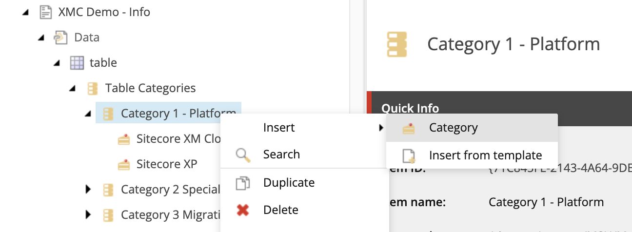
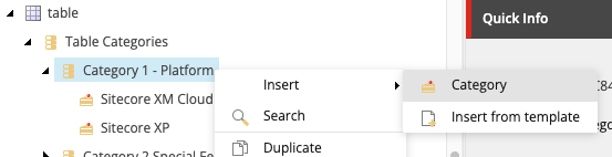
- Add value(s) to the category filter:
- Right click on the category name in the Content Tree to open the flyout menu.
- Click Insert and Category.
- Enter a name for the new category value and click OK.
- Enter a label for the value in the Value field on the new item. The value will default to the name of the Category item entered when it was created, but this label can be changed.
- Click Save.
Activate filters in Page Builder:
- Return to the Editor mode tab in Page Builder.
- Refresh the canvas to pull in the changes made in Content Editor or Content mode.
- Click the Table component to select it. The component will be outlined with a purple box, and the component toolbar will appear.
- On the right-side panel, choose the Design tab.
- Expand the Advanced Styling section.
- Check the box next to “Display Category #?” for each category that should be enabled as a displayed filter.
Rows can be added to a table in either Page Builder or Content Editor.
You must use Content Editor to add content to the cells within a row and to apply filter tags to the row. Many users find it easiest to use Content Editor when adding rows because the cell content and tagging can be done within the same step.
Add and Manage Rows
In Page Builder:
- Click the Table component to select it. The component will be outlined with a purple box, and the component toolbar will appear.
- On the right-side panel, choose the Design tab.
- Expand the Manage Items section.
- To add a row: Click the + Add new button and click Table Row. Rename the row and hit Enter to save the change.
- To rename a row: Click the “…” icon to the right of the row name, select Rename from the popup menu, enter a new name in the name field and hit Enter to save the change.
- To reorder rows: Click the “…” icon to the right of the row name, select Move up or Move down from the popup menu, as appropriate. Repeat as needed.
- To delete a row: Click the “…” icon to the right of the row name, select Delete from the popup menu and click Yes.
Alternatively in Content Editor:
- If the Table component does not appear in the Content Tree, close the page’s Data node and expand it again to refresh the Content Tree. Then in the Content Tree, expand Content > MSU > site name > Home > page name > Data or wherever the component was added.
- Locate and expand the Table component.
- To add a row: Right-click on the table name, click Insert and click Table Row. Enter a row name and click OK.
- To rename a row: Right-click on the row name, click Rename, enter a new name and click OK.
- To reorder rows: Click and drag a row item to another spot on the Content Tree, being careful to avoid nesting it or moving it outside of the table. Click OK.
- To delete a row: Right-click on the row name, click Delete and click OK.
Add Content or Category Tags to Cells in a Row
In Page Builder:
- Navigate to the page in the Sitemap list on the left side panel by expanding Home > page name.
- Click the quill icon on the local toolbar to open Content mode.
- Navigate to the table component and the specific row in the Content tree in the left side panel.
- Enter cell content in each necessary column field.
- Optional: Select category tag(s) for the row in the Category # fields.
- Repeat for additional rows, as needed.
- Click the paper and pencil icon on the local toolbar to return to Editor mode.
- Reload the canvas in Page Builder to load the changes.
- Click Actions and Submit to send the changes to the publishing workflow.
Alternatively, in Content Editor:
- If the Table component does not appear in the Content Tree, close the page’s Data node and expand it again to refresh the Content Tree. Then in the Content Tree, expand Content > MSU > site name > Home > page name > Data or wherever the component was added.
- Locate and expand the Table component and locate the row.
- Enter text in the necessary columns. Take care to properly align the column content to the column headings assigned in Page Builder.
Quick tip: To add basic styling, wrap text in the following HTML tags:
- Bold: <b>InsertTextHere</b>
- Italic: <i>InsertTextHere</i>
- Link: <a href=”https://website-url-example.edu”>InsertTextHere</a>
- Scroll to the Category 1, Category 2 and Category 3 fields. Select an option from the dropdown(s) for each category that will be tagged for this row.
- Click Save.
- Reload the canvas in Page Builder to load the changes.
- Click Actions and Submit to send the changes to the publishing workflow.
Publish the Table Item
Tables have a quirk in that the component needs to be submitted for publishing in addition to submitting the page that it appears on.
If working in Content Editor:
- If the Table component does not appear in the Content Tree, close the page’s Data node and expand it again to refresh the Content Tree. Then in the Content Tree, expand Content > MSU > site name > Home > page name > Data or wherever the component was added.
- Locate and expand the Table component.
- After configuration and content edits are complete, confirm all row items have been finalized. Click the row in the Content Tree, the Review tab and click Check In, if it appears.
- Click on the Table item in the Content Tree. Click the Review tab and select Check In from the menu.
- Return to Page Builder.
- Reload the canvas in Page Builder to load the changes.
- Click Actions and Submit to send the changes to the publishing workflow.
Examples
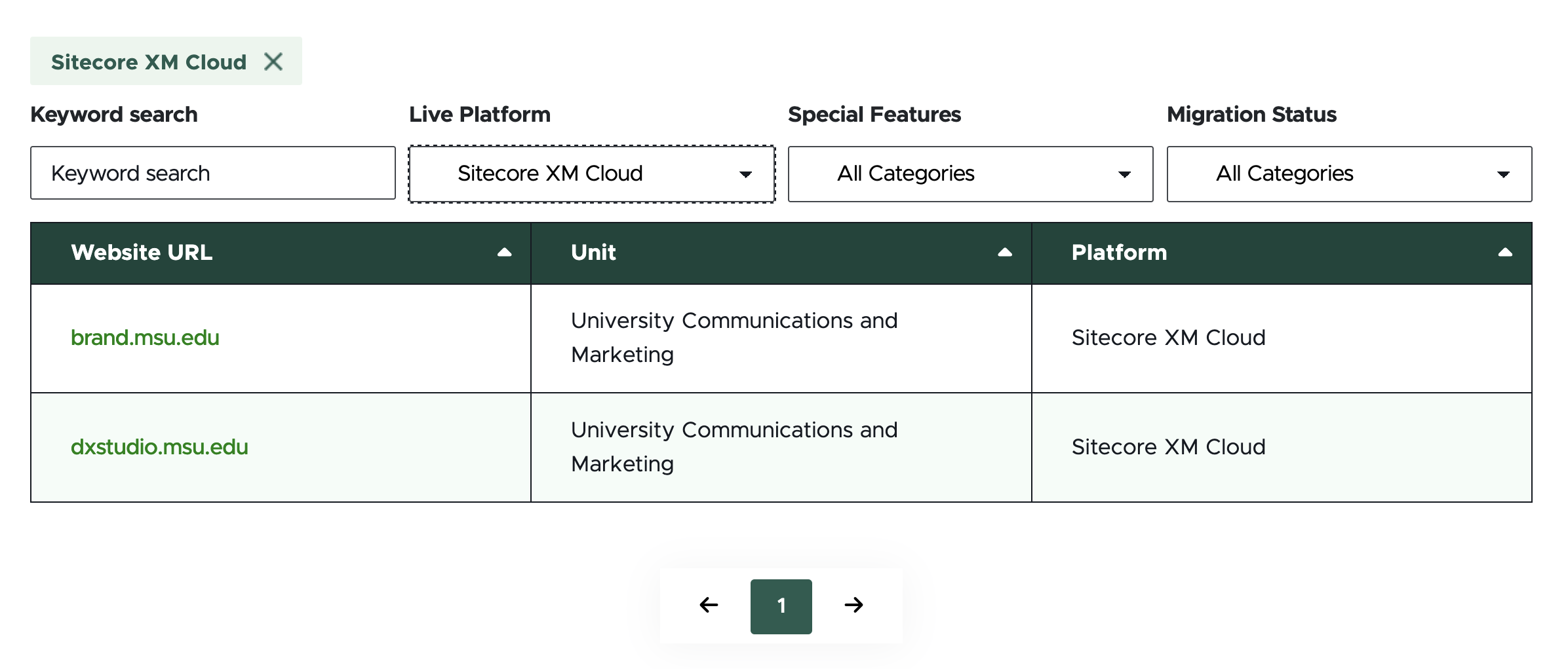
For a live demo of the Table component, view the Demo: Information-Focused Content Components page.
Note: All rows within the table will need to be tagged, as appropriate, to the enabled Category tags to display on filtered results. This can be done in Content Editor or Content mode of Page Builder.