• Jump to Header
  • Jump to Main Content
  • Jump to Footer
Michigan State University
Digital Experience Studio

University Communications and Marketing

Digital Experience Studio

  • Experience Program
    • Website Project Process
    • Working with a Vendor
    • Glossary
    • Taxonomy Data Dictionary
  • |
  • Experience Design
    • Website Strategy
    • Website Structure
    • Information Architecture and Navigation
    • User-Centered Design Conventions
    • Common UX Issues
    • Enterprise Design System
    • Content Planning
    • Creating Accessible Content
    • Taxonomy and Filters
  • |
  • Website Technology
    • Web Standards
    • Search Engine Optimization
    • Cascade CMS
    • Sitecore CMS
    • Content Hub Basics
    • Content Hub DAM
    • Content Hub Operations

    SitecoreAI

    Sitecore user login
  • |
  • Social Media
    • Alt Text Bookmarklet
    • Meta Ad Pixel
    • Social Media and Web Integration
    • Sprinklr

    Sprinklr

    Sprinklr user login
  • |
  • Analytics
    • Google Analytics (GA4)
    • Testing
    • Data Visualization

    Google Analytics

    Google Analytics user login
  • |
  • News and Events
    • News and Updates
    • Events and Trainings
Digital Experience Studio

University Communications and Marketing

  • Experience Program
  • Experience Design
  • Website Technology
  • Social Media
  • Analytics
  • News and Events

< Experience Program

  • Website Project Process
  • Working with a Vendor
  • Glossary
  • Taxonomy Data Dictionary

< Experience Design

  • Website Strategy
  • Website Structure
  • Information Architecture and Navigation
  • User-Centered Design Conventions
  • Common UX Issues
  • Enterprise Design System
  • Content Planning
  • Creating Accessible Content
  • Taxonomy and Filters

< Website Technology

  • Web Standards
  • Search Engine Optimization
  • Cascade CMS
  • Sitecore CMS
  • Content Hub Basics
  • Content Hub DAM
  • Content Hub Operations

SitecoreAI

Sitecore user login

< Social Media

  • Alt Text Bookmarklet
  • Meta Ad Pixel
  • Social Media and Web Integration
  • Sprinklr

Sprinklr

Sprinklr user login

< Analytics

  • Google Analytics (GA4)
  • Testing
  • Data Visualization

Google Analytics

Google Analytics user login

< News and Events

  • News and Updates
  • Events and Trainings
Digital Experience Studio > Website Technology > Sitecore CMS > Sitecore Component Guide >

Story Card

Story Card

Story Cards allow content authors to display a story or other webpage from the same website within the standard story card layout. Use this component to promote content that lives inside the current website without recreating that content.
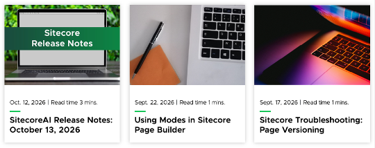
Three story cards appear in a row. The left story shows a photo of a laptop sitting on a table in front of green trees. A green banner with white text over the image reads “Sitecore Release Notes.” Below the image, small text reads “Oct. 12, 2026 | Read time 3 mins.” followed by medium bold text reading “SitecoreAI Release Notes: October 13, 2026.” The middle story shows a photo of a laptop keyboard sitting next to orange paper and a black pen. Below the image, small text reads “Sept. 22, 2026 | Read time 1 mins.” followed by medium bold text reading “Using Modes in Sitecore Page Builder.” The right story shows a photo of a nearly closed laptop with a glowing orange and purple screen. Below the image, small text reads “Sept. 17, 2026 | Read time 1 mins.” followed by medium bold text reading “Sitecore Troubleshooting: Page Versioning.”
Figure 1: Three Story Cards appear on the page.

Component Information

  • Usage
  • Benefits

    Story Cards are best suited for: 

    • Promoting a story from the same website on a different page.
    • Linking to website story content within the context of another page on the same website.
    • Card content is generated automatically based on the story’s Open Graph data.

    Live Examples

    • Demo: Grid Components
  • Best Practices
  • Component Options and Limitations

    • The Story Card uses information made available by the story template data on the destination page to populate the card.
    • Fields that are not completed in the story template data and open graph data, such as Read Time, will remain empty.
    • Content authors should edit the respective data fields within a specific story or page to update the appearance of the story card. Keep in mind that any changes to the story will impact all story cards and external story cards that may be using the story as a data source.

    Guidelines

    • Before publishing, confirm the card displays the expected title, image, description and destination URL.
  • Expected Behavior
    • Card information will display based on data pulled from the destination page.
    • On desktop view, multiple Story Cards will appear in a row. Up to three stories appear per row.
    • On mobile view, multiple Story Cards will stack.
    • If an Open Graph field is incomplete, the data field will not display and will appear empty in Sitecore. 
  • Related Information
  • Similar Components:

    • External Story Card
    • Mixed Content

    Instructions for Use

    Add a Story Card Component to a Page

    In Page Builder:

    1. Select the page in the Content Tree.
    2. Click “+” button in any Placeholder box below the Breadcrumb links.
    3. Select Media Story Layout component from the list. It appears in the Containers section.
    4. Click “+” button in the Media Story Layout component.
    5. Click Story Card.
    6. Expand the content item list to locate the desired story page. Click to select the page and click Assign.

    Alternate method:

    1. Click Components tab at top of the Content Tree.
    2. Locate the Media Story Layout component in the Containers section.
    3. Drag the Media Story Layout component to any empty placeholder area in the main area of the page below the Breadcrumb links.
    4. Click “+” button in the Media Story Layout component.
    5. Click Story Card.
    6. Expand the content item list to locate the desired story page. Click to select the page and click Assign.
    Add Additional Story Cards

    To add additional Story Card components to the same Media Story Layout container:

    1. Click Components tab at top of the Content Tree.
    2. Locate the Story Card component in the Grid Components section.
    3. Drag the Story Card component to the Media Story Layout. A purple line will indicate where the component will be placed. Stories are stacked from left to right and top to bottom.
    4. Follow the steps above to select the story data source.

    Users may place multiple Media Story Layout containers on the same page. Story Cards and External Story Cards may be combined within the same Media Story Layout container.

    Tool Use Guide


    Documentation updated: Oct. 22, 2026

    Is there an issue with this documentation? Report it here.

    MSU Tools and Resources

    • A to Z Index
    • Find People
    • Email
    • Tech Support
    • Social Media Directory

    Communications Resources

    • University Communications and Marketing
    • University Trademarks and Licensing
    • MSU Brand Studio
    • MSU Editorial Style Guide
    • MSU Photos

    Contact us

    517-355-7505

    Address

    Michigan State University
    408 West Circle Drive
    East Lansing, MI 48824

    Follow Us

    • Visit our Facebook page
    • Visit our page on X
    • Visit our Instagram page
    • Visit our LinkedIn page
    • Visit our YouTube page
    • Visit our TikTok page

    If you're having accessibility issues, please let us know.

    • Contact Information|
    • Site Map|
    • Privacy Statement|
    • Site Accessibility|
    • Call MSU: (517) 355-1855|
    • Visit: msu.edu|
    • Notice of Nondiscrimination|

    SPARTANS WILL|© Michigan State University|