Mixed Content Containers and Components
Mixed Content containers add placeholder cells that hold a variety of types of content components. There are two types of Mixed Content containers: Mixed Content Full-Bleed, which takes up the entire page width, and Mixed Content Grid, which takes up the width of the content area. Each has multiple variants, detailed below.
Mixed Content components are placed in Mixed Content containers. Mixed Content components enable content authors to combine a headline, description text, a call to action, and image or YouTube video into one content block.
Component Information
Benefits
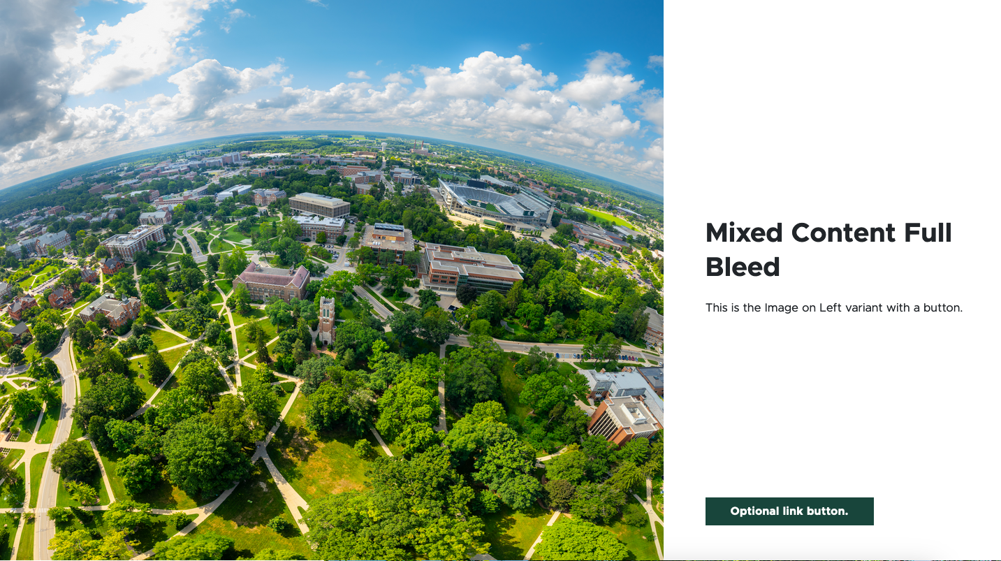
- The Mixed Content Full Bleed container allows the content author to provide an image or video, a title, descriptive text and a call-to-action button in a component spanning the entire width of the page.
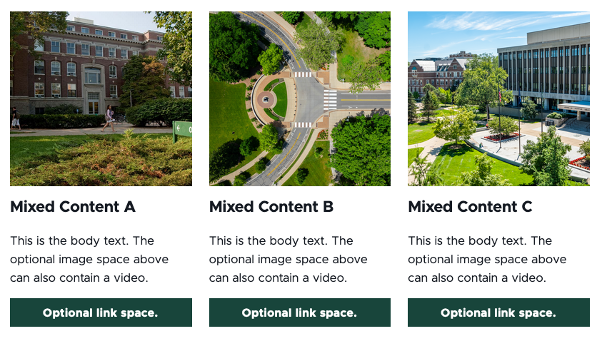
- The Mixed Content Grid container allows the content author to combine image or video, a title, descriptive text and a call to action in a variety of layouts, adding visual interest to the page.
- All fields are optional. Any field left empty will not display.
Example Use Cases
- Construct a visually interesting page with calls to action to various sections of a website.
- Create calls to action to link to recommended resources and specific pages within a website.
- Highlight images or video with accompanying text and a link to related information.
Live Examples
Template Data
Design tab:
Variant (dropdown)
- Image on Left (default)
- Image on Right
Advanced Styling options:
Page Anchor ID (single line text)
- Creates an anchor to the component which can be linked to using an anchor link
Component fields:
Image
- Upload image
- Browse media library
- Optional field
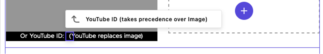
YouTube ID (single line text)
- Enter the video ID characters from the end of a YouTube video URL
- The YouTube ID field overrides any image. Leave empty to display an image.
- Optional field
Title (single line text)
- Text that appears as the headline in the component
- Optional field
Description (multi line text)
- Text that appears as body copy in the component.
- Optional field
CTA
- Internal
- External
- Media
Title (single line text)
- Text that appears as the headline in the component.
- Optional field.
Description (multi line text)
- Text that appears as body copy in the component.
- Optional field.
Image
- Upload image
- Browse media library
- Optional field.
YouTube ID (single line text)
- Enter the video ID characters from the end of a YouTube video URL.
- The YouTube ID field overrides any image. Leave empty to display an image.
- Optional field.
CTA (choose type)
- Internal
- External
- Media
Design tab
Variant (dropdown)
- 1 Column
- 2 Columns
- 3 Columns
Advanced Styling options
Image Size (dropdown)
- Large
- Medium
- Small
Page Anchor ID (single line text)
- Creates an anchor to the component which can be linked to using an anchor link
Eyebrow Text (single line text)
- Small text that appears at the top of the component
Title (single line text)
- Text that appears as the headline in the component.
- Optional field.
Description (multi line text)
- Text that appears as body copy in the component.
- Optional field.
Image
- Upload image
- Browse media library
- Optional field.
YouTube ID (single line text)
- Enter the video ID characters from the end of a YouTube video URL.
- The YouTube ID field overrides any image. Leave empty to display an image.
- Optional field.
CTA (choose type)
- Internal
- External
- Media
Title (single line text)
- Text that appears as the headline in the component
- Optional field
Description (multi line text)
- Text that appears as body copy in the component
- Optional field
Image
- Upload image
- Browse media library
- Optional field
YouTube ID (single line text)
- Enter the video ID characters from the end of a YouTube video URL.
- The YouTube ID field overrides any image. Leave empty to display an image.
- Optional field
CTA (choose type)
- Internal
- External
- Media
Frequently Asked Questions
When dragging a component from the Components list, be sure that “mainbody” displays before the component is dropped into the page.
From a public video page, the video ID is the string of characters that appear after “watch?v=” in the video URL (available in the browser URL bar or from the Share link option on YouTube). If the video is in a list, do not include the character after the video ID starting with “&list=.”
From the Video Details pane on an owned YouTube channel, the video ID is the string of characters at the end of the Video link, displayed under the preview panel on the right side of the Video details page.
Instructions for Use
In Page Builder:
- Select the page in the Content Tree. The page must use a basic Page layout.
- Click the “+” button in any full-width area Placeholder box below the Breadcrumb links.
- Select Mixed Content Full Bleed container from list.
Alternate method:
- Click Components tab at top of the Content Tree.
- Locate Mixed Content Full Bleed container.
- Drag the Mixed Content Full Bleed container to any empty full-width placeholder area of the page below the Breadcrumb links.
Choose a variant:
- Click the Design tab and select a variant from the Variant drop-down list:
- Image on Left
- Image on Right
In Page Builder:
- Select the page in the Content Tree.
- Click the “+” button in any Placeholder box below the Breadcrumb links.
- Select Mixed Content Grid container from list.
Alternate method:
- Click Components tab at top of the Content Tree.
- Locate Mixed Content Grid container.
- Drag the Mixed Content Grid container to any empty placeholder area of the page below the Breadcrumb links.
Choose a variant:
- Click the Design tab on the right side.
- Select a variant from the Variant drop-down list:
- 1 Column
- 2 Columns
- 3 Columns
Assign a component:
- Select a Mixed Content container.
- Click the “+” in the cell placeholder.
- Choose the available component.
- Mixed Content 1 Column will appear when adding content to a Mixed Column Grid container 1 Column variant.
- Mixed Content will appear when adding content to a Mixed Column Grid container 2 Column or 3 Column variants or the Mixed Content Full Bleed container.
Alternative method:
- Open the Components menu.
- Locate the desired component under the Grid Components section of the menu.
- Click and drag to drop it in the appropriate column.
Assign content to the Mixed Content component:
- In the Assign content item window, choose the component data to use:
- For existing components, select them from the page’s Data folder or from the appropriate shared folder.
- For new components, select Create new, type in the component title and hit Enter.
- Once the component data is selected, click on the Assign button in the lower right corner.
- To add a title, enter text in the Title field.
- To add additional text, enter text in the Description field.
- To add a link, click on the text on the button and use the right-side panel to set the Link Type, Link Text (what appears on the button) and URL (the link destination). Optional parameters are available to have the link open in a new window (appropriate when linking to a document or PDF).
- Adjust settings in the right panel, as needed.
- To add an image, click the image placeholder and use the right-side panel to add an image. Click Browse media library, locate the image in Media Library, Content Hub or upload an image, select the image and click Add selected.
- To add a video thumbnail to the image space, enter a YouTube video ID to the YouTube ID field below the image. Take care not to add extra spaces or characters when pasting a copied ID.
In Page Builder:
- Click the dropdown arrow to the right of the Sitecore XM Cloud icon in upper left.
- Select Content Editor. It opens in a new browser tab.
In Content Editor:
- If the Mixed Content component does not appear in the Content Tree, close the page’s Data node and expand it again to refresh the Content Tree.
- In the Content Tree, expand Content > MSU > site name > Home > page name > Data or wherever the component was added.
- Locate and expand the Mixed Content component.
- Use the file location tool to select an image.
- Add text to necessary fields.
- Click Save.
- Return to Page Builder.
In Page Builder:
- Refresh the canvas.
- Click Actions and Submit to send the changes to the publishing workflow.
For a live demo of Mixed Content Grid and Mixed Content Full Bleed components, view the Demo: Two-Thirds Layout and Mixed Content Components page.
Image Specifications
Sketch Link: Mixed Content
Mixed Content – One Column
- Desktop – Width: 555px | Height: varies by image
- Mobile – Width: full container / 305px | Height: 300px
- Recommended size – Width: 600px | Height: 400px
Mixed Content – Two Column
- Desktop – Width: 555px | Height: 384px
- Mobile – Width: full container / 305px | Height: 300px
- Recommended size – Width: 600px | Height: 400px
Mixed Content – Three Column
- Desktop – Width: 360px | Height: 245px
- Mobile – Width: full container / 305px | Height: 300px
- Recommended size – Width: 600px | Height: 400px
Note: