Jump to HeaderJump to Main ContentJump to Footer
Michigan State University
Digital Experience Studio

University Communications and Marketing

Digital Experience Studio

  • Experience Program
    • Website Project Process
    • Working with a Vendor
    • Glossary
    • Taxonomy Data Dictionary
  • |
  • Experience Design
    • Website Strategy
    • Website Structure
    • Information Architecture and Navigation
    • User-Centered Design Conventions
    • Common UX Issues
    • Enterprise Design System
    • Content Planning
    • Creating Accessible Content
    • Taxonomy and Filters
  • |
  • Website Technology
    • Web Standards
    • Search Engine Optimization
    • Cascade CMS
    • Sitecore CMS
    • Content Hub Overview
    • Content Hub DAM
    • Content Hub Operations

    SitecoreAI

    Sitecore user login
  • |
  • Social Media
    • Alt Text Bookmarklet
    • Meta Ad Pixel
    • Social Media and Web Integration
    • Sprinklr

    Sprinklr

    Sprinklr user login
  • |
  • Analytics
    • Google Analytics (GA4)
    • Testing
    • Data Visualization

    Google Analytics

    Google Analytics user login
  • |
  • News and Events
    • News and Updates
    • Events and Trainings
Digital Experience Studio

University Communications and Marketing

  • Experience Program
  • Experience Design
  • Website Technology
  • Social Media
  • Analytics
  • News and Events

< Experience Program

  • Website Project Process
  • Working with a Vendor
  • Glossary
  • Taxonomy Data Dictionary

< Experience Design

  • Website Strategy
  • Website Structure
  • Information Architecture and Navigation
  • User-Centered Design Conventions
  • Common UX Issues
  • Enterprise Design System
  • Content Planning
  • Creating Accessible Content
  • Taxonomy and Filters

< Website Technology

  • Web Standards
  • Search Engine Optimization
  • Cascade CMS
  • Sitecore CMS
  • Content Hub Overview
  • Content Hub DAM
  • Content Hub Operations

SitecoreAI

Sitecore user login

< Social Media

  • Alt Text Bookmarklet
  • Meta Ad Pixel
  • Social Media and Web Integration
  • Sprinklr

Sprinklr

Sprinklr user login

< Analytics

  • Google Analytics (GA4)
  • Testing
  • Data Visualization

Google Analytics

Google Analytics user login

< News and Events

  • News and Updates
  • Events and Trainings
Digital Experience Studio > Website Technology > Sitecore CMS > Sitecore Component Guide >

Footer

MSU Tools and Resources

  • A to Z Index
  • Find People
  • Email
  • Tech Support
  • Social Media Directory

Communications Resources

  • University Communications and Marketing
  • University Trademarks and Licensing
  • MSU Brand Studio
  • MSU Editorial Style Guide
  • MSU Photos

Contact us

517-355-7505

Address

Michigan State University 408 West Circle Drive East Lansing, MI 48824

Follow Us

  • Visit our Facebook page
  • Visit our page on X
  • Visit our Instagram page
  • Visit our LinkedIn page
  • Visit our YouTube page
  • Visit our TikTok page

If you're having accessibility issues, please let us know.

Know MoreTransparency Reporting: Budget & Salary/Compensation
  • Contact Information|
  • Site Map|
  • Privacy Statement|
  • Site Accessibility|
  • Call MSU: (517) 355-1855|
  • Visit: msu.edu|
  • Notice of Nondiscrimination|

SPARTANS WILL|© Michigan State University|

Footer

The Footer component collectively refers to a folder containing multiple dependent sections. The Footer contains commonly requested links and general site information that visitors expect to find on any website. The Footer component displays at the bottom of every page (apart from headless pages), above the Legal Footer. The Footer can be modified and customized to some extent.

The Footer is also referred to as the “mega footer.”
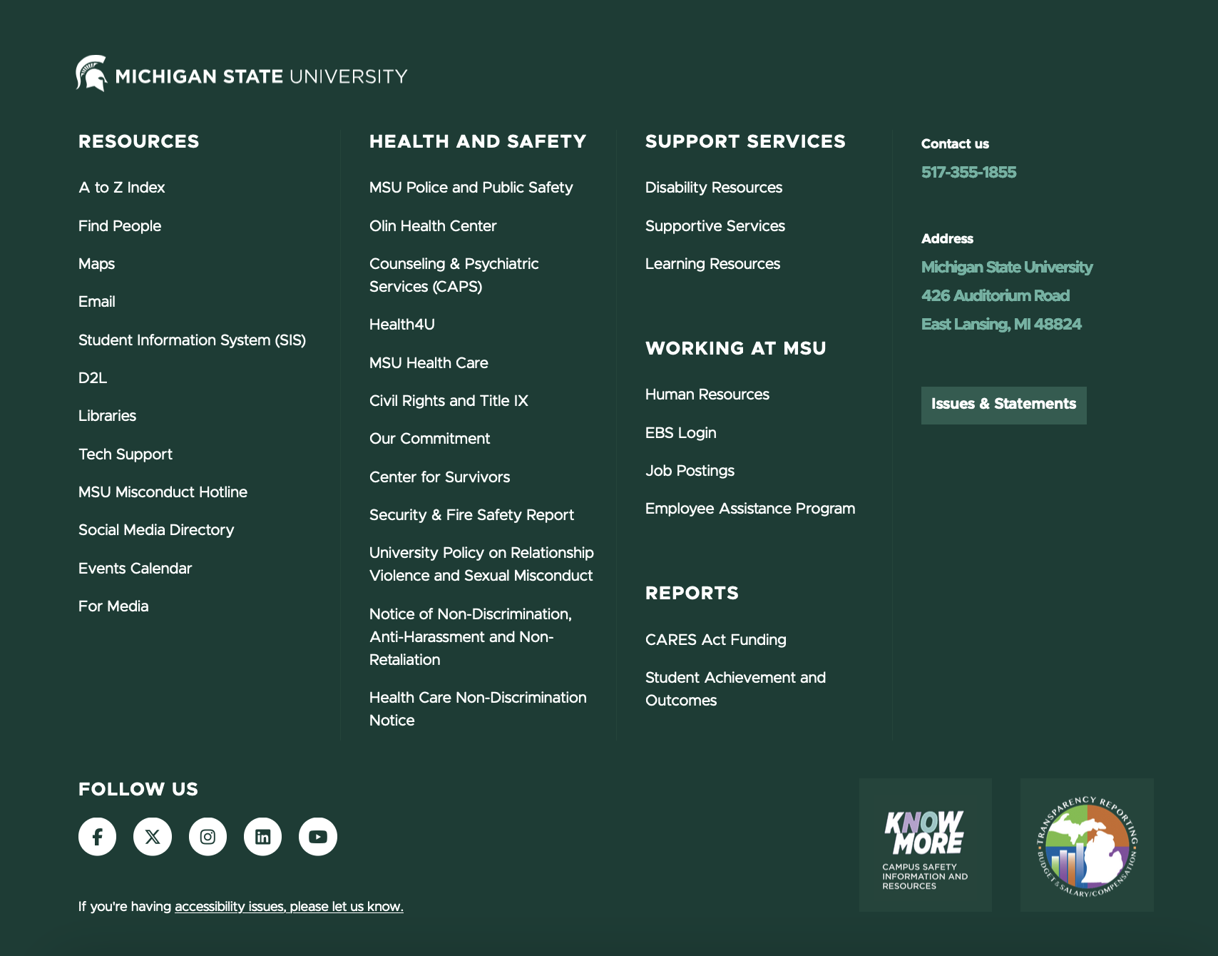
Screenshot of MSU footer showing four columns of links to various resources
Figure 1: Example of a Footer component.


Component Information

  • Usage
  • Benefits

    • Display general site-specific and general MSU information on every webpage (with possible exceptions on headless landing pages).
    • Provide quick links to enable visitors to find information they may be seeking.
  • Best Practices
  • Template Data

    • Footer Contacts
    • Footer CTA
    • Footer Links
    • Footer Social Media

    Each Contact Us item consists of the fields below. By default, the following subsections are created in new tenant sites: phone, address, issues.

    Title (single-line text)

    • Displays above the text description in green text
    • Required field

    Description (multi-line text)

    • Short text, may be one line or multiple lines
    • Used as button label if "Display as Button" is checked

    Link (general link)

    • Create a link so that the Title is a clickable destination
    • Optional

    Display As Button (checkbox)

    • Display link as a button instead of a text link
    • Optional

    Show CTA in Footer? (checkbox)

    • Controls whether the “Know More” and “MI Transparency” image links display.
    • These are links to pages in the main MSU website. Images are global shared assets and cannot be changed by content authors.
    • Values:
      • Checked (display both image links)
      • Unchecked (do not display either image link)

    Footer Links content is created and displayed in levels: column, category and link.

    Each column has one or more categories, or groupings. Each category has one or more link items.

    A new site is created with three columns and default column categories with MSU-related links which can be modified or removed. New links may be added.

    The Accessibility reporting link is present by default on new sites. It cannot be modified or removed. This link that allows visitors to report accessibility issues with the page or any part of the website. It leads to a form that routes to the IT Services Digital Accessibility team.

    Column

    • Footer may have one, two or three columns; column names are not displayed.
    Hide Column if Empty? (checkbox)
    • Controls if the column is hidden when no links are present.
    • Values:
      • Checked (column is hidden)
      • Unchecked (column is not hidden)

    Category

    A Footer column may have one or more categories, or groups of related links. Category title is displayed.

    Title (single-line text)
    • Heading that displays above a group of related links
    • Category label is not a clickable link
    • Multiple categories are allowed in each column.
    • Optional

    Link

    Link (general link)
    • Link text and destination URL
    • Required

    Sites are created with a default set of MSU social media icons and links that can be modified or removed by content authors.

    Each social media item consists of:

    Icon (droplink)

    • Social media vendor’s approved icon that acts as an image link to social accounts
    • These icons are required for listing social media accounts.
    • Choose from the drop-down list. A content author cannot add additional icons.

    Link (general link)

    • Destination for the social icon. This navigates to the site owner (unit’s) social account or a general MSU social account.
    • Required if listing social media accounts

    Frequently Asked Questions

    Can I change the layout of the Footer?

    Footer layout can be modified by changing content or by omitting content in any of the four main sections.

    Instructions for Use

    General Instructions

    In Content Editor:

    1. Navigate to Content > MSU > site name > Data > Footer.
    2. Expand Footer folder to see the four main Footer sections.
    Important: Do not delete any main Footer section. Deletion of content within a Footer section is permitted.
    Tool Use Guide


    Documentation updated: May 29, 2026

    Is there an issue with this documentation? Report it here.

    Component Options and Limitations

    • The Footer component is included in page templates. Content authors will not need to take any action to add the Footer to pages.
    • Footer includes sections with content that can be modified by the content author:
      • Footer Contacts — phone, address and other contact information
      • Footer CTA — thumbnail images and links to “Know More” and “MI Transparency Reporting.” Both are pages in the main MSU website.
      • Footer Links — 1 to 3 columns reserved for links, usually to external destinations, to websites of interest to visitors. A column may have text titles for related groups of links.
      • Footer Social Media — “Follow Us” heading and one or more social media icons with links to social media accounts   

    Guidelines

    • The Footer appears as a folder in the Content Editor tree.
    • The Footer contains the MSU helmet and white MSU wordmark logo and link to the main MSU website. This content cannot be modified by the content author.
    • Content authors cannot move the Footer to another place on the page.
    • A site can use the MSU social media accounts, the unit’s social media accounts, or display no social media accounts. The Content author controls which icons display, the order and link destinations. Supported platforms include: Facebook, Instagram, LinkedIn, TikTok, X and YouTube.
    • When a site is created, initial items include phone, address, and may include a link to the university releases and statements page. Content authors may modify initial values and add any number of “Contact Us” items. It is content authors’ responsibility to ensure that vertical height of this section displays properly.
    • A unit’s logo or other logo image is not permitted in the Footer component, per MSU brand standards.
    • MSU wordmark, “Know More” and “MI Transparency Reporting” images are stored in a global shared area.
  • Tips and Tricks
    • Although link text can be any length, for readability it is best to use concise link text so that links do not wrap to new line(s) extensively.
    • Each link in the Footer Links section has an internal Sitecore name that is distinct from the link’s text. Changing one does not affect the other. Be sure to provide link text when creating a link.
  • Expected Behavior
    • The Footer component displays on every page.
    • If a Footer Links column is empty, footer content moves to the left to fill in the column. The column is not displayed as empty space. If no links are present in the Footer Links section, the Footer Contacts section displays left justified on the page.
    • The Footer displays white and medium green, or “Excellence Green,” text over a dark green, or “MSU Green,” background.
  • Related Information
  • Related Components

    • Legal Footer
    Edit Footer Contacts
    1. Expand Footer Contacts in content tree.
    2. Add new Contact item:
      1. Right click Footer Contacts in tree.
      2. Select Insert > Contact Item.
      3. Give it a unique name and click OK.
        1. Name is not displayed anywhere. This is for internal use only.
      4. In the right pane (main content area), fill in the title and description.
        1. Title displays as white text.
        2. Description displays as medium green bolded text.
      5. Optional: Convert description to a text link by clicking the appropriate option (e.g., Insert Link for internal links or Insert External Link for external links).
        1. Adding a link turns the description into a clickable/tappable link.
        2. Phone can be made a link by using this URL format: tel:5179999999
      6. “Display As Button” (checkbox):
        1. Check this box to change a text link into a button link.
        2. The value in the Description field is used as the button label.
      7. Click Save.
    3. Change existing Contact item:
      1. Click the Contact item in content tree.
      2. Click Lock and Edit.
      3. Change title — this is a required field.
        1. Exception: Issues and Statements item has a blank title, where included.
      4. Change Description
        1. Can be one line or multiple lines
        2. Cannot be styled
        3. Optional
      5. Change link by clicking a link type. Do not change the link text.
        1. Insert DAM link — select asset from DAM dialog box.
        2. Insert link — select internal page from dialog box tree.
        3. Insert media link — select asset from Media Library tree.
        4. Insert external link — change description (link text) or fully specified URL, or Target Window.
          1. Active Browser — open link in same browser tab
          2. New Browser — open link in new browser tab, usually reserved for PDFs and other static files
        5. Clear — remove the link; Contact text content remains unchanged
      6. Check Display as Button to display link as a button instead of a text link.
      7. Click Save.
      8. Click Approve on the Review tab of the navigation ribbon to submit the change to the publishing workflow.
    4. Delete (remove) an existing Contact item:
      1. Select Contact item in the content tree.
      2. Right-click the item and select Delete (red X).
      3. Click Save.
      4. Note: Deleted items in the Recycle Bin can be restored to the site.
    Edit Footer CTAs
    1. Expand Footer CTA in content tree.
    2. Click Lock and Edit.
    3. To display “Know More” and “MI Transparency” links and images:
      1. Check Show CTA in Footer?
    4. To hide “Know More” and “MI Transparency” links and images:
      1. Uncheck Show CTA in Footer?
    5. Click Save.
    6. Click Approve on the Review tab of the navigation ribbon to submit the change to the publishing workflow.
    Edit Footer Links
    1. Expand Footer Links in content tree.
    2. Add new column:
      1. Right click Footer Links in tree.
      2. Select Insert > Footer Links Column.
      3. Give it a unique name and click OK.
      4. If more than three columns are created, only the top three columns in the tree are displayed.
    3. Add new category:
      1. Right-click Footer Links Column in tree.
      2. Select Insert > Footer Links Category.
      3. Give it a unique name and click OK. Name is not displayed.
    4. Add new Link:
      1. Right-click Footer Contacts in tree.
      2. Select Insert > Footer Link.
      3. Give it a unique name and click OK. Name is not displayed. It is for internal use only.
      4. In the right pane (main content area), fill in the title and description.
      5. Optional: add a link by clicking the appropriate option (e.g., Insert Link for internal links or Insert External Link for external links).
      6. Adding a link turns the description into a clickable link.
      7. To have an item display as a button, select the Display As Button checkbox. The value in Description field is used as the button label.
    5. Change existing column, category or link:
      1. Locate the item in the tree and select it by clicking on it.
      2. Click Lock and Edit.
      3. Make necessary changes. See Add instructions, above, for explanation of fields and options.
      4. Click Save.
      5. Click Approve on the Review tab of the navigation ribbon to submit the change to the publishing workflow.
    6. Delete/remove existing column, category or link:
      1. Locate the item in the tree and select it by clicking on it.
      2. Click Lock and Edit.
      3. Right-click the item and click Delete (red X). The item is moved to Recycle Bin.
      4. Click Save.
      5. Click Approve on the Review tab of the navigation ribbon to submit the change to the publishing workflow.
      6. Note: Deleted items in the Recycle Bin can be restored to the site.
    Edit Footer Social Media
    1. Expand Footer Social Media in content tree.
    2. To change Follow Us text:
      1. Select Follow Us in tree.
      2. Click Lock and Edit.
      3. In the right pane (main content area), change the title to some other text.
      4. Click Save.
      5. Click Approve on the Review tab of the navigation ribbon to submit the change to the publishing workflow.
    3. Add new Social Media item:
      1. Right-click Follow Us in tree.
      2. Select Insert > Social Media Link.
      3. Give it a unique name and click OK. Name is not displayed. It is for internal use only.
      4. Icon: In the right pane (main content area), select an icon from drop-down list.
      5. Link: Click a link type:
        • Insert DAM link — Select asset from DAM dialog box.
        • Insert link — Select page from dialog box tree.
        • Insert media link — Select asset from Media Library tree.
        • Insert external link — Change description (link text), fully specified URL or Target Window.
          • Active Browser — Open link in same browser tab.
          • New Browser — Open link in new browser tab. This is usually reserved for PDFs and other static files.
      6. Click Save.
      7. Click Approve on the Review tab of the navigation ribbon to submit the change to the publishing workflow.
    4. Change existing Social Media item:
      1. Locate the item in the tree and select it by clicking on it.
      2. Click Lock and Edit.
      3. Icon: Change as needed by selecting from the drop-down.
      4. Change link by clicking a link type. Do not change the link text.
        • Insert DAM link — Select asset from DAM dialog box.
        • Insert link — Select internal page from dialog box tree.
        • Insert media link — Select asset from Media Library tree.
        • Insert external link — Change description (link text), fully specified URL or Target Window.
          • Active Browser — Open link in same browser tab.
          • New Browser — Open link in new browser tab. This is usually reserved for PDFs and other static files.
        • Clear — Remove the link. Contact text content remains unchanged.
      5. Link is required. If cleared, add a new link by selecting a link type.
      6. Click Save.
      7. Click Approve on the Review tab of the navigation ribbon to submit the change to the publishing workflow.
    5. Delete to remove an existing Social Media item:
      1. Locate the item in the tree and select it by clicking on it.
      2. Right-click the item and click Delete (red X icon). The item is moved to Recycle Bin.
      3. Note: Deleted items in the Recycle Bin can be restored to the site.
      4. Click Save.
      5. Click Approve on the Review tab of the navigation ribbon to submit the change to the publishing workflow.
    Examples


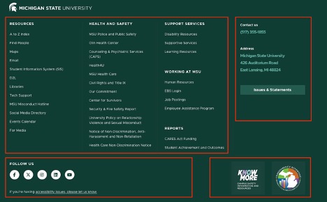
    Screenshot of MSU footer showing four columns of links to various resources. The footer sections are marked with red outlines.
    Figure 2: Footer sections are marked in red. Sections, clockwise from top left, include: Footer Links; Footer Contacts; Footer CTA; Footer Social Media


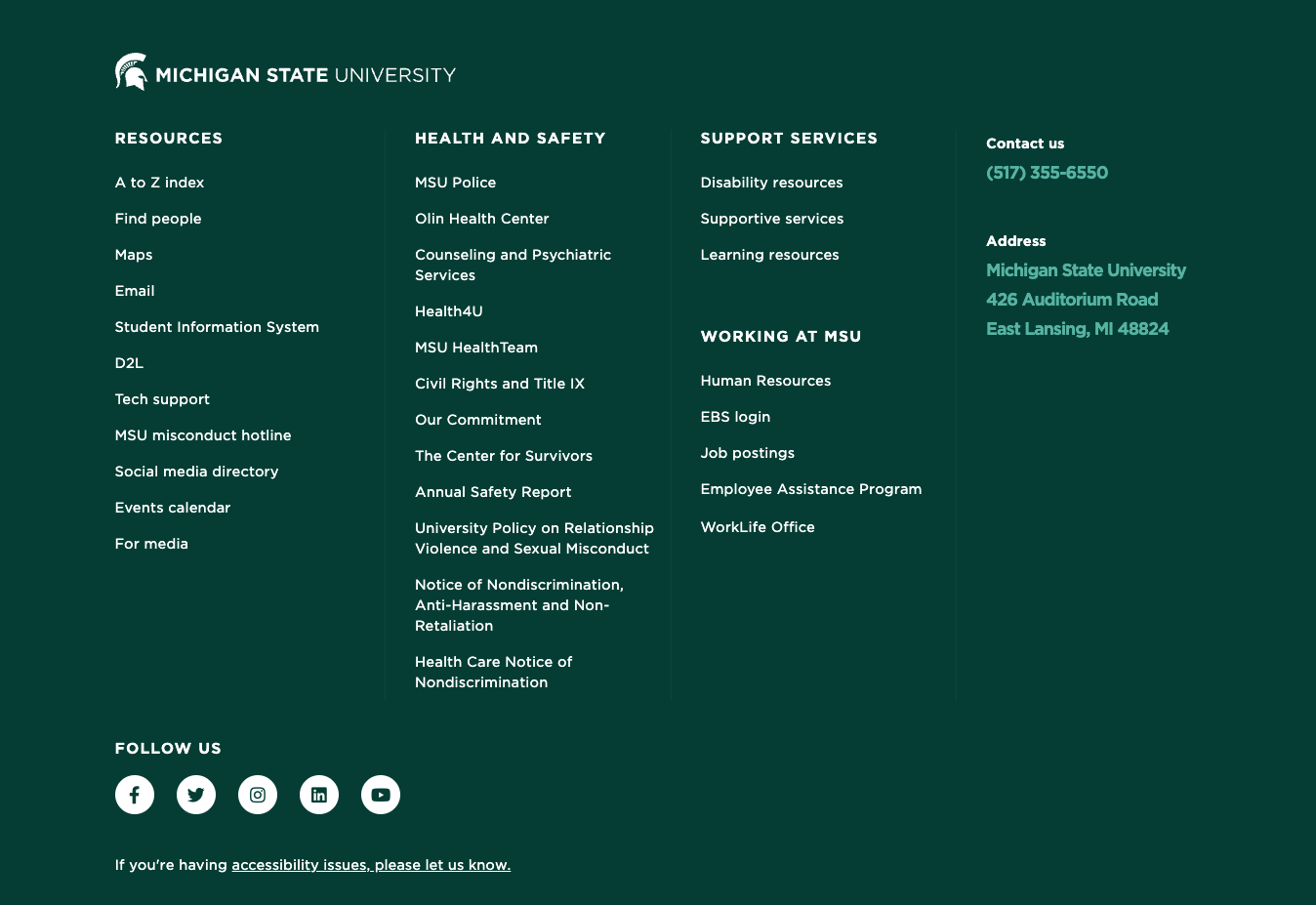
    Screenshot of MSU footer showing four columns of links to various resources.
    Figure 3: The Footer with the Footer CTA section removed.


    Screenshot of MSU footer showing two columns of links to various resources
    Figure 4: The Footer with the Footer CTA and Footer Social Media sections removed.