Jump to HeaderJump to Main ContentJump to Footer
Digital Experience Studio

University Communications and Marketing

  • Experience Program
  • Experience Design
  • Website Technology
  • Social Media
  • Analytics
  • News and Events

< Experience Program

  • Website Project Process
  • Working with a Vendor
  • Glossary
  • Taxonomy Data Dictionary

< Experience Design

  • Website Strategy
  • Website Structure
  • Information Architecture and Navigation
  • User-Centered Design Conventions
  • Common UX Issues
  • Enterprise Design System
  • Content Planning
  • Creating Accessible Content
  • Taxonomy and Filters

< Website Technology

  • Web Standards
  • Search Engine Optimization
  • Cascade CMS
  • Sitecore CMS
  • Content Hub Overview
  • Content Hub DAM
  • Content Hub Operations

SitecoreAI

Sitecore user login

< Social Media

  • Alt Text Bookmarklet
  • Meta Ad Pixel
  • Social Media and Web Integration
  • Sprinklr

Sprinklr

Sprinklr user login

< Analytics

  • Google Analytics (GA4)
  • Testing
  • Data Visualization

Google Analytics

Google Analytics user login

< News and Events

  • News and Updates
  • Events and Trainings
Michigan State University

MSU Tools and Resources

  • A to Z Index
  • Find People
  • Email
  • Tech Support
  • Social Media Directory
Michigan State University
Digital Experience Studio

University Communications and Marketing

Digital Experience Studio

  • Experience Program
    • Website Project Process
    • Working with a Vendor
    • Glossary
    • Taxonomy Data Dictionary
  • |
  • Experience Design
    • Website Strategy
    • Website Structure
    • Information Architecture and Navigation
    • User-Centered Design Conventions
    • Common UX Issues
    • Enterprise Design System
    • Content Planning
    • Creating Accessible Content
    • Taxonomy and Filters
  • |
  • Website Technology
    • Web Standards
    • Search Engine Optimization
    • Cascade CMS
    • Sitecore CMS
    • Content Hub Overview
    • Content Hub DAM
    • Content Hub Operations

    SitecoreAI

    Sitecore user login
  • |
  • Social Media
    • Alt Text Bookmarklet
    • Meta Ad Pixel
    • Social Media and Web Integration
    • Sprinklr

    Sprinklr

    Sprinklr user login
  • |
  • Analytics
    • Google Analytics (GA4)
    • Testing
    • Data Visualization

    Google Analytics

    Google Analytics user login
  • |
  • News and Events
    • News and Updates
    • Events and Trainings
Digital Experience Studio > Website Technology > Sitecore CMS > Sitecore Component Guide >

Tabs

Tabs

Tabs display a horizontal list of tabbed headings that, when clicked, reveal layered panels containing rich text content. Visitors can click the heading tabs to move between the panels. Only one panel displays at a time.

egr-civil-bs-program-overview-tabs
Figure 1: The Tabs component displays one panel at a time. The tab name for the visible tab is underlined in green.


Component Information

Communications Resources

  • University Communications and Marketing
  • University Trademarks and Licensing
  • MSU Brand Studio
  • MSU Editorial Style Guide
  • MSU Photos

Contact us

517-355-7505

Address

Michigan State University 408 West Circle Drive East Lansing, MI 48824

Follow Us

  • Visit our Facebook page
  • Visit our page on X
  • Visit our Instagram page
  • Visit our LinkedIn page
  • Visit our YouTube page
  • Visit our TikTok page

If you're having accessibility issues, please let us know.

Know MoreTransparency Reporting: Budget & Salary/Compensation
Michigan State University
  • Contact Information|
  • Site Map|
  • Privacy Statement|
  • Site Accessibility|
  • Call MSU: (517) 355-1855|
  • Visit: msu.edu|
  • Notice of Nondiscrimination|

SPARTANS WILL|© Michigan State University|

  • Usage
  • Benefits

    • Organize content into sections (tab panels) for easy viewing.
    • Tabs optimize visible page space. Clickable tab headings control which panel is currently in view.
    • Tab headings allow visitors to scan a list of sections and show the content only for sections that are of interest.
    • Tabs allow the content author to hide detailed content until the visitor is ready to view it. The tab heading indicates the content that will be found within the panel.
    • Search engines and AI bots can crawl Tab content even though it is not always visible.

    Example Use Cases

    • Provide a list of headings as scannable topics so that visitors only open the headings for which they want to see content.
    • Provide a menu of all topics. The visitor can quickly scan panel headings and locate specific topics of interest.
    • Provide a “big picture” to the visitor before they view all the details.
    • Provide an efficient way of presenting content by minimizing page length and scrolling. This is especially helpful for mobile users.
    • Eliminate the need for multiple pages when all page content can be placed in separate tabs panels on a single page. This is a good solution when page content is not lengthy.
       
  • Best Practices
  • Component Options and Limitations

    • Any number of tab panels can be created, but only the first ten panels in the item list are displayed.
    • The component may extend tabs to multiple rows. This should be avoided. See “Guidelines” for additional information.
    • Data is created for a specific type of component. Sitecore will not allow a data item to be assigned to another type of component. For example, a Data>Tabs item cannot be assigned to a Hero Banner component.

    Guidelines

    • Tabs panels contain rich text content, such as text, text links, buttons, images and videos. Content can be styled (e.g., bulleted lists, alignment, bold text).
    • There is no limit on how much rich text is placed in a Tabs panel. However, keep the user experience in mind, such as visitors viewing extensive content on a mobile device.
    • A Tabs component is not suitable for content that should always remain viewable. Do not use a Tabs component in these cases, as doing so would force visitors to click all the panels open.
    • Do not nest Accordion, Side Tab or Tab components. Doing so creates a bad experience for users, particularly on mobile devices.
    • Headings should be short and concise. They should accurately indicate what content will display when the panel expands. One to two words is ideal.
    • A best practice is to have at least two Tabs headings. One Tabs heading should not be used alone; use a rich text component instead.
    • Ensure Tabs appear in a single row. If the Tabs component extends to multiple lines, consider a different component (such as Accordion), reduce the number of tabs or shorten the tab headings. When the Tabs component extends to multiple lines, the tabs in the lower rows may appear to be sub-categories of the first row. Multiple rows are more difficult to scan quickly and can cause confusion.
    • The Tabs component can be placed in the left column of the two-column page layout.
    • Test view a Tabs component using multiple devices to verify that text displays properly. What looks good in desktop mode may not look good in mobile mode.
       
  • Tips and Tricks
    • Use the Column Splitter tool to create a multi-column format inside a Tabs panel. 
       
  • Expected Behavior
    • Tabs run horizontally across the top of the component. Headings are separated by bars (“|”).
    • Tabs headings can be clicked to change which panel content is currently displayed. Clicking a Tabs heading switches the displayed content in the Tabs panel area to the content associated with that heading.
    • Initial state: When the page loads, the first tabbed panel is displayed.
    • Tabs panels do not open and close independently. One, and only one, Tabs panel is displayed at any time.
    • Tabs headings display in the order in which they appear in the component item list.
    • Tabs headings will wrap to a new line if all heading tabs do not fit on one line. This creates multiple rows of tabbed headings. This is not desirable. See “Guidelines” above.
       
  • Related Information
  • Related Components

    • Accordion component — Accordion heading and panels display vertically. Tab headings and panels display horizontally. Opening an Accordion panel expands the panel. Panels remain open until clicked again.
    • Side Tabs component — The Side Tabs component has similar functionality. Side Tab heading and panels display vertically. Tab headings and panels display horizontally. Opening either a side tab panel or a tab panel replaces the display of the previously opened panel.

    Live Example

    • Demo: Information-Focused Content Components

    Template Data

    Field names are the same in Page Builder, Explorer and Content Editor, unless specifically noted.

    • Component Fields
    • Panel Fields
    • There are no fields in this section.
    • The component has a unique name (used as internal Sitecore identifier). 

    Tab Title (single-line text)

    • Heading for the panel. This displays even if the panel content is hidden.
    • Required field.

    Tab Content

    • See instructions for individual components being placed in the Tabs component.
       

    Frequently Asked Questions

    Can I open a specific panel when the page loads?

    Yes, by adding a URL parameter that specifies the panel’s GUID (unique identifier). See “Instructions for Use,” below, for more information.

    Can I add a thumbnail image or icon to the Tabs tab heading?

    No, images are not supported in the heading.

    Instructions for Use

    Add Tabs Component

    In Page Builder:

    1. Select the page in the content tree.
    2. Click “+” button in any Placeholder box below the Breadcrumb links.
    3. Select Tabs component from list.

    Alternate method:

    1. Click Components tab at top of content tree.
    2. Locate Tabs component.
    3. Drag the Tabs component to any area of the page below the masthead and the Breadcrumb links.

    The Tabs component is displayed.
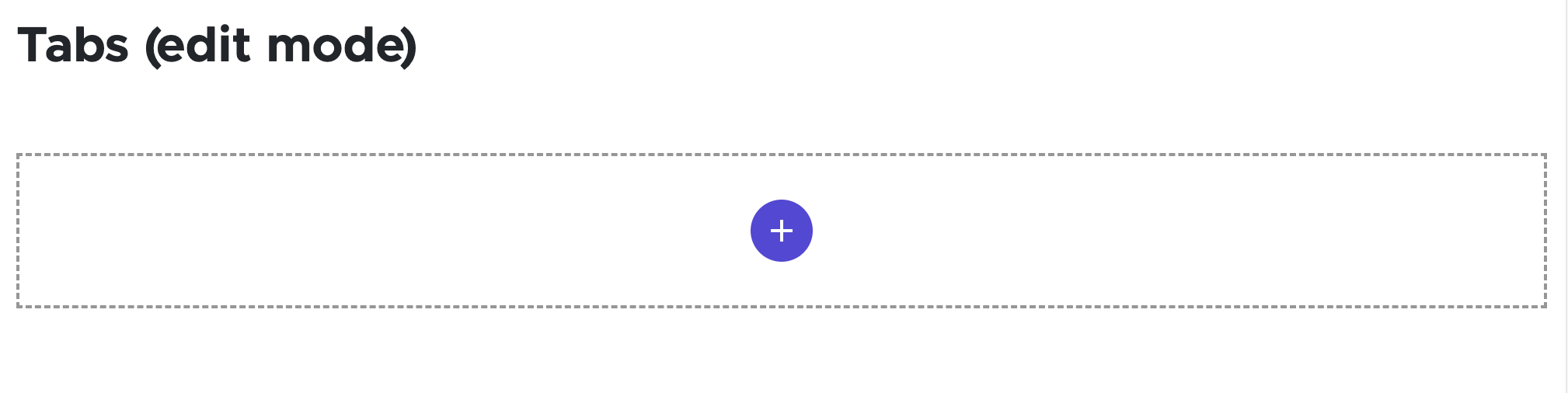
    Screenshot of a Tabs component with no tabs or content
    Figure 2: The Tabs component is added to the page. There are no tab panels, no component name, no tab panel labels and no content when the component is first placed on the page.
    Manage Panels in a Tabs Component

    Note: Tab components utilize Side Tab Panel components for panels, just like a Side Tab component.

    Add the first tab, in Page Builder:

    1. With the Tabs component selected, click the "+" icon to add a component.
    2. Choose Tab Panel from the menu.  
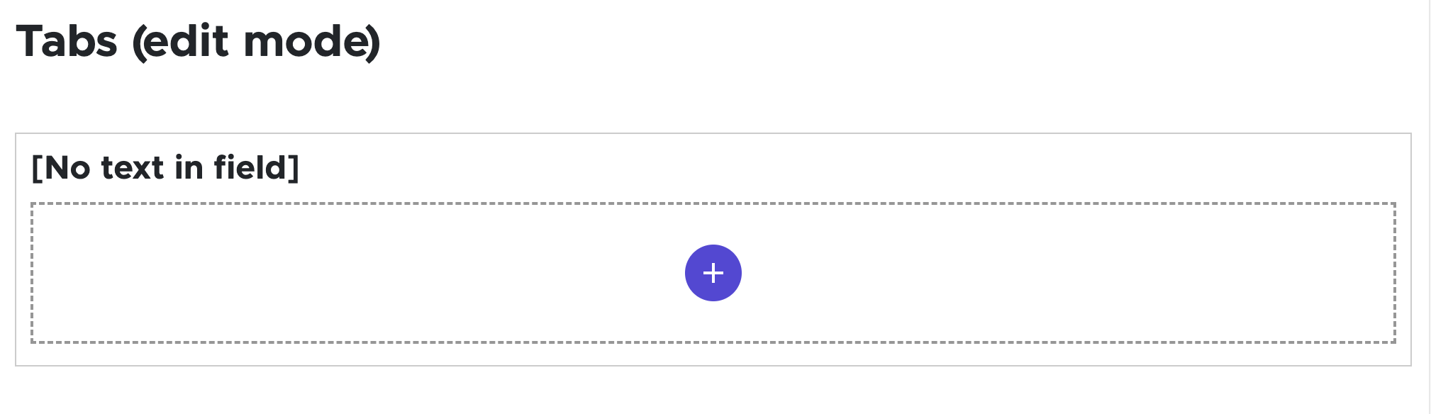
    Screenshot of a Tabs component with one tab but no tab content
    Figure 3: The initial appearance of a Tabs panel shows placeholder text for an empty title field and a button to add content.

    If this is new Tabs tab content:

    1. In the “Assign content item” window, hover over the Data folder and then click on the “+” icon that appears to open the options menu.
    2. Click Tab Panel.
    3. Type in the desired name for the Side Tab Panel component and hit enter.
    4. Select the item and click on the Assign button.

    If using existing Tab Panel content:

    1. Select an existing Tab Panel component from the Data folder.
    2. Click Assign.

    The Tab Panel component and toolbar are displayed.

    Add additional tabs:

    1. Click Components tab at top of content tree.
    2. Locate Tab Panel component in the Components section.
    3. Drag the Tab Panel component to the location in the Tabs component where the tab should be inserted. A dark purple line appears to indicate placement location.
    4. Follow the above instructions to create and assign a new Side Tab Panel component data source or assign an existing data source.
    5. Add up to 10 tabs to display in a Tabs component. Any additional tabs added over 10 will not display.

    Change tab order:

    1. With a Tab Panel within a Tabs component selected, click the move handle on the left end of the component toolbar and drag the panel to a new location within the Tabs component. A dark purple line appears to indicate placement location.
    Add Content to Tabs Panels
    1. On the page canvas, click on the Tab Title field and enter text to add a panel Heading.
    2. In the panel content area below Title, click the purple “+” and select a type of content to add from the list of available options.

    Alternate method: 

    1. Click Components tab at the top of the content tree.
    2. Drag an appropriate component into the Tabs panel placeholder box.

    To assign a new component data source to a tab component:

    1. Click “+” to the right of Data.
    2. Give the data source a unique name.
      1. Tip: Include a reference to the panel name to more easily match this data source to the correct panel.
    3. Click Assign.

    To assign an existing data source to a tab component:

    1. Select the data item.
    2. Click Assign.

    Repeat as necessary to add all panels and to add content to all panels. Follow instructions for specific components being added to panels.

    Alternative: Edit Using Content Editor

    Locate the Tabs component:

    1. Open Content Editor:
      1. In Pages, click the dropdown arrow to the right of the SitecoreAI Cloud icon in upper left.
      2. Select Content Editor. It opens in a new browser tab.
    2. If the Tabs component does not appear in the content tree, close the page’s Data node and expand it again to refresh the content tree.
    3. In the content tree, expand Content > MSU > site name > Home > page name > Data.
    4. Locate and expand the Tabs component.

    Add a Panel:

    1. Right click the Tabs component.
    2. Select Insert, then select General Tab.
    3. Add content in the main pane on the right side.
    Note: New panels can also be created by duplicating an existing panel with the correct content type, then changing the name and content.

    Edit an existing panel:

    1. Click and expand the panel in the content tree.
    2. Edit as needed in the main content pane on the right side.

    Tips for Using Images:

    • Alt text can be changed in Page Builder (click the Alt icon on the image toolbar) or Content Editor (Properties link in the Image panel), or when the asset is loaded into Media Library or Content Hub.
    • An image size can be changed in Content Editor > Image > Properties. HTML uses width and height attributes.
    • The image margin (i.e., padding) can be changed in Content Editor > Image > Properties.

    Delete a Panel:

    1. Locate and expand the Tabs component.
    2. In the content tree, right click the panel.
    3. Click Delete and confirm.

    Delete the Tabs Component:

    1. In the content tree, right click the Tabs component.
    2. Click Delete and confirm.

    Publish Changes: 

    1. Return to Page Builder by closing the Content Editor browser tab.
    2. Refresh the canvas to see changes.
    3. Preview and publish the page.
       
    Link to a tab component

    Link to the top of the tab component:

    1. Select the tab component

    2. Navigate to the Advanced styling of the component options in the right-hand pane

    3. Add the desired anchor text to the PAGE ANCHOR ID field (use a short alphanumeric ID name with no spaces or special characters)

    4. Set the link to that tab component by appending the URL of the link with the PAGE ANCHOR ID used on the tab component.

      1. URL format is [site URL]#PAGE ANCHOR ID, for example a link to the Component information tab component on this page would be: https://martech.msu.edu/website-technology/sitecore-cms/xmc-component-guide/tabs#information

    Link to a specific tab:

    • At this time, there is not a way to set a link anchor to a specific tab content. This will be a future enhancement.
    Manage Panels in a Tabs Component (OLD)
    Note: The Tabs component was rebuilt in late 2024 resulting in some changes in how they are constructed. Any tabs built before this change will display "Tabs (OLD)" when hovered on in Page Builder and will still work. 

    In Page Builder:

    1. Click the Tabs component to display the toolbar.
    2. In the “Tabs” right column, expand Manage items.
    3. Change Item 1, which is automatically created, as needed:
      1. Rename by clicking “…” to the right of the item and giving it a new name.
      2. Delete item by clicking “…” to the right of the item and click Delete.
    4. To add a panel:
      1. Click “+ Add new” and click the General Tab button.
      2. Give it a unique name. Hit enter.
      3. Wait for the page to refresh before making additional changes in the Manage items menu.
    5. To rename a panel: click “…” to the right of the item and enter a new name.
    6. To delete a panel: click “…” to the right of the item and click Delete.
    7. To reorder panels: click “…” and use the up and down arrows to change the tab order.

    Initially, a Tabs panel appears without a title. The content area contains a “+” button.

    Screenshot showing an empty tab panel
    Figure 4: The initial appearance of a Tabs tab shows placeholder text for an empty title field and a button to add content.


    Image Specifications

    Sketch Link: Tabs


    Images in Tabs

    • Desktop – Width: 915px | Height: 665px
    • Mobile – Width: 275px | Height: 200px
    • Recommended size – Width: 1000px | Height: 700px

    Tool Use Guide

    *Add desired content type and follow component-specific instructions


    Documentation updated: July 14, 2026

    Is there an issue with this documentation? Report it here.