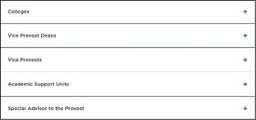
Headings, displayed vertically and stacked, that expand to reveal panels containing rich text content. Visitors can click the headings to show or hide a panel’s content.

Component Information
Template Data
Panel Title (single-line text)
- Heading for the panel. This displays even if the panel content is hidden.
- Required field.
Panel Content (Simple mode only)
- Rich-text content used for the panel content in the “Rich Text Only” variant.
“Placeholder Available” variant Accordion Tab Content
- Panel content is created using component(s).
- Eligible components include Image, Video Player, CTA Button, Rich Text, Table, Column Splitter and Row Splitter.
- Template Data follows component documentation.
Frequently Asked Questions
No, this function is not supported using the Accordion.
No, images are not supported in the heading.
Instructions for Use
A new “Rich Text Only” Accordion Tab variant was added to the system on June 9, 2026. By default, tabs will contain a rich text field. Selecting the “Placeholder Available” variant will enable users to add additional content components to the Accordion tab.
If it is the first component in the placeholder:
- Click the Pages tab at the top of the left side panel to display the Sitemap
- Click to select the page in the Sitemap.
- Click “+” button in the mainbody or twothirdsbody placeholder box below the Breadcrumb links.
- Select Accordion component from list.
If added to a placeholder that already has one or more components:
- Click the Pages tab at the top of the left side panel to display the Sitemap.
- Click to select and display the page in the Sitemap.
- Click the Components tab at top of the left side panel to display the Components menu.
- Locate Accordion component in the Container group. Drag the Accordion component to an allowed location above or below an existing component in the mainbody or twothirdsbody areas.
The Accordion Tab and toolbar are displayed.
In Page Builder:
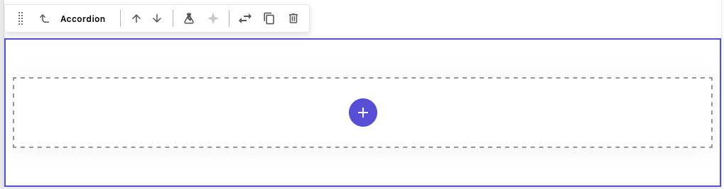
To add a first Accordion Tab:
- Click the purple “+” icon in the placeholder space and select Accordion Tab component from list.
- Map content to the tab following steps below.
To add additional Accordion Tabs:
- Drag an Accordion Tab component to the Accordion container to add an additional tab to the Accordion. A dark purple line will display showing where the tab will be added.
- Map content to the tab following steps below.
Mapping a new Accordion content data source:
- In the “Assign content item” dialog box, hover over Data until a “+” appears to the right.
- Click “+” and select "Tab Panel" (previously called “Accordion Tab” or “Accordion with Panel”).
- Give the component a unique name and click away from the name area on hit the Enter key.
- Click Assign.
Mapping an existing Accordion content data source:
- Select the proper Accordion Tab component from the list.
- Click Assign.
To change mapping to a different content data source:
- Click on the Accordion Tab to select it. The tab will be outlined with a thick purple line and a toolbar with the panel name will appear.
- Click the Swap with another component icon on the toolbar.
- Choose Accordion Tab from the menu.
- Select the replacement tab from the data sources available and click Assign.
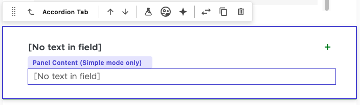
Initially, an Accordion panel appears as the "Rich Text Only" variant, without a title or text. Enter text in both fields, or adjust the variant.
To change the variant of a tab:
The default variant for a new tab is is the “Rich Text Only” variant which uses the Panel Content (Simple mode only) field to contain rich text.
To add alternative content types to the tab, change this tab variant to the Placeholder Available variant:
- Click on the Accordion Tab to select it. The tab will be outlined with a thick purple line and a toolbar with the panel name will appear.
- Click the Design Tab in the right side panel.
- Choose Placeholder Available from the top field variant menu.
- The tab will now display a “+” icon that can be clicked to assign a component.
To move Accordion Tabs:
- Click on the Accordion Tab to select it. The tab will be outlined with a thick purple line and a toolbar with the panel name will appear. (Note: It may say “Side Tab Panel.”)
- Click and hold on the 10-dot handle icon on the component toolbar and move the Accordion Tab to the desired location in the Accordion container.
Instructions for previous iteration of Accordion:
In Page Builder:
- Click the Accordion component to display the toolbar.
- In “Accordion” right column, expand Manage items.
- Change Item 1, which is automatically created, as needed:
- Rename — Click “…” to right of Item and give it a new name.
- Delete item — Click “…” to right of item and delete it.
- Add more panels as needed:
- Click “+ Add new” and click Accordion Tab button.
- Give it a unique name.
- To rename a panel: Click “…” to right of the item and give it a new name.
- To delete a panel: Click “…” to the right of the item and delete it.
- To reorder panels: Click “…” and use the up and down arrows to change the tab order.
In Page Builder:
- In the middle pane, or content pane, add an Accordion tab title by typing in the rich text field. The title is the panel Heading. Initially, title is set to “[No text in field].”
- In the panel content area below the title, click the blue “+” and select a type of content to add.
- Select any permitted component from the dialog box. Permitted components include:
- Image
- Video Player
- Column Splitter
- Row Splitter
- CTA Button
- Rich Text
- Table
Alternate method: Click Components tab at the top of the content tree. Drag a component into the Accordion panel placeholder box.
To assign a new component data source to an Accordion component:
- Click “+” to the right of the Accordion Tab to nest the accordion content underneath the parent Accordion container. Content may also be added to the main Data level.
- Give the data source a unique name.
- Tip: Include the panel name to more easily match this data source to the correct panel.
- Click Assign.
To assign an existing data source to an Accordion component:
- Select the data item.
- Click Assign.
Repeat as necessary to add all panels to the Accordion and to add content to all panels. Follow the instructions for specific components being added to panels.
Note for images: For regular desktop devices (1280px width), the panel image width is 1046px and the image displays by default with a width of 800px. The image’s aspect ratio determines the height. Use Content Editor to change image size using the image Properties link. Image alt text can be edited using the Alt Text field in Content Editor but not Page Builder.
Note: Only Accordion Tab components have a data element in Content Editor, the Accordion container does not appear there.
Locate the Accordion Tab
- Open Content Editor:
- In Page Builder, click the dropdown arrow to the right of the SitecoreAI icon in upper left..
- Select Content Editor. It opens in a new browser tab.
- If the Accordion Tab does not appear in the Content Tree, close the page’s Data node and expand it again to refresh the Content Tree.
- In the Content Tree, expand Content > MSU > site name > Home > page name > Data.
- Locate and select the Accordion Tab component.
Edit an Accordion Tab
To edit an existing Accordion Tab’s Panel Title or Panel Content field:
- Click the tab in the Content Tree.
- Click on Edit or Lock and Edit to lock tab for editing.
- Change as needed in the main content pane on the right side.
- Save edits.
To edit existing components in an Accordion Tab:
- Locate the existing component in the Content Tree
- Expand an Accordion Tab data if component data is nested under it.
- Edit component data following standard component procedure.
- Save edits.
To create a new content type in an Accordion Tab:
- Right-click the tab.
- Select Insert and select a content type (column and row splitters need to be added in Page Builder).
- Add content in the main content pane on the right side.
Tips for Using Images
- Alt Text should be added to images and saved in the media library folder, but can be overridden in Page Builder in the image’s “Image alt text” field or the “Alternate Text” field in Image > Properties in Content Editor.
- An image size can be changed in Content Editor > Image > Properties. HTML uses width and height attributes.
- The image margin (i.e., padding) can be changed in Content Editor > Image > Properties.
- For regular desktop devices (1280px width), the panel image width is 1046px and the image displays by default with a width of 800px.
- The image’s aspect ratio determines the height.
Delete an Accordion Tab
Note: To avoid potential issues on the page, remove the accordion tab from the page in Page Builder before delete its data in Content Editor.
- Locate and expand the Accordion Tab component.
- In the Content Tree, right-click the tab.
- Click Delete and confirm.
Publish Changes
When done with content authoring activities:
- Return to Page Builder.
- Click the Reload canvas icon to see changes.
- Preview and submit the page to the publishing workflow.
The Accordion component was rebuilt in fall 2024 resulting in some changes in how they are constructed. Any accordions built before this change will display "Accordion (OLD)" when hovered on in Page Builder and will still work using the instructions for the previous version (see "Add Accordion Tabs to an Accordion Component," below).
Note: removing or adding tabs to an Accordion (OLD) component may cause issues with the mapped content. Users may need to re-map content to the appropriate accordion tab. Users may wish to rebuild an Accordion (OLD) component into a new Accordion component to prevent this issue in the future.
Image Specifications
Sketch Link: Accordion Component Design
Images in Tabs
- Desktop – Width: 915px | Height: 665px
- Mobile – Width: 275px | Height: 200px
- Recommended size – Width: 1000px | Height: 700px
Tool Use Guide
*Add content type and then follow component-specific instructions
Documentation updated: June 29, 2026
Is there an issue with this documentation? Report it here.
Note: The Accordion container may only be added to the page in Page Builder.