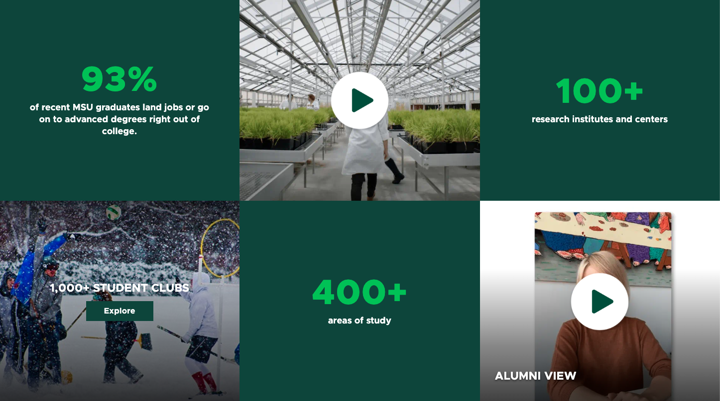
A combination of text, a background image and a call to action, or CTA, button. Text can appear at the top and bottom of the component. This component can be displayed in a Grid Container component for a tiled layout.
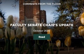
Component Information
Benefits
- The Grid Ad is a versatile component that allows the content author to create a combination of text (including several lines, positions and font sizes), a background image and a call to action, or CTA, button to display in a Grid Container with other made-for-grid components.
- The Grid Ad must be used in a Grid Container. It cannot be placed on a page without using one of these components.
- The Grid Container is full page-width. It extends from one edge of the browser window to the other, spanning the width of the site. This expansive view pulls visitor focus to the grid images.
Example Use Cases
- Provide a small snippet of text and keywords with a button link to a story or event page.
- Provide visual imagery to attract visitor attention, text that summarizes detailed content and a button link that directs visitors to a page with more content.
- Highlight a particular page and provide an easy way for visitors to get to it.
Component Options and Limitations
- The Grid Ad is limited to certain page types:
- A Grid Ad can be placed on the “Page” page type within a Grid Container.
- A Grid Ad can be placed in the left column of a “Two-Thirds Page” page type within a Grid Container.
- A Grid Ad component cannot be added to a “Story Page” or any other page type.
- The Grid Ad component is not suitable for lengthy text. It is intended for short headings and sub-headings. If text is too long, the Top text may display overlaying the Bottom text, may force the Bottom text to truncate or may cause the component layout to break.
- Depending on the grid tile size selected, not all Grid Ad component fields will display. See the Template Data section below for additional information.
- Data (content) is created for a specific component. Sitecore will not allow Data to be assigned to another type of component. For example, a Data>Grid Ad item cannot be assigned to a Hero Banner component.
Guidelines
- The call to action, or CTA, button destination may be an internal page, a media item, an external page, another asset or an email address.
- Only the background image is a required field. Although not designated as required, at least one line of text or the CTA should be specified.
- The CTA button is optional.
- When placing a Grid Ad in a small tile of a Grid Container, it will look best when either Top or Bottom text are used, but not both.
- Test view a Grid Ad using multiple devices to verify that text displays properly and is not too long. For example, what looks good in desktop mode may not look good in mobile mode.
- Since the Grid Container has multiple tiles, it is important to balance the look and feel of the Grid Ad with other tiles in the grid.
- In Page Builder, the Eyebrow field may not be visible. Always use Preview (the eye icon in upper right) to see what the page will look like in a browser
- The link is a button. It cannot be a text or image link.
- The Grid Ad component may look slightly different in each tile size.
- Certain grid sizes do not provide sufficient space in the Grid Ad tile to display all fields.
- Small cell: If using all fields (Eyebrow, Top, Bottom and CTA button), not all content will display. Experiment with fields and font sizes to make content fit and be sure to test in desktop, tablet and mobile views.
- Depending on length of text and which text fields are used, some content items may not display in other tile sizes.
- The button background color is dark green by default. This can be altered by adding CSS in the right column’s Additional Styles CSS field.
- On button hover, the background image expands slightly.
- Text is white by default. When “White Gradient” is selected, black text is automatically used instead of white text.
- No spacing is provided between a Grid Container and other components. No spacing is added between tiles in the grid.
- By default, the Eyebrow text displays at the top of a tile. Selecting the Up option also causes Eyebrow to display at top of tile. Selecting the Down option causes Eyebrow to display above the Bottom text field.
- Eyebrow text is automatically displayed as uppercase using a small font size.
Template Data
Image (image)
- Background image for the Grid Ad component. It fills the entire tile.
- Required field.
Eyebrow (single-line text)
- Title that displays at the top of the component.
- The text is automatically converted to uppercase regardless of how text is entered.
Top Header (single-line text)
- Text that displays in large font at top of component, if present.
- If the Grid Ad component is placed in a Large or Tall grid tile, the Top Header does not display.
- If the Grid Ad component is placed in a Small grid tile and if both Top and Bottom fields are entered, only the Eyebrow and Bottom fields are displayed.
Top Sub-Header (multi-line text)
- Text that displays in a medium-sized font at the top of the component, if present, and below the Top Header, if one is present.
- If the Grid Ad component is placed in a Large or Tall grid tile, the Top Sub-Header text does not display.
Bottom Header (single-line text)
- Text that displays in a medium-sized font at the bottom of the component, if present.
- The text is automatically converted to uppercase regardless of how text is entered.
Bottom Sub-Header (multi-line text)
- Text that displays in a medium-sized font at the top of the component, if present, and below the Bottom Header, if one is present.
CTA (droptree)
- An optional button that displays at the bottom of the component.
- Values:
- None (default)
- Call to Action button
- The button will only display if at least one of the Top or Bottom fields is used.
ID
- Not used
CSS Styles
- Not used
Gradient (dropdown menu)
- Optionally adds a slight gradient to the image.
- Values:
- Black (default)
- Green
- White
Eyebrow Position (dropdown menu)
- Location where the Eyebrow text displays.
- Values:
- Up — This is the default. The Eyebrow displays above the Top text area.
- Down — The Eyebrow displays above the Bottom text area.
Text Alignment (dropdown menu)
- Determines whether all text is displayed as left justified or centered in the component.
- Values:
- Center Align (default)
- Left Align
Green Line (checkbox)
- An optional decorative green bar that displays between the Top Header and Top Sub-Header fields.
- Values:
- Checked (default)
- Unchecked
Use Large Bottom Header Text (checkbox)
- Option to display this field with large text rather than the default small-sized text.
- Values:
- Unchecked (default)
- Checked
Use Small Bottom Sub-Header Text (checkbox)
- Option to display this field with small text rather than the default medium-sized text.
- Values:
- Unchecked (default)
- Checked
Link type
- Selects the type of link to insert.
- Three main options:
- External (for a link not in this site)
- Internal (a link in this site)
- Media (a link to a media file)
- Email (the button generates an email draft in the default user's email browser to a specified email address)
URL/Path (general link)
- The Call to Action link destination
- Required field when using a CTA button
Link text (single-line text)
- The text that displays on an optional Call to Action button.
- Be concise. Text that does not fit is truncated.
Open in new window (checkbox)
- When checked link opens in a new window.
Frequently Asked Questions
Technically, only the image is required. However, at least one text field should be specified.
Image Specifications
Grid XLarge
- Desktop – Width: 100% | Height: 810px
- Mobile – Width: 100% | Height: 573px
- Recommended size – Width: 2000px | Height: 1000px
Grid Large
- Desktop – Width: 960px | Height: 810px
- Mobile – Width: 375px | Height: 536px
- Recommended size – Width: 1000px | Height: 1000px
Grid Medium
- Desktop – Width: 50% / 720px | Height: 810px
- Mobile – Width: 100% | Height: 300px
- Recommended size – Width: 800px | Height: 900px
Grid Small
- Desktop – Width: 33% / 480px | Height: 405px
- Mobile – Width: 100% | Height: 300px
- Recommended size – Width: 500px | Height: 500px
Grid Tall
- Desktop – Width: 33% / 480px | Height: 810px
- Mobile – Width: 100% | Height: 300px
- Recommended size – Width: 500px | Height: 900px
Instructions for Use
Add a Grid Container to the page where the Grid Ad component is needed, and select the desired variant.
Tool Use Guide
Documentation updated: June 15, 2026
Is there an issue with this documentation? Report it here.