Grid Container

The Grid Container is used to arrange specific components in a full-width grid of content with multiple options for the number and size of grid cells to display.

grid-container-example
Fig. 1: Example of a Grid Container from the MSU homepage. This example uses the “1 Tall, 4 Small (2x2)” variant with Image, Story and Fact components.


Component Information

Frequently Asked Questions

Being a container component, the Grid Container does not appear in a page’s data folder in Content Editor like other components. Make edits to this component in Page Builder.

Some component data does not display when used in a Grid Container. Consult that component’s documentation for its usage in a Grid Container.

Instructions for Use

In Page Builder:

  1. Select the page in the content tree.
  2. Click “+” button in any Placeholder box below the Breadcrumb links.
  3. Select Grid Container component from list. 

Alternate method:
  1. Click Components tab at top of content tree.
  2. Locate Grid Container component.
  3. Drag the Grid Container component to any empty placeholder area of the page below the Breadcrumb links.
  1. With the Grid Container selected, locate the right-side Component Options panel.
  2. Click the Design tab.
  3. Choose the desired variant option from the Variant drop-down menu.
  1. Select a Grid Container cell placeholder.
  2. Choose the desired component from the list of available components.
  3. In the Assign content item window, choose the component data to use: 
    1. For existing components, select from the page’s Data folder or from the appropriate shared folder.
    2. For new components, select Create new, type in the component title and hit enter.
  4. Once the component data is selected, click on the Assign button in the lower right corner.
  5. Add or edit component data, per the component requirements.
  6. Repeat the process until all Grid Container cells are filled.
grid-container-admissions-example
Fig. 2: Example of a Grid Container from the Office of Admissions. This example uses the “6 Small” variant with Fact, Video and Grid Ad components.

Layout Variants

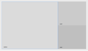
1-large-2-small-blank
Fig. 3: Grid Container layout showing the “1 Large, 2 Small” variant.
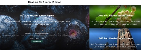
1-large-2-small-example
Fig. 4: Grid Container layout showing the “1 Large, 2 Small” variant. Each cell contains a Grid Ad component.
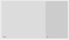
1-large-1-tall-blank
Fig. 5: Grid Container layout showing the “1 Large, 1 Tall” variant
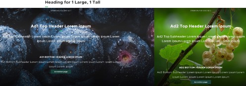
1-large-1-tall-example
Fig. 6: Grid Container layout showing the “1 Large, 1 Tall” variant. Each cell contains a Grid Ad component.
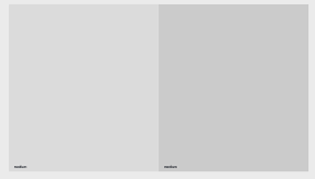
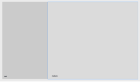
2-medium-blank
Fig. 7: Grid Container layout showing the “2 Medium” variant.
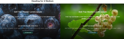
2-medium-example
Fig. 8: Grid Container layout showing the “2 Medium” variant. Each cell contains a Grid Ad component.
Screenshot showing a wide section with a call to action to subscribe to MSUToday and a small grid section with a social media follow call to action.
Fig. 9: The Small 2 and 1 (Newsletter) variant was designed to showcase a left section that is as wide as two small sections, with another small section on the right. In this example the wide section shows a call-to-action for a newsletter and the right section uses a social share component.
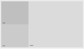
2-small-1-large-blank
Fig. 10: Grid Container layout showing the “2 Small, 1 Large” variant.
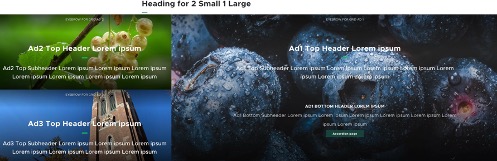
2-small-1-large-example
Fig. 11: Grid Container layout showing the “2 Small, 1 Large” variant. Each cell contains a Grid Ad component.
2-small-1-large-blank
Fig. 12: Grid Container layout showing the “3 Small” variant.
2-small-1-large-example
Fig. 13: Grid Container layout showing the “3 Small” variant. Each cell contains a Grid Ad component.
2-small-1-large-blank
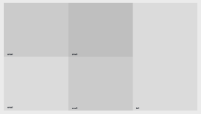
Fig. 14: Grid Container layout showing the “4 Small, 1 Tall” variant.
2-small-1-large-example
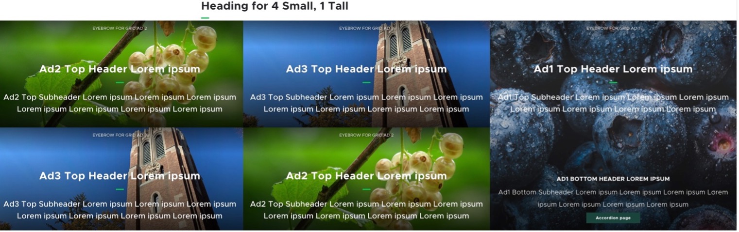
Fig. 15: Grid Container layout showing the “4 Small, 1 Tall” variant. Each cell contains a Grid Ad component.
2-small-1-large-blank
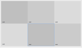
Fig. 16: Grid Container layout showing the “6 Small” variant.
2-small-1-large-example
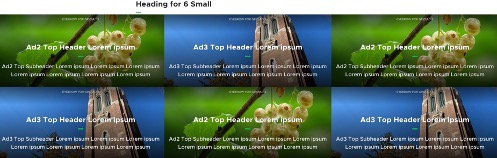
Fig. 17: Grid Container layout showing the “6 Small” variant. Each cell contains a Grid Ad component.
2-small-1-large-blank
Fig. 18: Grid Container layout showing the “1 Tall, 1 Large” variant.
2-small-1-large-example
Fig. 19: Grid Container layout showing the “1 Tall, 1 Large” variant. Each cell contains a Grid Ad component.
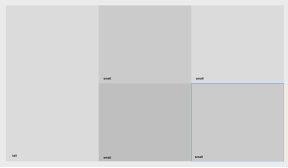
2-small-1-large-blank
Fig. 20: Grid Container layout showing the “1 Tall, 4 Small” variant.
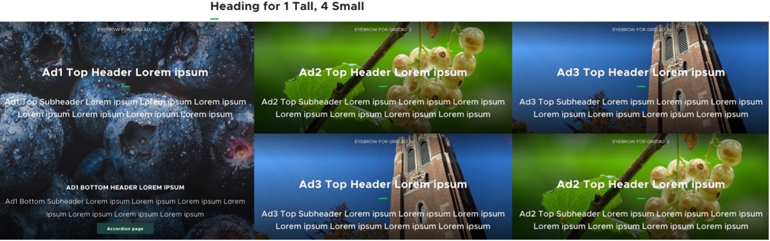
2-small-1-large-example
Fig. 21: Grid Container layout showing the “1 Tall, 4 Small” variant. Each cell contains a Grid Ad component.
2-small-1-large-blank
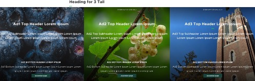
Fig. 22: Grid Container layout showing the “3 Tall” variant.
2-small-1-large-example
Fig. 23: Grid Container layout showing the “3 Tall” variant. Each cell contains a Grid Ad component.
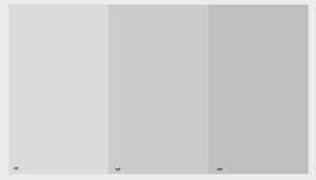
2-small-1-large-blank
Fig. 24: Grid Container layout showing the “X-Large” variant.
2-small-1-large-example
Fig. 25: Grid Container layout showing the “X-Large” variant. The cell contains one Grid Ad component.

Image Specifications

Sketch Link: Grid Container

Grid XLarge

  • Desktop – Width: 100% | Height: 810px
  • Mobile – Width: 100% | Height: 573px
  • Recommended size – Width: 2000px | Height: 1000px

Grid Large

  • Desktop – Width: 960px | Height: 810px
  • Mobile – Width: 375px | Height: 536px
  • Recommended size – Width: 1000px | Height: 1000px

Grid Medium

  • Desktop – Width: 50% / 720px | Height: 810px
  • Mobile – Width: 100% | Height: 300px
  • Recommended size – Width: 800px | Height: 900px

Grid Small

  • Desktop – Width: 33% / 480px | Height: 405px
  • Mobile – Width: 100% | Height: 300px
  • Recommended size – Width: 500px | Height: 500px

Grid Tall

  • Desktop – Width: 33% / 480px | Height: 810px
  • Mobile – Width: 100% | Height: 300px
  • Recommended size – Width: 500px | Height: 900px

Tool Use Guide

*Add content type and then follow component-specific instructions


Documentation updated: May 29, 2026

Is there an issue with this documentation? Report it here.