Jump to HeaderJump to Main ContentJump to Footer
Michigan State University
Digital Experience Studio

University Communications and Marketing

Digital Experience Studio

  • Experience Program
    • Website Project Process
    • Working with a Vendor
    • Glossary
    • Taxonomy Data Dictionary
  • |
  • Experience Design
    • Website Strategy
    • Website Structure
    • Information Architecture and Navigation
    • User-Centered Design Conventions
    • Common UX Issues
    • Enterprise Design System
    • Content Planning
    • Creating Accessible Content
    • Taxonomy and Filters
  • |
  • Website Technology
    • Web Standards
    • Search Engine Optimization
    • Cascade CMS
    • Sitecore CMS
    • Content Hub Overview
    • Content Hub DAM
    • Content Hub Operations

    SitecoreAI

    Sitecore user login
  • |
  • Social Media
    • Alt Text Bookmarklet
    • Meta Ad Pixel
    • Social Media and Web Integration
    • Sprinklr

    Sprinklr

    Sprinklr user login
  • |
  • Analytics
    • Google Analytics (GA4)
    • Testing
    • Data Visualization

    Google Analytics

    Google Analytics user login
  • |
  • News and Events
    • News and Updates
    • Events and Trainings
Digital Experience Studio

University Communications and Marketing

  • Experience Program
  • Experience Design
  • Website Technology
  • Social Media
  • Analytics
  • News and Events

< Experience Program

  • Website Project Process
  • Working with a Vendor
  • Glossary
  • Taxonomy Data Dictionary

< Experience Design

  • Website Strategy
  • Website Structure
  • Information Architecture and Navigation
  • User-Centered Design Conventions
  • Common UX Issues
  • Enterprise Design System
  • Content Planning
  • Creating Accessible Content
  • Taxonomy and Filters

< Website Technology

  • Web Standards
  • Search Engine Optimization
  • Cascade CMS
  • Sitecore CMS
  • Content Hub Overview
  • Content Hub DAM
  • Content Hub Operations

SitecoreAI

Sitecore user login

< Social Media

  • Alt Text Bookmarklet
  • Meta Ad Pixel
  • Social Media and Web Integration
  • Sprinklr

Sprinklr

Sprinklr user login

< Analytics

  • Google Analytics (GA4)
  • Testing
  • Data Visualization

Google Analytics

Google Analytics user login

< News and Events

  • News and Updates
  • Events and Trainings
Digital Experience Studio > Website Technology > Sitecore CMS > Sitecore Component Guide >

Image Fact Grid

Michigan State University

MSU Tools and Resources

  • A to Z Index
  • Find People
  • Email
  • Tech Support
  • Social Media Directory

Communications Resources

  • University Communications and Marketing
  • University Trademarks and Licensing
  • MSU Brand Studio
  • MSU Editorial Style Guide
  • MSU Photos

Contact us

517-355-7505

Address

Michigan State University 408 West Circle Drive East Lansing, MI 48824

Follow Us

  • Visit our Facebook page
  • Visit our page on X
  • Visit our Instagram page
  • Visit our LinkedIn page
  • Visit our YouTube page
  • Visit our TikTok page

If you're having accessibility issues, please let us know.

Know MoreTransparency Reporting: Budget & Salary/Compensation
Michigan State University
  • Contact Information|
  • Site Map|
  • Privacy Statement|
  • Site Accessibility|
  • Call MSU: (517) 355-1855|
  • Visit: msu.edu|
  • Notice of Nondiscrimination|

SPARTANS WILL|© Michigan State University|

Image Fact Grid

The Image Fact Grid presents one, two or three facts over a full-width background image.
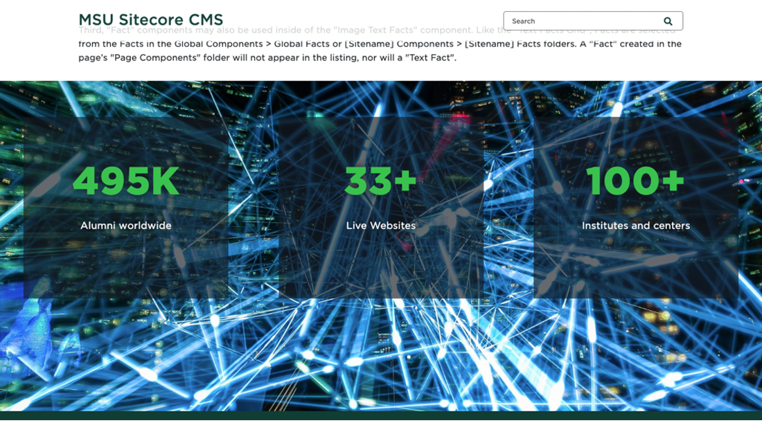
An image of blue and white laser lines serves as the backdrop for three semi-translucent black boxes containing bright green and white text.
Figure 1: An Image Fact Grid component. This example uses the “Translucent Black” styling option. 

Component Information

  • Usage
  • Best Practices
  • Expected Behavior
  • Related Information

Benefits

  • An Image Facts Grid is placed on a page to display up to three facts over an image background.
  • This provides a more visual option for page design flexibility. 

Component Options and Limitations

  • The Image Facts Grid can display up to three facts.
  • There are three different font/box style options:
    • Translucent Black
    • Green
    • White
  • The content author is responsible for ensuring selected background images and variant combination meet accessibility standards for color contrast. See the Digital Accessibility website for more information

Guidelines

  • Choose a background image that is large enough for the desktop view. It will resize for smaller views.
  • Keep in mind that text will appear over the image.
  • Users should avoid using photos of people to avoid text rendering over faces.
  • Busy images may make reading the text more challenging if “Translucent Black” option is selected.
  • If adding a link to the fact, the Image Fact Grid will work best if no link description text is included.
  • The image will adjust to the designated tablet or mobile image when viewed on a device. Text size adjusts accordingly.

Related Components

  • Fact

Similar Components

  • Grid Container
  • Text Fact Grid

Live Example

  • Demo: Grid Components

Template Data

  • Page Builder Fields
  • Content Editor and Explorer Fields

Content Tab

Background Image Desktop
  • This is a required image field with normal image field options.
  • This is used for the desktop image size and for other sizes if other image fields are left blank.
  • This field is accessed by clicking on the image icon in the lower right corner of the component.
Background Image Tablet
  • This is an optional image field with normal image field options.
  • This image will be used for tablet image size. 
Background Image Mobile
  • This is an optional image field with normal image field options.
  • This image will be used for mobile image size.

Design Tab

Background Color
  • This is the variant control.
  • Drop-down menu with three options:
    • Translucent Black
    • Green
    • White
  • This changes the color of the Fact background boxes and text.

Editing Canvas

Three Fact Placeholders
  • Assign up to three facts for the placeholders in the Image Fact Grid component.
Background Image Desktop 
  • This is a required image field with normal image field options.
  • This field is used for the desktop image size. 
  • This field will also be used for other device sizes if the other image fields are left blank. It is recommended that users preview the component on various device and browser sizes to confirm how the images appear. Users may wish to set alternative images for different devices viewports. For example, an image may crop inappropriately when viewed on mobile. 
  • This behaves the same as the corresponding field in Page Builder.
Background Image Tablet
  • This is an optional image field with normal image field options. 
  • This image will be used for tablet image size. 
Background Image Mobile
  • This is an optional image field with normal image field options. 
  • This image will be used for mobile image size. 

Frequently Asked Questions

What does the Image Fact Grid display?

The Image Fact Grid displays up to three facts. It is recommended that you not include Link Description text if adding a link.

What is a fact?

Instructions for Use

Create Facts
  • Before adding the Image Fact Grid component, the content author should have the desired facts details ready.
  • Existing facts available to use are in the site’s Data > Facts Folder or in the Shared Sites > Global Facts Folder.
  • Content authors may create new facts in Content Editor in their site’s Data > Facts Folder.
  • Content authors may also create new facts by choosing “Create new” when placing a fact in the Image Facts Grid in Pages. Select the site Facts Folder for the location.
  • Data for a fact can be added/edited in the Content Editor or directly in Page Builder.

Specific notes for facts used in an Image Fact Grid:

  • A fact must have the “Title – Text” and “Description” fields completed.
  • The “Source URL” and “Description” text are optional.
  • The “Subheading” and “Image” fields are not used in the Image Facts Grid. These fields are used in other components that use facts.

Style Variants

Image Fact Grid – Green
A photo looking down from the sky on Beaumont Tower, green grass and trees, and grey sidewalks serves as the background for three dark green boxes containing large bold white text reading "Fact Title" above smaller, light weight light green text reading "Fact description."
Image Fact Grid – White

Tool Use Guide

*Alt text should already be added for images in Content Hub or Media Library.


Documentation updated: June 29, 2026

Is there an issue with this documentation? Report it here.

A fact is a special component located in the site’s Data > Facts Folder or in the Shared Sites > Global Facts Folder.

See the Fact page for more details.

Where can I create and/or find a fact?

Users can create a new fact inside of the site’s Data > Facts Folder. Users may also find facts inside the Shared Sites > Global Facts Folder.

See the Fact page for more details.

What is required for an Image Fact Grid?

To work properly, an Image Fact Grid at minimum needs a background image set for desktop view and at least one fact added to the component.

How many facts can I display in an Image Fact Grid?

Websites may display one, two or three facts in an Image Fact Grid.

Add Image Fact Grid to Page

In Page Builder:

  1. Select the page in the Content Tree.
  2. Click “+” button in any Placeholder box below the Breadcrumb links.
  3. Select Image Fact Grid component from list.

Alternate method:

  1. Click Components tab at top of Content Tree.
  2. Locate Image Fact Grid component.
  3. Drag the Image Fact Grid component to any empty placeholder area of the page below the Breadcrumb links. 
Format Image Fact Grid and Add Content
  1. Click on the component to select it. The Image Fact Grid panel opens on the right side.
  2. Click Content to display the Content tab.
  3. In the Image Fact Grid section of the Content tab, click the down arrow to expand the Background Image Desktop option.
  4. Click Browse media library to open the Media Library.
  5. Search for and select an image to use as the desktop background. Click the image to select it, then click Add selected.
  6. Add a background image to the Background Image Desktop area by clicking on the background image selector in the bottom right corner.
  7. Repeat steps 3 through 6 to add Tablet and Mobile images, if desired. If no images are added to these fields, the desktop image will be resized as appropriate.
  8. Click Design at the top of the Image Fact Grid right side panel to display the Design tab.
  9. Click Advanced Styling to expand the options.
  10. Choose a variant using the Background color dropdown menu.
  11. Add (or create) the desired fact(s), starting with the left-side placeholder.
    1. To use one fact, leave the middle and right placeholders empty.
    2. To use two facts, leave the right placeholder empty.
  12. Add or edit fact data, as needed.
    1. Note: When using existing facts, take care when editing. Facts could be used in other locations on the site. Any changes made will change the data for the fact anywhere it is used.
    2. Global Facts are only editable by system administrators.
  13. Click Actions and Submit to send changes to publishing workflow.
Optional: Add Background Images in Content Editor

Mobile and/or tablet background images can be added in Content Editor or Explorer.

In Page Builder: 

  1. Click the dropdown arrow to the right of the Sitecore XM Cloud icon in upper left.
  2. Select Content editor. It opens in a new browser tab.

In Content Editor:

  1. If the Image Fact Grid does not appear in the Content Tree, close the page’s Data node and expand it again to refresh the Content Tree.
    In the Content Tree, expand Content > MSU > site name > Home > page name > Data or wherever the component was added.
  2. Locate and expand the Image Fact Grid component.
  3. Use the file location tool to select a background image.
  4. Click Save.
  5. Return to Page Builder. 

In Page Builder:

  1. Refresh the  canvas to preview the changes.
  2. Click Actions and Submit to send changes to publishing workflow.
A photo looking up at an angle at Beaumont Tower against a clear blue sky serves as the background for three semi-translucent white boxes containing large bold black text reading "Fact Title" above smaller, light weight black text reading "Fact description."
Image Fact Grid – Translucent Black
A photo of two students sitting at a computer in a dark room surrounded by digital screens displaying data serves as the background for three semi-translucent black boxes containing large bold bright green text reading "Fact Title" above smaller, light weight white text reading "Fact description."