Jump to HeaderJump to Main ContentJump to Footer
Michigan State University
Digital Experience Studio

University Communications and Marketing

Digital Experience Studio

  • Experience Program
    • Website Project Process
    • Working with a Vendor
    • Glossary
    • Taxonomy Data Dictionary
  • |
  • Experience Design
    • Website Strategy
    • Website Structure
    • Information Architecture and Navigation
    • User-Centered Design Conventions
    • Common UX Issues
    • Enterprise Design System
    • Content Planning
    • Creating Accessible Content
    • Taxonomy and Filters
  • |
  • Website Technology
    • Web Standards
    • Search Engine Optimization
    • Cascade CMS
    • Sitecore CMS
    • Content Hub Overview
    • Content Hub DAM
    • Content Hub Operations

    SitecoreAI

    Sitecore user login
  • |
  • Social Media
    • Alt Text Bookmarklet
    • Meta Ad Pixel
    • Social Media and Web Integration
    • Sprinklr

    Sprinklr

    Sprinklr user login
  • |
  • Analytics
    • Google Analytics (GA4)
    • Testing
    • Data Visualization

    Google Analytics

    Google Analytics user login
  • |
  • News and Events
    • News and Updates
    • Events and Trainings
Digital Experience Studio

University Communications and Marketing

  • Experience Program
  • Experience Design
  • Website Technology
  • Social Media
  • Analytics
  • News and Events

< Experience Program

  • Website Project Process
  • Working with a Vendor
  • Glossary
  • Taxonomy Data Dictionary

< Experience Design

  • Website Strategy
  • Website Structure
  • Information Architecture and Navigation
  • User-Centered Design Conventions
  • Common UX Issues
  • Enterprise Design System
  • Content Planning
  • Creating Accessible Content
  • Taxonomy and Filters

< Website Technology

  • Web Standards
  • Search Engine Optimization
  • Cascade CMS
  • Sitecore CMS
  • Content Hub Overview
  • Content Hub DAM
  • Content Hub Operations

SitecoreAI

Sitecore user login

< Social Media

  • Alt Text Bookmarklet
  • Meta Ad Pixel
  • Social Media and Web Integration
  • Sprinklr

Sprinklr

Sprinklr user login

< Analytics

  • Google Analytics (GA4)
  • Testing
  • Data Visualization

Google Analytics

Google Analytics user login

< News and Events

  • News and Updates
  • Events and Trainings
Digital Experience Studio > Website Technology > Sitecore CMS > Sitecore Component Guide >

Featured News and Events

MSU Tools and Resources

  • A to Z Index
  • Find People
  • Email
  • Tech Support
  • Social Media Directory

Communications Resources

  • University Communications and Marketing
  • University Trademarks and Licensing
  • MSU Brand Studio
  • MSU Editorial Style Guide
  • MSU Photos

Contact us

517-355-7505

Address

Michigan State University 408 West Circle Drive East Lansing, MI 48824

Follow Us

  • Visit our Facebook page
  • Visit our page on X
  • Visit our Instagram page
  • Visit our LinkedIn page
  • Visit our YouTube page
  • Visit our TikTok page

If you're having accessibility issues, please let us know.

Know MoreTransparency Reporting: Budget & Salary/Compensation
  • Contact Information|
  • Site Map|
  • Privacy Statement|
  • Site Accessibility|
  • Call MSU: (517) 355-1855|
  • Visit: msu.edu|
  • Notice of Nondiscrimination|

SPARTANS WILL|© Michigan State University|

Featured News and Events

The Featured News and Events component allows for featuring one or more news articles, events or both on a web page. The included content can be fully automated or can include some manual curation. The automated settings can pull in content based on facets, such as unit, event audience or story topic. Five variants of the component are available.
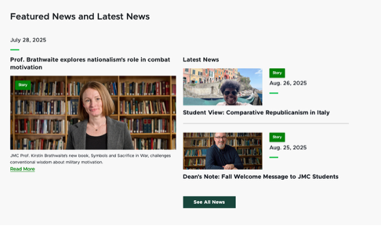
A sample of the Featured News and Latest News variant displays one large featured story on the left and two smaller latest news items on the right above a view all button linking to the full list of news stories.
Figure 1: Example of a Featured News and Events component, using the Featured News and Latest News variant.

Component Information

  • Usage
  • Benefits

    • Highlight news stories, events or both within a component on any web page within the website.
    • Choose a single item that’s manually curated (optional). The rest of the items within the component update automatically based on publishing date.
    • Set a global featured event or featured news item to be highlighted in any Featured News and Event component throughout the website, so the featured item only needs to be updated in one place.
    • Leverage page-level overrides to allow for page-specific featured content instead of the global featured item.
    • Filter a “latest event” feed by facet, including Event Type, Event Category, Event Audience or College Department.
    • Filter a “latest news” feed by facet, including Story Topic, Story Type or College Department. 

    Variants

    • The Featured News and Events component has five variants available. Each variant offers a different combination of news or events — or both — and different settings for featured content vs. most recent content.
    • Variants include:
      • Featured News and Latest News (Default)
      • Featured Event and Latest News
      • Featured Event and Upcoming Event
      • Featured News and Upcoming Events
      • Latest News and Latest Events
  • Best Practices
  • Template Data

    Global Featured and Show All Settings – Content Editor

    Note: The global and show all settings for the Featured News and Events component are located in the “Search – General and Featured News and Events Defaults” section of the main site node. [Site admin access is required to change these settings.] See full instructions below.

    Use Full URL (checkbox)

    • Check this box to have items in the list display with the full URL.
    • Default: off

    Default Featured News Item (select from Content Tree)

    • Select a featured news item to include as the default featured item in any Featured News and Events component throughout the website using a variant including a featured news item.
    • This can be overridden at the page level for specific Featured News and Events components.
    • Choose "None" to remove a previously selected news item from the default setting.

    Default Featured Event (select from Content Tree)

    • Select a featured event to include as the default in any Featured News and Events component throughout the website using a variant including a featured event item.
    • This can be overridden at the page level for specific Featured News and Events components.
    • Choose "None" to remove a previously selected event from the default setting.

    Default News Show All Page (select from Content Tree)

    • Select a page to serve as the default when “Show all” is selected for events in any Featured News and Events component throughout the website.
    • This is typically the News listing page.
    • This can be overridden at the page level for specific Featured News and Events components.

    Default Event Show All Page (select from Content Tree)

    • Select a page to serve as the default when “Show all” is selected for events in any Featured News and Events component throughout the website.
    • This is typically the Events listing page.
    • This can be overridden at the page level for specific Featured News and Events components.

    Instructions for Use

    Add a Featured News and Events Component to a Page

    In Page Builder:

    1. Select the page in the Content Tree.
    2. Click “+” button in any Placeholder box below the Breadcrumb links.
    3. Select Featured News and Events component from list.

    Alternate method:

    1. Click Components tab at top of Content Tree.
    2. Locate Featured News and Events component.
    3. Drag the Featured News and Events component to any empty placeholder area in the main area of the page below the Breadcrumb links.

    When the component is added, placeholder text appears showing the location of the content. The component is not visible in Edit or Preview Mode. 

    In Pages, the page displays text reading
    Figure 2: The Featured News and Events component viewed in Edit Mode indicates the presence of the component and the settings in use. 
    Screenshot of text in preview mode reading
    Figure 3: The Featured News and Events component viewed in Preview Mode indicates the component will not function unless published.


    Component Variants

    Featured News and Latest News (Default)
    A sample of the Featured News and Latest News variant displays one large featured story on the left and two smaller latest news items on the right above a view all button linking to the full list of news stories.
    Figure 11: A screenshot of the default variant of the component, showing one featured news item (manually curated) and two latest news items (automatically displayed based on publishing date).

    Image Specifications

    News and event images are set for each individual item and will pull in to the Featured News and Events component, as needed. 

    Sketch Link: Featured Events

    Listing Page Image

    • Desktop — Width: 460px | Height: 220px
    • Mobile — Width: 305px | Height: 150px  
    • Recommended size — Width: 500px | Height: 300px

    Detail Page Image

    • Desktop — Width: 750px | Height: 520px
    • Mobile — Width: 305px | Height: 210px
    • Recommended size — Width: 800px | Height: 600px


    Sketch Link: Featured News

    Story Card — Grid

    • Desktop — Width: 425px | Height: 230px  
    • Tablet — Width: 425px | Height: 220px  
    • Mobile — Width: 350px | Height: 120px
    • Recommended size — Width: 500px | Height: 300px

    Story Card — List

    • Desktop — Width: 388 px (1/3 the container) | Height: 210px  
    • Tablet — Width: 294 px (1/3 the container) | Height: 210px  
    • Mobile — Width: Story container | Height: 120px
    • Recommended size — Width: 500px | Height: 300px

    Tool Use Guide

    Documentation updated: June 29, 2026

    Is there an issue with this documentation? Report it here.
    Component Options and Limitations

    • Featured (i.e., manually curated) items are limited to one news item or one event item.
    • News and event feeds can be filtered using one facet.
    • Global featured news and event items will appear in the featured item section of any Featured News and Event component on the website, unless the component has a component-specific override selected.
    • Featured content items cannot be scheduled to change. 

    Guidelines

    • It is recommended that site content owners keep a log of any Featured News and Event components on a website to ensure all are updated when necessary.
    • Be mindful when selecting global featured news and event items to ensure they are appropriate to display on any page with a Featured News and Events component within the site, or that any pages that should not display the item are updated with a manual override.
    • Set reminders to update Featured News and Event items regularly so they do not become outdated. 
  • Expected Behavior
    • A featured item (news or event) is manually curated.
    • A latest item (news) is the most recent published.
    • An upcoming item (events) is the next occurring event.
    • Upcoming events will fall off the list at the end of the day on their event date.
  • Related Information
  • Related Components:

    • Event Details Page
    • Events Taxonomy
    • Story Page
    • News Taxonomy
    Page-Level Layout Details Settings – Content Editor
    Note: The page-level settings for the Featured News and Events component are found by selecting the page in Content Editor and going into the page’s Layout Details using the PRESENTATION tab > Details menu item. See full instructions below. 
     

    Title (single-line text)

    • Enter text to override the default component title (matches variant name).
    • This text appears as the headline above the component.

    Featured News Item (link)

    • Select a specific news item to use in a featured news space within the component.
    • This selection will override any default option set at the site node.

    Featured Upcoming Event (link)

    • Select a specific event to use in a featured event space within the component.
    • This selection will override any default option set at the site node.
    • The item does not automatically “expire” when the featured event date has passed. It must be manually updated. 

    Event List Source ID (droplist)

    • Select the data list for upcoming events.
    • The typical setting will be “Event List – Prod”.
    • Only set something here to override the site default value.

    Event Site Names (single-line text)

    • Enter the site name for any website(s) that should serve as data sources for events on this website.
    • The typical setting will be the name of the site where the component is placed.
    • Only set something here to override the site default value.
    • Note: site names are case sensitive. Enter exactly as viewed in the Content Tree. 

    News List Source ID (droplist)

    • Select the data list for news.
    • The typical setting will be “News List – Prod”.
    • Only set something here to override the site default value.

    News Site Names (single-line text)

    • Enter the site name for any website(s) that should serve as data sources for news on this website.
    • The typical setting will be the name of the site where the component is placed.
    • Note: site names are case sensitive. Enter exactly as viewed in the Content Tree. 

    News List Show All (select from Content Tree)

    • Select the page that is accessed by clicking the “View All” button below News.
    • This selection will override any default option set at the site node.
    • If no selection is made in either the default settings or the component settings, the button will not display.

    Event List Show All (select from Content Tree)

    • Select the page that is accessed by clicking the “View All” button below Events.
    • This selection will override any default option set at the site node.
    • If no selection is made in either the default settings or the component settings, the button will not display.

    News Facet (droplist)

    • Select a facet to pre-filter the news list.
    • If a facet is selected, a News Facet Value must be included in the appropriate field.
    • If no facet is selected, all news story pages from the selected News List Source will be eligible to display in the Featured News and Events component.

    News Facet Value (single-line text)

    • Enter the desired value for the selected News Facet.
    • The value must be one of the values already associated with the selected News Facet. 

    Event Facet (droplist)

    • Select a facet to pre-filter the event list.
    • If a facet is selected, an Event Facet Value must be included in the appropriate field.
    • If no facet is selected, all news story pages from the selected Events List Source will be eligible to display in the Featured News and Events component.

    Event Facet Value (single-line text)

    • Enter the desired value for the selected Event Facet.
    • The value must be one of the values already associated with the selected Event Facet. 

    Styling (droplist)

    • Select a variant.
    • Available variants include:
      • Featured News and Latest News (Default)
      • Featured Event and Latest News
      • Featured Event and Upcoming Event
      • Featured News and Upcoming Events
      • Latest News and Latest Events

    Additional Parameters (single-line text)

    • Use to add additional filter parameters.
    • The facet should be entered on the left. The facet value should be entered on the right. 
    Component-Specific Settings (Design Tab, Advanced Styling Panel) – Page Builder

    Variant (droplist)

    • Select a variant.
    • Available variants include:
      • Featured News and Latest News (Default)
      • Featured Event and Latest News
      • Featured Event and Upcoming Event
      • Featured News and Upcoming Events
      • Latest News and Latest Events

    Title (single-line text)

    • Enter text to override the default component title (matches variant name).
    • This text appears as the headline above the component.

    News Facet (droplist)

    • Select a facet to pre-filter the news list.
    • If a facet is selected, a News Facet Value must be included in the appropriate field.
    • If no facet is selected, all news story pages from the selected News List Source will be eligible to display in the Featured News and Events component.

    Event Facet (droplist)

    • Select a facet to pre-filter the event list.
    • If a facet is selected, an Event Facet Value must be included in the appropriate field.
    • If no facet is selected, all news story pages from the selected Events List Source will be eligible to display in the Featured News and Events component.

    Event List Source ID (droplist)

    • Select the data list for upcoming events.
    • The typical setting will be “Event List – Prod”.

    News Facet Value (single-line text)

    • Enter the desired value for the selected News Facet.
    • The value must be one of the values already associated with the selected News Facet.

    Event Facet Value (single-line text)

    • Enter the desired value for the selected Event Facet.
    • The value must be one of the values already associated with the selected Event Facet. 

    Event Site Names (single-line text)

    • Enter the site name for any website(s) that should serve as data sources for events on this website.
    • The typical setting will be the name of the site where the component is placed.
    • Note: site names are case sensitive. Enter exactly as viewed in the Content Tree. 

    News List Source ID (droplist)

    • Select the data list for news.
    • The typical setting will be “News List – Prod”.

    News Site Names (single-line text)

    • Enter the site name for any website(s) that should serve as data sources for news on this website.
    • The typical setting will be the name of the site where the component is placed.
    • Note: site names are case sensitive. Enter exactly as viewed in the Content Tree. 
    Setting the Component Variant

    In Page Builder:

    1. Click on the component within the page to select it.
    2. Click the Design tab in the right-side panel.
    3. Click to expand the Advanced Styling panel.
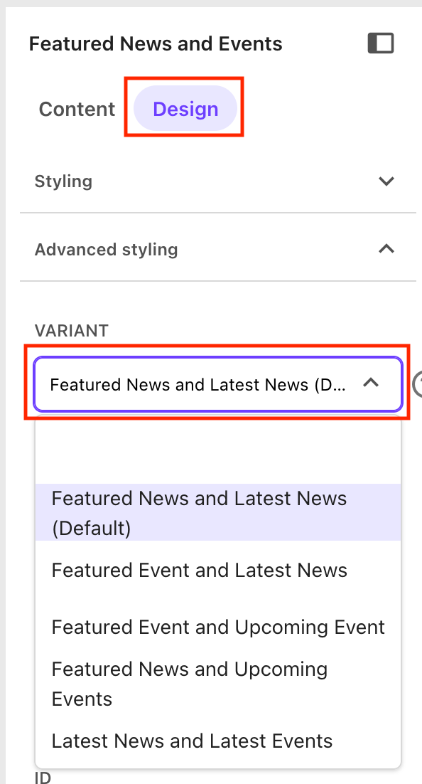
    4. Click the Variant drop-down list and click a variant name to select. 
    In Pages, the variant is selected using a dropdown menu in the Design tab on the right side of the working space.
    Figure 4: The Variant selection field is in the “Advanced styling” panel of the “Design” tab.
    Set a Component Title

    By default, the component will display a headline descriptive of the component contents, based on the selected variant. To override the default title, in Page Builder:

    1. Click on the component within the page to select it.
    2. Click the Design tab in the right-side panel.
    3. Click to expand the Advanced Styling panel.
    4. Enter a new title in the Title field.
    Set a Sitewide (i.e., Global) Featured News Item and Show All Page

    Note: Site admin access is required to change these settings.


    In Content Editor:

    1. Navigate to the main site node in the Content Tree: Expand Content node, MSU node and click on the site name.
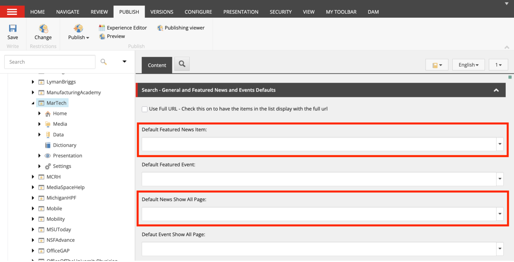
    2. In the right-side content area, scroll to the “Search – General and Featured News and Events Defaults” section.
    3. Click the Default Featured News Item drop-down menu.
    4. Use the pop-up panel to navigate through the site tree to select the news story that should be the default featured item in any Featured News and Events component variant including a Featured News option.
    5. Click the Default News Show All Page drop-down menu.
    6. Use the pop-up panel to navigate through the site tree to select the page that should be the default featured item in any Featured News and Events component variant when “Show all” is selected for News. This is typically the News listing page.
    7. Click Save.
    8. Saved changes will be updated during the next standard publishing cycle.
    The Content Editor settings panel with fields for setting a default news item and news view all link.
    Figure 5: The default news item and Show All page are set in the “Search – General and Featured News and Events Defaults” section of the site node in Content Editor.

    Note: If the variant in use includes a Featured News space and no featured news item is selected at the global or page level, the component will not display a featured news item, and the latest news content will shift to the left column. If no “Show All” page is selected, there will not be a “Show All” call to action visible on the component.

    Set a Page-Level Featured News Item Override

    In Content Editor:

    1. Locate the page where the component resides: Expand Content node, MSU node, site name node and locate the page. Click the page name.
    2. Click Lock and Edit to open edit mode.
    3. On the navigation ribbon, click the Presentation tab.
    4. Click Details.
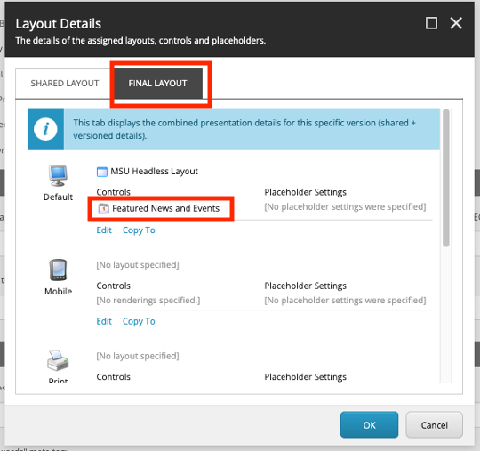
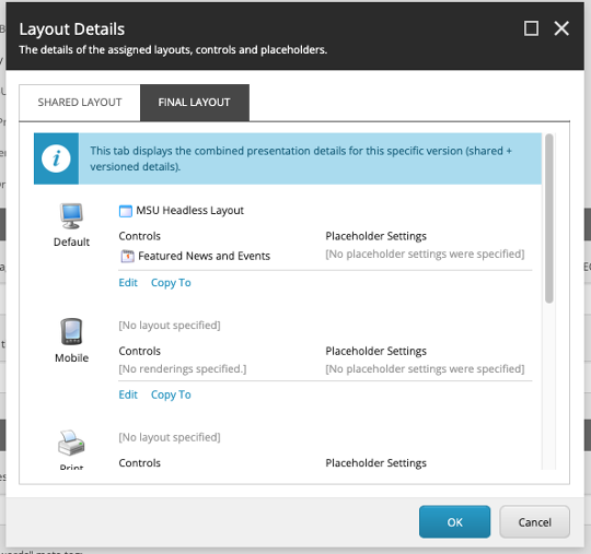
    5. Click the Final Layout tab in the pop-up panel.
    6. Scroll the list and locate the Featured News and Events component. Click the component name.
    The layout details tab includes a link for the Featured News and Events component, used to adjust display settings for the component on the page.
    Figure 6: Click “Featured News and Events” on the Final Layout tab of the Layout Details panel under Presentation in the navigation ribbon to access settings for the component.
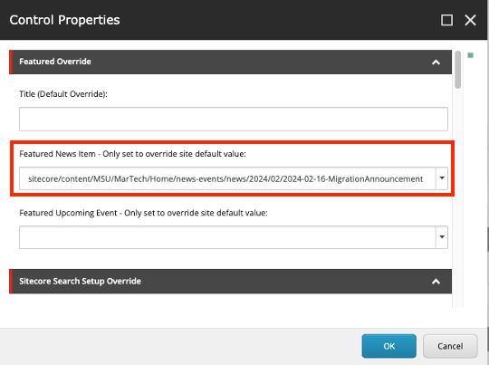
    1. In the Featured News Item field, select the page to be featured for this component.
    2. Click OK.
    3. Click OK.
    4. Click Save.
    5. Submit the page to the publishing workflow.
      1. Click the Review tab in navigation ribbon.
      2. Click Submit.
      3. Click OK.
      4. Submitted changes will be updated during the next standard publishing cycle.
    In Content Editor the featured news story can be overridden on the page using a field marked with a red box.
    Figure 7: Selecting a page in the “Featured News Item” field of the component’s final layout presentation details properties panel will override a site default featured item. The featured story will display in the component if a variant including a Featured News space is selected.

    Note: If the variant in use includes a Featured News space and no featured news item is selected at the global or page level, the component will not display a featured news item, and other content will shift to the left column. If no “Show All” page is selected, there will not be a “Show All” call to action visible on the component.

    Set Page-Level Component News Source Parameters

    In Page Builder:

    1. Click on the component within the page to select it.
    2. Click the Design tab in the right-side panel.
    3. Click to expand the Advanced Styling panel.
    4. Select an option from the News Facet drop-down. Options include Departments, Topics or Unit Topics.
    5. Enter a value for the selected facet in the “News Facet Value” drop-down.
    6. Select the correct News source, typically News List – Prod, from the droplist in the News List Source ID field.
    7. Enter the site name (as written in the main site node in the Content Tree) in the “News Site Names” field. 
    Set a Sitewide (i.e., Global) Featured Event Item and Show All Page

    Note: Site admin access is required to change these settings.


    In Content Editor:

    1. Navigate to the main site node in the Content Tree: Expand Content node, MSU node and click on the site name.
    2. In the right-side content area, scroll to the “Search – General and Featured News and Events Defaults” section.
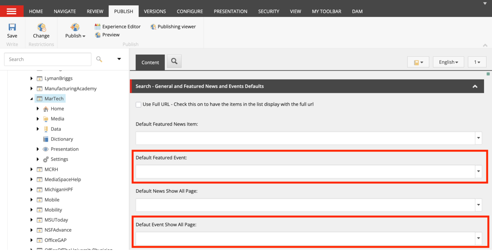
    3. Click the Default Featured Event drop-down menu.
    4. Use the pop-up panel to navigate through the site tree to select the event item that should be the default featured item in any Featured News and Events component variant including a Featured Event option.
    5. Click the Default Event Show All Page drop-down menu.
    6. Use the pop-up panel to navigate through the site tree to select the page that should be the default featured item in any Featured News and Events component variant when “Show all” is selected for Events. This is typically the events listing page.
    7. Click Save.
    8. Saved changes will be updated during the next standard publishing cycle.
    The Content Editor settings panel with fields for setting a default event and event view all link.
    Figure 8: The default event item and Show All page are set in the “Search – General and Featured News and Events Defaults” section of the site node in Content Editor.

    Note: If the variant in use includes a Featured Event space and no featured event item is selected at the global or page level, the component will not display a featured event item, and the other content will shift to the left column. If no “Show All” page is selected, there will not be a “Show All” call to action visible on the component.

    Set a Page-Level Featured Event Item Override

    In Content Editor:

    1. Locate the page where the component resides: Expand Content node, MSU node, site name node and locate the page. Click the page name.
    2. Click Lock and Edit to open edit mode.
    3. On the navigation ribbon, click the Presentation tab.
    4. Click Details.
    5. Click the Final Layout tab in the pop-up panel.
    6. Scroll the list and locate the Featured News and Events component. Click the component name.
    The layout details tab includes a link for the Featured News and Events component, used to adjust display settings for the component on the page.
    Figure 9: Click “Featured News and Events” on the Final Layout tab of the Layout Details panel under Presentation in the navigation ribbon to access settings for the component.
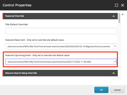
    1. In the Featured Upcoming Event field, select the page to be featured for this component.
    2. Click OK.
    3. Click OK.
    4. Click Save.
    5. Submit the page to the publishing workflow.
      1. Click the Review tab in navigation ribbon.
      2. Click Submit.
      3. Click OK.
      4. Submitted changes will be updated during the next standard publishing cycle.
    In Content Editor the featured event can be overridden on the page using a field marked with a red box.
    Figure 10: Selecting a page in the “Featured Event” field of the component’s final layout presentation details properties panel will override a site default featured item. The featured event will display in the component if a variant including a Featured Event space is selected.

    Note: If the variant in use includes a Featured Event space and no featured event item is selected at the global or page level, the component will not display a featured event item, and the other content will shift to the left column. If no “Show All” page is selected, there will not be a “Show All” call to action visible on the component.

    Set Page-Level Component Event Source Parameters

    In Page Builder:

    1. Click on the component within the page to select it.
    2. Click the Design tab in the right-side panel.
    3. Click to expand the Advanced Styling panel.
    4. Select an option from the Event Facet drop-down. Options include Category, Types, Featured, Offices and Centers, Audiences and Departments.
    5. Enter a value for the selected facet in the Event Facet Value drop-down.
    6. Select Event List – Prod from the droplist in the Event List Source ID field.
    7. Enter the site name (as written in the main site node in the Content Tree) in the Event Site Names field. 
    Featured Event and Latest News
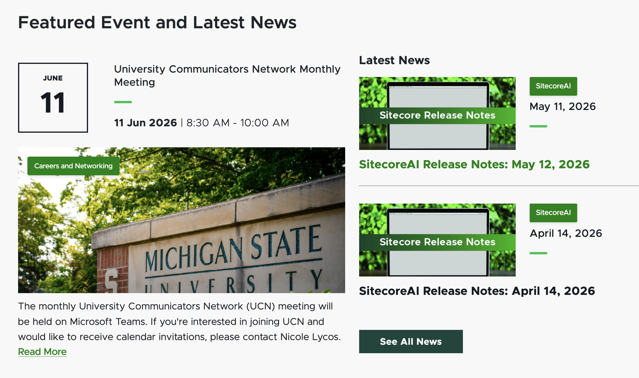
    A screenshot showing one featured event item on the left and two recent news items on the right.
    Figure 12: A screenshot of the Featured Event and Latest News variant of the component, showing one featured event item (manually curated) and two latest news items (automatically displayed based on publishing date).
    Featured Event and Upcoming Events
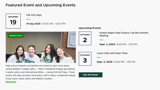
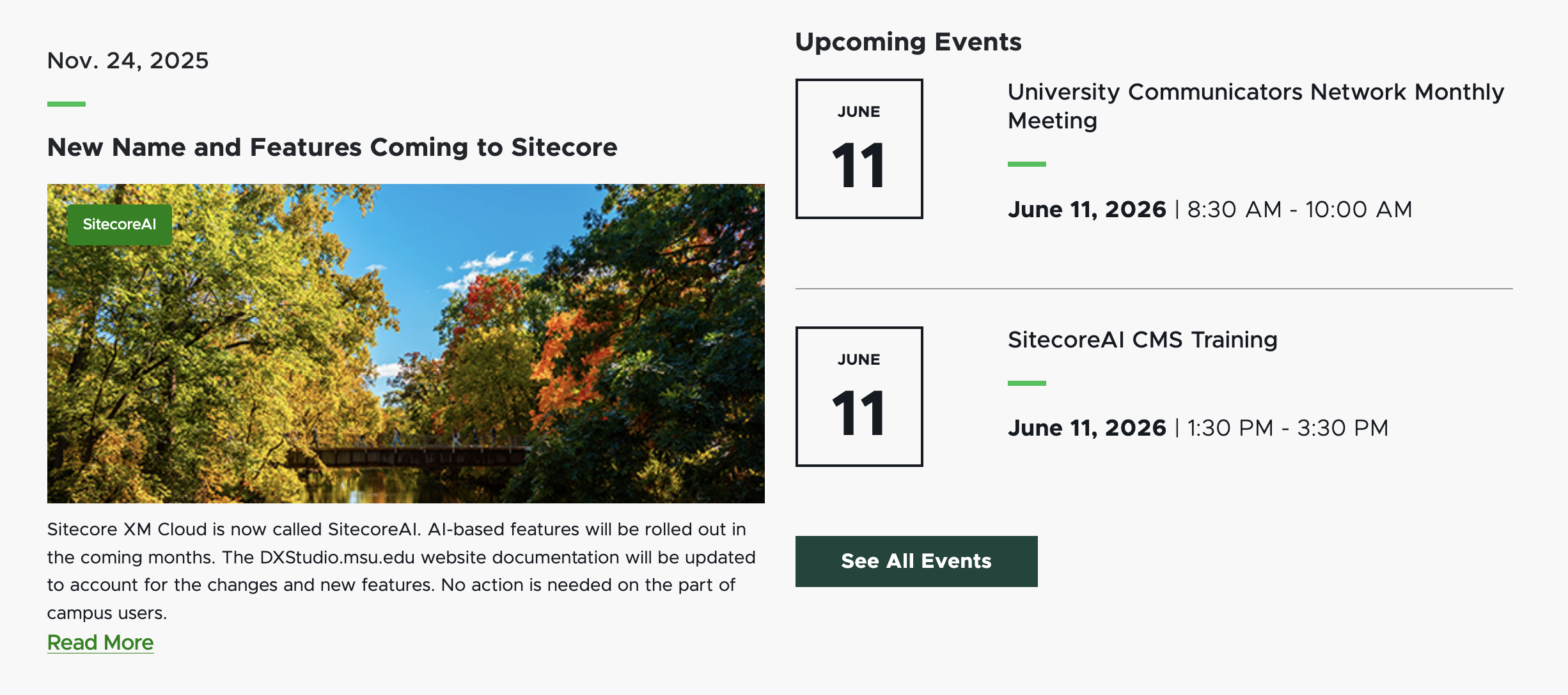
    A sample of the Featured Event and Upcoming Events variant displays one large featured event on the left and two smaller upcoming event items on the right above a view all button linking to the full list of events.
    Figure 13: A screenshot of the Featured Event and Upcoming Event variant of the component, showing one featured event item (manually curated) and the next upcoming event item (automatically displayed based on event date).
    Featured News and Upcoming Events
    A screenshot showing one featured news item on the left and two upcoming events on the right.
    Figure 14: A screenshot of the Featured News and Upcoming Events variant of the component, showing one featured news item (manually curated) and two upcoming event items (automatically displayed based on date).
    Latest News and Upcoming Events
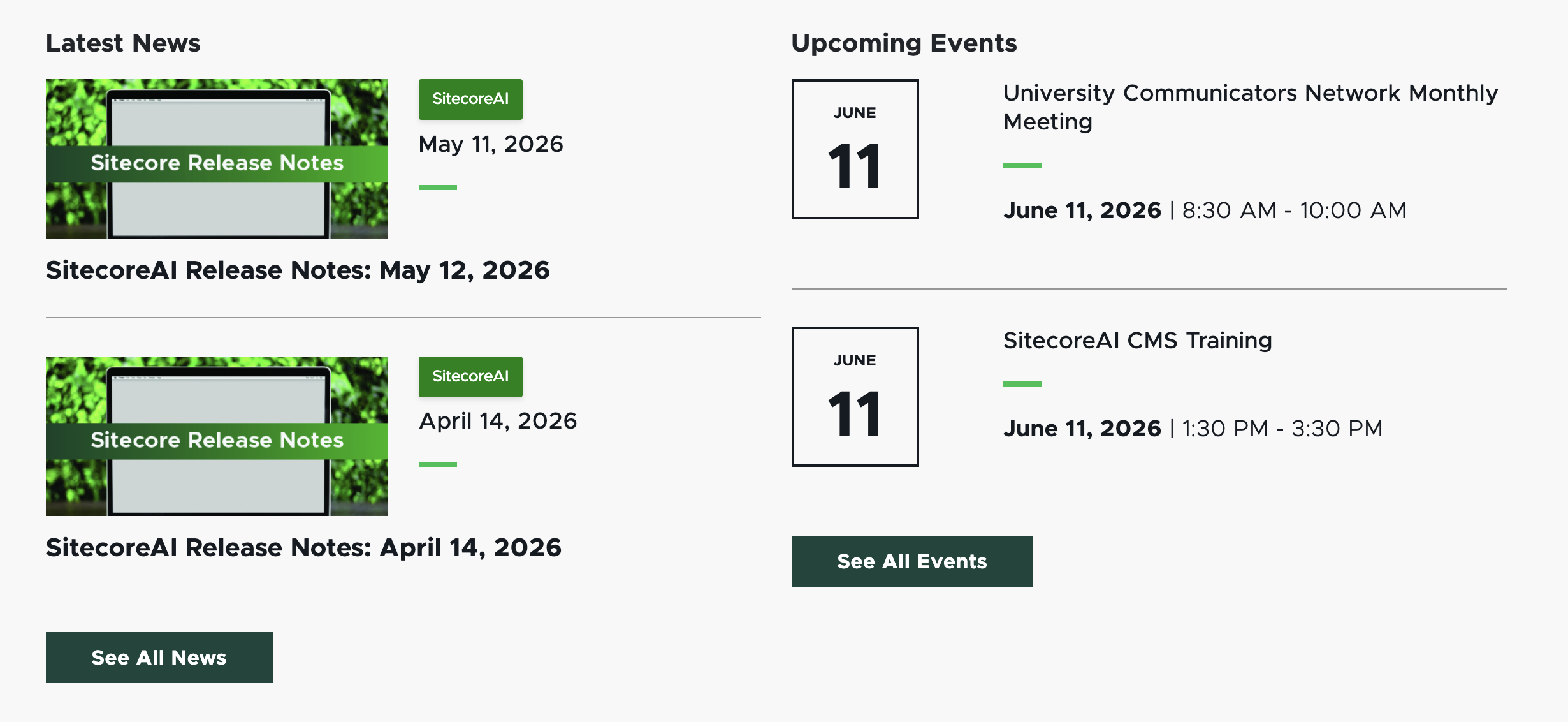
    A screenshot showing two featured news items on the left and two upcoming events on the right.
    Figure 15: A screenshot of the Latest News and Upcoming Events variant of the component, showing two most recent news item (automatically displayed based on publishing date) and two recent upcoming event items (automatically displayed based on event date).