Jump to HeaderJump to Main ContentJump to Footer
Michigan State University
Digital Experience Studio

University Communications and Marketing

Digital Experience Studio

  • Experience Program
    • Website Project Process
    • Working with a Vendor
    • Glossary
    • Taxonomy Data Dictionary
  • |
  • Experience Design
    • Website Strategy
    • Website Structure
    • Information Architecture and Navigation
    • User-Centered Design Conventions
    • Common UX Issues
    • Enterprise Design System
    • Content Planning
    • Creating Accessible Content
    • Taxonomy and Filters
  • |
  • Website Technology
    • Web Standards
    • Search Engine Optimization
    • Cascade CMS
    • Sitecore CMS
    • Content Hub Overview
    • Content Hub DAM
    • Content Hub Operations

    SitecoreAI

    Sitecore user login
  • |
  • Social Media
    • Alt Text Bookmarklet
    • Meta Ad Pixel
    • Social Media and Web Integration
    • Sprinklr

    Sprinklr

    Sprinklr user login
  • |
  • Analytics
    • Google Analytics (GA4)
    • Testing
    • Data Visualization

    Google Analytics

    Google Analytics user login
  • |
  • News and Events
    • News and Updates
    • Events and Trainings
Digital Experience Studio

University Communications and Marketing

  • Experience Program
  • Experience Design
  • Website Technology
  • Social Media
  • Analytics
  • News and Events

< Experience Program

  • Website Project Process
  • Working with a Vendor
  • Glossary
  • Taxonomy Data Dictionary

< Experience Design

  • Website Strategy
  • Website Structure
  • Information Architecture and Navigation
  • User-Centered Design Conventions
  • Common UX Issues
  • Enterprise Design System
  • Content Planning
  • Creating Accessible Content
  • Taxonomy and Filters

< Website Technology

  • Web Standards
  • Search Engine Optimization
  • Cascade CMS
  • Sitecore CMS
  • Content Hub Overview
  • Content Hub DAM
  • Content Hub Operations

SitecoreAI

Sitecore user login

< Social Media

  • Alt Text Bookmarklet
  • Meta Ad Pixel
  • Social Media and Web Integration
  • Sprinklr

Sprinklr

Sprinklr user login

< Analytics

  • Google Analytics (GA4)
  • Testing
  • Data Visualization

Google Analytics

Google Analytics user login

< News and Events

  • News and Updates
  • Events and Trainings
Digital Experience Studio > Website Technology > Sitecore CMS > Sitecore Component Guide >

Carousel

MSU Tools and Resources

  • A to Z Index
  • Find People
  • Email
  • Tech Support
  • Social Media Directory

Communications Resources

  • University Communications and Marketing
  • University Trademarks and Licensing
  • MSU Brand Studio
  • MSU Editorial Style Guide
  • MSU Photos

Contact us

517-355-7505

Address

Michigan State University 408 West Circle Drive East Lansing, MI 48824

Follow Us

  • Visit our Facebook page
  • Visit our page on X
  • Visit our Instagram page
  • Visit our LinkedIn page
  • Visit our YouTube page
  • Visit our TikTok page

If you're having accessibility issues, please let us know.

Know MoreTransparency Reporting: Budget & Salary/Compensation
  • Contact Information|
  • Site Map|
  • Privacy Statement|
  • Site Accessibility|
  • Call MSU: (517) 355-1855|
  • Visit: msu.edu|
  • Notice of Nondiscrimination|

SPARTANS WILL|© Michigan State University|

Carousel

Display multiple images in a carousel format. The images do not automatically change; the visitor uses arrows or pagination links to change images manually. 
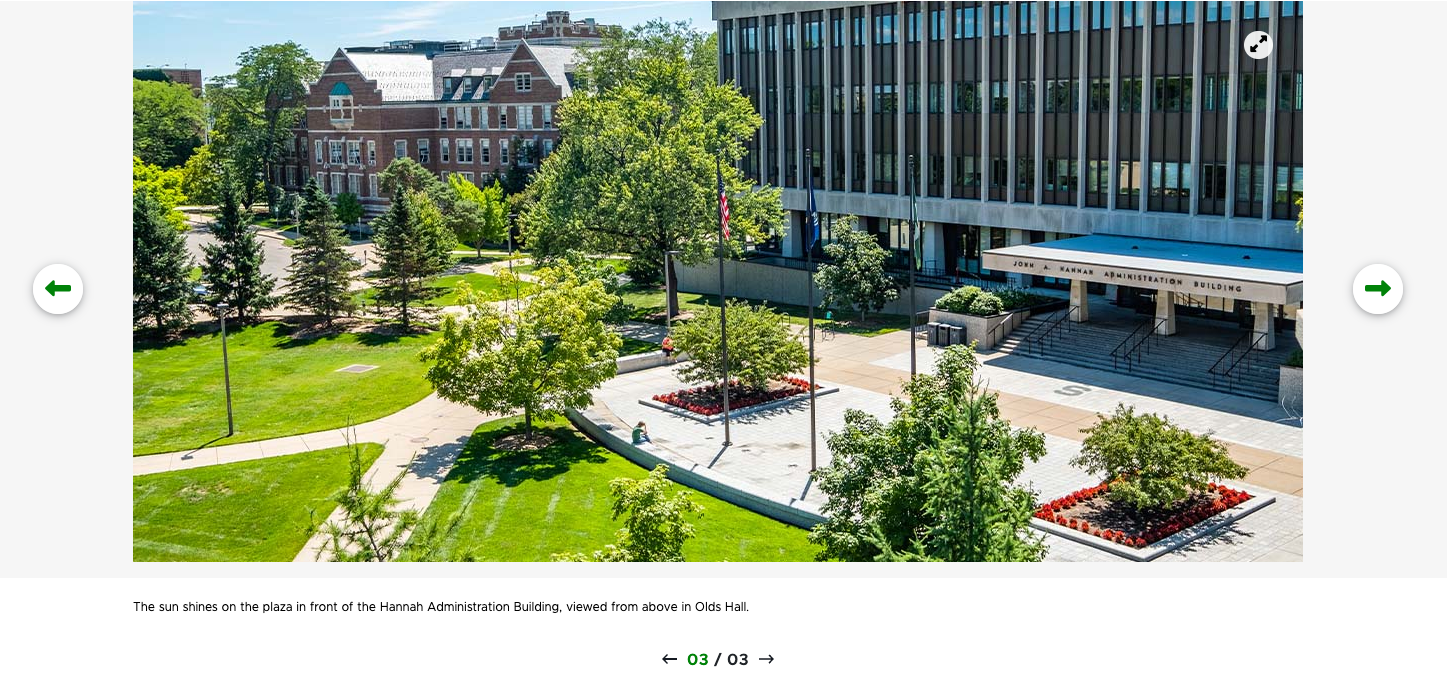
A screenshot of a carousel slide featuring an aerial photo of the Hannah Administration Building.
Figure 1: Example of a Carousel component, including pagination arrows and a caption.


Component Information

  • Usage
  • Best Practices
  • Expected Behavior
  • Template Data
  • Related Information

Benefits

  • Carousels are commonly used as a photo gallery.
  • Carousels can be used on standard pages or story pages.

Live Examples

  • Demo: Media-Focused Content Components

Component Options and Limitations

  • Content authors can choose between:
    • Center Portrait — for vertical portrait photos
    • Center Aligned — a caption goes below photos
    • Left Aligned — photo is left-aligned and text is inserted in a small box on the right
    • Right Aligned — photo is right-aligned and text is inserted in a small box on the left
  • The Carousel component can be used on a standard webpage or on a story page.

Guidelines

  • As a best practice, use a set of images that have the same dimensions.
  • For reference, in MSUToday’s photo galleries, 1170x560 is often used.
  • Avoid mixing portrait orientation photos with landscape orientation photos.
  • Upload carousel images first to Media Library.
  • Image slides will appear in the order they’re listed in the content items list.
  • Visitors can manually advance the images using the pagination arrows.

Content Editor

Component

Title (single-line text)
  • Overall title for the full carousel component.
  • Optional.
  • Displays in some variants.
Description (multi-line text)
  • Overall description for the full carousel component.
  • Optional.
  • Displays in some variants.

Slide

Orientation (droplist)
  • Choose the orientation of the slide image.
  • Options:
    • Landscape
    • Portrait
    • Square
Image (image)
  • Browse
    • Select an image from the Media Library.
  • Browse Sitecore DAM
    • Select an image from Content Hub.
    • This is only available to Content Hub users.
  • Properties
    • Adjust specific properties of the image.
    • Add alternate text.
    • Control width and height.
    • Add horizontal and vertical space around the image.
  • Clear
    • Remove the image from the slide.
Caption (multi-line text)
  • Add a caption to display in the carousel for the slide.

Page Builder

Content Tab

Title (single-line text)
  • Overall title for the full carousel component.
  • Optional.
  • Displays in some variants.
Description (multi-line text)
  • Overall description for the full carousel component.
  • Optional.
  • Displays in some variants.

Design Tab

Variant (droplist)
  • Choose the desired variant from the drop-down list.
  • Options:
    • Center Portrait — vertical portrait photo
    • Center Aligned — horizontal landscape photos
    • Left Aligned — horizontal landscape photos
    • Right Aligned — horizontal landscape photos
Manage Items
  • Add and remove slides from the carousel.
  • Click the three dots icon to open the options menu. Use this menu to access options to rename, move up, move down and delete carousel items. Also use to access the "Open in Content Editor" and "Open in Explorer" menu items.
Advanced Styling
  • Horizontal Line (checkbox)
    • Adds a green bar between the title and description
  • Use reduced height (right/left aligned) (checkbox)


Similar components:

  • Image
  • Image Fact Grid
  • Wide Flexbox

Frequently Asked Questions

Can the Carousel be set to automatically advance the images in a slideshow?

No, only manual image advancing is available. 

Instructions for Use

Add a Carousel to a Page

In Page Builder:

  1. Select the page in the content tree.
  2. Click “+” button in any Placeholder box below the Breadcrumb links.
  3. Select Carousel component from list.

Alternate method:

  1. Click Components tab at top of the content tree.
  2. Locate Carousel component.
  3. Drag the Carousel component to any empty placeholder area of the page below the Breadcrumb links.

If this is new Carousel content:

  1. Click “+” next to Data
  2. Select Carousel with Slide
  3. Enter a unique name for the data
  4. Click Assign 

If using existing Carousel Data (content):

  1. Select the data item from the tree
  2. Click Assign
Note: To add a title or description for the overall carousel, enter them by selecting the component in Content Editor or by filling in the specific fields in the Content Tab of the component options panel in Page Builder.
Manage Slides in a Carousel Component

Carousel Variants

Center Portrait - Vertical portrait photos
A screenshot of a carousel component using the Center Portrait Aligned variant. The photo appears in the center with a portrait orientation. The caption line and pagination arrows appear below the photo. In this slide, a photo of The Spartan Statue is shown.Figure 4: The Center Portrait variant of the Carousel component.
Center Aligned - Horizontal landscape photos

Image Specifications

Sketch Link: Carousel Component Design

Carousel Images – Landscape

  • Desktop – Width: 1170px | Height: 561px
  • Tablet – Width: 555px | Height: 312px
  • Mobile – Width: 100% | Height: 209px
  • Recommended size – Width: 1200px | Height: 600px

Carousel Images – Portrait

  • Desktop – Width: 434px | Height: 559px
  • Desktop – Width: 434px | Height: 559px
  • Mobile – Width: 100% | Height: 398px
  • Recommended size – Width: 500px | Height: 600px

Tool Use Guide


Documentation updated: Apr. 13, 2026

Is there an issue with this documentation? Report it here.

In Page Builder:

  1. Click the Carousel component to display the toolbar.
  2. In “Carousel” right panel menu, click the Design tab.
  3. Click to expand Manage items.
  4. Rename Slide 1, which is automatically created, as needed: Click “…” to right of Item, click Rename and give it a new name.
  5. To add more slides:
    1. Click “+ Add new” and click Carousel Slide button.
    2. Give it a unique name.
  6. To rename a slide: Click “…” to right of the item and give it a new name.
  7. To delete a slide: Click “…” to the right of the item and delete it.
  8. To reorder slides: Click “…” and use the up and down arrows to change the tab order.
Note: Initially, a Carousel slide appears without content. The content area contains an image placeholder and slide pagination arrows.
Add Content to a Carousel Component

In Page Builder:

  1. Click the pagination arrows to navigate to a slide.

    pagination-carousel
    Figure 2: The pagination arrows on a Carousel are used to navigate to images.
  2. Click on the Image placeholder icon in the page layout.

    image-placeholder-carousel
    Figure 3: The Image placeholder icon in a Carousel slide that does not have an assigned image.
  3. In the right panel, click on the Add button.
  4. Select an image in the Media Library or upload an image.
  5. Click Add Selected.
  6. To add an additional slide, under Manage Items, click on the Add New button.
  7. Repeat for additional slides.
Note: Image captions must be entered using Content Editor. The display of the image caption is controlled by the variant (e.g., Right Aligned or Center Portrait)
Alternative: Edit Using Explorer
  1. Click the Carousel to display the toolbar.
  2. In “Carousel” right panel menu, click the Design tab.
  3. Click to expand Manage items.
  4. Click the three dots icon on a slide to open the manage items menu.
  5. Click Open in Explorer.
  6. Click the Explorer icon.
  7. In left pane, locate the Carousel and click to select.
    1. Edit the Carousel title and description, if desired.
  8. Locate and click a slide to select it.
  9. Make changes in the right pane.
    1. Change orientation.
    2. Upload or select an image from the Media Library.
    3. Add alt text.
    4. Add an image caption.
  10. To add additional slides:
    1. Click “+ Create” in the content column.
    2. Click Carousel Slide.
    3. Give the content a unique name and click the checkmark icon.
    4. Add content in the right pane.
  11. To edit existing Carousel slide:
    1. Click a Carousel slide item in Carousel panel column.
    2. Change content in right pane.
  12. To duplicate a Carousel slide:
    1. Click a Carousel item in Carousel slide column.
    2. Click “…” in right pane.
    3. Click Duplicate.
  13. To delete a Carousel slide:
    1. Click a Carousel item in Carousel slide column.
    2. Click “…” in right pane.
    3. Click Delete.
  14. Return to Page Builder by closing the Explorer browser tab.
  15. Refresh the screen.
  16. Preview and publish the page.
Alternative: Edit Using Content Editor

Locate the Carousel

In Page Builder:

  1. In Pages, click the dropdown arrow to the right of the Sitecore XM Cloud icon in upper left..
  2. Select Content Editor. It opens in a new browser tab.

In Content Editor:

  1. If the Carousel does not appear in the Content Tree, close the page’s Data node and expand it again to refresh the Content Tree.
  2. In the Content Tree, expand Content > MSU > site name > Home > page name > Data.
  3. Locate and expand the Carousel component.

Add a Slide

  1. Right-click the Carousel component.
  2. Select Insert, then select Carousel Slide.
  3. Add content in the main pane on the right side.
Note: New slides can also be created by duplicating an existing slide, then changing the name and content.

Edit a Slide

To edit an existing slide:

  1. Click on the slide in the Content Tree.
  2. Change as needed in the main content pane on the right side.
    1. Change orientation.
      1. Change image.
      2. Add a caption.

Tips for Using Images

  • Alt Text can be changed in Explorer or Content Editor.
  • An image size can be changed in Content Editor > Image > Properties. HTML uses width and height attributes.
  • The image margin (i.e., padding) can be changed in Content Editor > Image > Properties.

Delete a Slide

  1. Locate and expand the Carousel component.
  2. In the Content Tree, right-click the slide.
  3. Click Delete and confirm.

Delete the Carousel

  1. In the Content Tree, right-click the carousel.
  2. Click Delete and confirm.

Publish Changes

When done with content authoring activities:

  1. Return to Page Builder by closing the Explorer browser tab.
  2. Refresh screen to see changes.
  3. Preview and publish the page.
A screenshot of a carousel component using the Center Aligned variant. The photo appears in the center with a caption box and pagination arrows below the image. In this slide, a drone photo of the intersection of Kalamazoo Street and Beal Street is shown.Figure 5: The Center Aligned variant of the Carousel component.
Left Aligned - Horizontal landscape photos
A screenshot of a carousel component using the Center Left Aligned variant. The photo appears on the left with a caption box and pagination arrows on the right. In this slide, a photo of the Hannah Administration Building plaza is shown.Figure 6: The Left Aligned variant of the Carousel component.
Right Aligned - Horizontal landscape photos
A screenshot of a carousel component using the Center Right Aligned variant. The photo appears on the right with a caption box and pagination arrows on the left. In this slide, a photo of a lantern against a backdrop of tree branches and a blue sky is shown.Figure 7: The Right Aligned variant of the Carousel component.