Jump to HeaderJump to Main ContentJump to Footer
Michigan State University
Digital Experience Studio

University Communications and Marketing

Digital Experience Studio

  • Experience Program
    • Website Project Process
    • Working with a Vendor
    • Glossary
    • Taxonomy Data Dictionary
  • |
  • Experience Design
    • Website Strategy
    • Website Structure
    • Information Architecture and Navigation
    • User-Centered Design Conventions
    • Common UX Issues
    • Enterprise Design System
    • Content Planning
    • Creating Accessible Content
    • Taxonomy and Filters
  • |
  • Website Technology
    • Web Standards
    • Search Engine Optimization
    • Cascade CMS
    • Sitecore CMS
    • Content Hub Overview
    • Content Hub DAM
    • Content Hub Operations

    SitecoreAI

    Sitecore user login
  • |
  • Social Media
    • Alt Text Bookmarklet
    • Meta Ad Pixel
    • Social Media and Web Integration
    • Sprinklr

    Sprinklr

    Sprinklr user login
  • |
  • Analytics
    • Google Analytics (GA4)
    • Testing
    • Data Visualization

    Google Analytics

    Google Analytics user login
  • |
  • News and Events
    • News and Updates
    • Events and Trainings
Digital Experience Studio

University Communications and Marketing

  • Experience Program
  • Experience Design
  • Website Technology
  • Social Media
  • Analytics
  • News and Events

< Experience Program

  • Website Project Process
  • Working with a Vendor
  • Glossary
  • Taxonomy Data Dictionary

< Experience Design

  • Website Strategy
  • Website Structure
  • Information Architecture and Navigation
  • User-Centered Design Conventions
  • Common UX Issues
  • Enterprise Design System
  • Content Planning
  • Creating Accessible Content
  • Taxonomy and Filters

< Website Technology

  • Web Standards
  • Search Engine Optimization
  • Cascade CMS
  • Sitecore CMS
  • Content Hub Overview
  • Content Hub DAM
  • Content Hub Operations

SitecoreAI

Sitecore user login

< Social Media

  • Alt Text Bookmarklet
  • Meta Ad Pixel
  • Social Media and Web Integration
  • Sprinklr

Sprinklr

Sprinklr user login

< Analytics

  • Google Analytics (GA4)
  • Testing
  • Data Visualization

Google Analytics

Google Analytics user login

< News and Events

  • News and Updates
  • Events and Trainings
Digital Experience Studio > Website Technology > Sitecore CMS > Sitecore Component Guide >

Hero Banner

Michigan State University

MSU Tools and Resources

  • A to Z Index
  • Find People
  • Email
  • Tech Support
  • Social Media Directory

Communications Resources

  • University Communications and Marketing
  • University Trademarks and Licensing
  • MSU Brand Studio
  • MSU Editorial Style Guide
  • MSU Photos

Contact us

517-355-7505

Address

Michigan State University 408 West Circle Drive East Lansing, MI 48824

Follow Us

  • Visit our Facebook page
  • Visit our page on X
  • Visit our Instagram page
  • Visit our LinkedIn page
  • Visit our YouTube page
  • Visit our TikTok page

If you're having accessibility issues, please let us know.

Know MoreTransparency Reporting: Budget & Salary/Compensation
Michigan State University
  • Contact Information|
  • Site Map|
  • Privacy Statement|
  • Site Accessibility|
  • Call MSU: (517) 355-1855|
  • Visit: msu.edu|
  • Notice of Nondiscrimination|

SPARTANS WILL|© Michigan State University|

Hero Banner

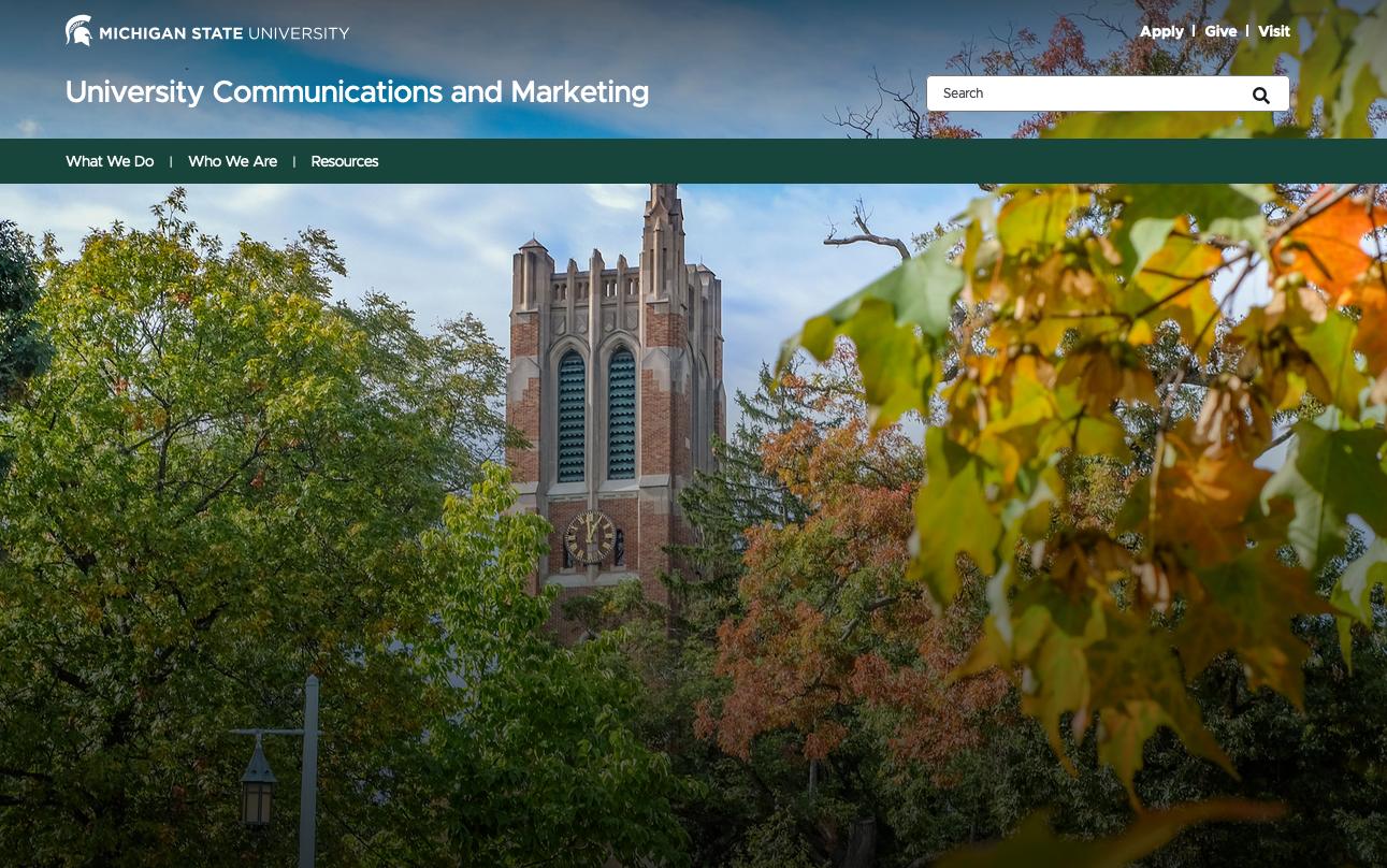
The Hero Banner is a large, full-width banner image or video. It is placed prominently at the top of the page and serves as the background for the masthead. Text is used as the page title. There are various options for customization.
martech-home-hero-banner
Figure 1: Example of a Hero Banner image component.


Component Information 

  • Usage
  • Best Practices
  • Template Data

Benefits

  • The standard default (larger-sized) Hero Banner components are generally used on the homepage of a website.
  • The small-sized banner is generally used on section homepages within a website, though they aren’t mandatory.
  • Some pages omit a banner and use a Page Title component instead. This is typical of tertiary pages (i.e., third level of navigation and deeper.)
  • Hero Banners can be used on a standard Page or Story Page.
  • Landing Hero Banners can be used on Landing Page templates. A Landing Hero Banner includes space for a Slate form component, used to capture information from prospective students. 

Live Examples

  • Demo: Information-Focused Content Components
  • Demo: Media-Focused Content Components

Component Options and Limitations

  • Hero Banners may only be used at the top of a page.
  • Image size can be regular (default) or small.
  • Text may be included on the banner but is optional.
  • An optional CTA (call to action) button can be specified.  
  • Landing Hero Banners can only be placed on Landing Page templates.

Guidelines

  • A Hero Banner and Page Title component should not be used on the same page. Using both would create two H1 heading tags. Redundant H1 heading tags cause accessibility and SEO issues.
  • The large sized Hero Banner isn’t generally used on internal pages. It is reserved for the website homepage.
  • Be careful with text length in the Title field. Use preview on all devices sizes to confirm text appears correctly and is not blocked by navigation elements. Reduce text content or text size, if needed.
  • Video backgrounds should be used sparingly as they usually have large file sizes and can slow down webpage load times.
  • When using a video background, it is a best practice to also select a Desktop Background Image as it will be used instead of the video.
  • The background image may be changed in Pages or in Content Editor.
  • Optional hero text and/or a button may be added in Content Editor. 

Page Builder — Content Tab:

Banner Description (multi-line text)
  • Optional text that can be used beneath the title.
Banner Title (single-line text)
  • Optional title that can be added as text on top of the banner.
Hero Background Video (video)
  • MP4 video that can be used as the background and will override any image background.
Hero Text Size (numeric)
  • Users can override the default text site.
Desktop Background Image (image)
  • Select the image file path to the background image.
Hero Button (single-line text)
  • An optional CTA button can be added to link to another page.
Mobile Background Image (image)
  • Users may set an optional background image that will be used on mobile devices. Otherwise, the desktop background image will be used.
Tablet Background Image (image)
  • Users may set an optional background image that will be used on tablet devices. Otherwise, the desktop background image will be used.
Custom Rich Text (text)
  • For use with custom rich text variant. 

Page Builder — Design Tab:

Variant
  • Standard banner is pre-populated with components for image/video and optional headline, subheadline and CTA button.
  • Custom rich text variant is also available but should be used sparingly. University Communications does not support custom content.
CTA Button Color
  • The background color of the CTA button can have a green (default) background or a transparent background.
Text Size
  • Small, medium or large text can be used for the banner text.
Banner Size
  • The default is MSU - Regular. This is the larger-sized Hero Banner typically used on a website's homepage (e.g., https://msu.edu/).
  • Users may choose a smaller-sized banner for an internal page (e.g., https://msu.edu/academics).
Center Align Text
  • This aligns the text to the center of the page.
Use Dark Text
  • This can be used if the banner image is lighter in color so that text can be easily read with high contrast.
Use Gradient
  • This displays a gradient over the the background image to assist with color contrast.
Add Horizontal Line
  • This will include a small green line to separate the title from the text.

In Content Editor:

Banner Description (multi-line text)
  • Optional text that can be used beneath the title.
Banner Title (single-line text)
  • Optional title that can be added as text on top of the banner.
Hero Background Video (video)
  • MP4 video that can be used as the background and will override any image background.
Hero Text Size (numeric)
  • Users can override the default text site.
Desktop Background Image (image)
  • Select the image file path to the background image.
Hero Button (single-line text)
  • An optional CTA button can be added to link to another page.
Mobile Background Image (image)
  • Users may set an optional background image that will be used on mobile devices. Otherwise, the desktop background image will be used.
Tablet Background Image (image)
  • Users may set an optional background image that will be used on tablet devices. Otherwise, the desktop background image will be used.
Custom Rich Text (text)
  • For use with custom rich text variant. 

Instructions for Use

Add Hero Banner Component to Page

Using the Hero Banner placeholder:

  1. Select the page in the content tree.
  2. Click “+” button on the page layout in the Hero Banner placeholder just below the navigation. When published, it will stretch to the top of the page.
  3. Select Hero Banner component from list.
  4. Assign a Hero Banner content item:
    1. To use an existing item, choose a hero banner content item from the list and click Assign.
    2. To create a new item, click the "+" (Create New) icon to the right of Data, click Hero Banner, name the item and hit enter or click away to save the name. Then choose the new item and click Assign.


Image Specifications

Sketch Link: Large |  Small  |  Extra Small


Home Page – Large Hero Banner (MSU - Regular; Default)

  • Desktop – Width: 100% | Height: 812px
  • Mobile – Width: 100% | Height: 592px
  • Recommended size – Width: 2500px | Height: 1400px

Secondary Page – Small Hero Banner (MSU - Small)

  • Desktop – Width: 100% | Height: 571px
  • Mobile – Width: 100% | Height: 700px
  • Recommended size – Width: 2000px | Height: 800px

Secondary Page – Extra Small Hero Banner (Used for MSUToday)

  • Desktop – Width: 100% | Height: 375px
  • Mobile – Width: 100% | Height: 325px
  • Recommended size – Width: 2000px | Height: 500px 

Tool Use Guide


Documentation updated: June 2, 2026

Is there an issue with this documentation? Report it here.

Add/Edit Hero Banner Image
  1. Once the Hero Banner component has been placed on the page, select the placeholder image in the center panel. This will open the Desktop Background Image pane on the right.

    Note: If the image selection option doesn't appear at the top of the right pane, try refreshing the canvas or page. 
     
  2. Click Browse media library to open the Media Library.
  3. For an image already in the Media Library:
    1. Navigate to the folder location of the image. Images should be in the [Sitename] > Images folder (or subfolder).
    2. Click on the desired image to select.
    3. Click on the Add selected button.  
  4. For a new image:
    1. Select the desired location in the Media Library site tree for the uploaded image (images should be located in the [Sitename] > Images folder (or subfolder)).
    2. Click Upload Media icon (an up arrow) and select the image file to upload.
    3. Once uploaded (click refresh if image doesn't appear at first), click on the image to select.
    4. Click on the Add selected button.
  5. Once an image has been placed, images can be edited by clicking on the change button or removed by clicking on the clear (X) button.
Add/Edit Hero Banner Video

Users may wish to include a video in the hero banner. Videos should be atmospheric to give a sense of place, and not rely on dialog or audio to convey messaging. 

  1. Once the Hero Banner component has been placed on the page, click it to select the component. This will open the component panel on the right.
  2. Click Content tab.
  3. Click the dropdown arrow to expand the Hero Background Video section.
  4. Click the appropriate link type icon to select where the video file is stored. This will typically be the Media icon for assets loaded into Sitecore or the external link icon for video assets housed in Content Hub.
  5. Choose the asset using the link path settings. For Media links, click the magnifying glass icon to open Media Library and follow the standard media selection process. For external links, paste the full link into the URL field.
Add Alternative Images for Mobile and Tablet

Users may wish to add alternative images for mobile and tablet viewers of the page. 

  1. Click on the Hero Banner component to select it. The component toolbar should read "Hero Banner" when the correct item is selected.

  2. Click the Content tab on the right side panel to view and edit available fields. 

  3. Alternatively, click the Content (quill icon) option on the local toolbar at the top of the page to enter Content Mode. This view allows you to edit fields without a visual representation of the changes. Toggle back to Editor Mode to view the changes. 

  4. Click the down arrow to expand the Mobile Background Image and Tablet Background Image field sections. 

  5. Click Browse media library and follow the process to select or upload an appropriate image. Click Add selected.

  6. Add image alt text using the Image alt text field. This ensures accessibility to visitors using screen reader technology. 

Add Text, Links and Styling to the Hero Banner

Click in the optional fields within the page edit canvas to add content.

  1. To add a title, click in the Banner Title field and type the desired text.
  2. To add a description, click in the Banner Description field and type the desired text.  
  3. To add a button:
    1. Click on the Hero Button field
    2. With the Hero Button selected, go to the Element Options in the right-hand pane.
    3. Click the icon for the desired Link Type.
      1. Click on the Link text field and type in the desired button text. Use Internal for links within the same website and External for links to other websites.
      2. For an External link, add a link in the URL field (this needs to be a full URL path starting with https://).
      3. For an Internal link:
        1. Click the Browse button to open the Internal link panel.
        2. Locate the page using the Context site dropdown list to locate a page on another website within SitecoreAI.
        3. Click the page name to be linked and click the Add link button.
      4. For a Media link (usually used for PDF files or other document files):
        1. Click on the Browse button.
        2. Select the desired file from the Media Library or upload a file and select it.
        3. With the file selected, click the Add selected button.

Alternative: Edit content fields using the Content tab on the right side panel or in Content Mode.

  1. Click on the Hero Banner component to select it. The component toolbar should read "Hero Banner" when the correct item is selected.

  2. Click the Content tab on the right side panel to view and edit available fields. 

  3. Alternatively, click the Content (quill icon) option on the local toolbar at the top of the page to enter Content Mode. This view allows you to edit fields without a visual representation of the changes. Toggle back to Editor Mode to view the changes. 

Change Hero Banner styling options.

  1. With the Hero Banner selected, go to the right-hand pane.
  2. Click the Design tab.
  3. Choose a variant (Standard or Custom Rich Text) in the dropdown menu.
  4. Click on the down arrow next to Advanced styling to expand that section.
  5. Make desired changes to the styles. See the Template Data tab above for details.
Add Slate Component to Landing Hero Banner

Users may wish to add a Slate form to the landing hero banner on a campaign landing page. Slate forms are used to capture data from prospective students and use it in future marketing campaigns. The Slate form to be linked must be created in Slate first. The Sitecore user will need the Slate Form ID to add the form to the landing hero banner.

In Page Builder:

  1. Click the "+" icon in the right column placeholder space of the landing hero banner.
  2. Click Slate Form.
  3. Assign a Slate Form content item:
    1. To use an existing item, choose a Slate form content item from the list and click Assign.
    2. To create a new item, click the "+" (Create New) icon to the right of Data, click Slate Form, name the item and hit enter or click away to save the name. Then choose the new item and click Assign.
  4. Click in the Form ID field and enter the Slate Form ID. 
Publish Changes

In Page Builder:

  1. Click Actions button.
  2. Click Submit.
  3. All submitted changes will publish during the next regularly scheduled publishing run.
Alternative: Edit Using Content Editor

In Page Builder: 

  1. Click the dropdown arrow to the right of the SitecoreAI icon in upper left.
  2. Select Content Editor. Content Editor opens in a new tab.

In Content Editor:

  1. Navigate to the page and data folder in the Content Tree.
  2. Select the Hero Banner component.
  3. Click Lock and Edit to enter edit mode.
  4. To add a description, add text to the Banner Description field.
  5. To add a title, add text to the Banner Title field.
  6. To add a background video, use the Hero Background Video field to select an MP4 video file. A video file will override a background image selection.
  7. To override hero text size, enter a number in the Hero Text Size field.
  8. To add a background image, use the Desktop Background Image field:
    1. Click on Browse.
    2. For an image already in the Media Library:
      1. Use any of the navigation tools (short cut links, filters, search, List view or Tree view) to locate the desired image in the Media Library.
      2. Click on the desired image.
      3. Click on the Select button.
    3. Or to upload a new image:
      1. Click on the Upload Media button.
      2. Click on Change Destination to the desired folder location in the Media Library.
      3. Drag and drop the image file into the panel or click Browse for media files to select a file.
      4. Optional: Add/edit text in the Name and Description fields.
      5. Add text to the Alternate Text field if empty.
      6. Click Upload media.
      7. Click on the image.
      8. Click on the Select button.
  9. To add a button:
    1. Use the Hero Button insert link field to add a link.  
    2. Depending on type of link selected, add button text to the Description or Link description field in the selected Insert Link panel.
    3. Fill out any optional link fields, if needed.
  10. To add a different image to load on mobile devices, use the Mobile Background Image and Tablet Background Image fields to add an image (following the same process as the Desktop Background Image).
  11. Click Save.
  12. Click Check In under the Review tab on the navigation ribbon.
  13. Return to Page Builder. Click the Reload canvas icon to refresh the canvas and view the changes.
  14. Click Actions and Submit to send the changes to the publishing workflow.