Jump to HeaderJump to Main ContentJump to Footer
Michigan State University
Digital Experience Studio

University Communications and Marketing

Digital Experience Studio

  • Experience Program
    • Website Project Process
    • Working with a Vendor
    • Glossary
    • Taxonomy Data Dictionary
  • |
  • Experience Design
    • Website Strategy
    • Website Structure
    • Information Architecture and Navigation
    • User-Centered Design Conventions
    • Common UX Issues
    • Enterprise Design System
    • Content Planning
    • Creating Accessible Content
    • Taxonomy and Filters
  • |
  • Website Technology
    • Web Standards
    • Search Engine Optimization
    • Cascade CMS
    • Sitecore CMS
    • Content Hub Overview
    • Content Hub DAM
    • Content Hub Operations

    SitecoreAI

    Sitecore user login
  • |
  • Social Media
    • Alt Text Bookmarklet
    • Meta Ad Pixel
    • Social Media and Web Integration
    • Sprinklr

    Sprinklr

    Sprinklr user login
  • |
  • Analytics
    • Google Analytics (GA4)
    • Testing
    • Data Visualization

    Google Analytics

    Google Analytics user login
  • |
  • News and Events
    • News and Updates
    • Events and Trainings
Digital Experience Studio

University Communications and Marketing

  • Experience Program
  • Experience Design
  • Website Technology
  • Social Media
  • Analytics
  • News and Events

< Experience Program

  • Website Project Process
  • Working with a Vendor
  • Glossary
  • Taxonomy Data Dictionary

< Experience Design

  • Website Strategy
  • Website Structure
  • Information Architecture and Navigation
  • User-Centered Design Conventions
  • Common UX Issues
  • Enterprise Design System
  • Content Planning
  • Creating Accessible Content
  • Taxonomy and Filters

< Website Technology

  • Web Standards
  • Search Engine Optimization
  • Cascade CMS
  • Sitecore CMS
  • Content Hub Overview
  • Content Hub DAM
  • Content Hub Operations

SitecoreAI

Sitecore user login

< Social Media

  • Alt Text Bookmarklet
  • Meta Ad Pixel
  • Social Media and Web Integration
  • Sprinklr

Sprinklr

Sprinklr user login

< Analytics

  • Google Analytics (GA4)
  • Testing
  • Data Visualization

Google Analytics

Google Analytics user login

< News and Events

  • News and Updates
  • Events and Trainings
Digital Experience Studio > Website Technology > Sitecore CMS > Sitecore Component Guide >

Main Navigation

Michigan State University

MSU Tools and Resources

  • A to Z Index
  • Find People
  • Email
  • Tech Support
  • Social Media Directory

Communications Resources

  • University Communications and Marketing
  • University Trademarks and Licensing
  • MSU Brand Studio
  • MSU Editorial Style Guide
  • MSU Photos

Contact us

517-355-7505

Address

Michigan State University 408 West Circle Drive East Lansing, MI 48824

Follow Us

  • Visit our Facebook page
  • Visit our page on X
  • Visit our Instagram page
  • Visit our LinkedIn page
  • Visit our YouTube page
  • Visit our TikTok page

If you're having accessibility issues, please let us know.

Know MoreTransparency Reporting: Budget & Salary/Compensation
Michigan State University
  • Contact Information|
  • Site Map|
  • Privacy Statement|
  • Site Accessibility|
  • Call MSU: (517) 355-1855|
  • Visit: msu.edu|
  • Notice of Nondiscrimination|

SPARTANS WILL|© Michigan State University|

Main Navigation

The Main Navigation contains the top-level categories for page navigation within a website.

Main Navigation is a part of the header, along with Brand Bar and Masthead. These are found in a site’s Header folder inside the site’s Data node in Content Editor.
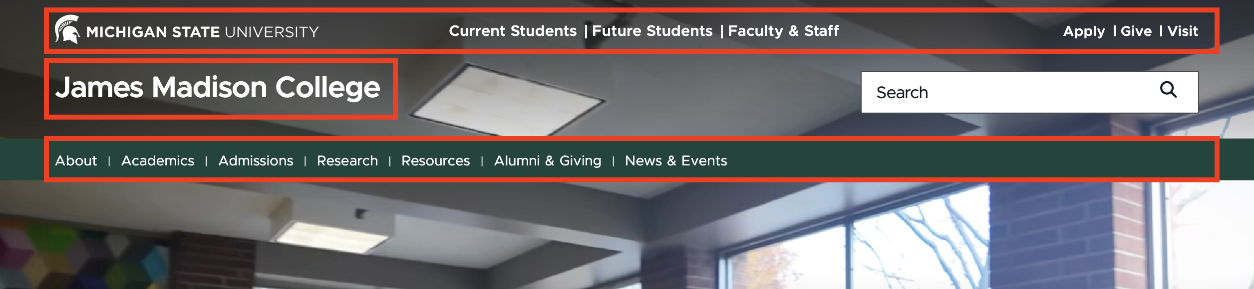
Screenshot of the header on the James Madison College website, with the brand bar, masthead and main navigation outlined with red boxes.
Figure 1: Example of the Header component from the James Madison College homepage. The top red outlined area indicates the Brand Bar, including Audience Links and Global CTA Links. The outlined area in the middle indicates the Masthead. The bottom outlined area indicates the Main Navigation.  


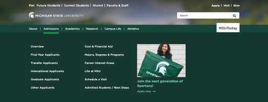
A screenshot of an expanded navigation panel.
Figure 2: Example of the Header component from the msu.edu homepage, in its expanded form (shown when hovering on the Admissions Main Navigation Link.) In this case, the Main Navigation has three columns. The right-side column has a CTA area containing an image and link to the application page. 


Note: While the search bar appears in this same area, it is a separate site configuration and not considered part of the Header component.

Component Information

  • Usage
  • Best Practices
  • Expected Behavior
  • Related Information

Benefits

  • This component displays the Main Navigation bar for the site. It allows users to easily find pages in the site. 
  • The Main Navigation organizes the site hierarchy and allows for some variety in how site links are displayed.
  • The Main Navigation component is made up of Main Navigation Links which may contain additional columns of links and/or call to action, or CTA, area. Column Links are added into columns.

Component Options and Limitations

  • The Main Navigation can have top-level links (Main Navigation Links) only or can have a “mega nav” state with a drop-down of additional menu options.
  • Drop-down mega nav options are arranged in columns. 
  • Columns can have a call to action, or CTA, area, which provides additional styling (image, link) when viewed on desktop.

Guidelines

  • It is a user experience recommendation to have no more than seven top-level links in the Main Navigation bar (viewable when the menu is in a closed state). This number may be lower if text labels are longer than average. Keep text labels to one line, if possible.
  • Keep text short to reduce text wrapping issues. 
  • Preview the Main Navigation on mobile, tablet and desktop view settings to confirm link order appears appropriately and that links fit well in the desktop and mobile views of the navigation bar. See Expected Behavior section for details on how menus shift on mobile devices. 

On mobile: 

  • All links stack in a series of collapsible link areas. The left-aligned Main Navigation Links appear at the top of the menu below the search box. 
  • Right-aligned Main Navigation Links appear below the Brand Bar links. 
  • Inside each Main Navigation Link Column and CTA area, links are stacked top to bottom in the same order they appear from left to right on desktop.

Related components

  • Brand Bar
  • Masthead

Related information

  • Experience Design: Information Architecture and Navigation

Template Data

  • Main Navigation Links
  • Columns and Links
  • Calls to Action

Main Navigation Links

Main Navigation Links are the top-level links added to the Main Navigation bar that appears on the webpage below the Masthead. Main Navigation Links display horizontally on wider browser window views, such as typically found on desktop. They display as stacked top to bottom on narrower views, such as on mobile.

Link (general link)
  • Sets the link for the Main Navigation Link
  • Description text is what displays on the page.
Is Aligned Right (check box)
  • If checked, the Main Navigation Links are right-aligned on desktop and display differently than the default setting. Right-aligned links appear as a white button on the navigation bar. (See MSUToday link in Figure 3.)
CTAs Title (single-line text)
  • This is only used if the Main Navigation Link is right-aligned.
  • Text that displays above the stacked CTAs

Column

A column is inserted below a Main Navigation Link. Columns organize Column Links into columns of links under a Main Navigation Link. Use of Columns and Column Links is optional.

Column Link

Column Link (general link)
  • Sets the link for the Column Link
  • Description text is what displays on the page.
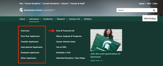
Screenshot of the expanded main navigation with a column surrounded by a red box and an individual link highlighted with a red arrow.
Figure 3: Example of the Header component from the msu.edu homepage, in its expanded form (shown when hovering on the Admissions Main Navigation Link.) A column is marked with a red box. An individual column link (“Cost & Financial Aid”) is marked with a red arrow. The MSUToday button on the right is created by 

CTA

A call to action, or CTA, may be inserted under a Column. It creates a special column under a Main Navigation Link. On desktop views, this CTA column is styled differently, depending on if it is aligned to the left or to the right.

Image (image)
  • Choose an image to display.
  • Setting values:
    • Left-aligned: The image displays at the top of the column, above the other CTA elements.
    • Right-aligned: The image displays to the left of the other CTA elements with the textual content on the right.
  • Optional.
Text (single-line text)
  • This text appears as a bold text subhead.
Date (single-line text)
  • Intended to be used as a date text for CTAs in right-aligned Main Navigation Link areas. Displays to the right of the image, aligned to the top of the image and above the short green horizontal line.
Link (general link)
  • Adds a link to the CTA Text.

Frequently Asked Questions

How do I add a Column Link to a Main Navigation Link?

A Column Link may not be placed directly under a Main Navigation Link. A Column needs to be inserted under a Main Navigation Link first and then Column Links can be added under the Column.

Do Columns and Column Links need to be under Main Navigation Links?

Instructions for Use

Add a Main Navigation Link

In Content Editor:

  1. Locate the site’s Main Navigation folder (site name > Data > Header > Main Navigation).
  2. Right click on Main Navigation and select Insert in the pop-up panel.
  3. Then choose Main Navigation Link to add the link.
  4. Once selected, enter a name for the link. This name is for internal use only.
  5. Click OK.
  6. Select the desired insert link option.
  7. On the Insert Link panel select or input the desired link and put in the Description text. This is the text that displays on the site.
  8. Click Save.
Note: Be sure to add text to the Description text field when adding a link when adding any links. This is the only way that link text will appear on the website. 
Add a Column under a Main Navigation Link

Tool Use Guide


Documentation updated: August 10, 2026

Is there an issue with this documentation? Report it here.

No, top-level Main Navigation Links may stand alone with nothing below them.

In Content Editor:

  1. Locate the site’s Main Navigation folder (site name > Data > Header > Main Navigation).
  2. Select the desired Main Navigation Link.
  3. Right click on the Main Navigation Link and select Insert in the pop-up panel.
  4. Select Column.
  5. Once selected, enter a name for the Column. The name is for internal use only.
  6. Click OK.
  7. Click Save.
Add a Column Link

In Content Editor:

  1. Locate the site’s Main Navigation folder (site name > Data > Header > Main Navigation).
  2. Right click on the desired Column and select Insert in the pop-up panel.
  3. Then choose Column Link to add the link.
  4. Once selected, enter a name for the link. The name is for internal use only.
  5. Click OK.
  6. Select the desired insert link option.
  7. On the Insert Link panel select or input the desired link and put in the Description text. This is the text that displays on the site.
  8. Click Save.
Note: Be sure to add text to the Description text field when adding a link when adding any links. This is the only way that link text will appear on the website. 
Add a CTA

In Content Editor:

  1. Locate the site’s Main Navigation folder (site name > Data > Header > Main Navigation).
  2. Right click on the desired Column and select Insert in the pop-up panel.
  3. Then choose CTA to add the CTA area to the Column.
  4. Once selected, enter a name for the CTA. The name is for internal use only.
  5. Click OK.
  6. Select an image, if desired.
  7. Add the CTA text. This is a required field and will display on the page.
  8. If using the CTA in a right-aligned Main Navigation Link area: Add the date to the Date text field (optional).
  9. Enter the link the CTA should point to in the CTA Link field.
  10. Select the desired Insert link option.
  11. Use the Insert Link panel select or input the desired link and put in the Description text. This is the text that displays on the site.
  12. Click Save.
Note: Be sure to add text to the Description text field when adding a link when adding any links. This is the only way that link text will appear on the website. 
Publish Changes to the Main Navigation

Publishing of navigation changes depends on the change. All publishing actions, if needed, occur in Content Editor.


  • Main Navigation Link: 

    • Additions and changes are automatically published. No additional steps are needed.

  • Column: 

    • Columns are not a part of workflow. They'll automatically publish when there is approved content placed in the column.

  • Column Link:

    1. Click Edit and Approve on the Home tab of the navigation ribbon, or click Approve on the Review tab of the navigation ribbon.

  • CTA:

    1. Click Edit and Approve on the Home tab of the navigation ribbon, or click Approve on the Review tab of the navigation ribbon.