Jump to HeaderJump to Main ContentJump to Footer
Michigan State University
Digital Experience Studio

University Communications and Marketing

Digital Experience Studio

  • Experience Program
    • Website Project Process
    • Working with a Vendor
    • Glossary
    • Taxonomy Data Dictionary
  • |
  • Experience Design
    • Website Strategy
    • Website Structure
    • Information Architecture and Navigation
    • User-Centered Design Conventions
    • Common UX Issues
    • Enterprise Design System
    • Content Planning
    • Creating Accessible Content
    • Taxonomy and Filters
  • |
  • Website Technology
    • Web Standards
    • Search Engine Optimization
    • Cascade CMS
    • Sitecore CMS
    • Content Hub Overview
    • Content Hub DAM
    • Content Hub Operations

    SitecoreAI

    Sitecore user login
  • |
  • Social Media
    • Alt Text Bookmarklet
    • Meta Ad Pixel
    • Social Media and Web Integration
    • Sprinklr

    Sprinklr

    Sprinklr user login
  • |
  • Analytics
    • Google Analytics (GA4)
    • Testing
    • Data Visualization

    Google Analytics

    Google Analytics user login
  • |
  • News and Events
    • News and Updates
    • Events and Trainings
Digital Experience Studio

University Communications and Marketing

  • Experience Program
  • Experience Design
  • Website Technology
  • Social Media
  • Analytics
  • News and Events

< Experience Program

  • Website Project Process
  • Working with a Vendor
  • Glossary
  • Taxonomy Data Dictionary

< Experience Design

  • Website Strategy
  • Website Structure
  • Information Architecture and Navigation
  • User-Centered Design Conventions
  • Common UX Issues
  • Enterprise Design System
  • Content Planning
  • Creating Accessible Content
  • Taxonomy and Filters

< Website Technology

  • Web Standards
  • Search Engine Optimization
  • Cascade CMS
  • Sitecore CMS
  • Content Hub Overview
  • Content Hub DAM
  • Content Hub Operations

SitecoreAI

Sitecore user login

< Social Media

  • Alt Text Bookmarklet
  • Meta Ad Pixel
  • Social Media and Web Integration
  • Sprinklr

Sprinklr

Sprinklr user login

< Analytics

  • Google Analytics (GA4)
  • Testing
  • Data Visualization

Google Analytics

Google Analytics user login

< News and Events

  • News and Updates
  • Events and Trainings
Digital Experience Studio > Website Technology > Sitecore CMS > Sitecore Component Guide >

Curated Navigation

Michigan State University

MSU Tools and Resources

  • A to Z Index
  • Find People
  • Email
  • Tech Support
  • Social Media Directory

Communications Resources

  • University Communications and Marketing
  • University Trademarks and Licensing
  • MSU Brand Studio
  • MSU Editorial Style Guide
  • MSU Photos

Contact us

517-355-7505

Address

Michigan State University 408 West Circle Drive East Lansing, MI 48824

Follow Us

  • Visit our Facebook page
  • Visit our page on X
  • Visit our Instagram page
  • Visit our LinkedIn page
  • Visit our YouTube page
  • Visit our TikTok page

If you're having accessibility issues, please let us know.

Know MoreTransparency Reporting: Budget & Salary/Compensation
Michigan State University
  • Contact Information|
  • Site Map|
  • Privacy Statement|
  • Site Accessibility|
  • Call MSU: (517) 355-1855|
  • Visit: msu.edu|
  • Notice of Nondiscrimination|

SPARTANS WILL|© Michigan State University|

Curated Navigation

The Curated Navigation is a vertical side navigation that displays in the right column of a two-column layout. It consists of a customized list of links, navigation icons and/or a call-to-action, or CTA, button. Navigation items are manually selected and maintained by the content author.
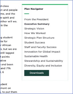
A screenshot of a curated navigation with a button
Figure 1: Example of a Curated Navigation component with a CTA button. 

Component Information

  • Usage
  • Best Practices
  • Tips and Tricks
  • Expected Behavior
  • Related Information

Benefits

  • Provides an alternate way of navigating on the website
  • Visually highlights links and a call to action, or CTA, relevant to the content on the current page
  • Gives content authors control to modify component, unlike the automatically generated Contextual Navigation component
  • Navigation is “sticky” and stays visible on screen as the user scrolls the page

Example Use Cases

  • Provide an alternate navigation method
  • Provide a fast way to move between a list of pages selected by the content author
  • Provide a navigation that can be shared among multiple pages
  • Create a side column navigation menu that includes a CTA button. This can be helpful for highlighting important links, such as an intranet link on an employee page. 

Component Options and Limitations

  • This component can be placed in either a:
    • Two-Column Container — A “Basic Page” is used. The page content area is full-width except where the Two-Column Container is placed.  
    • Two Thirds Sublayout — A “Two Thirds” page is used. The content area is a two-column layout on the page.
  • The component can only be placed in the right column. It cannot appear on the left side of the page.
  • Links to media and/or external pages are allowed.
  • A CTA button can be included at the bottom of the Curated Navigation component.
  • Navigation items cannot show hierarchy or parent-child relationships. Each item displays without indentation or background color.
  • The green decorative bar below the navigation title displays automatically; it cannot be removed.

Guidelines

  • This component can only be placed in the right column.
  • The Two-Column Container or Two Thirds Page do not appear in Content Editor.
  • The Curated Navigation does not need to be the only component in the right column. Other components can be placed in the column, as well. Additional items should be placed above the Curated Navigation due to its sticky behavior.
  • Navigation items do not need to be in the same folder or node.
  • Navigation items can also be selected from Media Library or reference external items.  
  • Navigation Title is required. It is always a link and usually will link to the main page in the list of navigation items.
  • Items can be made to display in any order. The display order is controlled by the sequence in which items reside in the navigation list.
  • To ensure links remain visible, limit the number of links in the curated navigation. On desktop, content authors should limit the curated navigation list to 12 links if using a CTA and 14 links if not using a CTA. On mobile, the recommendations are no more than 9 links with a CTA and 11 links without a CTA. These recommendations assume all links are a single line of text. Limit navigation link labels to 25 characters to ensure the text remains on one line.
  • Navigation icons may be added to the component by selecting icons from a drop-down list of preapproved icons. Selected icons display to the left of a navigation item. Additional icons can be added, provided they’re free and available on the FontAwesome website.
  • The Curated Navigation component is usually stored in the site’s Data node, not the page’s Data folder. This allows it to be shared by multiple pages.
  • It is a best practice that all pages listed in a Curated Navigation include the same Curated Navigation component. This component can be shared by all the pages. 
  • The Curated Navigation component can be used on a single page and reference anchor tags within the page’s content. This creates an internal page navigation for large amounts of content. 
  • It is a best practice is to store the component in the website’s Data folder so that content authors can easily see that the Curated Navigation component is in use. 
  • Save time by copying an existing Curated Navigation and modifying links as needed, rather than creating a new one from scratch. 
  • To use a navigation icon that is not in the Content Editor component’s drop-down list, navigate to the FontAwesome website, locate the icon and note its unique code, and then contact the University Communications and Marketing Platforms Group to provide the code and request the new icon be added to the system.
  • All items in the Curated Navigation are visible at all times. There is no option to expand/contract child and parent links.
  • The Curated Navigation is “sticky,” meaning it remains in view as the visitor scrolls down the page. The navigation ceases to be sticky if the page focus moves to an area of the page that is not using the two-column layout, as in the case of using a Two-Column component.
  • Navigation items cannot show hierarchy or parent-child relationships. Each item displays without indentation or background color.
  • The current page being viewed by the visitor is bolded in the Curated Navigation.
  • The green decorative bar below navigation title displays automatically; it cannot be removed.
  • Curated items are manually created by the content author. Links can point to any assets, internal or external.
  • One button may be added to the component. It is automatically placed below all items.
  • A usability best practice is to use a maximum of 15 items to ensure the best user experience. 

Related Components

  • Two-Thirds Sublayout
  • Two Thirds Page Layout

Similar Components

  • Contextual Navigation
  • Main Navigation

Template Data

Component Fields

Content Tab

Link (general link)
  • The Link field controls the heading link for the Curated Navigation.
  • Use the link options icons to select a link type and enter link settings.
  • Link Description controls the label that appears at the top of the Curated Navigation.
CTA (general link)
  • The CTA field controls the CTA button that appears at the bottom of the Curated Navigation.
  • Use the link options icons (in Page Builder) or text (in Content Editor) to select a link type and enter link settings.
  • The CTA button is optional. If left empty, no button will appear.

Design Tab

Manage Items
  • + Add new enables adding an additional link to the Curated Navigation.

Frequently Asked Questions

Can I add text subtitles between groups of links?

No, the Curated Navigation only includes the page titles.

Can I add multiple buttons or display a button above the navigation?

Instructions for Use

Add Curated Navigation Component

Curated Navigation component can be used on a Two-Thirds Page Layout or in a Two-Thirds Page Sublayout component on a regular page.

A Two-Thirds Page is a two-column page layout. The two-column design applies to all page content. The Two-Thirds Page Sublayout adds a two-column section to a page. The page outside of the two-column section will be one-column.

In Page Builder:

  1. Select the page in the Content Tree. The page should use a two-column page layout or two-thirds page sublayout component.
  2. Click “+” in the right column placeholder of the container.
  3. Select Curated Navigation from the component list.
  4. In the Assign content item dialog box, expand Navigation node and select the appropriate Navigation List or click “+” to the right of the Data item, and select Navigation List to add a new list. Give it a name that is unique within the page. This is an internal name that will not display.
  5. Click Assign.
  6. Add links and adjust settings, as necessary. See instructions below.

Alternate method:

  1. Click Components tab at top of the Content Tree.
  2. Locate Curated Navigation and drag it into the right column of the page. The Curated Navigation component and toolbar are displayed.
  3. In the Assign content item dialog box, expand Navigation node and select the appropriate Navigation List or click “+” to the right of the Data item, and select Navigation List to add a new list. Give it a name that is unique within the page. This is an internal name that will not display.
  4. Click Assign.
  5. Add links and adjust settings, as necessary. See instructions below.

Tool Use Guide


Documentation updated: Apr. 13, 2026

Is there an issue with this documentation? Report it here.

Navigation Link Fields
Link (general link)
  • The Link field controls individual links for the Curated Navigation.
  • Use the link options icons to select a link type and enter link settings.
  • Link Description controls the label that appears at the top of the Curated Navigation.
Open in new window (checkbox)
  • Check this box to force the link to open in a new browser window.
Clear link value (button)
  • Click this button to reset the link settings.
Icon (Content Editor only)
  • Select an icon to appear in the Curated Navigation to the left of the link name. 

Only one button is allowed. It displays below the navigation items. However, a Rich Text component with a custom button can be added above the navigation component. This would not be “sticky” as users scroll on the page.

I can’t see all the icons on the component’s toolbar. What should I do?

Change the device view setting on the Pages top menu to a larger screen size and scroll right if needed.

The device preview menu icons
Figure 2: Device view settings menu. 
Add Navigation Links and Adjust Settings

In Page Builder:

  1. Select the Curated Navigation component in the page area.
  2. Add the required navigation heading and link: 

    1. Click the text field at the top of the navigation.
    2. In the Link right column, enter Link type, Link text and URL.
    3. Click anywhere on the page to enable the Link column changes.


    Note: Right-column settings are applied to all fields in the entire component.

  3. Click on the Curated Navigation component to select it.
  4. In Curated Navigation right side panel, click the Design tab and then expand Manage items.
  5. Click + Add new to create a new navigation item.
  6. Click on the link placeholder in the component to select it. This opens the Link menu in the right column.
  7. Use the Link menu to set link type, link text (what appears in the menu) and link URL.

    Note: Editing links is also possible using Explorer or Content Editor. Editing in Content Editor provides additional capabilities, including navigation icons. See instructions below.

  8. Click on the component to deselect the link and return to the full navigation component menu in the right column.
  9. Repeat steps four through seven, as necessary, to add additional links.
  10. To include a button, click on “[No text in field]” in the green button at the bottom of the menu. Set the link settings. If no link is added here the button will not appear in preview or on the live webpage.
  11. View the page using Preview (eye icon in upper right).  
  12. Submit the page to the publishing workflow to publish changes.
Alternative: Add Navigation Links and Adjust Settings in Content Editor 

Begin in Page Builder:

  1. Click the dropdown arrow to the right of the SitecoreAI icon in upper left.
  2. Select Content Editor.

In Content Editor:

  1. Locate the navigation list in the Content Tree. It should be located in the Navigation folder within the site’s Data folder.
  2. To change the heading link:
    1. Click on the navigation list name to select it.
    2. On the data panel, use the link setting tools to add a link to the Link field.
    3. Click Save.
  3. To add a button:
    1. Click on the navigation list name to select it.
    2. On the data panel, use the link setting tools to add a link to the CTA field.
    3. Click Save.
  4. To add a new link:
    1. Right click on the navigation list name.
    2. Click Insert.
    3. Click Navigation Link.
    4. Add a name that is unique within the list of links. Click OK.
    5. Click Insert link to add an internal link to add a link to a page within the same website or to a page on another MSU Sitecore XM Cloud website. Click external link to add a link to another website. Click insert media link to add a link to an item in the Media Library, such as a PDF.
    6. Follow the link selection process, depending on the type of link being added.
    7. Optional: To include a navigation icon, select one from the Icon dropdown menu on the link Data panel.
    8. Click Save. 
  5. Repeat as necessary to add additional links.

    Note: An existing navigation item can be duplicated and then changed, as needed.

  6. Return to Page Builder.

In Page Builder:

  1. Refresh the screen to see the changes.
  2. View the page using Preview (eye icon at the upper right).
  3. Submit the page to the publishing workflow to publish changes.
Add New Icon to Options Droplist (Sitecore Administrators Only) 
  1. Navigate to the FontAwesome website.
  2. Locate the desired icon and note its unique code.
  3. In Sitecore Global Configurations > Icons > Navigation Icons, Insert a navigation icon and enter the retrieved code.
  4. The navigation icon now displays in the dropdown selection list in a site.