Jump to HeaderJump to Main ContentJump to Footer
Michigan State University
Digital Experience Studio

University Communications and Marketing

Digital Experience Studio

  • Experience Program
    • Website Project Process
    • Working with a Vendor
    • Glossary
    • Taxonomy Data Dictionary
  • |
  • Experience Design
    • Website Strategy
    • Website Structure
    • Information Architecture and Navigation
    • User-Centered Design Conventions
    • Common UX Issues
    • Enterprise Design System
    • Content Planning
    • Creating Accessible Content
    • Taxonomy and Filters
  • |
  • Website Technology
    • Web Standards
    • Search Engine Optimization
    • Cascade CMS
    • Sitecore CMS
    • Content Hub Overview
    • Content Hub DAM
    • Content Hub Operations

    SitecoreAI

    Sitecore user login
  • |
  • Social Media
    • Alt Text Bookmarklet
    • Meta Ad Pixel
    • Social Media and Web Integration
    • Sprinklr

    Sprinklr

    Sprinklr user login
  • |
  • Analytics
    • Google Analytics (GA4)
    • Testing
    • Data Visualization

    Google Analytics

    Google Analytics user login
  • |
  • News and Events
    • News and Updates
    • Events and Trainings
Digital Experience Studio

University Communications and Marketing

  • Experience Program
  • Experience Design
  • Website Technology
  • Social Media
  • Analytics
  • News and Events

< Experience Program

  • Website Project Process
  • Working with a Vendor
  • Glossary
  • Taxonomy Data Dictionary

< Experience Design

  • Website Strategy
  • Website Structure
  • Information Architecture and Navigation
  • User-Centered Design Conventions
  • Common UX Issues
  • Enterprise Design System
  • Content Planning
  • Creating Accessible Content
  • Taxonomy and Filters

< Website Technology

  • Web Standards
  • Search Engine Optimization
  • Cascade CMS
  • Sitecore CMS
  • Content Hub Overview
  • Content Hub DAM
  • Content Hub Operations

SitecoreAI

Sitecore user login

< Social Media

  • Alt Text Bookmarklet
  • Meta Ad Pixel
  • Social Media and Web Integration
  • Sprinklr

Sprinklr

Sprinklr user login

< Analytics

  • Google Analytics (GA4)
  • Testing
  • Data Visualization

Google Analytics

Google Analytics user login

< News and Events

  • News and Updates
  • Events and Trainings
Digital Experience Studio > Website Technology > Sitecore CMS > Sitecore Component Guide >

Video Player

MSU Tools and Resources

  • A to Z Index
  • Find People
  • Email
  • Tech Support
  • Social Media Directory

Communications Resources

  • University Communications and Marketing
  • University Trademarks and Licensing
  • MSU Brand Studio
  • MSU Editorial Style Guide
  • MSU Photos

Contact us

517-355-7505

Address

Michigan State University 408 West Circle Drive East Lansing, MI 48824

Follow Us

  • Visit our Facebook page
  • Visit our page on X
  • Visit our Instagram page
  • Visit our LinkedIn page
  • Visit our YouTube page
  • Visit our TikTok page

If you're having accessibility issues, please let us know.

Know MoreTransparency Reporting: Budget & Salary/Compensation
  • Contact Information|
  • Site Map|
  • Privacy Statement|
  • Site Accessibility|
  • Call MSU: (517) 355-1855|
  • Visit: msu.edu|
  • Notice of Nondiscrimination|

SPARTANS WILL|© Michigan State University|

Video Player

The Video Player is available as a standalone component that can be placed on a page content area. It can also be placed in content containers, such as a Grid Container, or in other content components, such as in an Accordion tab. The Video Player includes optional title and caption fields and works with Sitecore-hosted video files and select video hosting platforms.
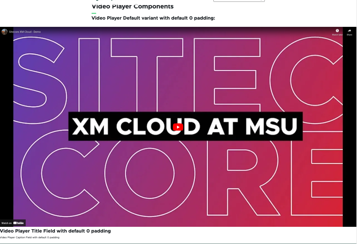
Screenshot of video component on page
Figure 1: Example of a Video Player component, preceded by text on the page.

Component Information

  • Usage
  • Best Practices
  • Related Information

Benefits

  • Provides a means of sharing video content on a website without forcing the viewer to leave the page to watch the video.
  • Enables a content author to provide contextual descriptive text with the video.
  • Works with YouTube, Vimeo and Kaltura MediaSpace, so units can avoid having to upload video files in multiple locations and can benefit from the additional visibility of sharing videos on these other platforms. 

Example Use Cases

  • Embed social media videos into a webpage from YouTube, Vimeo or Kaltura MediaSpace.
  • Share videos within context of related content, such as tutorials or demonstration videos with written instructions. 

Live Example

  • Demo: Media-Focused Content Components

Component Options and Limitations

  • Variants:
    • Default
    • Modal
  • Padding can be adjusted for the title, caption and video.
  • The play button can be dark or light to meet needs based on the video’s coloring.
  • Autoplay can be enabled or disabled. 

Guidelines

  • Formatting can be controlled using the Advanced Styling panel in Page Builder.
  • Title and caption data can be entered in Page Builder. Title and caption will only appear below the video but their padding is adjustable. 

Accessibility Information

  • It is up to the content author to ensure all video content meets standards for accessibility, including appropriate captioning.
  • For more information, see the Accessible Content page in the Experience Design section of this website. 

Related Components

  • Accordion
  • Grid Container

Template Data

Many of the video component data fields can be found in Page Builder and Content Editor. Descriptions below cite Page Builder because it is the most comprehensive set of available fields.

Component Fields in Page Builder's Content Tab

Title (single-line text)

  • Enter a title to appear with the video.
  • Optional field.

Caption (single-line text)

  • Enter a description to appear with the video.
  • Optional field.

Media (file selection)

  • Browse to select a video file from media library.
  • Must select a file in this field or include a video ID in a YouTubeID, Vimeo ID or Kaltura Embed field.

Video Captions (file selection)

  • Browse to select a caption file from media library.
  • All videos should be properly captioned to meet accessibility standards.
  • Optional field. If using a video hosted in another platform, a file is not needed. Be sure captions were added in the platform (e.g., YouTube). 

Video Thumbnail Image (file selection)

  • The thumbnail is the image that displays in a component before the video is played.
  • Click Upload to add a video thumbnail file.
  • Click Browse media library to select an image file previously uploaded.
  • Optional field. If using a video hosted in another platform, a thumbnail file is not needed. Be sure to set the video thumbnail image in the platform (e.g., YouTube).

Image alt text (single-line text)

  • Add alt text to describe the thumbnail image.
  • Images should include alt text to meet accessibility standards.

YouTube ID

  • Include the YouTube video ID from the YouTube URL.
  • Optional field. If using a native video file uploaded to the media field, this ID field remains empty. 

Vimeo ID

  • Include the Vimeo video ID from the Vimeo URL.
  • Optional field. If using a native video file uploaded to the media field, this ID field remains empty. 

Kaltura Embed

  • Include the src attribute from the Kaltura embed iframe tag.
  • Optional field. If using a native video file uploaded to the media field, this ID field remains empty. 

Frequently Asked Questions

Can I add videos from other platforms, such as Vimeo?

The Video Player component supports YouTube, Vimeo, Kaltura MediaSpace and Sitecore-hosted video files.

Where do I find the YouTube video ID to add a video in the image placeholder?

Instructions for Use

Add Video Player Component to a Page 

In Page Builder:

  1. Select the page in the Content Tree.
  2. Click the “+” button in any Placeholder box below the Breadcrumb links.
  3. Select the Video Player component from list.

Alternate method:

  1. Click Components tab at the top of the Content Tree.
  2. Locate the Video Player component.
  3. Drag the Video Player component to any empty placeholder area of the page or into the component that will contain the Video Player below the Breadcrumb links.

If this is new Video Player content:

  1. In the “Assign content item” dialog box, hover over “Data” until a “+” appears to the right.
  2. Click “+” and select Video Player.
  3. Give the component a unique name and click off the name area.
  4. Click Assign.

If using existing Video Player Data (content):

  1. Select the proper Video Player data source from the list.
  2. Click Assign.

Tool Use Guide

*Upload audio captioning and video thumbnails for platform-hosted videos directly in the platform (e.g., YouTube).


Documentation updated: June 15, 2026

Is there an issue with this documentation? Report it here.

Component Fields in Page Builder's Design Tab

Variant

  • Default
  • No Modal

Advanced Styling

Autoplay (checkbox)
  • Check this box to have the video automatically play upon page load.
Loop (checkbox)
  • Check this box to have the video play in a loop.
  • This is best used for atmospheric videos that do not involve dialog.
Title Padding
  • Six levels of left and right padding (from 0 to 5)
Caption Padding
  • Six levels of left and right padding (from 0 to 5)
Video Padding
  • Six levels of left and right padding (from 0 to 5)
Play Button Style
  • Dark
  • Light

From a public video page, the video ID is the string of characters that appears after “watch?v=” in the video URL (available in the browser URL bar or from the Share link option on YouTube). If the video is in a list, do not include the character after the video ID starting with “&list=.” 

From the Video Details pane on an owned YouTube channel, the video ID is the string of characters at the end of the Video link, displayed under the preview panel on the right side of the Video details page.  

Choose Variant and Apply Styling

In Page Builder:

  1. Click the Video Player component and display the component details on the right side panel. Click the Design tab.
  2. Click Advanced Styling to expand the section.
  3. Adjust settings, as needed:
    1. Check Autoplay to enable the video to automatically play on page load.
    2. Check Loop to enable the video to loop.
    3. Choose a Title Padding setting to change from the default of 0.
    4. Choose a Caption Padding setting to change from thedefault of 0.
    5. Choose a Video Padding setting, if desired.
    6. Choose a Play Button Style, if desired. Keep color contrast with the video thumbnail in mind.  
Add a Video to a Video Player Component 

In Page Builder:

  1. Click the Video Player component and display the component details on the right side panel. Click the Content tab.
  2. Add a Title and Caption, if desired.
  3. Add a video using one of the following methods:
    1. Click Browse media library to upload a video file to Sitecore. Follow the steps. Repeat to upload a Video Caption file and Video Thumbnail Image, using the media library links for these respective fields.
    2. Add a YouTube video ID to the YouTube ID field. The system will automatically pull in the video thumbnail from YouTube.
    3. Add a Vimeo video ID to the Vimeo ID field. The system will automatically pull in the video thumbnail from Vimeo.
    4. Add the "src" attribute from the Kaltura embed iframe code in the Kaltura Embed field. The system will automatically pull in the video thumbnail from Kaltura.
  4. Make additional adjustments in Page Builder, including advanced styling, if necessary.
  5. Preview the page.
  6. Click Actions and Submit to send the page to the publishing workflow.