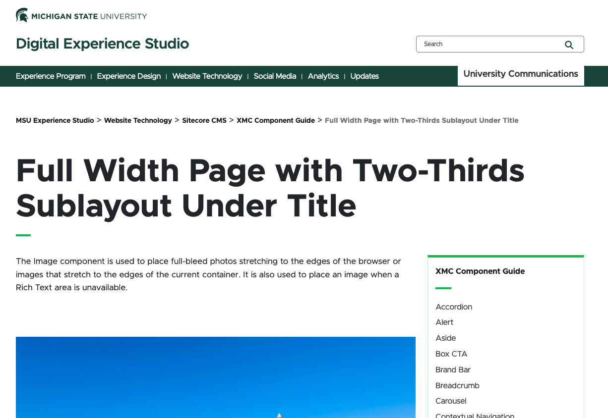
The Two-Thirds Sublayout container adds a two-column layout to a section of a webpage. The left column contains the main content and is two-thirds of the content area width. The right column contains secondary content, such as curated or contextual navigation or an aside, and is one-third of the content area width. Their combined width is equal to a one-column full-width content area.
Component Information
Benefits
- The Two-Thirds Sublayout container allows content authors to provide primary content, secondary content and navigation in a two-column layout, adding layout versatility to the page.
- The Two-Thirds Sublayout container can be placed on a basic page anywhere below the Breadcrumb links. This container cannot be used on other types of pages.
- A page can have both full-width and two-column content. The full-width content can be above and/or below the two-column content area.
- Each column may contain one or multiple components.
- The Two-Thirds Sublayout container extends from one edge of the content area to the other edge. It is not a full-bleed component.
- The Two-Thirds Sublayout container does not extend to the full-page height — the two-column layout only applies to the content placed inside the container.
Example Use Cases
- Provide a secondary navigation area for a group of related pages so that users do not have to open the mega navigation and hunt for other pages on the same topic.
- Provide an image, text and button to the right of the main content that show additional or related information about the main content.
- Highlight a particular page and provide an easy way for visitors to get to it.
Component Options
- The Two-Thirds Sublayout container has right-column and left-column areas.
- Any component can be placed in the left column except the following:
- Promo Bar
- Text CTA
- Wide Flexbox
- Another (nested) Two-Thirds Container
- The following components can be placed in the right column:
- Aside
- Contextual Navigation
- Curated Navigation
- The container is not added to Data nor is it given a name. The container does not appear in Data in Content Editor.
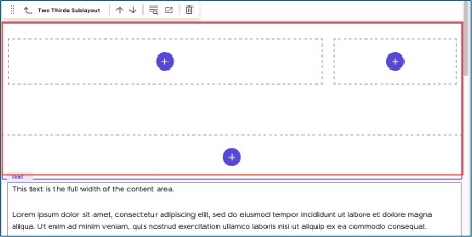
- When initially added, the Two-Thirds Sublayout container has two columns with a component placeholder in each, plus a full-bleed component placeholder below.
Guidelines and Limitations
- Two-Thirds Sublayout containers are placed and edited in Page Builder.
- Before placing a Two-Thirds Sublayout container on a page in Page Builder, have a content plan ready. This can guide you on whether a Two-Thirds Sublayout container or a Two-Thirds Page layout is the best option.
- While most components can be created while making a Two-Thirds Sublayout, it may be easier to create the needed components first.
- The Two-Thirds Sublayout container is limited to the basic Page type.
- Any number of components may be placed in either column.
- Avoid using an Aside, Contextual Navigation or Curated Navigation in the left column. It does not make sense, from a usability standpoint, to use these outside of the right column.
- Edit components to be placed in the Two-Thirds Sublayout following their requirements.
- Preview on all device types and sizes to confirm the layout adapts to mobile properly.
Accessibility Considerations
- The content author must ensure that content displays properly in the smaller widths of right and left columns in desktop, mobile and tablet views.
- The Two-Thirds Sublayout container will fill the full width of the content area on the webpage when viewed on desktop.
- When viewed on a tablet or mobile device, the sublayout cells stack vertically. Components assume their tablet and mobile formats. The expected order of display of present components and content areas is as follows: curated navigation, breadcrumb, mainbody content, twothirds sublayout content, aside, contextual navigation, twothird body content, twothirdsfullbleed content, mainbody content below twothirds sublayout.
- Preview the grid at various browser and device sizes to view the stacking order.
- If using both Contextual Navigation and Curated Navigation, place the Contextual Navigation above the Curated Navigation, so as not to interfere with the sticky behavior of the Curated Navigation.
- When adding a component to the Two-Thirds Sublayout container in Page Builder, drag the component into the content area and ensure that “twothirdsbody-1” displays before dropping the component.
- If “mainbody-1” displays, the component will be dropped into the full-width content area of the page.
- If a component name displays, such as “Rich Text,” the component will be dropped into an existing component.
- A two-column layout can also be accomplished by using a Two-Thirds Page template, rather than a Page template, when creating the page.
- A two-column content area can also be created by adding a Rich Text component to the page and then adding a Column Splitter component to the content area. This can be done in a full-width content area or in the Two-Thirds Sublayout container.
Layout alternatives:
- Sitecore User Guide: Page Layouts (including Column Splitter)
Related components:
Frequently Asked Questions
Click the "+" in a full width area to add a component in that space.
When dragging a component from the Components list, be sure that “mainbody-#” displays before the component is dropped into the page. The number may vary depending on the location on the page.
Instructions for Use
In Page Builder:
- Select the page in the Content Tree.
- Click “+” button in any Placeholder box below the Breadcrumb links.
- Select Two-Thirds Sublayout container from list.
Alternate method:
- Click Components tab at the top of the Content Tree.
- Locate Two-Thirds Sublayout container.
- Drag the Two-Thirds Sublayout container to any empty placeholder area of the page below the Breadcrumb links.
Tool Use Guide
*Follow component-specific instructions.
Documentation updated: June 29, 2026
Is there an issue with this documentation? Report it here.