Jump to HeaderJump to Main ContentJump to Footer
Michigan State University
Digital Experience Studio

University Communications and Marketing

Digital Experience Studio

  • Experience Program
    • Website Project Process
    • Working with a Vendor
    • Glossary
    • Taxonomy Data Dictionary
  • |
  • Experience Design
    • Website Strategy
    • Website Structure
    • Information Architecture and Navigation
    • User-Centered Design Conventions
    • Common UX Issues
    • Enterprise Design System
    • Content Planning
    • Creating Accessible Content
    • Taxonomy and Filters
  • |
  • Website Technology
    • Web Standards
    • Search Engine Optimization
    • Cascade CMS
    • Sitecore CMS
    • Content Hub Overview
    • Content Hub DAM
    • Content Hub Operations

    SitecoreAI

    Sitecore user login
  • |
  • Social Media
    • Alt Text Bookmarklet
    • Meta Ad Pixel
    • Social Media and Web Integration
    • Sprinklr

    Sprinklr

    Sprinklr user login
  • |
  • Analytics
    • Google Analytics (GA4)
    • Testing
    • Data Visualization

    Google Analytics

    Google Analytics user login
  • |
  • News and Events
    • News and Updates
    • Events and Trainings
Digital Experience Studio

University Communications and Marketing

  • Experience Program
  • Experience Design
  • Website Technology
  • Social Media
  • Analytics
  • News and Events

< Experience Program

  • Website Project Process
  • Working with a Vendor
  • Glossary
  • Taxonomy Data Dictionary

< Experience Design

  • Website Strategy
  • Website Structure
  • Information Architecture and Navigation
  • User-Centered Design Conventions
  • Common UX Issues
  • Enterprise Design System
  • Content Planning
  • Creating Accessible Content
  • Taxonomy and Filters

< Website Technology

  • Web Standards
  • Search Engine Optimization
  • Cascade CMS
  • Sitecore CMS
  • Content Hub Overview
  • Content Hub DAM
  • Content Hub Operations

SitecoreAI

Sitecore user login

< Social Media

  • Alt Text Bookmarklet
  • Meta Ad Pixel
  • Social Media and Web Integration
  • Sprinklr

Sprinklr

Sprinklr user login

< Analytics

  • Google Analytics (GA4)
  • Testing
  • Data Visualization

Google Analytics

Google Analytics user login

< News and Events

  • News and Updates
  • Events and Trainings
Digital Experience Studio > Website Technology > Sitecore CMS > Sitecore Component Guide >

Quote Box

MSU Tools and Resources

  • A to Z Index
  • Find People
  • Email
  • Tech Support
  • Social Media Directory

Communications Resources

  • University Communications and Marketing
  • University Trademarks and Licensing
  • MSU Brand Studio
  • MSU Editorial Style Guide
  • MSU Photos

Contact us

517-355-7505

Address

Michigan State University 408 West Circle Drive East Lansing, MI 48824

Follow Us

  • Visit our Facebook page
  • Visit our page on X
  • Visit our Instagram page
  • Visit our LinkedIn page
  • Visit our YouTube page
  • Visit our TikTok page

If you're having accessibility issues, please let us know.

Know MoreTransparency Reporting: Budget & Salary/Compensation
  • Contact Information|
  • Site Map|
  • Privacy Statement|
  • Site Accessibility|
  • Call MSU: (517) 355-1855|
  • Visit: msu.edu|
  • Notice of Nondiscrimination|

SPARTANS WILL|© Michigan State University|

Quote Box

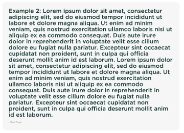
Display a quotation as a standalone component within a page. Image and author are optional. Quote Box can be styled with several preset style options (image alignment, background color, etc.)
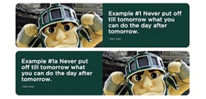
Screenshot of example quote with Sparty and placeholder text.
Figure 1: The Quote Box component. The image can be placed on the left or right.

Component Information

  • Usage
  • Best Practices
  • Template Data

Benefits

  • The Quote Box component consists of a quotation, with or without an image, and with display options that can be selected by the content author.
  • The Quote Box component can be used in Page and Story Page layouts. It cannot be used in Two-Thirds Page layouts.
  • The component can be used in any website.

Live Examples

  • Demo included in Accordion, Tabs: Information-Focused Content Components

Component Options and Limitations

  • The Quote Box component can be used in most page types.
  • The Quote Box component was designed to be used in a full width page. If placing the Quote Box inside another component (e.g., Two-Thirds Sublayout, Accordion tab), be sure to confirm the appearance of the Quote Box when viewed from a mobile device.
  • The standalone Quote Box component cannot be used in a 2-column container.
  • Recommended image sizes (in pixels) and approximate aspect ratio, assuming 1920x1080 display: Rendered 585x300 px (2:1 ratio)

Quote Box component

Variant
  • Equal ratio (default)
  • Image Half Ratio
  • Text Half Ratio
  • No image
Background color
  • Green
  • Gray
  • White
Image position
  • Left (default)
  • Right (checkbox)

Image

  • Image path selection

Quote

  • Text box

Author

  • Text box

Instructions for Use

Add Quote Box Component to a Page 

In Page Builder:

  1. Select the page in the Content Tree.
  2. Click the “+” button in any Placeholder box below the Breadcrumb links.
  3. Select Quote Box component from list.

Alternate method:

  1. Click Components tab at top of the Content Tree.
  2. Locate Quote Box component.
  3. Drag the Quote Box component to any empty placeholder area of the page below the Breadcrumb links.

If this is new Quote Box content:

  1. In the “Assign content item” dialog box, hover over Data until a “+” appears to the right.
  2. Click “+” and select Quote Box.
  3. Give the component item a unique name and click off the name area.
  4. Click Assign.

If using existing Quote Box Data (content):

  1. Select the proper Quote Box component item from the list.
  2. Click Assign and skip to step 8, below.

The Quote Box and toolbar are displayed.

Adjust component preferences:

  1. Click on the component to select it.
  2. Click the Design tab and expand the Advanced Styling group on the right-side menu.
  3. Select the preferred variant.
  4. Adjust background color and image placement, if necessary.
Note: If adding a Quote Box within another component, such as an Accordion, follow the instructions for adding the containing component first. 

Variant Examples

Equal Ratio (Default)

The image and quote each take up half of the space of the Quote Box.
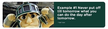
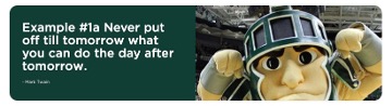
Screenshot of example quote with a green background and white quote reading "Example #1 Never put off till tomorrow what you can do the day after tomorrow. - Mark Twain" with a photo of Sparty on the left
Figure 4: The Quote Box component with all fields present, dark green background and image on left.


Screenshot of example quote with a green background and white quote reading "Example #1 Never put off till tomorrow what you can do the day after tomorrow. - Mark Twain" with a photo of Sparty on the right
Figure 5: The Quote Box component with all fields present, dark green background and image on right.


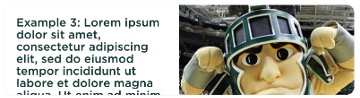
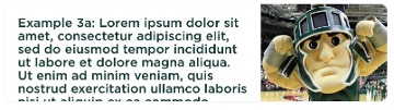
Screenshot of example quote with a white background and white quote with placeholder text and a photo of Sparty on the right
Figure 6: The Quote Box component with extra long text, no author, white background and image on right.
Image Half Ratio

Image Specifications

Sketch Link: Quote Box


Image in Quotes

  • Desktop – Width: 586px | Height: 263px
  • Mobile – Width: 305px | Height: 263px
  • Recommended size – Width: 600px | Height: 300px
Tool Use Guide


Documentation updated: June 15, 2026

Is there an issue with this documentation? Report it here.

Add an Image to a Quote Box 
  1. Click on the thumbnail placeholder image.
  2. Click Browse media library to select the image in Media Library, Content Hub or to upload an image. Follow the standard image selection process.
  3. In Advanced Styling, you have the option to choose which side the image appears using the Image on Right checkbox.
Add a Quote and Author (Optional) to a Quote Box
  1. Click on the Quote area at the top of the text column of the Quote Box.
  2. Enter text.
  3. Click on the Author area at the bottom of the text column of the Quote Box next to the hyphen symbol.
  4. Enter text.
Alternative: Edit Using Content Editor
  1. Open Content Editor:
    1. In Page Builder, click the dropdown arrow to the right of the SitecoreAI icon in upper left.
    2. Select Content Editor. It opens in a new browser tab.
  2. If the Quote Box does not appear in the Content Tree, close the page’s Data node and expand it again to refresh the Content Tree.
  3. In the Content Tree, expand Content > MSU > site name > Home > page name > Data or wherever the component was added.
  4. Locate and expand the Quote Box component.
  5. Use the file location tool to select an image.
  6. Add text to the Quote and Author fields (optional).
  7. Click Save.
  8. Return to Page Builder.
  9. Refresh the canvas.
  10. Click the eye icon to preview the page.
  11. Click Actions and Submit to send the page to the publishing workflow.

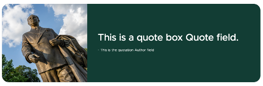
The image portion takes up half of the default image space.

Screenshot of example quote with a green background and white quote reading "This is a quote box Quote filed. - This is the quotation Author field" with a photo of the John Hannah statue on the left
Figure 7: The Quote Box component with all fields present, dark green background and image on left.


Screenshot of a quote box with a white background, green placeholder text and a photo of Sparty on the right
Figure 8: The Quote Box component with extra long quote text, no author, white background and image on right.


Text Half Ratio

The quote portion takes up half of the default text space.

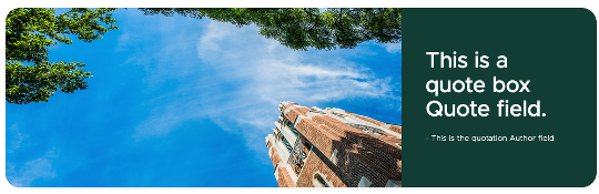
A wide, short photo of Beaumont Tower on the left. "This is a quote box Quote field. - This is the quotation Author field" in white text on a green background on the right.
Figure 9: The Quote Box component with all fields present, dark green background and image on left.
No Image

There is no image. The quote fills the space.

Screenshot of example quote with a green background and white placeholder text.
Figure 10: The Quote Box component with all fields present, dark green background and no image. 


Screenshot of example quote with a white background and a lot of green placeholder text.
Figure 11: The Quote Box component with an extra long quote, an author, no image and a light grey background.