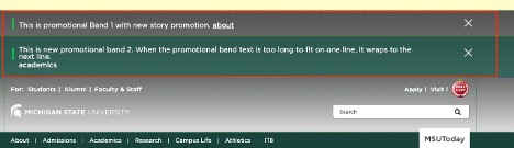
An important, usually time-sensitive message that is displayed at the top of a page below any Alert (MSU site only) and above the masthead. Visitors can opt out of future displays once the message is read.
Component Information
Benefits
- Display timely messages to visitors at the top of a page above the masthead, outside of the page’s normal content area between Breadcrumb links and Footer.
- Visitors can click to close the message once they’ve seen it.
- Content authors can schedule when the promotion bar stops showing to visitors.
Example Use Cases
- Provide a prominent message and optional text link to visitors.
- Provide a message that visitors can choose to opt out of displaying.
- Provide a message with an expiration date, on or after which the message no longer displays.
Frequently Asked Questions
No. You can manually place the same bar on multiple pages.
Create a Promo Bar by following the instructions below. In Content Editor, drag the Data item to the site’s Data node. Use this item for all pages that use the component.
Instructions for Use
In Page Builder:
- Select the page in the content tree.
- Click “+” button in the topmost placeholder area, above the masthead.
- Locate Promo Bar from the component list and drag it to the top of the page.
Note: You cannot add a Promo Bar below the masthead.
- In the Assign content item dialog box, expand the MSU node, expand the appropriate website, expand Home, expand the appropriate page and expand Data. Then skip to step 5, below.
Alternate method:
- Click Components tab at the top of the content tree.
- Locate Promo Bar and drag it from the left column Components list into the main area’s topmost placeholder above the masthead.
- In the Assign content item dialog box, expand MSU > site name > Home > page name > Data.
Assign data:
- Select Data and click “+” to the right of the Data item.
- Select Promo Bar and give it a name unique within the context of the page. For example, “Promo Bar 1.”
- Select the new component and click Assign.
- Choose Promo Bar options. See additional instructions below.
In Page Builder:
- Click Components tab at top of content tree.
- Locate Promo Bar and drag it from the left column Components list into the main area’s topmost placeholder above masthead, in the order in which multiple Promo Bars should display.
- In the Assign content item dialog box, expand MSU node, expand the site, expand Home, expand page and expand Data.
- Select appropriate Promo Bar content and click Assign.
- The component can be renamed in Content Editor (right click on item to rename) or Page Builder (click the pencil icon on the assign content panel).
- Choose Promo Bar options — see instructions below
In Page Builder:
- Click the Promo Bar to display the toolbar.
- Click Select content item icon.
- In the Assign content item dialog box, expand MSU node, expand the site, expand Home, expand page and expand Data.
The component can be renamed in Content Editor (right click on item to rename) or Page Builder (click the pencil icon on the assign content panel).
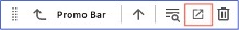
Figure 3: The Promo Bar toolbar. The Explorer icon is outlined in red. - Choose Promo Bar options — see instructions below
In Page Builder:
- Click the Promo Bar.
- In the Promo Bar right side panel, click the Design tab and expand Styling:
- Set any styling as required. These settings are not generally needed.
- In the Promo Bar right side panel, click the Design tab and expand Advanced styling:
- Select Color — Gray or Green background
- In Promo Bar right side panel, click the Content tab and adjust content:
- Text — This is the text that displays in the Promo Bar. Click the field and type directly into the field. “[No text in field]” indicates that nothing will display in the Promotion Bar.
- Link — Click the field in the component or expand Link in the Content tab to edit. “[No text in field]” indicates that no link will display.
- Link Type — Choose Internal (a page in this website), External (a page or file on another website), Media (an asset in this site’s Media Library) or Email (opens an email client with a preloaded recipient address.)
- Path — This is the link destination. The method of assigning the URL depends on the type of link: Internal (use the page chooser), External (provide fully specified URL/path) or Media (use the Media Library chooser).
- Link text — This is the text that appears on the button.
- Open in new window — Check the box to have the link open in a new window.
- Click Clear link value to remove the CTA button.
- Expiration Date — Add a date on which the Promo Bar expires and no longer displays.
- Click Actions and Submit to send the page to the publishing workflow.
In Page Builder:
- Click the dropdown arrow to the right of the Sitecore XM Cloud icon in upper left.
- Select Content Editor.
In Content Editor:
- Locate the Promo Bar component in the content tree.
- Make necessary changes in each field.
- An existing Promo Bar can be duplicated and then changed as needed.
- Return to Page Builder.
In Page Builder:
- Refresh the canvas to see changes.
- View the page using Preview (eye icon in upper right).
- Click Actions and Submit to send the page to the publishing workflow.