What is Information Architecture?
Information architecture refers to the structure and presentation of information to make it easy for users to understand. It is commonly referred to in user experience work for websites. Information architecture needs to consider the user, their needs and wants, the content that will be shared and the context in which users will engage with the content.
There are many elements involved in information architecture that impact website and content design:
- How content is organized
- How content is labeled
- How users can search through content
- How users can navigate content
Information architecture and navigation designs can be evaluated using a heuristic evaluation. A heuristic evaluation is used to identify design issues in a user interface based on a set of guidelines (also known as heuristics) determined to make websites easy for users to utilize.
Information Architecture and Navigation Best Practices
The following best practices are based on heuristics used to evaluate information architecture and navigation.
- Use an intuitive content hierarchy and user interface flow.
- Navigation should be visually prominent and separate.
- When using a mega navigation menu, or a navigation bar with a dropdown of additional links, divide topics into columns for quick scanning.
- Navigation should be contextual.
- Links should be clearly distinguished from other content.
- It should be easy to tell if user is in a secure/logged in state if the website supports logging in to a portal.
- The website’s main navigation bar is prime website real estate and should feature main pages/sections that are important for all (or the most important) audiences. Avoid placing links here that are only needed by a small subset of unit users (e.g., intranet, organizational chart). These pages can be linked from the drop-down mega navigation under a main page heading, from the footer or from content on relevant pages.
Issues to Avoid
- Too many links. This causes cognitive overload for users and may overwhelm them. Keep it simple and anticipate users’ top questions and needs. Use a maximum of seven main category labels. Sticking to five to six labels is ideal.
- Long, confusing labels. Labels should be succinct and avoid wrapping to a second line. Avoid jargon. It should be clear what each link or navigation item leads to.
- Inconsistent menu behavior. Menu behavior should stay consistent from page to page (and website to website, when possible).
Design Tools
Website administrators and content authors may utilize the following resources and tools when designing their information architecture and navigation and when planning for a website project. These tools are also commonly used when working with University Communications and Marketing and RDA on website projects.
A site crawl is a list of all content on a current, live website. This shows all the pages, images, documents and attachments on a website, as well as redirected links. It is commonly used to evaluate what a web search engine “sees” when it crawls a website. It is also a good way of gathering a list of all pages and content on a website. This can be used for a content audit and for determining how best to organize the site content into the information architecture.
Example tools for creating a site crawl: Screaming Frog, Semrush

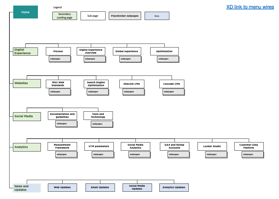
A site map is a representation of a website’s information architecture. It is often visual, resembling an organization chart. It also can be modeled in a spreadsheet, a hierarchical outline, or a visual tool (see below). The site map shows the hierarchy and relationship of pages. Pages can be color coded or labeled to indicate which pages exist on other websites, etc. It is common to develop a visual site map for high-level pages to illustrate how the content is organized, but often not all pages are included. For example, a designer might note where a blog/news section will contain many pages for each post/story but will not create a representation of each story page.
Example tools for creating a site map: Excel, PowerPoint, Adobe XM, Miro

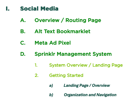
A navigation mock-up is a representation of a website’s proposed main navigation. It can be word-based (i.e., an outline) or visual. It should show the hierarchy and relationship of the main pages that will be listed in the navigation for a website.
Example tools for creating a navigation mock-up: Word, PowerPoint, Adobe XM


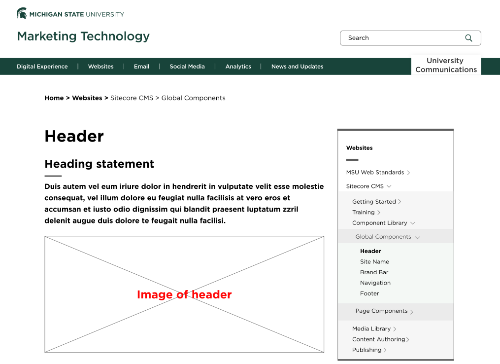
A wireframe is a visual representation of the layout and structure of the webpage. It shows the placements of components and navigation paths, typically using empty boxes as placeholders. It compares to the blueprints used to build a house: the wireframe shows the plans and the builder uses it to create a webpage and then add in any content. Wireframes can be helpful in planning out hierarchy of content and to plan how pages will interact with each other and with navigation. See “Content Planning” for more information.

Additional Information
Content Planning
Use the content inventory, audit and priority guide to plan effective content for the website.
User-Centered Design Conventions
Review best practices for crafting website user experiences.
Common UX Design Issues
Beware these common user experience issues when designing a website.
Documentation updated: Nov. 1, 2024